
Read summarized version with
What Do the Best CRO Case Studies Have in Common?
Every dollar you spend driving traffic to your site is wasted if visitors bounce without converting. That is why conversion rate optimization matters. The median conversion rate across industries sits at 6.6%, according to Unbounce's analysis of 41,000 landing pages. But the brands explored in these case studies have found ways to blow past that benchmark, sometimes by double or triple digits.
What unites the highest-performing case studies in 2026 is not a single tactic but a discipline: understanding where friction lives in the visitor journey and removing it systematically. In some cases, that friction is a mismatched landing page that fails to mirror the promise of the ad that drove the click. In others, it is a form with too many fields, a CTA with the wrong verb, or a mobile experience that breaks on smaller screens.
The 9 CRO case studies and 2 SaaS-specific success stories below represent some of the most documented conversion improvements available. Each includes the specific strategy deployed, the measurable result, and the transferable lesson. Whether you are optimizing landing pages for paid campaigns, reducing form abandonment, or testing copy changes, these examples give you validated starting points for your own experimentation roadmap.
Case Study Highlights
Company | Industry | Strategy | Result |
Goldelucks | Ecommerce (Bakery) | Product page optimization and exit popups | 31.56% more orders, 66.2% revenue improvement |
ACT Fibernet | Telecom | City-level landing page personalization | 25% more customer acquisitions |
Walmart Canada | Retail | Responsive redesign and button removal | 20% conversion boost, 98% mobile order increase |
Flos USA | Luxury Ecommerce | Full-funnel checkout optimization | 125% checkout conversion increase |
Indochino | Apparel | Editorial-style landing pages | 17.4% conversion rate, 800+ showroom bookings |
Going | Travel or SaaS | CTA copy A/B testing | 104% increase in premium trial starts |
Crown & Paw | Ecommerce | Headline testing + free shipping bar | 16% more orders, 10% revenue increase |
IMB Bank | Finance | Form redesign and navigation optimization | 87% increase in loan applications |
Broomberg | Home Services | Timed blog popups | 72% increase in blog leads |
9 CRO Success Stories You Cannot Miss
Goldelucks: Product Page Optimization and Exit Popups
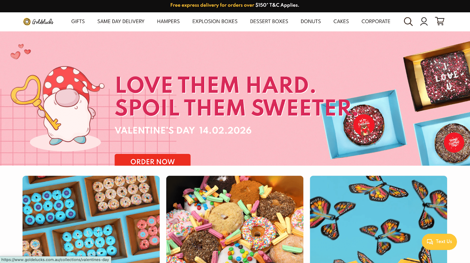
Goldelucks sells Instagram-worthy donut bouquets and confetti explosion gift boxes from their Australian bakery. Despite 40,000+ monthly visitors landing on product pages, too many people browsed, admired, and bounced. The challenge was to convert window shoppers into buyers without discounting the brand.
The Approach
Rather than deploying a generic discount popup, Goldelucks implemented a three-part optimization strategy. First, they added a highlight content box prominently featuring their unique selling proposition on product pages. Second, they rewrote product descriptions to focus on customer benefits rather than product features. Third, they deployed exit-intent popups that triggered when visitors showed signs of leaving; these popups showed personalized product recommendations based on browsing behavior.
The Results
The product page optimization alone drove a 31.56% increase in orders.The USP highlight box generated a 66.2% increase in order revenue. The exit-intent popups added another 12.27% order increase on top. Combined, these changes turned a leaky funnel into a conversion engine without a single discount code.
Takeaway: Exit-intent popups work when they add value rather than just pushing discounts. Showing relevant products to bouncing visitors rescues sales you would otherwise lose.
Source: OptiMonk
ACT Fibernet: City-Level Landing Page Personalization
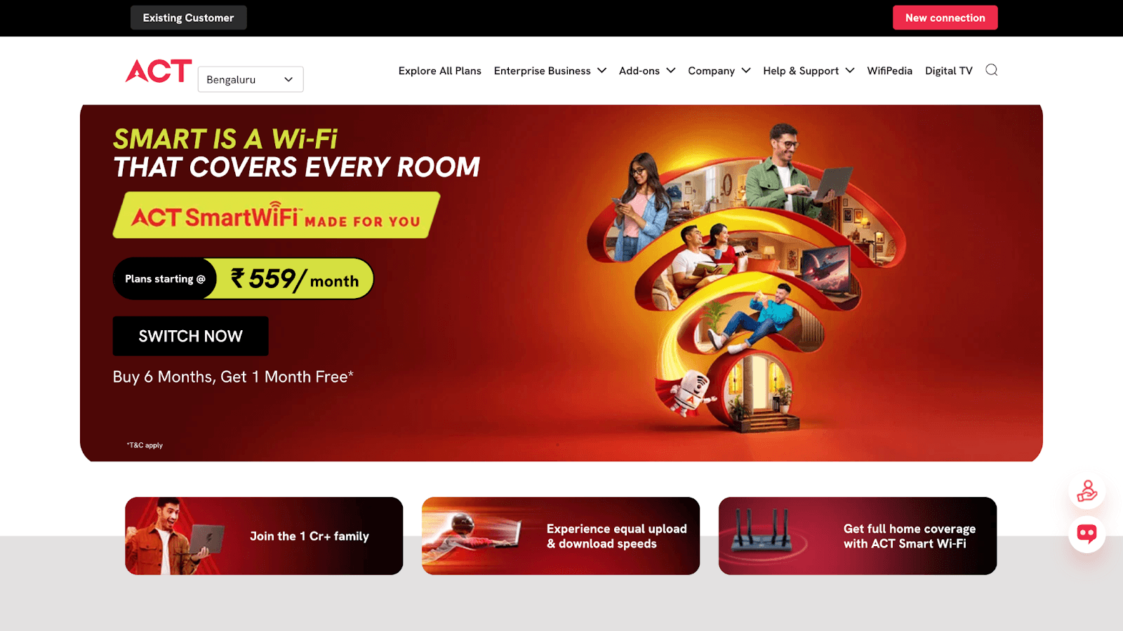
ACT Fibernet is one of India's leading broadband providers, but their dominance was concentrated in the southern regions. The company wanted to expand nationwide while improving conversion rates on their Google Search campaigns. A single landing page cannot effectively serve visitors searching for 'broadband for gaming' in Mumbai and 'internet with Netflix' in Chennai.
In 2026, this case remains one of the most widely cited examples of ad to landing page personalization producing measurable, documented results at scale for a telecom brand.
The Approach
ACT Fibernet partnered with Fibr to implement keyword-level and city-level landing page personalization at scale. When someone clicked an ad for 'high-speed internet Bangalore,' they landed on a page with Bangalore-specific pricing, imagery showing local relevance, and a form that pre-filled the city. Visitors searching for 'OTT broadband plans' saw landing pages focused on streaming features with Netflix imagery. The team also optimized CTA buttons through systematic A/B testing, changing text, colors, and placement based on which variants performed best for different visitor segments.
The Results
The personalization strategy delivered a 25% increase in customer acquisitions, a 12% lift in overall conversion rates, and a 6% improvement in CTA conversions from A/B testing alone. As ACT Fibernet CMO Ravi Karthik noted: We were early adopters of Fibr's Web Pilot product to align ad messaging with our landing pages. The conversions improved in our pilot by over 10% and ROAS have also grown.
Takeaway: Generic landing pages waste ad spend. When your landing page matches the specific intent behind each search query, visitors convert because they immediately see relevance.
Source: Fibr Case Study
Walmart Canada: Responsive Redesign and Button Removal
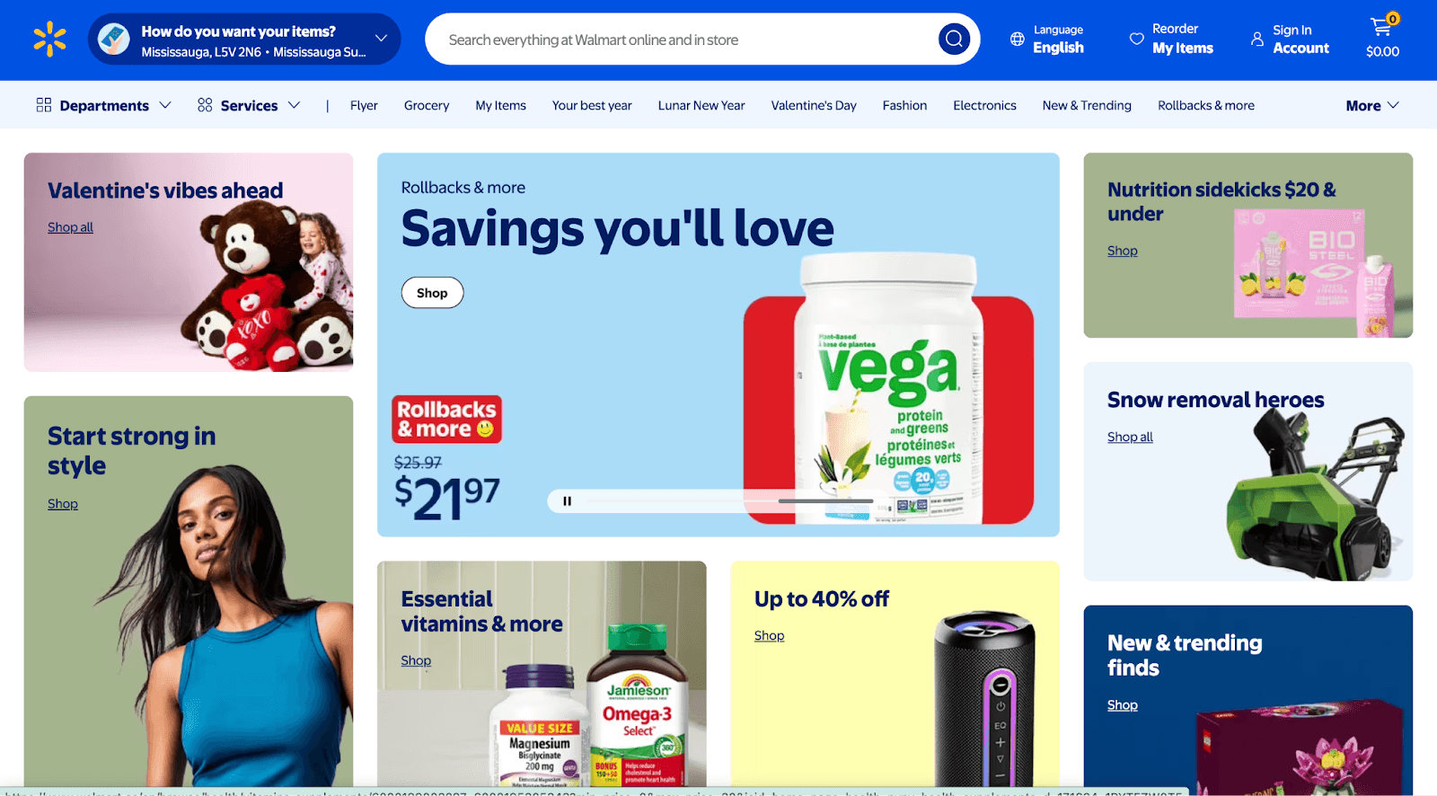
Walmart Canada noticed that nearly half their traffic came from mobile devices, but the mobile experience was abysmal. Pages loaded slowly, buttons were hard to tap, and the overall design looked broken on smaller screens.
The Approach
The team adopted a tablet-first responsive redesign philosophy, recognizing that their core customers, moms shopping from home, often used tablets. This meant designing touch-friendly navigation with larger buttons and swipe gestures, and restructuring how content collapsed across screen sizes. They used extensive A/B testing throughout the process, comparing the new responsive design against the legacy site. One surprising insight emerged: removing the View Details button for products not available online and replacing it with a clear inventory message above the Add to Cart button eliminated a major source of friction.
The Results
The responsive redesign delivered a 20% conversion increase across all devices and a 98% increase in mobile orders. The investment in responsive design paid for itself within months through improved mobile revenue. The button removal finding proves that sometimes removing elements converts better than adding them.
Takeaway: Mobile optimization is where most of your customers are. Small UX improvements like clearer inventory messaging compound across millions of sessions.
Source: CXL
Flos USA: Full-Funnel Checkout Optimization
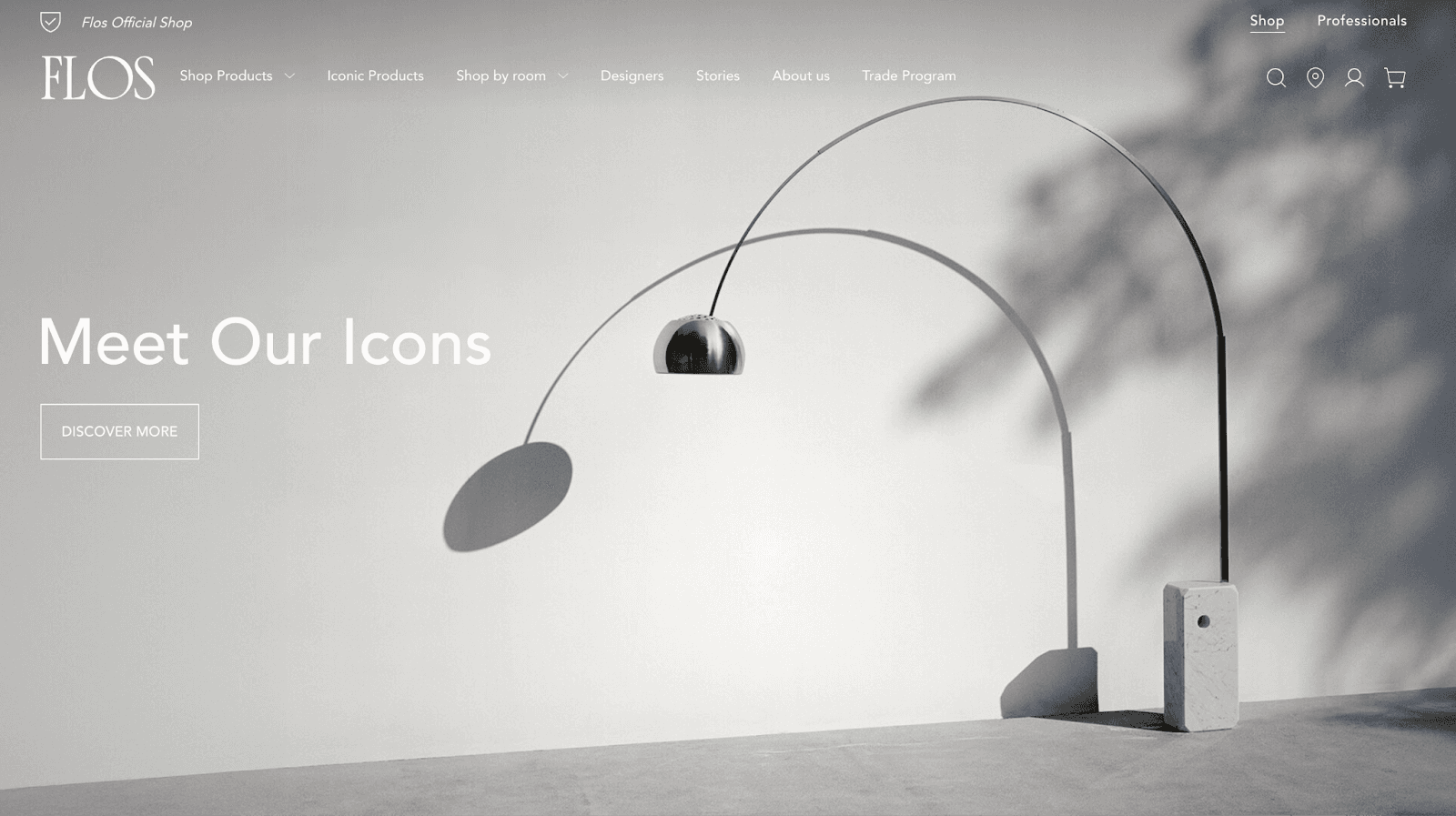
Flos Flos is an Italian luxury lighting brand known for design excellence. Their U.S. ecommerce operation had strong traffic from design enthusiasts, but too many visitors abandoned their carts before completing purchases. For a brand selling premium products with high average order values, every abandoned cart represents significant lost revenue.
The Approach
Flos USA took a full-funnel optimization approach rather than just tweaking the checkout page. Using heatmaps, scrollmaps, and session recordings, they identified specific pain points where visitors dropped off or showed confusion. The homepage received a layout and navigation redesign to help visitors find products faster. Product listing pages received improved filtering and sorting. The checkout flow was streamlined by eliminating unnecessary steps and reducing form fields. Each change was informed by behavioral data showing exactly where users struggled.
The Results
The optimization delivered a 125% increase in checkout conversions and an 18x return on investment from the CRO program. This case proves that checkout optimization alone is often not enough; friction earlier in the funnel prevents visitors from ever reaching checkout.
Takeaway: Do not assume conversion problems live only at checkout. Map the entire user journey and fix friction wherever it exists.
Source: VWO
Indochino: Editorial-Style Landing Pages
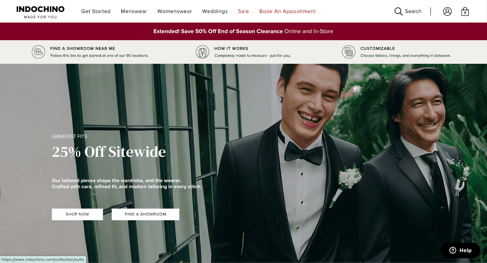
Indochino, the world's largest made-to-measure apparel company, faced an uncommon challenge: many visitors had never considered custom suits as an accessible option. The traditional landing page approach of feature-benefit-CTA was not enough to overcome that education gap.
The Approach
Instead of conventional landing pages, Indochino built editorial-style content experiences that felt more like magazine articles than sales pages. A Facebook ad might lead to a thoughtful piece about the value of a well-fitted suit, the craftsmanship behind made-to-measure tailoring, or style guides for specific occasions. These pages educated visitors first and converted them second. The team also created location-specific landing pages for showroom promotions and partner events, using Unbounce to build and iterate quickly without draining developer resources.
The Results
The editorial approach delivered a 17.4% conversion rate on key campaigns, along with 800+ new showroom bookings, 40 made-to-measure suit sales, and 750+ newsletter signups in just nine months.
Takeaway: For complex or unfamiliar products, education-first content can outperform traditional landing pages. Meet visitors where they are in their awareness journey.
Source: Unbounce
Going: CTA Copy A/B Testing
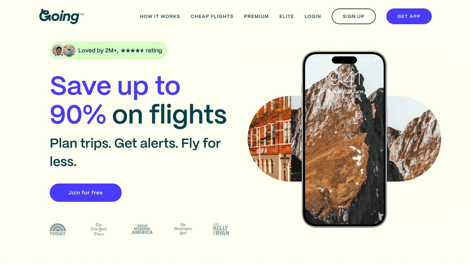
Going (formerly Scott's Cheap Flights) helps travelers find incredible flight deals. Their business model depends on converting free users into premium subscribers. The team hypothesized that more users would love the premium experience if they just tried it, but the existing CTA might be steering visitors toward the wrong option.
The Approach
Going ran a simple A/B test comparing two CTA variations: 'Sign up for free' versus 'Trial for free.' The test isolated a single variable to determine which language better directed visitor attention. This is the foundational principle of the A/B testing framework: change one element, measure the specific impact, and use that knowledge to inform the next experiment.
The Results
The "Trial for free" CTA delivered a 104% month-over-month increase in premium trial starts. By shifting just three words, Going doubled their premium trial signups.
Takeaway: Never underestimate copy. Micro-changes in CTA language can produce macro-changes in behavior. Test your assumptions; what seems insignificant often is not.
Source: Unbounce
Crown and Paw: Headline Testing and Free Shipping Bar
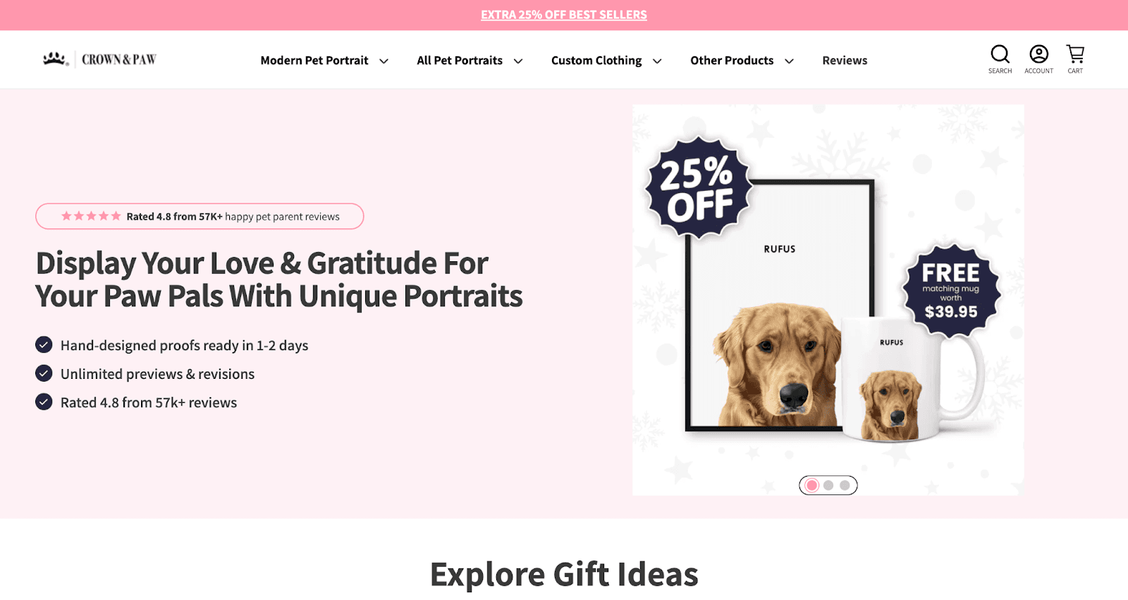
Crown & Paw turns pet photos into custom royal portraits. Converting social media interest into purchases required addressing two problems: an unclear value proposition and shipping cost anxiety.
The Approach
Crown and Paw implemented two high-impact optimizations. They A/B tested multiple homepage headline variations to find messaging that resonated most strongly with their audience. They also added a dynamic free shipping progress bar showing customers how much more they needed to add to qualify for free shipping. The latter addressed the number-one reason for cart abandonment: unexpected shipping costs, while simultaneously increasing average order value.
The Results
Headline testing drove a 16% increase in orders. The free shipping bar added another 7% order increase plus a 10% boost in overall revenue.
Takeaway: Shipping costs kill conversions. A dynamic free shipping bar transforms a potential objection into a motivation to buy more.
Source: OptiMonk
IMB Bank
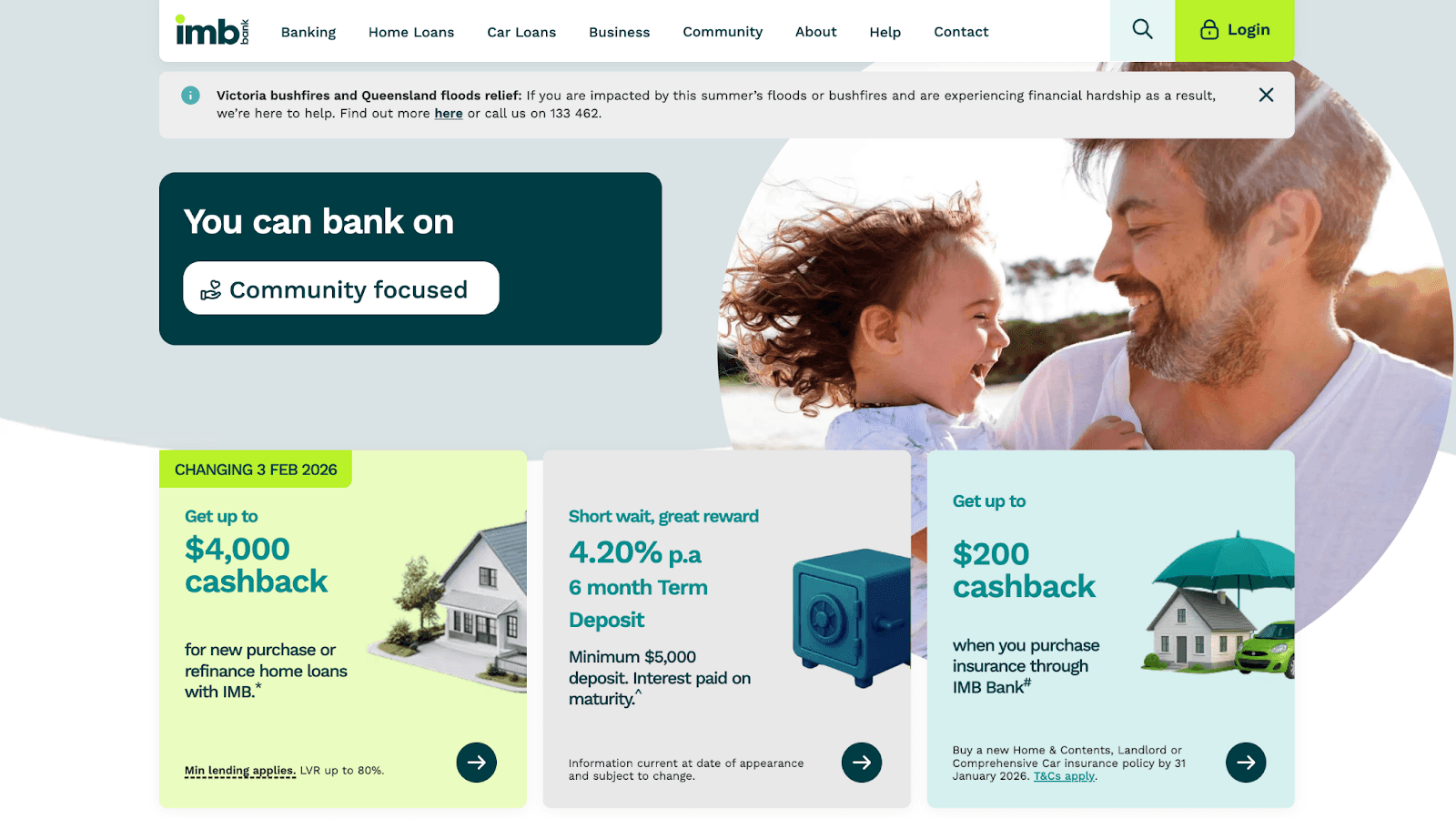
IMB Bank, an Australian financial institution, struggled with loan application completion rates. Visitors would start the application process but abandon it before finishing, a costly problem when each completed application represents significant potential revenue.
The Approach
The team analyzed user behavior data to pinpoint exactly where applicants dropped off. They discovered that 37% of users abandoned the first page of the personal loan application, caused by too many fields requesting information visitors were not ready to provide, combined with confusing navigation. The solution involved redesigning the form into a multi-step flow with clear progress indicators, reducing the number of required fields on early pages, improving navigation clarity, and adding trust signals.
The Results
The optimized loan application flow delivered an 87% increase in completed applications and a 9% improvement in form completion rate. By reducing early-stage friction and building trust throughout the process, IMB converted more visitors into qualified applicants.
Takeaway: Long forms work when they are designed as progressive journeys rather than walls of fields. Show users their progress and ask for sensitive information only after you have built trust.
Source: Fibr
Broomberg: Timed Blog Popups
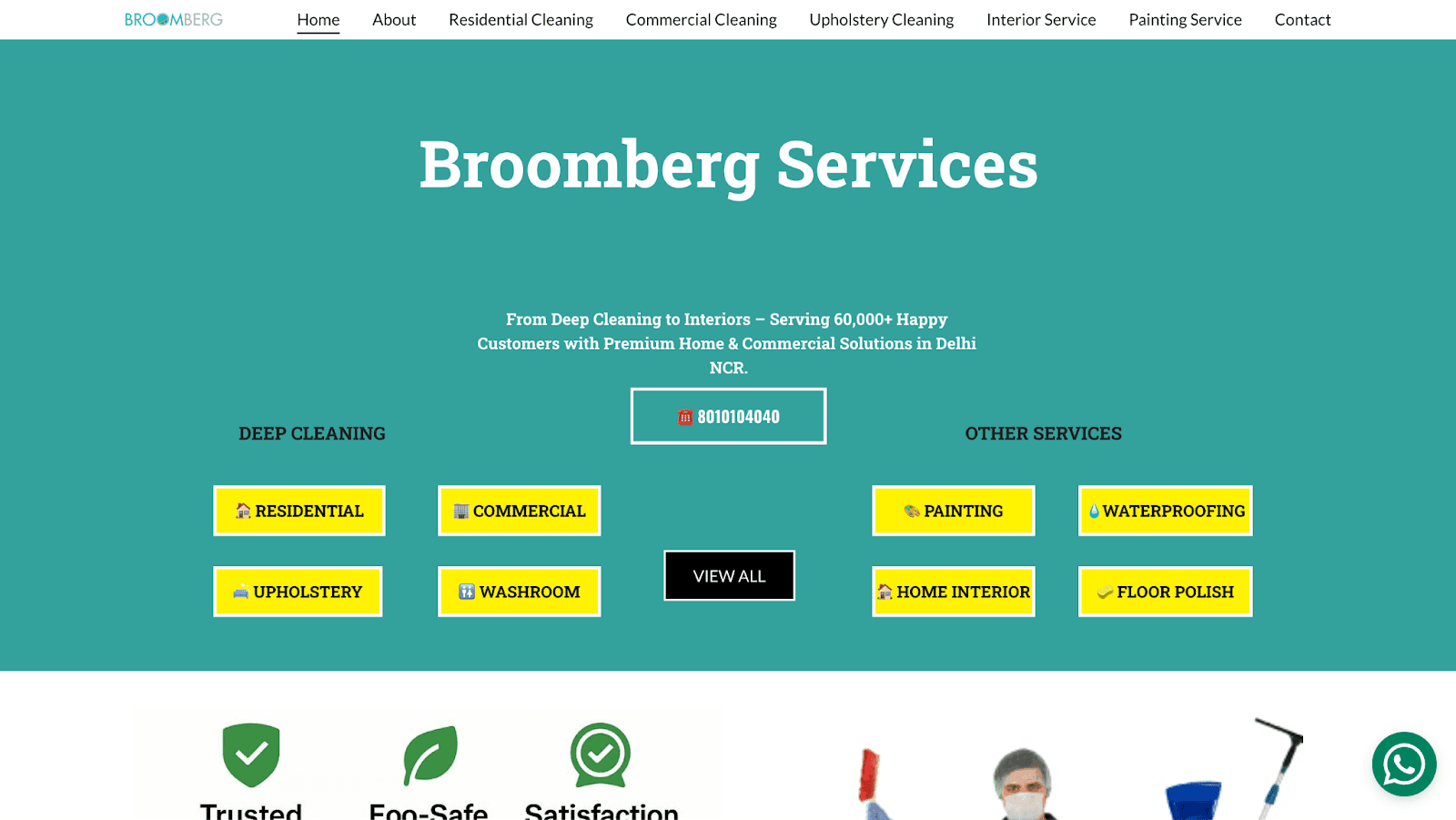
Broomberg, a home cleaning and maintenance service, faced expensive competition for bottom-funnel PPC keywords. Instead of outspending competitors, they invested in top-of-funnel blog content targeting customers in the research phase. Within three months, their blog posts generated 41% as much traffic as PPC, for free.
The Approach
Blog visitors were so engaged with the content that they scrolled right past embedded contact forms. Heatmap analysis revealed readers were focused on consuming information, not looking for conversion opportunities. Broomberg's solution was a simple popup triggered after visitors spent 100 seconds on a page, close to the average session duration. The popup asked for just one thing: a phone number.
The Results
The popup strategy delivered a 72% increase in total relevant blog leads. Popup leads accounted for 27% of all painting service leads and 23% of all flooring restoration leads.
Takeaway: Content marketing works for lead generation when you time your conversion asks correctly. Popups are not inherently annoying, but poorly timed, high-friction popups are.
Source: Unbounce
Additional SaaS CRO Case Studies
Thinkific: 150,000 Conversions From 700+ Landing Pages
Thinkific is a SaaS platform that empowers individuals and businesses to create and sell online courses. As Thinkific rapidly expanded, their marketing team faced mounting pressure to generate more leads, increase demo requests, and convert trial users into paying customers.
CRO Strategies Implemented
Rapid Landing Page Deployment: They created over 700 customized landing pages tailored to specific campaigns, audiences, and industries, allowing them to test different value propositions and messaging quickly.
Promotional Campaigns: They designed dedicated landing pages for time-limited offers.
Webinars and Online Summits: They hosted events using landing pages for registration, building community and generating leads.
CRM Integration: They connected landing pages to their CRM to automate lead capture and nurturing, ensuring efficient follow-up and personalization.
Testing New Ideas: They used landing pages to trial new products and website additions before fully integrating them, allowing for rapid iteration based on performance data.
Results
Generated over 150,000 conversions in less than two years through landing pages.
Doubled conversion rates and traffic during their back-to-school campaign compared to the previous year.
Acquired 600 new customers for their Pro plan in a single promotional period.
Achieved 50% conversion rates on webinar landing pages, with over 10,000 registrations for a recent online summit.
Built an engaged community of over 1,700 members from event participants.
Restroworks: 52% More Demo Requests Through Continuous Testing
Restroworks (formerly Posist) is a SaaS-based platform offering comprehensive restaurant management solutions, serving over 5,000 customers across more than 100 locations in six countries. The company faced significant drop-offs on their homepage and contact page, critical points in their conversion funnel, with potential clients not progressing to request demos.
Their approach exemplifies the value of iterative A/B testing as a systematic discipline rather than a one-time experiment. In 2026, teams that run more experiments per month consistently outperform those that treat testing as a periodic project.
CRO Strategies Implemented
Iterative A/B Testing: They conducted sequential A/B tests on the homepage and contact page, using insights from each test to inform the next. Homepage enhancements included compelling headlines, highlighted unique selling propositions, and clear calls-to-action.
Visitor Behavior Analysis: They used heatmaps and session recordings to understand how users interacted with pages and to identify friction points.
Trust and Credibility Focus: They emphasized testimonials and recognizable client logos to establish credibility and encourage conversions.
Results
Increased homepage visits to the contact page by over 16% in the first test.
Achieved an additional 5% uplift in the second homepage test.
Improved contact page conversions by 20% in the third test.
Secured a further 7% increase in contact page conversions in the fourth test.
Overall, generated 52% more leads in a single month.
Increased the website conversion rate to 3.4%, a total improvement of 25%.
What These Case Studies Teach Us
Personalization compounds faster than you think: Landing page personalization delivered ACT Fibernet a 25% customer acquisition improvement by matching pages to visitor intent. Generic pages waste the money you spent getting clicks in the first place.
Mobile optimization is a must: Walmart Canada's 98% mobile order increase proves that poor mobile experience costs real revenue. Your customers are on phones and your site needs to work flawlessly on every device.
Friction hides everywhere: Flos USA found problems throughout their funnel, not just at checkout. IMB Bank discovered abandonment on page one of their form. Map the entire journey from the very start using landing page analytics to surface drop-off patterns before they compound.
Even small copy changes have a big impact: Going doubled premium trials by changing three words. Crown and Paw lifted orders 16% by testing headlines. Test what seems trivial, and it often is not.
Timing matters in CRO: Broomberg's 72% lead increase came from asking at the right moment. Goldelucks rescued bouncing visitors with perfectly-timed exit popups.
Education drives conversion for complex products: Indochino's editorial approach worked because visitors needed to understand the value before they would buy. For complex products, teach first and sell second.
FAQs
Which SaaS Platforms Provide Ad to Landing Page Personalization Features?
Fibr AI, Instapage, Unbounce, and Mutiny are the leading SaaS platforms providing ad to landing page personalization features. Fibr AI is the most purpose-built, using AI agents to automatically generate personalized landing pages matched to each ad group, keyword, or audience segment without developer involvement. Instapage offers ad-to-page mapping for Google Ads campaigns. Unbounce uses Smart Traffic for automated variant routing. Mutiny specializes in account-based personalization for B2B SaaS.
How Does Landing Page Personalization Improve CRO Results?
Landing page personalization improves CRO by reducing the gap between what an ad promises and what the page delivers. ACT Fibernet achieved a 25% increase in customer acquisitions and a 12% lift in overall conversion rates by implementing city-level and keyword-level landing page personalization with Fibr AI. The core principle is message match: when visitors see the same promise on the page that they clicked in the ad, they are far more likely to convert.
What Is the Average Conversion Rate I Should Benchmark Against?
The median conversion rate across industries is 6.6%, based on Unbounce's analysis of 41,000 landing pages. However, benchmarks vary significantly by sector: financial services average 8.4%, SaaS averages 3.8%, and ecommerce averages around 4.5%. Rather than chasing a universal benchmark, focus on improving your own baseline through continuous A/B testing and personalization.
Which CRO Case Studies Show the Highest Conversion Lifts?
The highest documented lifts are: Flos USA with a 125% checkout conversion increase from full-funnel optimization, Going with a 104% month-over-month increase in premium trial starts from a three-word CTA change, and IMB Bank with an 87% increase in completed loan applications from form redesign. These results confirm that the highest lifts come from fixing friction that prevents visitors from completing the intended action. See CRO tools for platforms used in similar programs.
What Are the Fastest CRO Wins for Improving Conversion Rate?
The fastest wins come from A/B testing CTA copy, adding exit-intent popups with personalized product recommendations, and optimizing form length on high-dropout pages. Going doubled premium trial starts by changing three words. Broomberg increased blog leads by 72% with a timed popup. IMB Bank improved loan application completion by 87% by simplifying their form. A structured CRO strategy ensures these quick wins build toward compounding long-term conversion improvement.




Ankur Goyal
CEO @ Fibr AI
Ankur Goyal, a visionary entrepreneur, is the driving force behind Fibr, a groundbreaking AI co-pilot for websites. With a dual degree from Stanford University and IIT Delhi, Ankur brings a unique blend of technical prowess and business acumen to the table. This isn't his first rodeo; Ankur is a seasoned entrepreneur with a keen understanding of consumer behavior, web dynamics, and AI. Through Fibr, he aims to revolutionize the way websites engage with users, making digital interactions smarter and more intuitive.
Read summarized version with
What Do the Best CRO Case Studies Have in Common?
Every dollar you spend driving traffic to your site is wasted if visitors bounce without converting. That is why conversion rate optimization matters. The median conversion rate across industries sits at 6.6%, according to Unbounce's analysis of 41,000 landing pages. But the brands explored in these case studies have found ways to blow past that benchmark, sometimes by double or triple digits.
What unites the highest-performing case studies in 2026 is not a single tactic but a discipline: understanding where friction lives in the visitor journey and removing it systematically. In some cases, that friction is a mismatched landing page that fails to mirror the promise of the ad that drove the click. In others, it is a form with too many fields, a CTA with the wrong verb, or a mobile experience that breaks on smaller screens.
The 9 CRO case studies and 2 SaaS-specific success stories below represent some of the most documented conversion improvements available. Each includes the specific strategy deployed, the measurable result, and the transferable lesson. Whether you are optimizing landing pages for paid campaigns, reducing form abandonment, or testing copy changes, these examples give you validated starting points for your own experimentation roadmap.
Case Study Highlights
Company | Industry | Strategy | Result |
Goldelucks | Ecommerce (Bakery) | Product page optimization and exit popups | 31.56% more orders, 66.2% revenue improvement |
ACT Fibernet | Telecom | City-level landing page personalization | 25% more customer acquisitions |
Walmart Canada | Retail | Responsive redesign and button removal | 20% conversion boost, 98% mobile order increase |
Flos USA | Luxury Ecommerce | Full-funnel checkout optimization | 125% checkout conversion increase |
Indochino | Apparel | Editorial-style landing pages | 17.4% conversion rate, 800+ showroom bookings |
Going | Travel or SaaS | CTA copy A/B testing | 104% increase in premium trial starts |
Crown & Paw | Ecommerce | Headline testing + free shipping bar | 16% more orders, 10% revenue increase |
IMB Bank | Finance | Form redesign and navigation optimization | 87% increase in loan applications |
Broomberg | Home Services | Timed blog popups | 72% increase in blog leads |
9 CRO Success Stories You Cannot Miss
Goldelucks: Product Page Optimization and Exit Popups
Goldelucks sells Instagram-worthy donut bouquets and confetti explosion gift boxes from their Australian bakery. Despite 40,000+ monthly visitors landing on product pages, too many people browsed, admired, and bounced. The challenge was to convert window shoppers into buyers without discounting the brand.
The Approach
Rather than deploying a generic discount popup, Goldelucks implemented a three-part optimization strategy. First, they added a highlight content box prominently featuring their unique selling proposition on product pages. Second, they rewrote product descriptions to focus on customer benefits rather than product features. Third, they deployed exit-intent popups that triggered when visitors showed signs of leaving; these popups showed personalized product recommendations based on browsing behavior.
The Results
The product page optimization alone drove a 31.56% increase in orders.The USP highlight box generated a 66.2% increase in order revenue. The exit-intent popups added another 12.27% order increase on top. Combined, these changes turned a leaky funnel into a conversion engine without a single discount code.
Takeaway: Exit-intent popups work when they add value rather than just pushing discounts. Showing relevant products to bouncing visitors rescues sales you would otherwise lose.
Source: OptiMonk
ACT Fibernet: City-Level Landing Page Personalization
ACT Fibernet is one of India's leading broadband providers, but their dominance was concentrated in the southern regions. The company wanted to expand nationwide while improving conversion rates on their Google Search campaigns. A single landing page cannot effectively serve visitors searching for 'broadband for gaming' in Mumbai and 'internet with Netflix' in Chennai.
In 2026, this case remains one of the most widely cited examples of ad to landing page personalization producing measurable, documented results at scale for a telecom brand.
The Approach
ACT Fibernet partnered with Fibr to implement keyword-level and city-level landing page personalization at scale. When someone clicked an ad for 'high-speed internet Bangalore,' they landed on a page with Bangalore-specific pricing, imagery showing local relevance, and a form that pre-filled the city. Visitors searching for 'OTT broadband plans' saw landing pages focused on streaming features with Netflix imagery. The team also optimized CTA buttons through systematic A/B testing, changing text, colors, and placement based on which variants performed best for different visitor segments.
The Results
The personalization strategy delivered a 25% increase in customer acquisitions, a 12% lift in overall conversion rates, and a 6% improvement in CTA conversions from A/B testing alone. As ACT Fibernet CMO Ravi Karthik noted: We were early adopters of Fibr's Web Pilot product to align ad messaging with our landing pages. The conversions improved in our pilot by over 10% and ROAS have also grown.
Takeaway: Generic landing pages waste ad spend. When your landing page matches the specific intent behind each search query, visitors convert because they immediately see relevance.
Source: Fibr Case Study
Walmart Canada: Responsive Redesign and Button Removal
Walmart Canada noticed that nearly half their traffic came from mobile devices, but the mobile experience was abysmal. Pages loaded slowly, buttons were hard to tap, and the overall design looked broken on smaller screens.
The Approach
The team adopted a tablet-first responsive redesign philosophy, recognizing that their core customers, moms shopping from home, often used tablets. This meant designing touch-friendly navigation with larger buttons and swipe gestures, and restructuring how content collapsed across screen sizes. They used extensive A/B testing throughout the process, comparing the new responsive design against the legacy site. One surprising insight emerged: removing the View Details button for products not available online and replacing it with a clear inventory message above the Add to Cart button eliminated a major source of friction.
The Results
The responsive redesign delivered a 20% conversion increase across all devices and a 98% increase in mobile orders. The investment in responsive design paid for itself within months through improved mobile revenue. The button removal finding proves that sometimes removing elements converts better than adding them.
Takeaway: Mobile optimization is where most of your customers are. Small UX improvements like clearer inventory messaging compound across millions of sessions.
Source: CXL
Flos USA: Full-Funnel Checkout Optimization
Flos Flos is an Italian luxury lighting brand known for design excellence. Their U.S. ecommerce operation had strong traffic from design enthusiasts, but too many visitors abandoned their carts before completing purchases. For a brand selling premium products with high average order values, every abandoned cart represents significant lost revenue.
The Approach
Flos USA took a full-funnel optimization approach rather than just tweaking the checkout page. Using heatmaps, scrollmaps, and session recordings, they identified specific pain points where visitors dropped off or showed confusion. The homepage received a layout and navigation redesign to help visitors find products faster. Product listing pages received improved filtering and sorting. The checkout flow was streamlined by eliminating unnecessary steps and reducing form fields. Each change was informed by behavioral data showing exactly where users struggled.
The Results
The optimization delivered a 125% increase in checkout conversions and an 18x return on investment from the CRO program. This case proves that checkout optimization alone is often not enough; friction earlier in the funnel prevents visitors from ever reaching checkout.
Takeaway: Do not assume conversion problems live only at checkout. Map the entire user journey and fix friction wherever it exists.
Source: VWO
Indochino: Editorial-Style Landing Pages
Indochino, the world's largest made-to-measure apparel company, faced an uncommon challenge: many visitors had never considered custom suits as an accessible option. The traditional landing page approach of feature-benefit-CTA was not enough to overcome that education gap.
The Approach
Instead of conventional landing pages, Indochino built editorial-style content experiences that felt more like magazine articles than sales pages. A Facebook ad might lead to a thoughtful piece about the value of a well-fitted suit, the craftsmanship behind made-to-measure tailoring, or style guides for specific occasions. These pages educated visitors first and converted them second. The team also created location-specific landing pages for showroom promotions and partner events, using Unbounce to build and iterate quickly without draining developer resources.
The Results
The editorial approach delivered a 17.4% conversion rate on key campaigns, along with 800+ new showroom bookings, 40 made-to-measure suit sales, and 750+ newsletter signups in just nine months.
Takeaway: For complex or unfamiliar products, education-first content can outperform traditional landing pages. Meet visitors where they are in their awareness journey.
Source: Unbounce
Going: CTA Copy A/B Testing
Going (formerly Scott's Cheap Flights) helps travelers find incredible flight deals. Their business model depends on converting free users into premium subscribers. The team hypothesized that more users would love the premium experience if they just tried it, but the existing CTA might be steering visitors toward the wrong option.
The Approach
Going ran a simple A/B test comparing two CTA variations: 'Sign up for free' versus 'Trial for free.' The test isolated a single variable to determine which language better directed visitor attention. This is the foundational principle of the A/B testing framework: change one element, measure the specific impact, and use that knowledge to inform the next experiment.
The Results
The "Trial for free" CTA delivered a 104% month-over-month increase in premium trial starts. By shifting just three words, Going doubled their premium trial signups.
Takeaway: Never underestimate copy. Micro-changes in CTA language can produce macro-changes in behavior. Test your assumptions; what seems insignificant often is not.
Source: Unbounce
Crown and Paw: Headline Testing and Free Shipping Bar
Crown & Paw turns pet photos into custom royal portraits. Converting social media interest into purchases required addressing two problems: an unclear value proposition and shipping cost anxiety.
The Approach
Crown and Paw implemented two high-impact optimizations. They A/B tested multiple homepage headline variations to find messaging that resonated most strongly with their audience. They also added a dynamic free shipping progress bar showing customers how much more they needed to add to qualify for free shipping. The latter addressed the number-one reason for cart abandonment: unexpected shipping costs, while simultaneously increasing average order value.
The Results
Headline testing drove a 16% increase in orders. The free shipping bar added another 7% order increase plus a 10% boost in overall revenue.
Takeaway: Shipping costs kill conversions. A dynamic free shipping bar transforms a potential objection into a motivation to buy more.
Source: OptiMonk
IMB Bank
IMB Bank, an Australian financial institution, struggled with loan application completion rates. Visitors would start the application process but abandon it before finishing, a costly problem when each completed application represents significant potential revenue.
The Approach
The team analyzed user behavior data to pinpoint exactly where applicants dropped off. They discovered that 37% of users abandoned the first page of the personal loan application, caused by too many fields requesting information visitors were not ready to provide, combined with confusing navigation. The solution involved redesigning the form into a multi-step flow with clear progress indicators, reducing the number of required fields on early pages, improving navigation clarity, and adding trust signals.
The Results
The optimized loan application flow delivered an 87% increase in completed applications and a 9% improvement in form completion rate. By reducing early-stage friction and building trust throughout the process, IMB converted more visitors into qualified applicants.
Takeaway: Long forms work when they are designed as progressive journeys rather than walls of fields. Show users their progress and ask for sensitive information only after you have built trust.
Source: Fibr
Broomberg: Timed Blog Popups
Broomberg, a home cleaning and maintenance service, faced expensive competition for bottom-funnel PPC keywords. Instead of outspending competitors, they invested in top-of-funnel blog content targeting customers in the research phase. Within three months, their blog posts generated 41% as much traffic as PPC, for free.
The Approach
Blog visitors were so engaged with the content that they scrolled right past embedded contact forms. Heatmap analysis revealed readers were focused on consuming information, not looking for conversion opportunities. Broomberg's solution was a simple popup triggered after visitors spent 100 seconds on a page, close to the average session duration. The popup asked for just one thing: a phone number.
The Results
The popup strategy delivered a 72% increase in total relevant blog leads. Popup leads accounted for 27% of all painting service leads and 23% of all flooring restoration leads.
Takeaway: Content marketing works for lead generation when you time your conversion asks correctly. Popups are not inherently annoying, but poorly timed, high-friction popups are.
Source: Unbounce
Additional SaaS CRO Case Studies
Thinkific: 150,000 Conversions From 700+ Landing Pages
Thinkific is a SaaS platform that empowers individuals and businesses to create and sell online courses. As Thinkific rapidly expanded, their marketing team faced mounting pressure to generate more leads, increase demo requests, and convert trial users into paying customers.
CRO Strategies Implemented
Rapid Landing Page Deployment: They created over 700 customized landing pages tailored to specific campaigns, audiences, and industries, allowing them to test different value propositions and messaging quickly.
Promotional Campaigns: They designed dedicated landing pages for time-limited offers.
Webinars and Online Summits: They hosted events using landing pages for registration, building community and generating leads.
CRM Integration: They connected landing pages to their CRM to automate lead capture and nurturing, ensuring efficient follow-up and personalization.
Testing New Ideas: They used landing pages to trial new products and website additions before fully integrating them, allowing for rapid iteration based on performance data.
Results
Generated over 150,000 conversions in less than two years through landing pages.
Doubled conversion rates and traffic during their back-to-school campaign compared to the previous year.
Acquired 600 new customers for their Pro plan in a single promotional period.
Achieved 50% conversion rates on webinar landing pages, with over 10,000 registrations for a recent online summit.
Built an engaged community of over 1,700 members from event participants.
Restroworks: 52% More Demo Requests Through Continuous Testing
Restroworks (formerly Posist) is a SaaS-based platform offering comprehensive restaurant management solutions, serving over 5,000 customers across more than 100 locations in six countries. The company faced significant drop-offs on their homepage and contact page, critical points in their conversion funnel, with potential clients not progressing to request demos.
Their approach exemplifies the value of iterative A/B testing as a systematic discipline rather than a one-time experiment. In 2026, teams that run more experiments per month consistently outperform those that treat testing as a periodic project.
CRO Strategies Implemented
Iterative A/B Testing: They conducted sequential A/B tests on the homepage and contact page, using insights from each test to inform the next. Homepage enhancements included compelling headlines, highlighted unique selling propositions, and clear calls-to-action.
Visitor Behavior Analysis: They used heatmaps and session recordings to understand how users interacted with pages and to identify friction points.
Trust and Credibility Focus: They emphasized testimonials and recognizable client logos to establish credibility and encourage conversions.
Results
Increased homepage visits to the contact page by over 16% in the first test.
Achieved an additional 5% uplift in the second homepage test.
Improved contact page conversions by 20% in the third test.
Secured a further 7% increase in contact page conversions in the fourth test.
Overall, generated 52% more leads in a single month.
Increased the website conversion rate to 3.4%, a total improvement of 25%.
What These Case Studies Teach Us
Personalization compounds faster than you think: Landing page personalization delivered ACT Fibernet a 25% customer acquisition improvement by matching pages to visitor intent. Generic pages waste the money you spent getting clicks in the first place.
Mobile optimization is a must: Walmart Canada's 98% mobile order increase proves that poor mobile experience costs real revenue. Your customers are on phones and your site needs to work flawlessly on every device.
Friction hides everywhere: Flos USA found problems throughout their funnel, not just at checkout. IMB Bank discovered abandonment on page one of their form. Map the entire journey from the very start using landing page analytics to surface drop-off patterns before they compound.
Even small copy changes have a big impact: Going doubled premium trials by changing three words. Crown and Paw lifted orders 16% by testing headlines. Test what seems trivial, and it often is not.
Timing matters in CRO: Broomberg's 72% lead increase came from asking at the right moment. Goldelucks rescued bouncing visitors with perfectly-timed exit popups.
Education drives conversion for complex products: Indochino's editorial approach worked because visitors needed to understand the value before they would buy. For complex products, teach first and sell second.
FAQs
Which SaaS Platforms Provide Ad to Landing Page Personalization Features?
Fibr AI, Instapage, Unbounce, and Mutiny are the leading SaaS platforms providing ad to landing page personalization features. Fibr AI is the most purpose-built, using AI agents to automatically generate personalized landing pages matched to each ad group, keyword, or audience segment without developer involvement. Instapage offers ad-to-page mapping for Google Ads campaigns. Unbounce uses Smart Traffic for automated variant routing. Mutiny specializes in account-based personalization for B2B SaaS.
How Does Landing Page Personalization Improve CRO Results?
Landing page personalization improves CRO by reducing the gap between what an ad promises and what the page delivers. ACT Fibernet achieved a 25% increase in customer acquisitions and a 12% lift in overall conversion rates by implementing city-level and keyword-level landing page personalization with Fibr AI. The core principle is message match: when visitors see the same promise on the page that they clicked in the ad, they are far more likely to convert.
What Is the Average Conversion Rate I Should Benchmark Against?
The median conversion rate across industries is 6.6%, based on Unbounce's analysis of 41,000 landing pages. However, benchmarks vary significantly by sector: financial services average 8.4%, SaaS averages 3.8%, and ecommerce averages around 4.5%. Rather than chasing a universal benchmark, focus on improving your own baseline through continuous A/B testing and personalization.
Which CRO Case Studies Show the Highest Conversion Lifts?
The highest documented lifts are: Flos USA with a 125% checkout conversion increase from full-funnel optimization, Going with a 104% month-over-month increase in premium trial starts from a three-word CTA change, and IMB Bank with an 87% increase in completed loan applications from form redesign. These results confirm that the highest lifts come from fixing friction that prevents visitors from completing the intended action. See CRO tools for platforms used in similar programs.
What Are the Fastest CRO Wins for Improving Conversion Rate?
The fastest wins come from A/B testing CTA copy, adding exit-intent popups with personalized product recommendations, and optimizing form length on high-dropout pages. Going doubled premium trial starts by changing three words. Broomberg increased blog leads by 72% with a timed popup. IMB Bank improved loan application completion by 87% by simplifying their form. A structured CRO strategy ensures these quick wins build toward compounding long-term conversion improvement.
Ankur Goyal
CEO @ Fibr AI
Ankur Goyal, a visionary entrepreneur, is the driving force behind Fibr, a groundbreaking AI co-pilot for websites. With a dual degree from Stanford University and IIT Delhi, Ankur brings a unique blend of technical prowess and business acumen to the table. This isn't his first rodeo; Ankur is a seasoned entrepreneur with a keen understanding of consumer behavior, web dynamics, and AI. Through Fibr, he aims to revolutionize the way websites engage with users, making digital interactions smarter and more intuitive.
Featured Blogs
Featured Blogs

Delaware, USA
Subscribe to our newsletter for exclusive updates and insights.
By clicking submit, you agree to the terms and conditions and acknowledge the privacy policy.




Delaware, USA
Subscribe to our newsletter for exclusive updates and insights.
By clicking submit, you agree to the terms and conditions and acknowledge the privacy policy.
Delaware, USA
Subscribe to our newsletter for exclusive updates and insights.
By clicking submit, you agree to the terms and conditions and acknowledge the privacy policy.