
Pritam Roy
What if you could land on a webpage that feels like it was made just for you—focused, engaging, and designed to guide you to the thing you're looking for?
That’s exactly what an e-commerce landing page does.
Unlike a cluttered homepage or a generic product page, these pages are created just to convert visitors into paying customers.
In this article, we’ll learn all about what makes these pages so effective, why every e-commerce store needs them, and how you can create one that stands out from the competition.
Tl;DR;
Worried of low conversions and high bounce rates on your online store? E-commerce landing pages can be the answer.
E-commerce landing pages are single-purpose pages designed to convert visitors into buyers by focusing on a specific goal, such as making a purchase or capturing leads
They outperform generic homepages by increasing conversions and personalizing user experiences
Landing pages are essential for tracking campaign performance, optimizing ROI from paid ads, and improving brand trust through social proof
They are quick to set up, mobile-friendly, and ideal for A/B testing, and they let marketers refine headlines, CTAs, and visuals for better results
Compared to product pages, landing pages focus on a single action with minimal distractions, making them more effective for campaigns like sales or promotions
Challenges include balancing simplicity with content depth, ensuring fast load times (under 3 seconds), and tracking multi-channel conversions accurately.
What is An E-commerce Landing Page?
An e-commerce landing page is a single-purpose webpage on an online store designed to compel visitors to make a product purchase or add it to the cart.
A typical e-commerce landing page contains elements like:
Attractive product headlines,
Sharp and clear visuals,
Concise copy,
Trust-building features about a product
A simple and compelling call-to-action (CTA), such as “Add To Cart” or “Buy Now”
For example, a traveler planning a weekend camping trip searches online for “Best Lightweight Tents for Camping.” Among the search results, they click on a link titled, “The Perfect Tent for Any Outdoor Adventure.”
On the landing page, they’re greeted by the headline, “Lightweight, Durable Tents for Every Explorer.” A clear call-to-action (CTA) button offers a “20% Off Your First Purchase – Shop Now!”
The page delivers exactly what the traveler was searching for—relevant information, offers to entice, and trust-building elements—all in a focused design. Within moments, they are ready to make a purchase.
Why Do You Need a Landing Page for Your E-commerce Store?
If you run an e-commerce store, you are bound to have landing pages for your products. They improve your sales, engagement, and overall success. Here’s how:
1. They increase conversions (big time!)
Landing pages are built to convert. Unlike a generic homepage, which puts everything on a platter at once, a landing page is focused sharply on just one goal: to sell a product or maybe to capture an email, or promote a special offer.
Businesses see an average increase of 55% in conversions when they have different landing pages for specific campaigns. The reason is simple: the page speaks directly to what the visitor wants, without distractions like navigation-unrelated links.
For example, if you’re promoting a 20% off sale on yoga mats, a landing page highlighting the deal with a clear “Shop Now” button will outperform your regular homepage every time.
2. They let you personalize user experiences
Landing pages are also a tool to mold content to your audience.
With something like Google Ads or Facebook Ads, you can drive traffic to specific pages that match what people are searching for.
For instance, someone looking for “affordable running shoes” should land on a page featuring your best deals on running shoes—not your entire shoe collection.
Personalized landing pages improve conversion rates by as much as 300%. Address the visitor’s specific needs, and they have no reason to click away.
3. They’re perfect for tracking and optimization
A landing page is a marketer’s best friend for testing and tracking performance. Google Analytics, Hotjar, and similar tools let you monitor how users interact with the page:
Heatmaps show where people click the most.
Scroll depth reveals how far visitors go down the page.
A/B testing lets you compare two versions of the page to see which one converts better.
Over time, you can tweak the headline, CTA buttons, or imagery to maximize results, and eventually, your ROI.
4. They drive more ROI from paid ads
When you’re spending money to bring people to your site—why send them to a generic page where they might get lost? That’s why paid ads call for landing pages.
Research backs up that campaigns with dedicated landing pages see up to a 5x increase in ROI compared to ads directing users to a homepage. A good landing page makes sure that every click is more likely to lead to a sale.
5. They improve people’s perception of your brand
Landing pages give you space to address your visitors’ concerns and build confidence.
Include customer testimonials, reviews, guarantees, or even trust badges (like Secure Checkout icons). They’ll reassure potential buyers that they’re making the right choice.
92% of people hesitate to buy if they don’t see any reviews. Social proof in your landing page might be the difference between a lost lead and a loyal customer.
6. They make your campaigns stand out
Be it a holiday sale, a product launch, or a limited-time discount, a landing page makes your promotion feel special. How? It isolates the offer and keeps the visitor focused, which increases the urgency to take action.
One good example is a countdown timer on a landing page for a Black Friday deal: it creates a sense of urgency and potential buyers are made to think they’re missing out on an amazing deal if they don’t check out now.
7. They grab leads for future sales
Not every visitor will buy on their first visit.
That’s okay—landing pages are also fantastic for collecting emails. Offer something of value (like a discount code or free guide) in exchange for an email and you’ll grow your list of potential customers.
Email marketing has an average ROI of $36 for every $1 spent. The email leads you collect can turn into serious revenue down the line.
Build customized landing pages for every product you sell with FibrAI. Get started now!
E-commerce Landing Page Vs. Product Page
Although they share many similarities, both e-commerce landing pages and product pages have their role in different stages of the customer journey.
Typically, visitors will land on your homepage or a product page when they first arrive. These pages are great for introducing your brand or giving detailed product information, but they don’t always inspire immediate action.
Fun fact, visitors who hit a product page are 72% more likely to bounce than those who land on a dedicated landing page.
Why?
Because landing pages are designed with one thing in mind: conversion. They’re made to drive a specific action, unlike product pages, which are more focused on providing information. Because of this, each page uses different kinds of strategies and elements to fulfill its goals
Here’s a quick breakdown of how landing pages and product pages compare:
Let’s take the example we discussed earlier to illustrate the difference.
If the shopper looking for lightweight tents lands on a product page, they’ll see general details about one particular tent, a “Buy” button, and links to other products like "Camping Stoves" or "Sleeping Bags." There’s room to explore, and visitors bounce between categories or check out product recommendations.
But if they land on a landing page instead, the experience will be more focused. The message will be about lightweight, durable tents, with an enticing offer—say, a 30% discount—and a single, prominent CTA to Buy Now.
It’s clear, it’s direct, and it satisfies the shopper’s original intent.
While both pages aim to get the user to buy, the product page is more exploratory—introducing products and encouraging further browsing. The landing page, on the other hand, pushes the visitor towards conversion.
With FibrAI, you can create as many landing pages as you want. This way, you convince every customer, just right—based on their behavior or the platform they came for. Discover FibrAI now.
Benefits Of Creating An E-commerce Landing Page
Here are some key benefits of landing pages that would have a big impact on your e-commerce business:
1. Quick and easy to set up
Landing pages are pretty easy to create, especially compared to full website redesigns or complex product pages.
With tools like Shopify, Unbounce, or WordPress, you can quickly build and launch a landing page in just a few hours, without extensive technical expertise. Not to mention that landing page templates make the process of creating one even easier.
For this reason, landing pages are ideal for rolling out time-sensitive promotions or seasonal campaigns without delay.
2. Helps with customer segmentation
E-commerce landing pages give you the flexibility to differentiate your content to different customer segments.
If you sell a variety of products, you can create separate landing pages for different customer needs or demographics—like one for new customers and another for loyal shoppers.
With this kind of audience segmentation, you can deliver more relevant content and offers for better engagement and higher conversion rates.
3. Optimized for mobile shopping
Landing pages are often optimized specifically for mobile devices as they’re relatively simpler than product pages. With more consumers shopping on smartphones and tablets, mobile-optimized landing pages improve user experience and reduce bounce rates.
This means you’re more likely to convert shoppers who land on your page while browsing on-the-go.
4. Simplifies A/B testing
Landing pages are your best shot for testing different headlines, CTAs, images, and offers too, to see which version performs best.
This simple form of A/B testing continuously refines your marketing and makes data-driven decisions.
For example, you might find that changing the wording of your CTA from “Shop Now” to “Get Yours Today” brings a noticeable step up in conversions.
5. Boosts SEO with focused content
Landing pages help you optimize content around specific keywords and topics.
For example, if you’re running a campaign for eco-friendly backpacks, you can optimize the landing page for long-tail keywords like “best eco-friendly backpacks for hiking.”
These highly focused, keyword-optimized pages bring a noticeable improvement in your organic search rankings and attract more relevant traffic to your site.
E-commerce Landing Page Challenges
But is it all rainbows and candies? Certainly not! Challenges exist as well. Some of the more complex issues you might encounter include:
1. Finding the right balance between content and simplicity
One of the biggest challenges with landing pages is making sure the content is comprehensive without overwhelming the user.
If you load a page with too many elements—like excessive images, long paragraphs, or too many links—it hurts both user experience (UX) and page performance.
This also affects your SEO rankings, as Google values user-friendly, well-organized pages. Properly implementing collapsible sections or using clear, concise copy counters this without sacrificing content depth.
2. Consistency across multiple campaigns
When running multiple campaigns, the challenge becomes maintaining consistency in design, messaging, and overall UX across various landing pages.
This is especially tricky when targeting different customer segments (e.g., first-time visitors vs. returning customers) or running concurrent promotions.
Using a landing page builder that allows you to set global styles or templates across different pages helps a lot.
However, seeing that each landing page fits with your brand guidelines—while still being personalized to each campaign—requires tools for dynamic content customization and integration with your CRM or email platforms.
3. Page speed and mobile optimization
Landing pages with high-resolution images, complex animations, or bloated code can significantly slow down load times, especially on mobile devices.
This has a negative impact on both UX and conversion rates—Google’s PageSpeed Insights recommends under 3-second load times to reduce bounce rates.
Lazy loading, image compression, and minifying JavaScript and CSS files are some common ways to speed up your landing page.
4. Managing traffic spikes during promotions
Unexpected traffic surges during high-conversion periods (like Black Friday or a flash sale) are a technical challenge many e-commerce sites face.
If your hosting environment isn’t scalable, be prepared for slow load times or even site crashes.
Cloud hosting solutions like AWS or CDN services (like Cloudflare) automatically scale resources based on traffic spikes so that your landing page stays responsive even under high traffic volumes.
5. Accurate conversion tracking and attribution
To track conversions in landing pages, you need proper integration with analytics tools, which becomes complex depending on the traffic sources and user journeys.
For instance, setting up Google Analytics to track both macro and micro conversions (form submissions, purchases, or engagement) requires configuring event tracking and custom goals.
Even multi-channel attribution (tracking how different marketing channels contribute to conversions) becomes tricky, especially if users move between devices or have multiple touchpoints before converting.
UTM parameters, enhanced e-commerce tracking, and integration with customer data platforms (CDPs) provide a clear view of your landing page performance and which channels drive the most conversions.
13 Tips For a Great E-commerce Landing Page
Now that you know all about landing pages, time to make them better than your competitors. Follow these tips to make your stand out and convert more:
1. Nail the headline—fast and clear wins the game
Your headline has just one job: to hook your visitor. And you've got about 3-5 seconds to do it. Don’t be generic. Avoid stuff like “Shop Our Products.” Boring!
Instead, highlight the key value proposition right up front. For example:
"Eco-Friendly Sneakers That Feel Like Clouds."
"Tech Gadgets That Save You Time—and Money."
See the difference? A great headline answers three questions instantly:
What are you offering?
Who is it for?
Why should I care?
Here’s something else: include power words like “free,” “exclusive,” or “guaranteed” to instill some urgency. Studies show that headlines with emotional or specific language increase conversions by up to 30%.
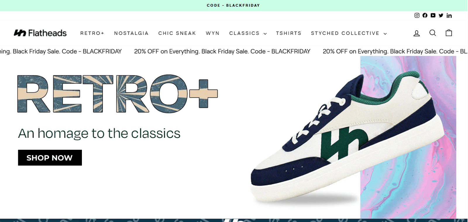
Check out Flatheads Retro+ headline, as a case in point.
2. Make your landing page load super fast
Every second counts in the world of e-commerce. If your landing page takes more than 3 seconds to load, you’re already losing 53% of mobile users. That’s not a stat you want to ignore.
How do you fix this?
Compress your images without sacrificing quality (tools like TinyPNG work wonders).
Use a content delivery network (CDN) to load your page faster for global visitors.
Ditch unnecessary plugins and scripts—they slow down your page
Did you know? Years ago, Amazon found that with a delay of just 100 milliseconds off their page load time, they lost 1% of their total sales. If that doesn’t say “speed matters,” I don’t know what does.
3. Add social proof to your page
Off-topic but do you ever walk past a restaurant with a long line and think, This place must be really good!?
Social proof works the same magic on your landing page. It convinces visitors they’re making the right choice because others already have.
Here’s how you can use it:
Real customer reviews: Star ratings along with detailed feedback (not just “Great product!”) increase trust in your product or offer. Consider adding photos of customers (with content, of course) using your product to amplify authenticity.
User stats: If you have good numbers to flaunt, do it! For example, “Over 50,000 happy customers and counting.”
Social media highlights: Showcase Instagram posts or tweets from real buyers. A curated feed (or simple widget) can make your page come alive.
As an example, we like how Marley Spoon features a huge customer testimonial ‘midst their landing page from television personality Martha Stewarts.
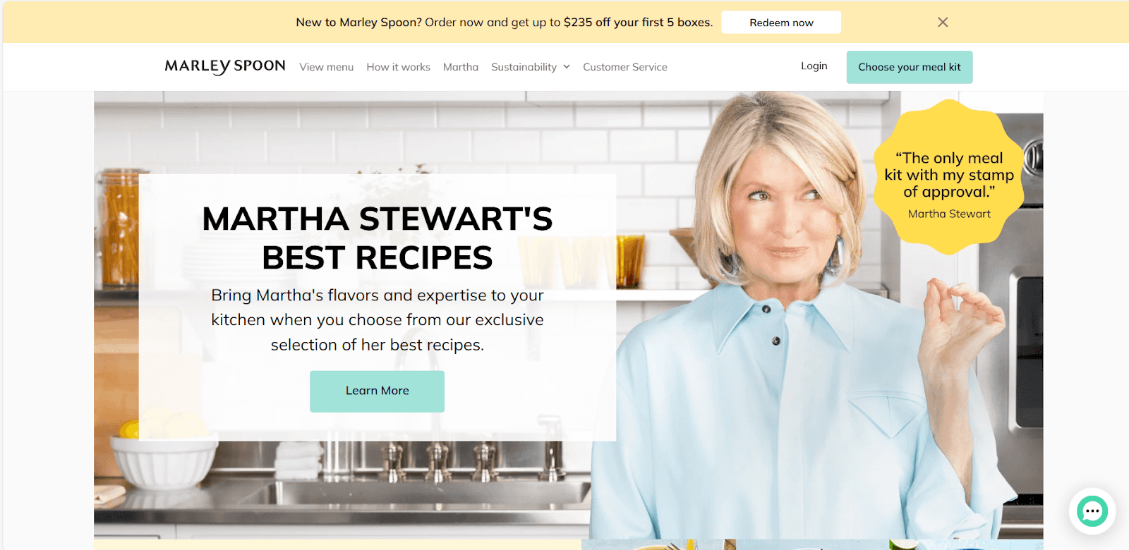
Fun Fact: Video testimonials convert even better. According to recent studies, they improve landing page conversions by 34% compared to static text testimonials.
4. Create a clear and compelling CTA
Your CTA is the ultimate goal of your landing page—it’s where you want visitors to take action. Don’t leave space for ambiguity here.
Instead of generic phrases like Click Here or Submit, use action-driven, benefit-oriented language like Get Your Free Trial or Claim Your 20% Off Now.
Position your CTA where it’s easily visible (above the fold is usually the best), but don’t be afraid to repeat it in better spots as users scroll.
💡 Pro Tip: Color matters! Orange and green CTAs often perform better because they create contrast with common web designs. A/B test to find what works best for your brand.
5. Focus on visual hierarchy and scannability
People don’t read landing pages—they scan them. Design your page to guide the visitor’s eye naturally from the headline to the CTA. Use elements like:
Contrasting fonts for headers and body text
Bullet points (like this!) for digesting information quickly
White space to avoid overwhelming the visitor
Studies show it takes just 50 milliseconds for a visitor to form an opinion about your website. If the layout feels cluttered, they will bounce before even reading your pitch.
6. Use intent-specific content
Make your landing page content match the user’s intent.
For example, someone clicking an ad for "affordable workout gear" likely expects to see pricing details and discounts right away, while someone searching "premium gym equipment" is probably more interested in product features and quality assurances.
A 2023 HubSpot survey found that landing pages with intent-matched content achieved up to 120% higher conversion rates than generic ones. Use tools like Google Analytics and heatmaps to identify what users prioritize and tweak your content accordingly.
Moreover, check out FibrAI. With FibrAI, you can create fully customized landing pages for every different ad you run, keyword query, audience type, and more. The AI does the heavy lifting, while you can build highly-converting e-commerce landing pages.
For instance, see how FibrAI helps you create 3 different landing pages (for the same product or service) for 3 different search queries. Powerful, isn’t it?
The results are stellar too. ACT swiftly implemented Fibr Web Pilot to align ad messaging with landing pages, achieving impressive results with minimal effort. The team is enthusiastic about scaling this solution across campaigns to drive greater growth and enhance productivity. They improve customer acquisition by 25% for Google Search Ads.
💡 Pro Tip: If you’re running multiple campaigns, creating separate landing pages for each ad group or keyword is the recipe to success. FibrAI is all you need.
7. Use video for demonstration or storytelling
Videos build trust, explain complex products, and evoke an emotional response more effectively than static text.
Dollar Shave Club’s landing page video famously combined humor with a clear product demonstration, leading to 12,000 orders in the first 48 hours.
Keep it short: Aim for 60–90 seconds.
Optimize for fast loading by compressing the video.
Include captions—most videos on social sites are watched without sound.
🎥 Fun Stat: Viewers retain 95% of a message when they watch it in a video, compared to only 10% when reading it as text.
8. Show FOMO with scarcity and urgency
Fear of missing out (FOMO) is a great tactic to drive conversions when used properly. Highlight limited-time offers, stock availability, or fast-expiring bonuses to nudge visitors into action.
Amazon’s “Only 3 left in stock” message on product pages encourages immediate purchases.
Booking.com prominently features “X people are viewing this property” to create urgency.
Adding a countdown timer to their landing page improved click-through rates by 30%.
Using a countdown timer, such as Zulily does, is another great way to bring in a sense of urgency to your landing page.
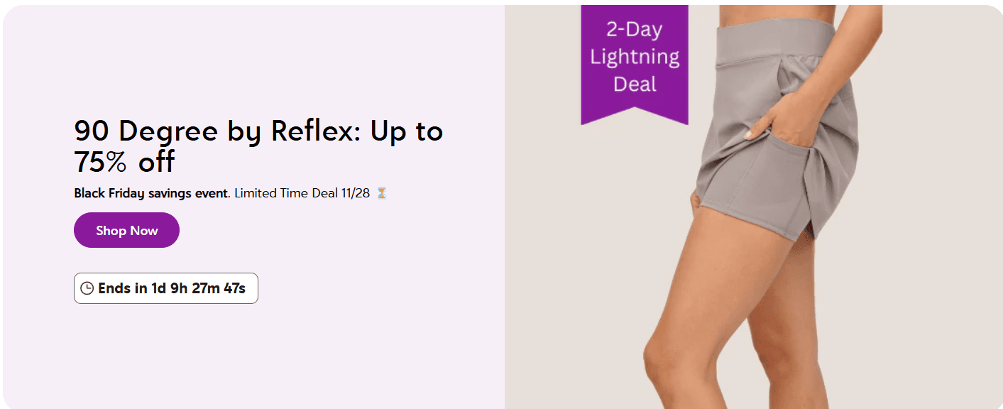
💡 Pro Tip: Use honest scarcity—fake urgency often backfires and harms your credibility. If something is genuinely limited, explain why (e.g., "only 100 units manufactured for sustainability").
9. Write persuasive, benefit-focused copy (not just features)
In your landing page copy, it’s easy to fall into the trap of listing features. "Our tent is 120” wide, 180” tall, and made from 100% recycled materials." Sure, that’s great—but does it emotionally connect with the customer?
Shift your focus from just features to benefits—why does the product make life easier, better, or more fun for the visitor? Instead of just listing specs, tell a story. For example, Instead of Made from recycled materials, try: Eco-friendly, durable, and built to last—helping you travel sustainably.
🌟 Pro Tip: Use the “So what?” test. After every feature, ask yourself, “So what does this mean for the customer?” and turn that into a benefit.
10. Use sticky elements for persistent CTAs
What’s worse than finding the perfect product on your landing page only to scroll down and lose the CTA? Sticky CTAs (also known as "floating CTAs") solve that problem. They’re buttons that follow the user as they scroll, so they never have to go hunting for the action button.
This little tweak improves conversions because it removes friction in the decision-making process.
Make sure the sticky CTA doesn’t distract or annoy—keep it subtle, with a transparent background or slight shadow, so it complements rather than competes with the page.
11. Add micro-interactions to keep engagement high
Micro-interactions are small, delightful elements that make the user experience feel more interactive. These could be as simple as a CTA button that changes color when you hover over it or a subtle animation when you scroll past a certain point.
When someone hovers over a "Buy Now" button, for instance, it could enlarge or change color—giving a satisfying visual cue that they’re about to take action.
Or when they fill out a form, the fields could gently shake to indicate a mistake, or check marks could appear next to completed sections.
Don’t go overboard—micro-interactions are meant to be subtle and should never distract or slow down the user’s journey. Test them to make sure they’re enhancing, not hindering, the conversion process.
12. Use pop-ups without being annoying
Pop-ups are a double-edged sword—they will either bring more conversions or annoy the heck out of your visitors.
When used properly, though, pop-ups effectively drive actions like email sign-ups, sales, or special promotions. The key is timing and design.
Exit-intent pop-ups: These show up when the user is about to leave the page, offering a last-chance discount or a freebie.
Delayed pop-ups: Trigger a pop-up after a user has spent a certain amount of time on the page (e.g., 30 seconds).
As an example, check out Jones Road Cosmetics shows a pop up on their landing page. Users who sign up get up to 25% off. Clever, right?
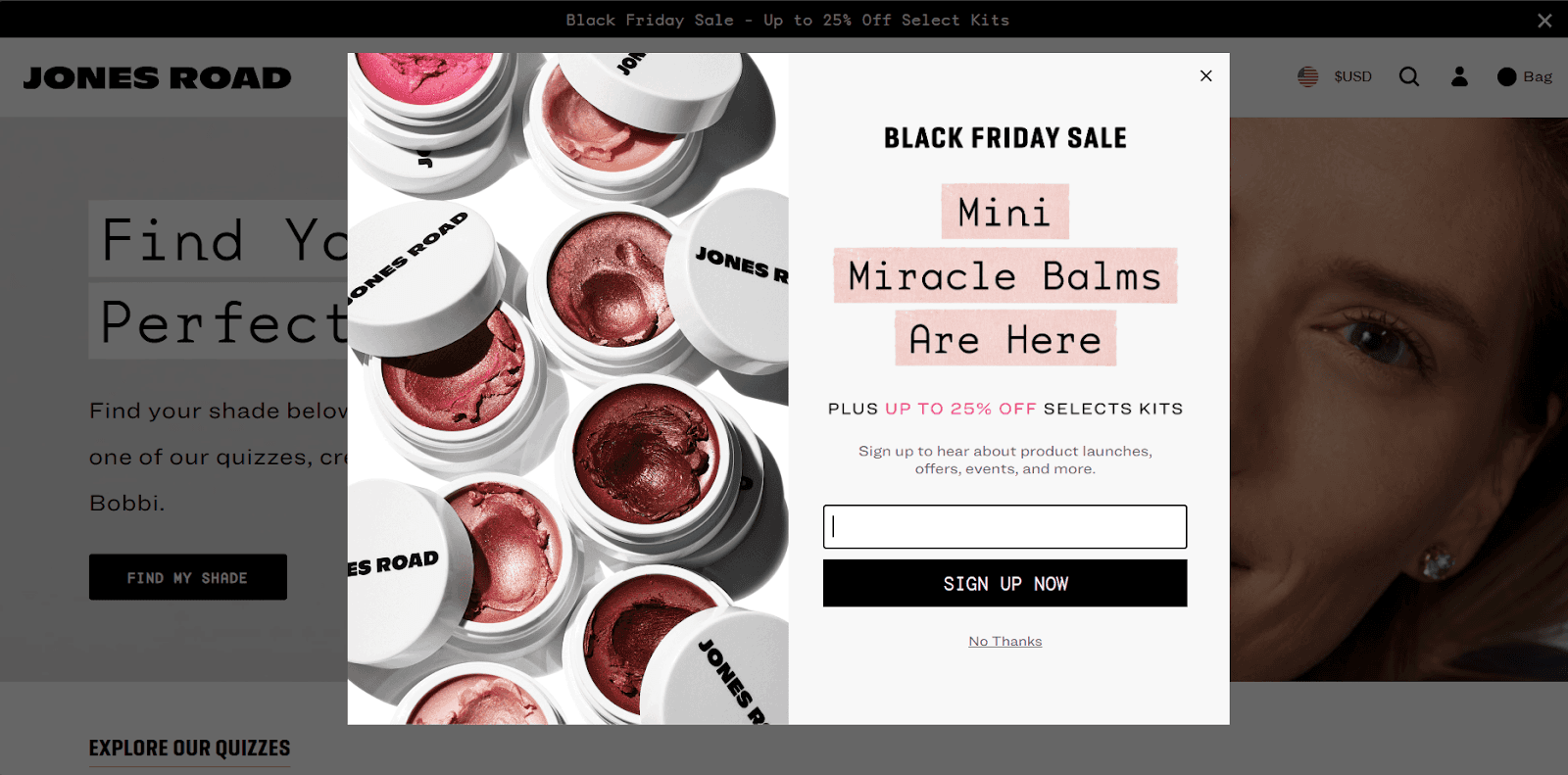
💡 Pro Tip: Always give users a clear exit option (like an “X” button) and avoid pop-ups that block the entire screen. Pop-ups should enhance the user experience, not detract from it.
13. Use clear, concise value propositions above the fold
The “above the fold” area is what visitors see without having to scroll.
If you don’t immediately tell them why they should stay on your page, you’re at risk of them bouncing in under 5 seconds.
A strong value proposition should be front and center in this space. Instead of saying “Durable Tents for Travellers,” go for something more compelling: “Explore Better with Our Durable, Lightweight Tents—Built to Withstand the Toughest Journeys.”
This tells visitors what your product does and how it solves a pain point right from the get-go.
💡 Pro Tip: Don’t bury your value proposition in a sea of text. A short, punchy statement backed up by a CTA is all you need to grab attention.
E-commerce Landing Page Examples
1. GoPro
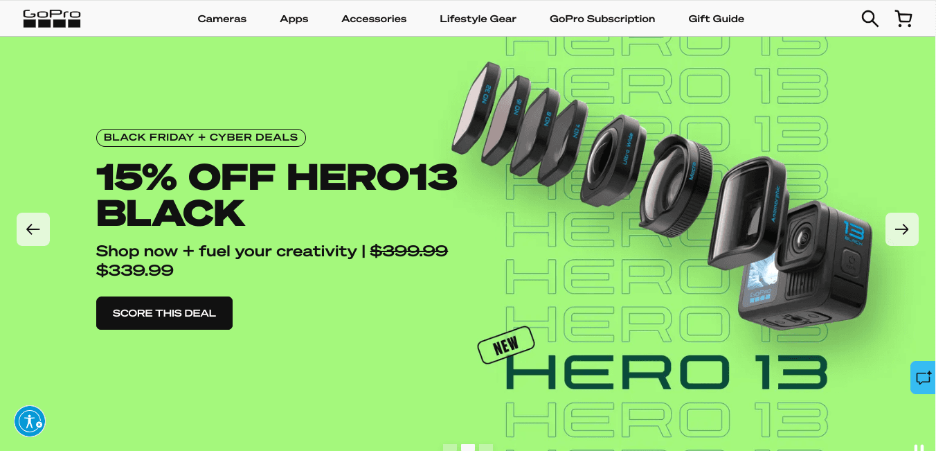
Via GoPro
GoPro’s landing page stands out with its simplicity and visual appeal. It uses bold, high-quality visuals to show its action cams. The aim is to make visitors grasp how small yet capable their camera lineup is.
The page prominently features a concise offer at the top, making it clear what value is being provided.
2. Allbirds
Via Allbirds
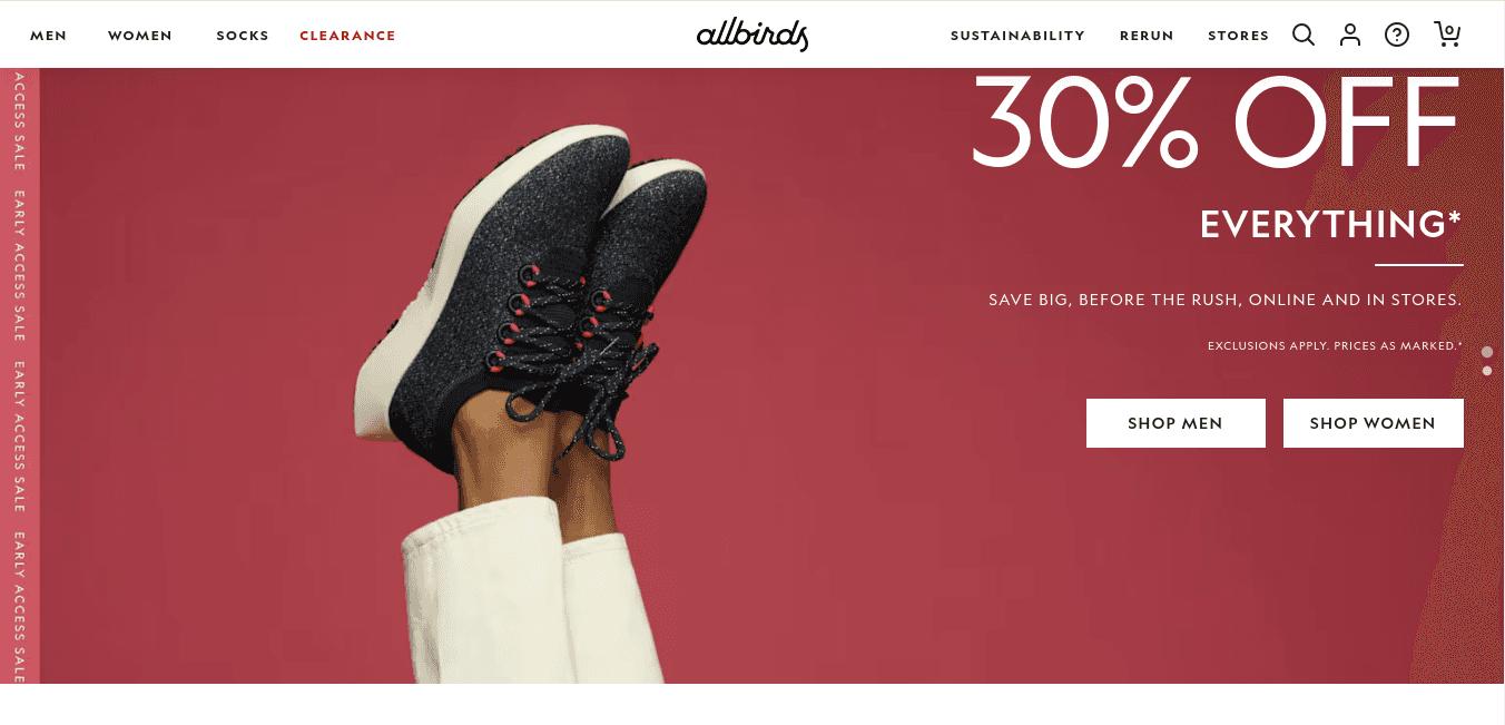
Allbirds’ landing page reflects its brand values of simplicity and sustainability.
It uses warm-toned visuals and concise copy to communicate its eco-friendly mission. The page provides detailed product descriptions of its shoe lineup, close-up photos, and user reviews to help customers choose a pair of shoes they'll actually want to own and wear.
3. Zenni
Via Zenni
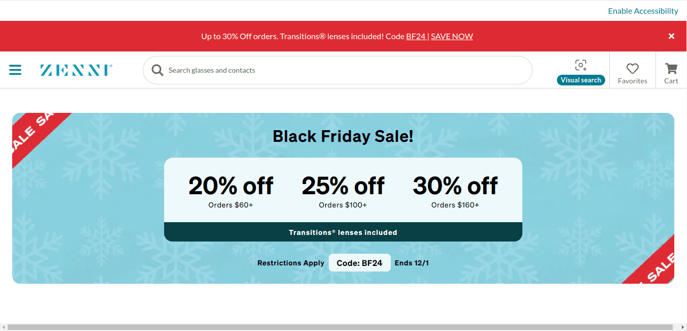
Apart from tbs sublime positioning of ongoing offers above the fold, Zenni’s landing page stands out for its clever use of AR.
There's a virtual try-on tool that allows customers to see how glasses look on their faces before purchasing. The homepage also categorizes all its products into separate sections for easy navigation.
4. Thistle
Via Thistle
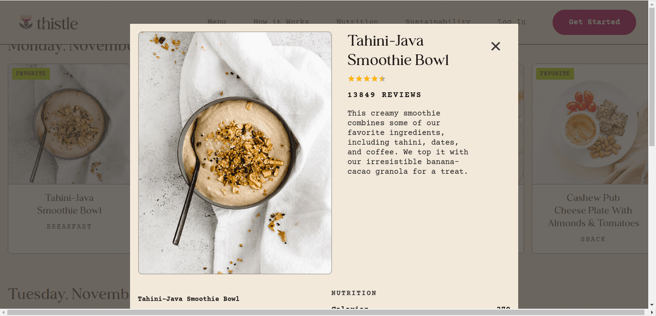
Thistle’s mobile-optimized landing page is a lesson in how to make minimal layouts encourage organic conversion.
Being a food and nutrition company, Thistle’s landing page guides the visitors eye to mouth watering visuals of the menu they offer. Although minimal, visitors get all the information they need, from social proof in the form of featured reviews and product information like nutritional values.
Create Better Landing Pages That Open the Gate for Conversions With Fibr AI
That’s a wrap. By focusing on a single goal, these pages simplify the user journey, personalize experiences, and create a sense of urgency that encourages action.
With the tips we've shared in this article—like writing clear CTAs, adding social proof, and optimizing for speed—you’re well-equipped to create landing pages that attract visitors and also convert them into paying customers.
FibrAI is your best friend when it comes to creating no-code, personalized, fast-loading, and high ROI custom landing pages.
Check out FibrAI now, and see how powerful landing pages can be.
FAQs
1. What is the purpose of an e-commerce landing page?
An e-commerce landing page guides visitors toward a specific action on your e-commerce site, like purchasing a product, signing up for a newsletter, or redeeming a discount. It’s focused, goal-oriented, and removes all (or most) distractions to maximize conversions.
2. What are the must-have elements of a high-converting e-commerce landing page?
A great e-commerce landing page must include a:
A clear and catchy headline.
High-res and high-impact visuals or product images.
A strong CTA like Buy Now or Sign Up Today.
Social proof, like customer reviews, and testimonials.
Ideally, no distractions to keep visitors focused on the goal.
3. How can I optimize my landing page for mobile users?
To make your landing page mobile-friendly:
Use responsive design so it fits all screen sizes.
Make pages load fast by optimizing images and code.
CTAs must be easily tappable and accessible with one finger.
Use large fonts and simple layouts for better navigation.
4. Are FAQ sections important on an e-commerce landing page?
Yes! An FAQ section can address common customer concerns (like shipping policies, returns) directly on the landing page. This reduces hesitation and helps customers make decisions without leaving the page.
5. How do I measure the success of my e-commerce landing page?
Track metrics like conversion rates (how many visitors take the desired action), bounce rates (how quickly visitors leave), and time spent on the page. A/B test different headlines, CTAs, or designs and find out what works best.


