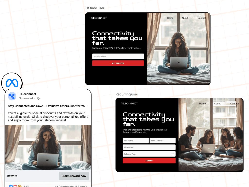
[Image: Lifecycle Marketing] A marketing workflow diagram labeled for "1st time user" and "Recurring user," featuring a Meta sponsored post and two variations of a Teleconnect landing page. The first-time user landing page features a simple email capture for a 20% discount, while the recurring user version features a more detailed lead generation form with fields for name, email, phone, and plan selection. Both landing pages show a split-screen design with a black background and photos of young adults using laptops in a bedroom setting.
Text in image: 1st time user. TELECONNECT. Home. About. Contact. Connectivity that takes you far. Welcome! Enjoy 20% Off Your First Month with Us. email address. GET STARTED. Recurring user. Connectivity that takes you far. Thank You for Being with Us! Unlock Exclusive Rewards and Discounts. Full name. Email address. Phone no. Select a Plan. SUBMIT. Teleconnect Sponsored. Stay Connected and Save – Exclusive Offers Just for You. You’re eligible for special discounts and rewards on your next billing cycle. Reward. Claim reward now.
BACKED BY LEADERS FROM
BENEFITS
Drive growth and retention with Fibr
Enhanced Customer Engagement
Increase engagement rates by delivering timely and relevant communications throughout the customer lifecycle. Use Fibr's automated workflows to maintain consistent interaction and build stronger relationships.
Improved Conversion Rates
Convert more leads into customers by optimizing messaging and offers based on real-time data insights. Use Fibr's integrated analytics to identify and capitalize on conversion opportunities
Increased Customer Retention
Foster long-term customer loyalty with personalized retention strategies and loyalty programs. Use Fibr to nurture customer relationships and encourage repeat business.
Page Visuals
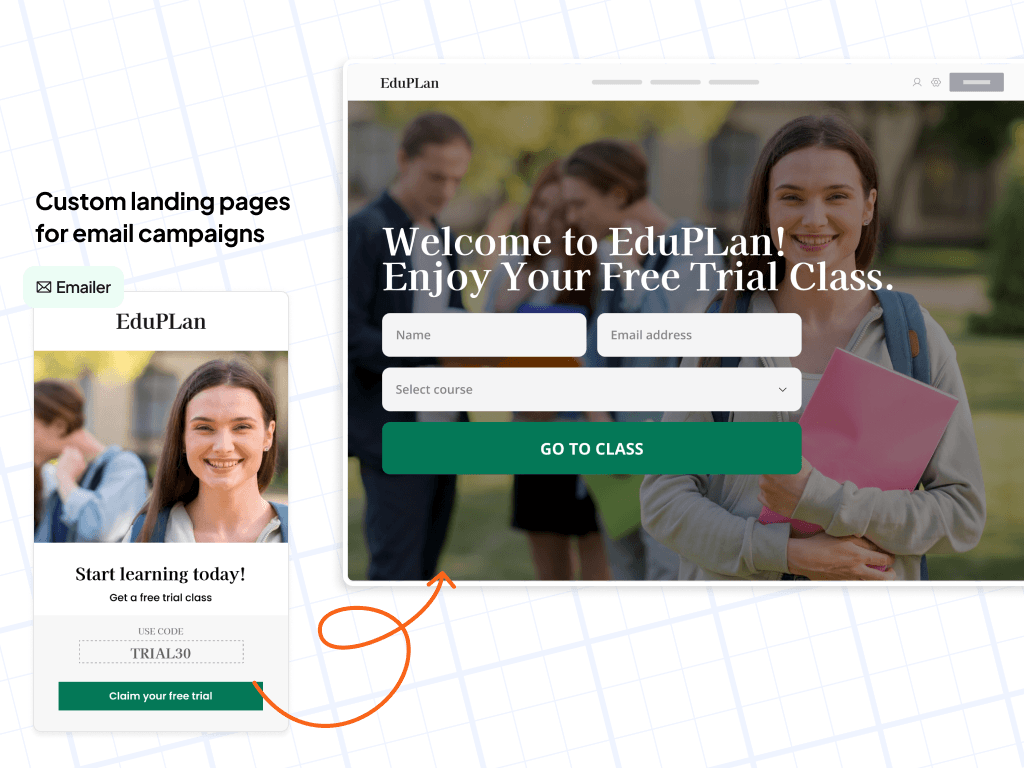
[Image: Personalized Customer Journeys] A UI mockup illustrates a personalized customer journey from an EduPlan email campaign to a custom landing page via an orange directional arrow. The email features a "Claim your free trial" button and promo code "TRIAL30," while the corresponding landing page shows a lead generation form with fields for name, email, and course selection over a background image of students.
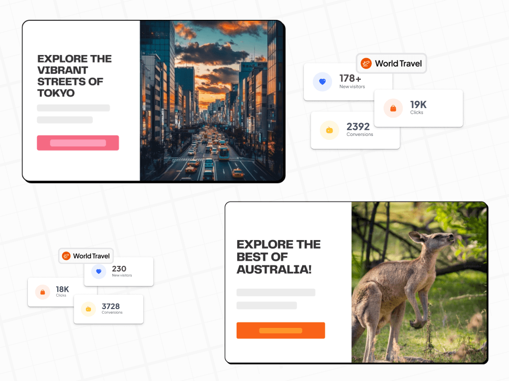
Text in image: Custom landing pages for email campaigns. Emailer. EduPlan. Start learning today! Get a free trial class. USE CODE TRIAL30. Claim your free trial. Welcome to EduPlan! Enjoy Your Free Trial Class. Name. Email address. Select course. GO TO CLASS.[Image: Conversion Optimization] An interface mockup demonstrating conversion optimization for travel landing pages, featuring two card layouts with corresponding performance metrics. The top layout promotes Tokyo with a sunset city street photo and shows 178+ new visitors, 19K clicks, and 2392 conversions, while the bottom layout promotes Australia with a kangaroo photo and shows 230 new visitors, 18K clicks, and 3728 conversions.
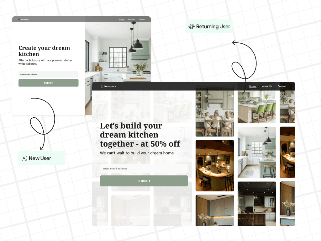
Text in image: EXPLORE THE VIBRANT STREETS OF TOKYO. World Travel. 178+ New visitors. 19K Clicks. 2392 Conversions. EXPLORE THE BEST OF AUSTRALIA! World Travel. 230 New visitors. 18K Clicks. 3728 Conversions.[Image: Retention and loyalty offers] A comparison of two website landing pages for "Your space" kitchen remodeling, illustrating personalized retention and loyalty offers for different audience segments. The "New User" version features a simple white kitchen photo and a standard email sign-up, while the "Returning User" version displays a gallery of kitchen designs and a more aggressive "50% off" loyalty incentive.
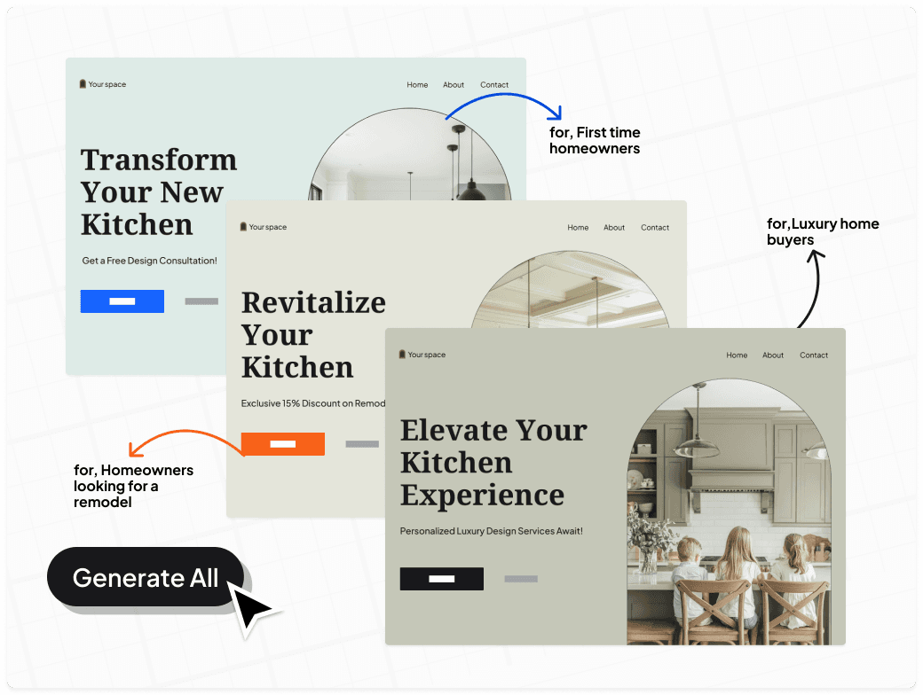
Text in image: Returning User; New User; Your space; Home; About Us; Contact; Create your dream kitchen; Affordable luxury with our premium shaker white cabinets; enter email address; SUBMIT; Let’s build your dream kitchen together - at 50% off; We can’t wait to build your dream home.[Image: Behavioral segmentation] This diagram illustrates dynamic behavioral segmentation by showing three variations of a "Your space" kitchen design landing page tailored to different audience segments. Arrows point from the different webpage headers to labels for "First time homeowners," "Luxury home buyers," and "Homeowners looking for a remodel," while a "Generate All" button at the bottom indicates automated content creation.
Text in image: Your space, Home, About, Contact. Transform Your New Kitchen. Get a Free Design Consultation! for, First time homeowners. Revitalize Your Kitchen. Exclusive 15% Discount on Remodel. for, Luxury home buyers. Elevate Your Kitchen Experience. Personalized Luxury Design Services Await! for, Homeowners looking for a remodel. Generate All.[Image: A/B Testing 101] An A/B testing conceptual diagram features two mobile app interfaces side-by-side, labeled A and B, separated by an orange "VS" hexagon. Variant A uses a vertical list format with small profile icons, while Variant B uses a more spacious layout with large circular graphics and different button placements. Both interfaces are accented with orange floating UI elements and the fibr.ai brand logo in the upper right.
Text in image: A, B, VS, fibr.ai, Wod Mene, We Sdigm Trop?, Yoan Spoelele, Soos toberle.[Image: Google Optimize Sunset Alternatives] A 3D digital graphic features the Google Optimize logo and name on a translucent glass pane, set against a black background with orange lighting. The composition includes layered glass elements, geometric spheres, and semicircles in shades of peach and orange, evoking a sunset aesthetic to represent the product's sunsetting phase.
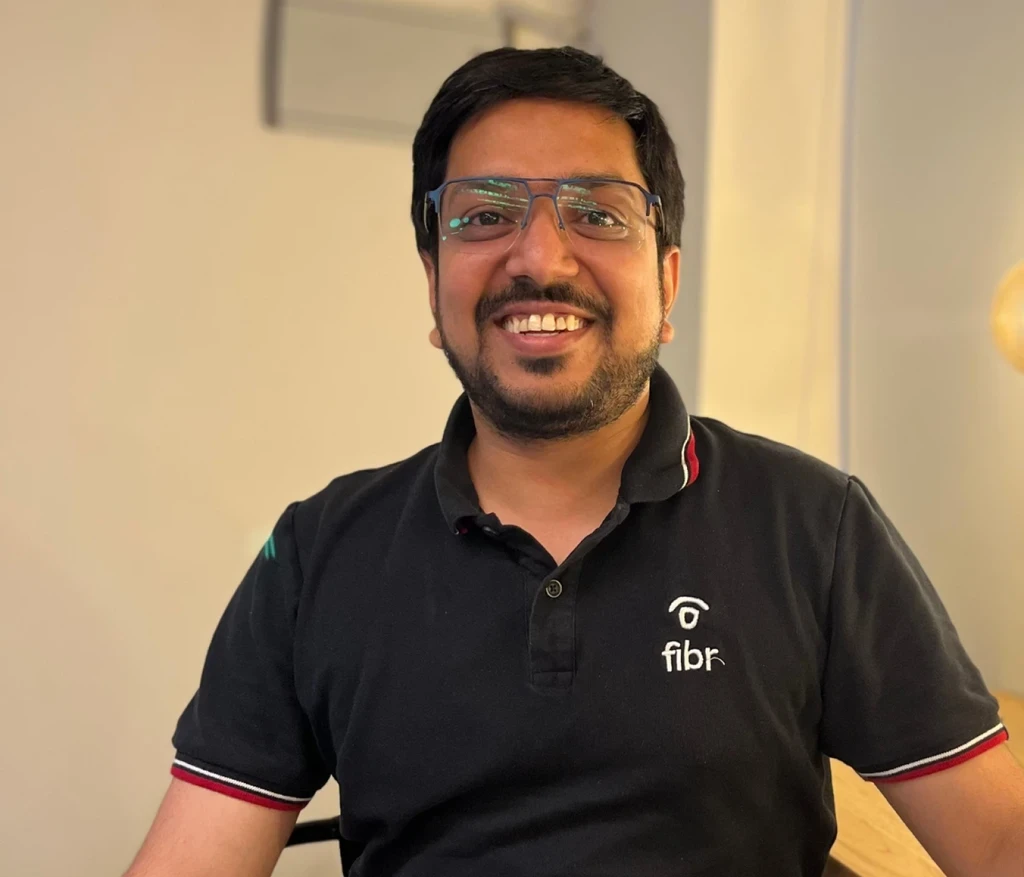
Text in image: Google Optimize, fibr.ai[Image: Ankur goyal] A portrait of Ankur Goyal smiling while wearing a black polo shirt with the "fibr" logo and light-colored pants. He is sitting at a wooden desk in an office setting, with a decorative hanging Edison-style light bulb in the background.
Text in image: fibr[Image: A/B Testing Examples] A 3D isometric illustration comparing two website layouts labeled "A" and "B" for A/B testing on a dark background. Layout A features a larger interface with profile icons and a line graph, while Layout B is a condensed version highlighting a "$5%" discount badge and a CTA button.
Text in image: fibr.ai, A, B, $5%, A/B VERSION[Image: AICPA] A circular blue gradient logo for AICPA SOC compliance, featuring a central badge design with white text. The organization name and "SOC" are separated by a horizontal line, with a website URL below and full descriptive text curving along the bottom outer border.
Text in image: AICPA SOC aicpa.org/soc4so SOC for Service Organizations | Service Organizations TM[Image: CCPA] A circular seal for the California Consumer Privacy Act (CCPA) featuring a dark blue silhouette of the state of California with a yellow padlock icon over it. The text "CCPA" is written in large blue block letters below the state outline, all contained within a thick blue border with white text.
Text in image: CALIFORNIA CONSUMER PRIVACY ACT CCPA[Image: HIPPA] A circular blue and white seal for HIPAA compliance featuring a caduceus medical symbol in the center. The badge utilizes a blue gradient and includes the URL for HIPAATraining.com along the bottom outer border.
Text in image: HIPAA COMPLIANT HIPAATraining.com[Image: pritam roy][Image: GDPR][Image: GDPR][Image: ISO][Image: G2 review][Image: G2 review][Image: G2 review][Image: G2 review][Image: G2 review]
Interactive Forms
Form
This page contains a form with the following fields: