CRO
30+ Stunning Landing Page Examples in 2024 to Maximize Conversion Rates

Ankur Goyal
Oct 27, 2024

CRO
30+ Stunning Landing Page Examples in 2024 to Maximize Conversion Rates

Ankur Goyal
Oct 27, 2024

TABLE OF CONTENTS
Give every audience
a 1:1 experience
Introduction
Have you ever wondered what makes a landing page so good that you cannot help but click? It’s 2024 and most marketers have concluded that landing pages need not be complex to drive conversion rates. (Secret: It’s quite the opposite)
Today, a successful landing page is not about just looking good or being creative–it’s about connecting and understanding how much value it adds to users. An ideal landing page would be the one where there is a moment of euphoria for the user–i.e. they have found what they were looking for.
You’d be surprised that the best landing pages in 2024 are those that are surprisingly simple, yet powerful! If you’re wondering how that works, in this blog we uncover exactly that. Our team at Fibr AI has also analyzed some top-performing landing pages to help you quickly understand what’s working and how you can optimize similarly.
Before we get to the analysis, let’s first understand why your landing page may need more optimization than you think.
What makes a landing page effective?
An effective landing page is clean and focussed on highlighting key offerings of the brand. It is visually engaging, uses a strong headline, has a clear call to action (CTA), and builds trust through social proof and testimonials.
The answer to this question is not straightforward. There are a lot of elements and technical factors you need to account for. However, we have singled out 4 super important factors that are actually simple, and yet overlooked often.
What are those? Read below–
1. Clear value proposition
The landing page is quite literally the heart of your product or service. It is your brand’s chance to engage with customers and let them know what benefit they could derive from this engagement.
Reports in fact suggest that having a clear value proposition can increase conversion rates by almost 35%!?
But, if your messaging is sloppy, disorganized, and confusing, it is going to directly, and negatively impact your conversion rate. Let’s understand this with an example.
Assume, you get on the landing page of a shoe company. On the page, you see a cluster of different offers, disorganized features, and pricing. Naturally, you’re going to be confused and may choose not to engage. Do you see how unclear messaging on your landing page can impact client conversions?
Let’s also take a real-life example. Below is the snapshot of DropBox. Observe the language, tone, and messaging.
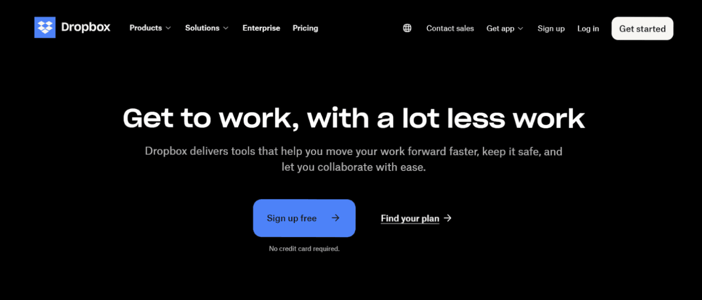
You’ll observe that it is simple, to the point, and has a clear value proposition. Naturally, if you need the services that DropBox offers, you are inclined to sign up with them.
How can you implement this for your page: Always aim to keep your messaging clear, concise, and strong to ensure the customer does not feel lost or confused.
2.Call To Action (CTA)
Call to Action (CTA) is arguably the most important pillar of your landing page. It is a marketing tactic that is designed to motivate clients to take the next step, whether it’s signing up or buying the product.
Here’s a quick question for you–If two separate landing pages had two separate CTAs–‘Start your free trial today’ and ‘Learn more’, which brand would you be more inclined to associate with?
Most of you would say the former. That’s the power of a strong CTA.
Your CTA should be action-oriented and create a sense of urgency for your clients. Relying on generic CTA can make your brand sound boring, and affect conversions.
How can you implement this for your page: Make sure your CTAs are inviting or may we say, irresistible. ‘Free Trials’, ‘Download Now’, ‘Free Shipping’, and more make for excellent CTAs. Also, ensure they are placed strategically, in the right colors and format through the landing page for more engagement.
Fun Fact: Did you know landing pages with a single CTA can increase conversions by more than 350%? Amazing isn’t it?
3.Design
The aesthetic appeal and look of your page can be a crucial factor impacting your conversion rates. The design of your page must be uncluttered, with the right amount of high-quality images, white spacing, and coloring.
For instance, below is a screenshot of Apple’s website–sleek and minimalist, in line with its offerings.
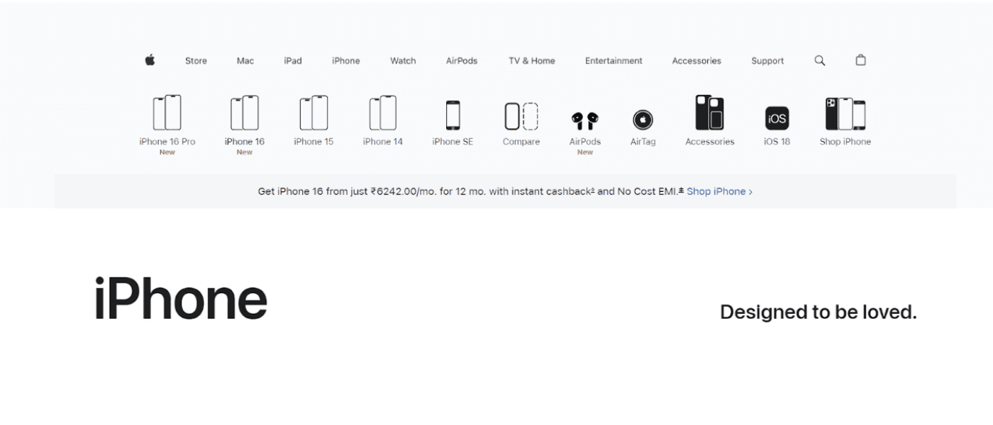
In the same context, your landing page’s design must be reflective of your brand’s voice, marketing, and audience.
How can you implement this for your page: Understand the messaging of your brand and formulate a design in accordance. For instance, if you run a travel company, then instead of going for the minimalist approach, try including striking images and videos of different countries and activities to attract and convert clients.
4.Social proof
If you have ever shopped online, you would truly appreciate and understand the value that social proof or testimonials add to a landing page, especially, if the client is unaware of your brand.
Displaying client names (especially if they are renowned), and testimonials assure potential clients that your brand or product is reliable and has users in the market already. You can view testimonials as another form of CTA that provides further motivation to clients and helps establish trust.
For instance, if your brand offers software services, showcasing testimonials from big names or putting across statements like ‘This increased our productivity by X%’ can go a long way in establishing credibility.
How can you implement this for your page: Make it practice to display and update your social proof. Add figures and numbers to further cement your brand.
Pro-tip: Optimizing for mobile, adding a coupon code or a video testimonial can increase your saying have a look at the best website optimization tools for your landing page’s conversion rates.
An effective landing page is clean and focussed on highlighting key offerings of the brand. It is visually engaging, uses a strong headline, has a clear call to action (CTA), and builds trust through social proof and testimonials.
The answer to this question is not straightforward. There are a lot of elements and technical factors you need to account for. However, we have singled out 4 super important factors that are actually simple, and yet overlooked often.
What are those? Read below–
1. Clear value proposition
The landing page is quite literally the heart of your product or service. It is your brand’s chance to engage with customers and let them know what benefit they could derive from this engagement.
Reports in fact suggest that having a clear value proposition can increase conversion rates by almost 35%!?
But, if your messaging is sloppy, disorganized, and confusing, it is going to directly, and negatively impact your conversion rate. Let’s understand this with an example.
Assume, you get on the landing page of a shoe company. On the page, you see a cluster of different offers, disorganized features, and pricing. Naturally, you’re going to be confused and may choose not to engage. Do you see how unclear messaging on your landing page can impact client conversions?
Let’s also take a real-life example. Below is the snapshot of DropBox. Observe the language, tone, and messaging.

You’ll observe that it is simple, to the point, and has a clear value proposition. Naturally, if you need the services that DropBox offers, you are inclined to sign up with them.
How can you implement this for your page: Always aim to keep your messaging clear, concise, and strong to ensure the customer does not feel lost or confused.
2.Call To Action (CTA)
Call to Action (CTA) is arguably the most important pillar of your landing page. It is a marketing tactic that is designed to motivate clients to take the next step, whether it’s signing up or buying the product.
Here’s a quick question for you–If two separate landing pages had two separate CTAs–‘Start your free trial today’ and ‘Learn more’, which brand would you be more inclined to associate with?
Most of you would say the former. That’s the power of a strong CTA.
Your CTA should be action-oriented and create a sense of urgency for your clients. Relying on generic CTA can make your brand sound boring, and affect conversions.
How can you implement this for your page: Make sure your CTAs are inviting or may we say, irresistible. ‘Free Trials’, ‘Download Now’, ‘Free Shipping’, and more make for excellent CTAs. Also, ensure they are placed strategically, in the right colors and format through the landing page for more engagement.
Fun Fact: Did you know landing pages with a single CTA can increase conversions by more than 350%? Amazing isn’t it?
3.Design
The aesthetic appeal and look of your page can be a crucial factor impacting your conversion rates. The design of your page must be uncluttered, with the right amount of high-quality images, white spacing, and coloring.
For instance, below is a screenshot of Apple’s website–sleek and minimalist, in line with its offerings.

In the same context, your landing page’s design must be reflective of your brand’s voice, marketing, and audience.
How can you implement this for your page: Understand the messaging of your brand and formulate a design in accordance. For instance, if you run a travel company, then instead of going for the minimalist approach, try including striking images and videos of different countries and activities to attract and convert clients.
4.Social proof
If you have ever shopped online, you would truly appreciate and understand the value that social proof or testimonials add to a landing page, especially, if the client is unaware of your brand.
Displaying client names (especially if they are renowned), and testimonials assure potential clients that your brand or product is reliable and has users in the market already. You can view testimonials as another form of CTA that provides further motivation to clients and helps establish trust.
For instance, if your brand offers software services, showcasing testimonials from big names or putting across statements like ‘This increased our productivity by X%’ can go a long way in establishing credibility.
How can you implement this for your page: Make it practice to display and update your social proof. Add figures and numbers to further cement your brand.
Pro-tip: Optimizing for mobile, adding a coupon code or a video testimonial can increase your saying have a look at the best website optimization tools for your landing page’s conversion rates.
The best 2024 landing page examples for high-conversion rates (Updated)
Discover the 10 best 2024 landing page examples for high conversion rates. See how these brands use clear messaging, strong hooks and CTAs, and perfect design elements to stand out amidst competitors. Each example shows different yet effective ways to convert your website visitors into future clients.
Creating a landing page is no less than writing a captivating story. There are so many elements involved, each with its unique importance. Our team at Fibr AI analyzed the landing pages of some renowned and new companies and concluded that the best landing pages commonly have a compelling hook, a straightforward messaging style, and a clean design.
Below, we present this analysis or the best landing page examples to help you strategize for maximum conversion. We have sectioned them per industry type for better clarity.
1.Asana
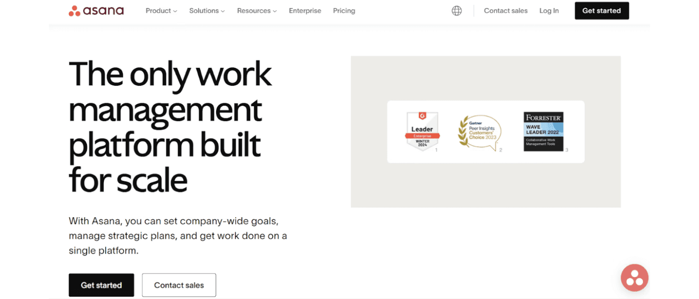
A good landing page example would be Asana– a work management and productivity software that companies and teams use to assign tasks and track progress and goals.
With simple features, and solutions specifically designed for Healthcare, Retail, Education, and Nonprofit industries, Asana comes on the top when it comes to work management.
Why it works so well?
Asana sells its USP well–that it is the ‘only’ work management platform that is built for scale. If an organization that is planning to scale in the future views this statement, they know Asana is an option they have to rely on.
Asana’s placement of awards and certification right at the top of its landing page can be deemed smart as it aims to establish trust quickly.
The page is decluttered, and simple, and balances well design elements.
2.Semrush
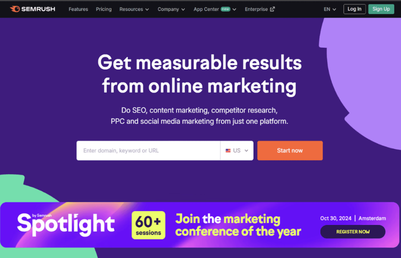
When it comes to product landing page examples, Semrush tops the list.
Semrush is a proper marketing tool that offers solutions like SEO, content marketing, data analytics, competitor research, and much more, all in one place.
The solutions are catered to the ever-changing dynamics of the marketing industry and help companies increase visibility and grow their audience.
Why it works so well?
Semrush’s landing page avoids the typical minimalist approach with a dash of dark and vibrant colors, making it more appealing to the younger audience.
The headline works well for Semrush, with words like ‘measurable’ and ‘one platform’ coming right at the top.
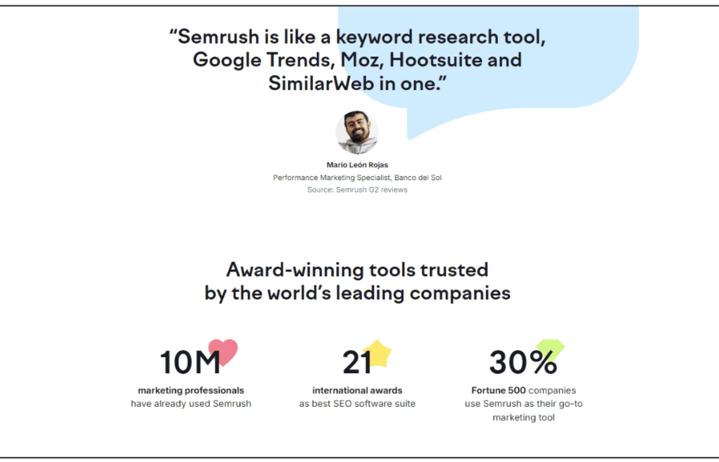
The display of numbers such as ‘10M’, and ‘30% 500 Fortune companies’, further cement Semrush’s position as a market leader and motivate potential clients to associate.
3.Basecamp
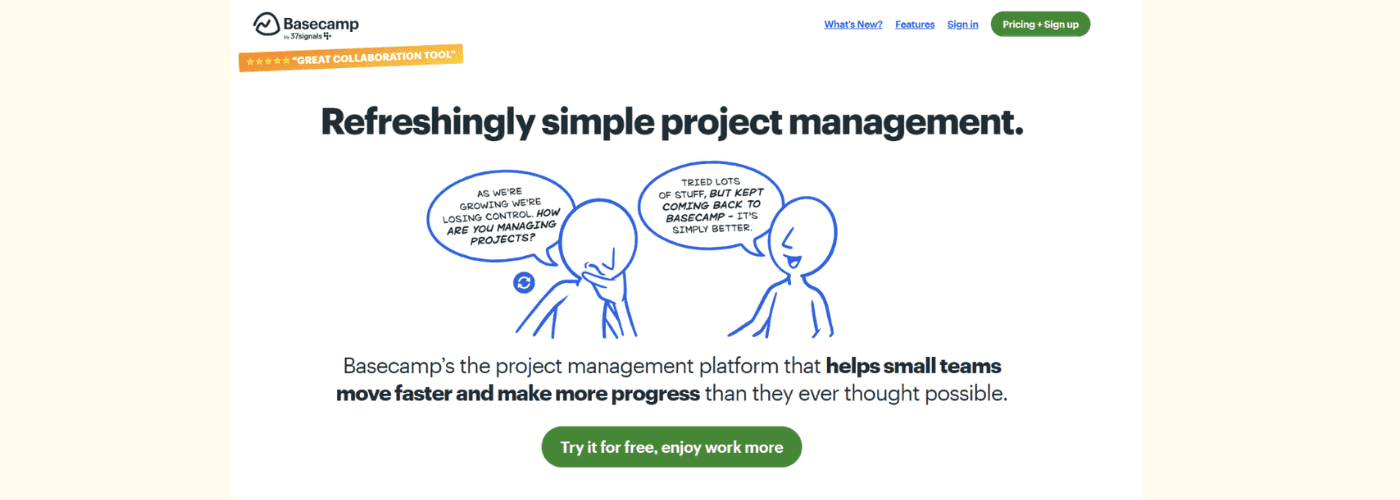
Basecamp is a project management tool that is designed for companies, startups, and freelancers who handle a large number of projects and clients.
Through Basecamp you can create separate windows for different clients, track projects, assign work, and monitor progress easily.
Why it works so well?
Basecamp’s messaging is bold, yet simple, highlighting that it’s effective for smaller teams.
Basecamp gets creative with an indirect placement of CTAs through doodling. A younger audience may be attracted to this form of marketing.
The actual CTA also goes up and above generic wordings through the ‘enjoy work more’ phrase.
4.Shopify
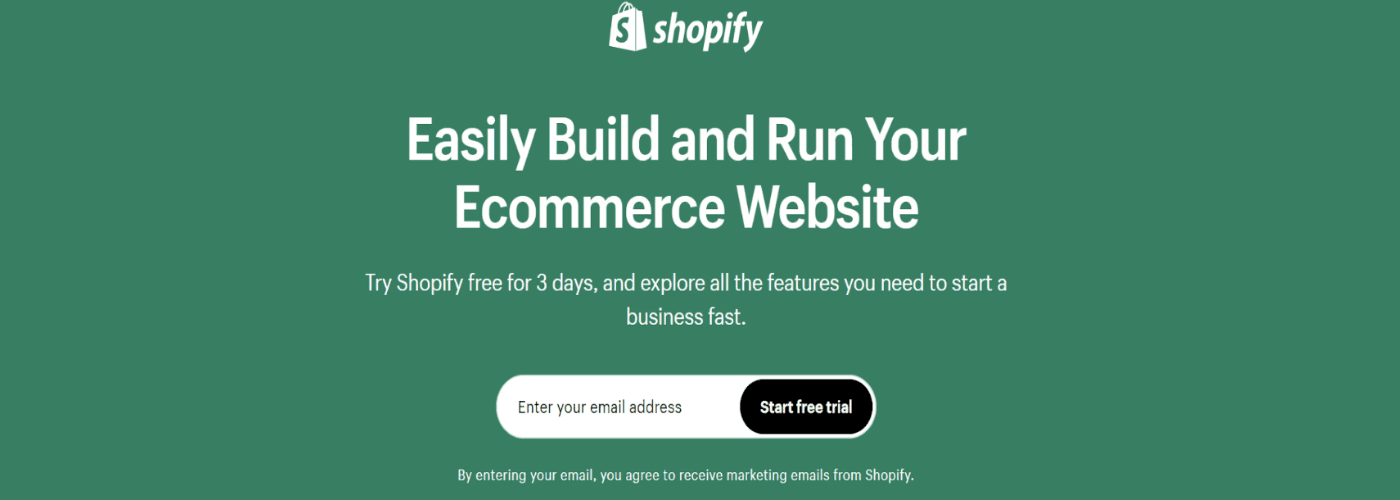
If you’re into eCommerce, you probably already know Shopify. It is ‘the’ eCommerce platform that lets you create, and manage your online stores.
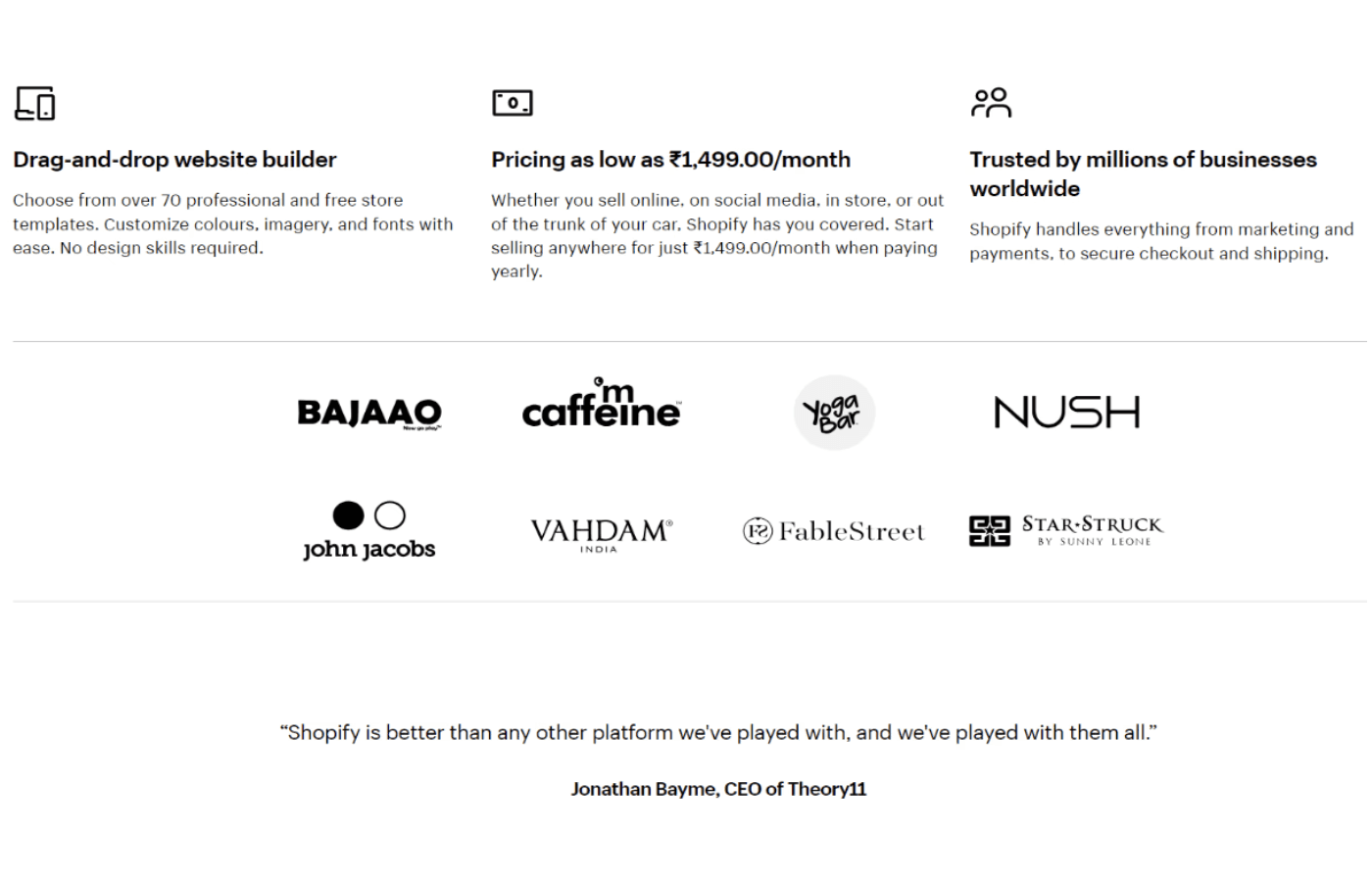
With a lot of custom templates, and easy-to-use tools, Shopify is perfect for any brand looking to sell online and enter the eCommerce industry without the pain of starting from scratch.
Why it works so well?
Shopify’s headline and messaging couldn’t be more clear. When a potential client lands on Shopify’s page, they are instantly looped in.
The CTA placement and wording work in Shopify’s favor as it lures potential customers to try Shopify for free and get a hands-on experience using the website and its features.
The ‘Start free trial’ is placed right after the headline, ensuring the viewer is closer to signing up.
With features, client base, and testimonials placed strategically on the page, Shopify’s landing page goes one step ahead to cement its position.
5.Alibaba
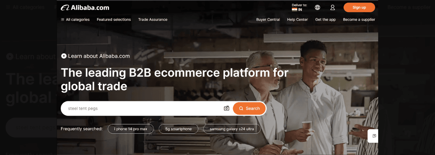
Alibaba, pioneered in China, is a B2B eCommerce platform that allows retailers to buy and sell products online across countries. It aims to build a global platform for opportunities for both business owners and buyers, with services extending to digital solutions, computing, and more.
Why it works so well?
Alibaba’s headline is simple and directly addresses the audience through targeted words like ‘B2B’ and more.
By adding the ‘Frequently searched’ snippet, Alibaba is showing the user that these products are trending and this is what the audience may probably be looking for. The presence of a search bar in the center of the page is also a smart placement strategy.
6.HubSpot
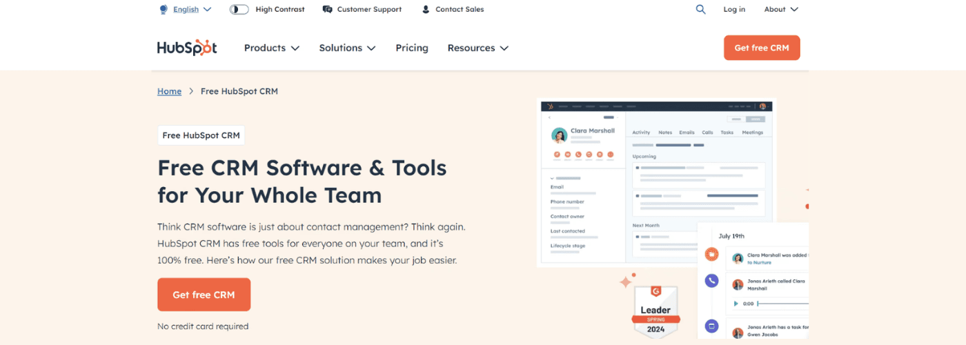
Topping the list of great landing page examples would be Hubspot.
Argued by most marketers as the top inbound marketing software, Hubspot can be described as your all-in-one CRM (Customer Relationship Management) platform with tools for marketing, customer services, and much more.
Hubspot is popular because it’s easy to use, offers a range of marketing solutions, and unifies your data and team in one place.
Why it works so well?
The headline and subheadline are designed to motivate potential clients to pause, think, and realign their strategies.
The ‘no credit card required’ messaging could be considered a smart CTA placement.
Though a lot of information is shared on the landing page, the design elements are still strong and do not crowd the landing page.
Also read: Why Ever Ad Campaign Needs Its Own Landing Page
7.Canva
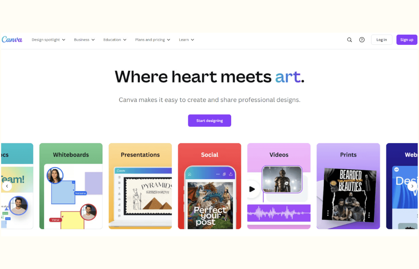
Canva is the name that pops first when talking about cool landing pages. It is the marketing world’s most easy-to-use and preferred designing software. Whether you are a beginner or an expert designer, Canva offers a range of templates, tools, and more to help you create designs, and graphics in record time.
From creating presentations to logos to videos and whiteboards, Canva is your perfect design partner.
Why it works so well?
Being quite literally ‘the design website’, Canva nails the blend of simplicity with a dash of vibrant colors. You’d notice how the word ‘art’ in the headline actually is in the color of their logo. Talk about getting creative.
Canva’s messaging is absolutely simple and clear. Even if an individual is unfamiliar with what Canva does, the headline explains it quickly without the usage of any jargon.
8.Netflix
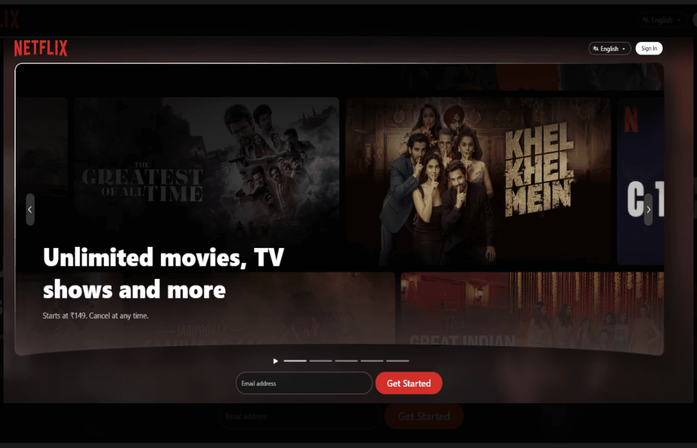
Netflix needs no introduction. It is your go-to streaming platform, packed with movies, TV shows, and more, and supported across continents and languages. With a paid subscription, you can watch high-quality content, anytime and anywhere–on your phone, iPad, laptop, or TV.
Why it works so well?
Neftlix’s headline is short, to the point, and clean. There is no fancy copywriting or phrases.
Right below the headline, Netflix places its pricing and also makes provision for canceling at any time. This messaging style informs the user that they are not bound to a lifelong subscription and can move out if they prefer to.
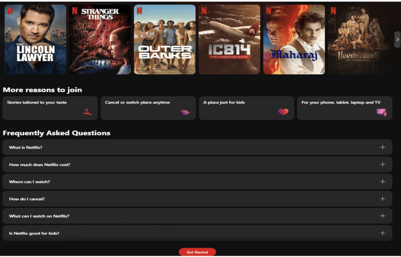
Netflix has an FAQ section on its website, meaning any common questions that users may have are already answered, making it a top contender when it comes to good landing page examples.
9.Coco Village
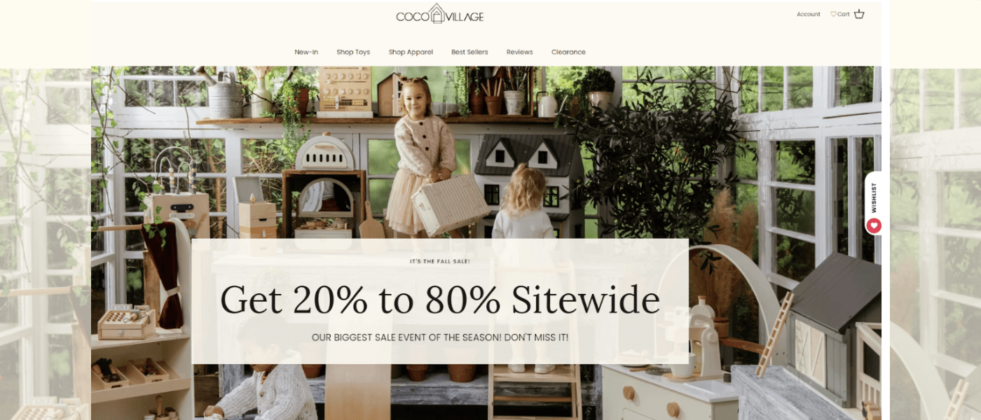
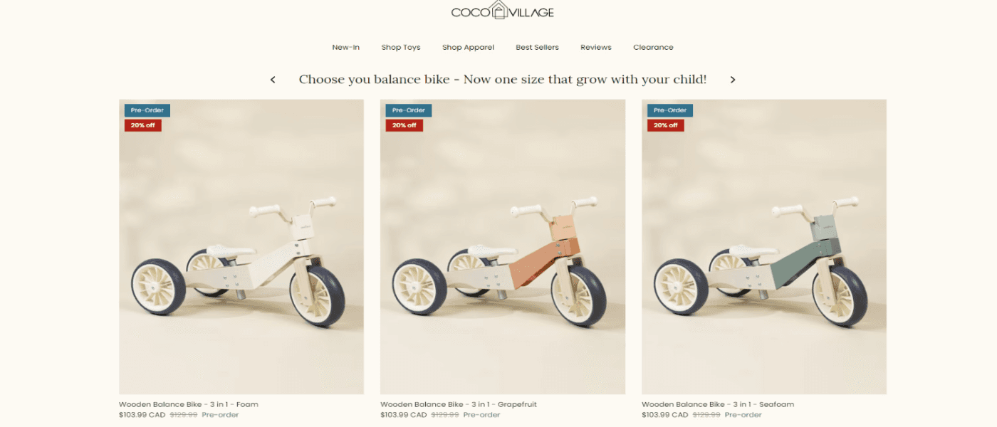
Coco Village is a minimalist top and furniture store. It is known for its aesthetic, and gender-neutral toys and furniture items. The company is also environment-first, ensuring its products are eco-friendly yet of premium quality.
Why it works so well?
The landing page is aesthetic and thoughtfully designed keeping in mind the brand’s offering.
The discount percentage which is boldly displayed is followed by a quick CTA that creates urgency.
The product placement and provision to pre-order work in the favor of the brand.
10.Good Eggs
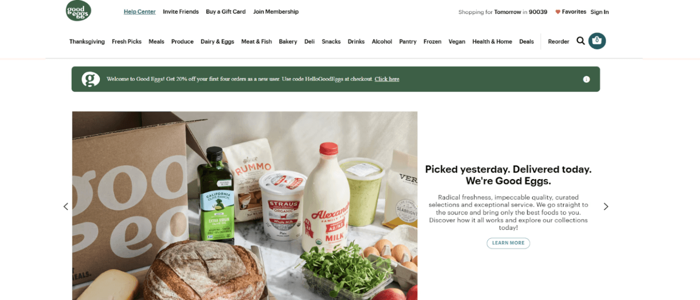
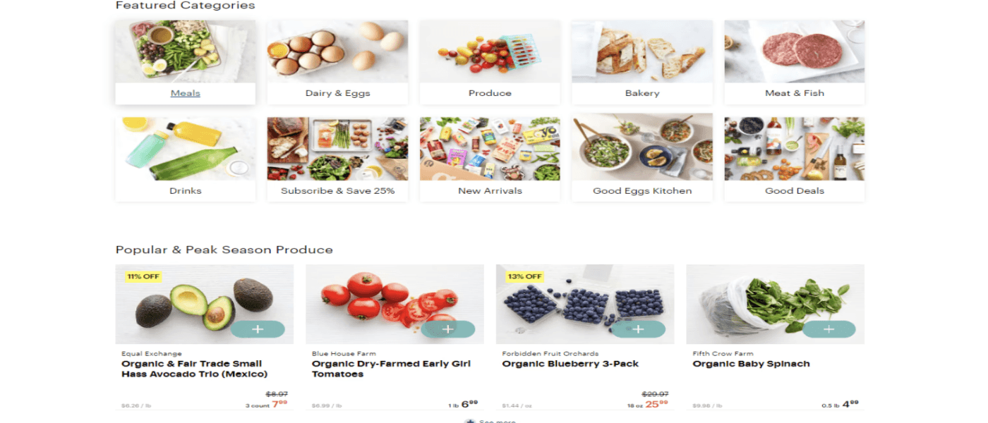
Good Eggs is an online delivery platform offering high-quality, locally sourced food. From premium fruits, and vegetables, to eggs and meat, Good Eggs delivers everything to your drop step.
Why it works so well?
Good Eggs landing page boosts a well-curated message with a soft CTA that drives the mission home.
The landing page is sectioned into different categories helping users to instantly find what they are specifically looking for.
11.Airbnb
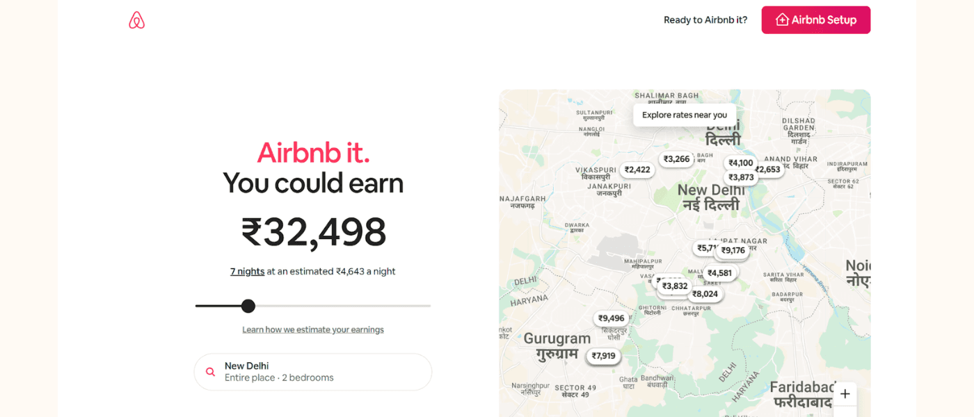
Here's another great landing page example from AirBnb. Its landing page is designed to guide potential hosts effortlessly using interactive elements. The page opens with a dynamic calculator that reflects how much someone can potentially earn by renting out their property on Airbnb, depending on their location.
Why it works so well:
The calculator immediately captures users’ attention helping them visualize their potential earnings.
A comprehensive list of USPs showcases the platform’s competitive advantage.
The CTA is neatly placed at the top-right corner without distracting from the page’s overall design.
12.Webflow
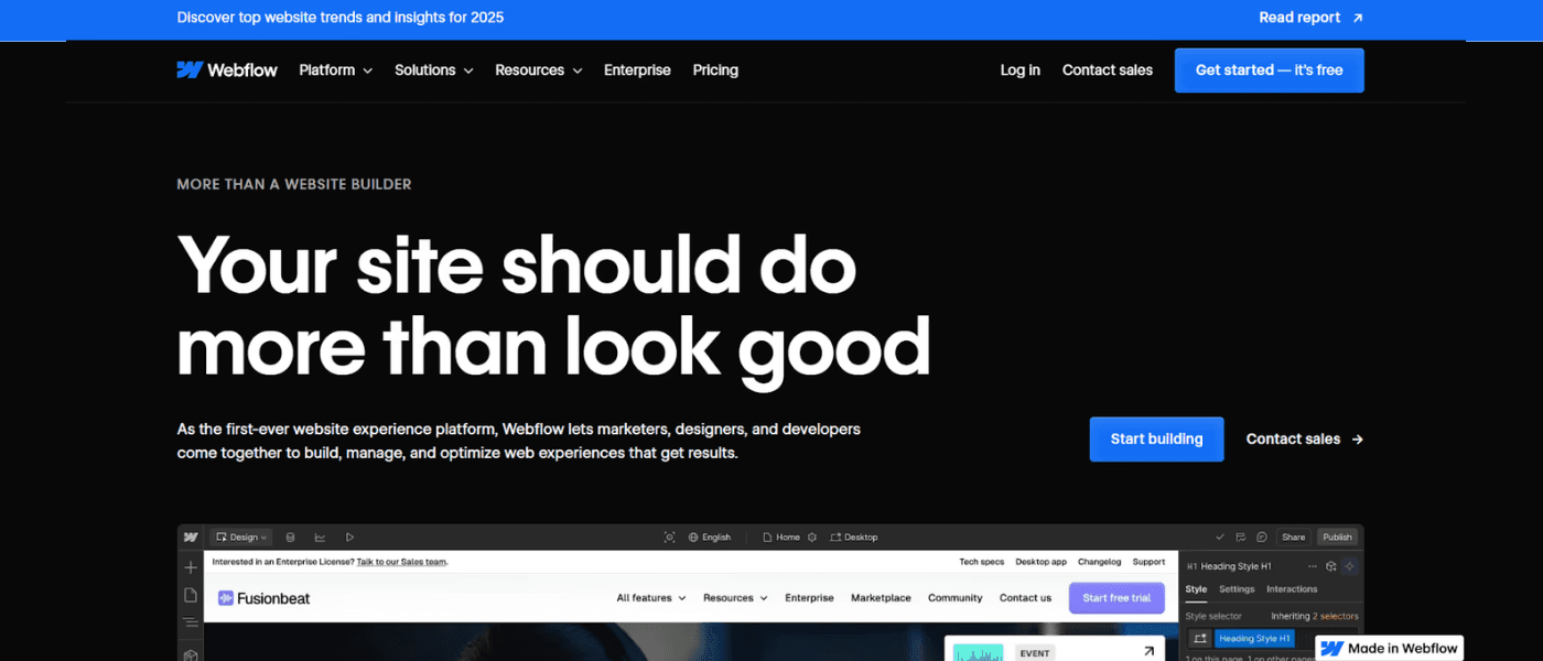
Webflow caters to designers, developers, and businesses looking for a no-code solution to create and launch professional websites. However, not all designers are developers, and vice versa. This is precisely where Webflow comes in. Its landing page emphasizes ease of use and the importance of an optimized site through a bold headline and a demo video.
Why it works so well:
The page is tailored to designers who would use the platform.
It highlights key benefits without going overboard.
It showcases customer testimonials through engaging videos.
13. Wix
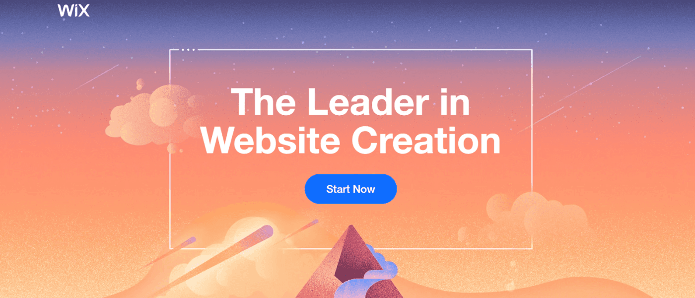
Wix's landing page is an excellent example of a visually appealing design that goes hand-in-hand with functionality. It is:
Clean
Minimal
Eye-catching
Why it works so well:
This example page features a clear yet impactful message, positioning Wix as a leader in website creation.
It highlights the various product features using a super minimalistic approach.
The page features a clean CTA, all while maintaining a dynamic aesthetic design.
14. Mailchimp
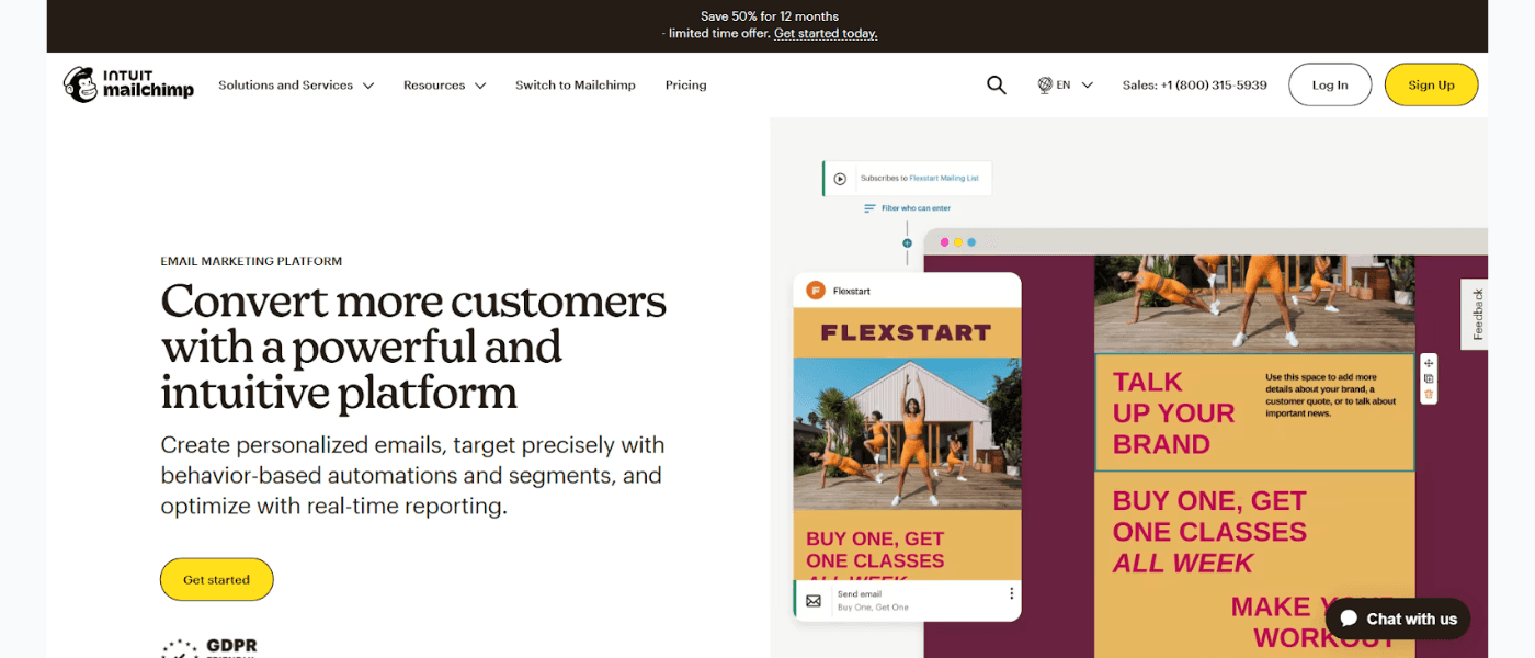
The popular email marketing platform Mailchimp is another excellent example of a landing page. As soon as visitors arrive on the page, their attention is immediately drawn to the two bright yellow-colored CTAs. Plus, the hero section immediately addresses the users' pain point of converting more customers.
The page also briefly highlights Mailchimp's USP, followed by the key benefits users stand to gain:
Creating effective marketing campaigns
Generating ROI
Crafting impactful emails faster
Why it works so well:
The bold CTAs immediately draw attention, making it easier for visitors to take action.
The pricing section offers a clear comparison of plans, helping users determine which option best suits their needs.
The hero section speaks directly to users’ concerns.
15. Zoho
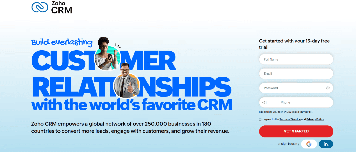
While Zoho's landing page is more text-heavy compared to other page examples, it, in fact, works well to provide users with more information to make a sound decision. Plus, it uses trust signals right in the beginning by:
Highlighting the logos of major brands that use Zoho
Showcasing major industry achievements
Sharing customer reviews on Capterra
Why it works so well:
Zoho's landing page not only lists down the benefits for users but also quantifies them for maximum impact.
It compares Zoho with other popular CRM platforms to highlight its USPs and cost-effectiveness.
It builds customer trust through multiple trust signals.
16. Uber
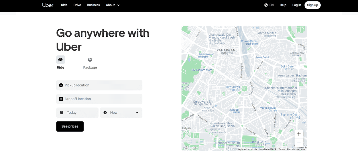
Uber is one of the best landing page examples when it comes to clean, modern designs with minimal text. It has a short, direct headline and features a dynamic map based on the user's location.
The landing page briefly highlights services for both:
Users: Ride, package, reserve
Drivers: Make money on your own schedule or by renting out your car
Why it works so well:
The page follows a consistent color palette and branding that reflects Uber's modern, tech-focused identity.
Uber's landing page also has clear CTAs placed across the page along with QR codes for the Uber and Driver apps.
Location-based personalization makes the page more relevant to users.
17. Shopify Plus
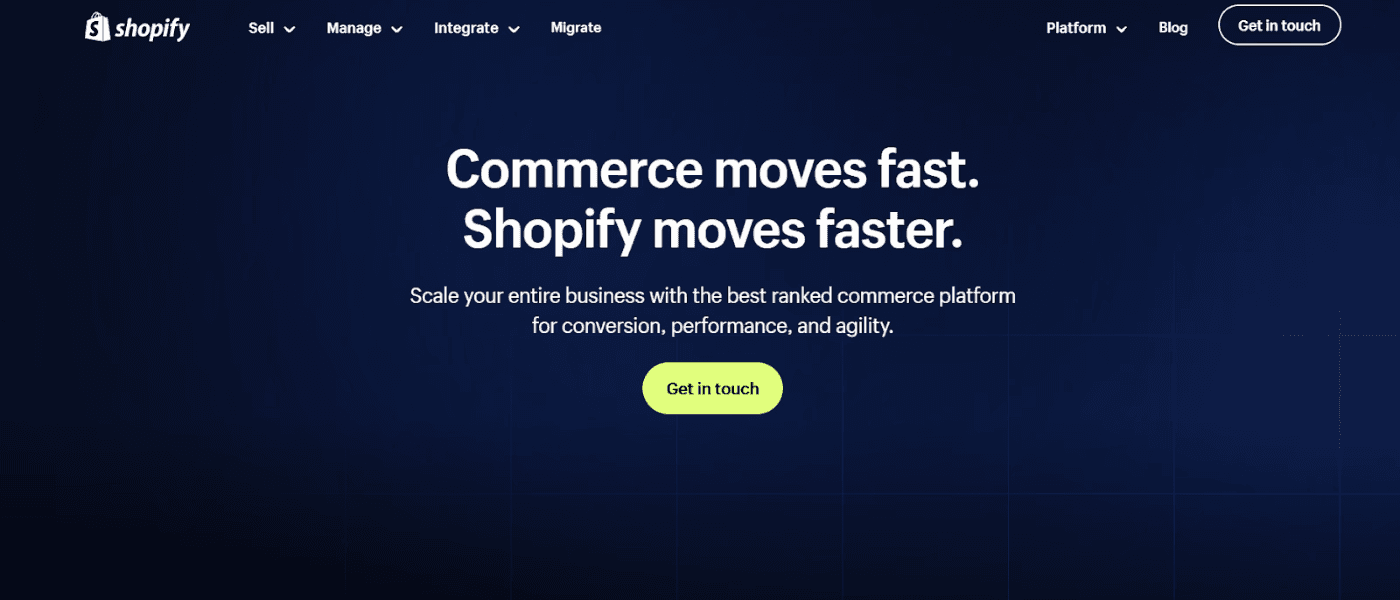
Shopify Plus caters to eCommerce stores that are looking to scale their business. Its landing page directly addresses their concerns and highlights exactly what they can achieve. In contrast to Uber, Shopify Plus is more text-heavy with extensive features, detailed benefits, and quantifiable benefits.
Why it works so well:
Shopify Plus uses bright-colored, tailored CTAs for different sections of the landing page, allowing customers to select the next step they wish to take.
Its landing page focuses on the challenges eCommerce businesses face and highlights exactly how Shopify Plus can help.
The detailed features and quantifiable benefits help build customer trust.
18. Spotify
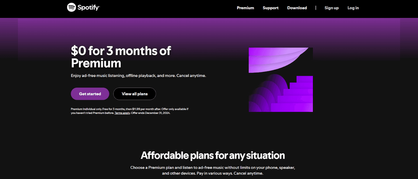
Most experts recommend following your brand's color palette when it comes to landing pages. But Spotify ditched its classic green and black for something completely different—purple!
Surprisingly, it also doesn't include any interactive images or videos.
Why it works so well:
The page focuses on the product’s value proposition.
It compares the free plan with the premium one and clearly lists down the pricing.
It answers FAQs in detail to help users navigate common questions independently.
19. Slack
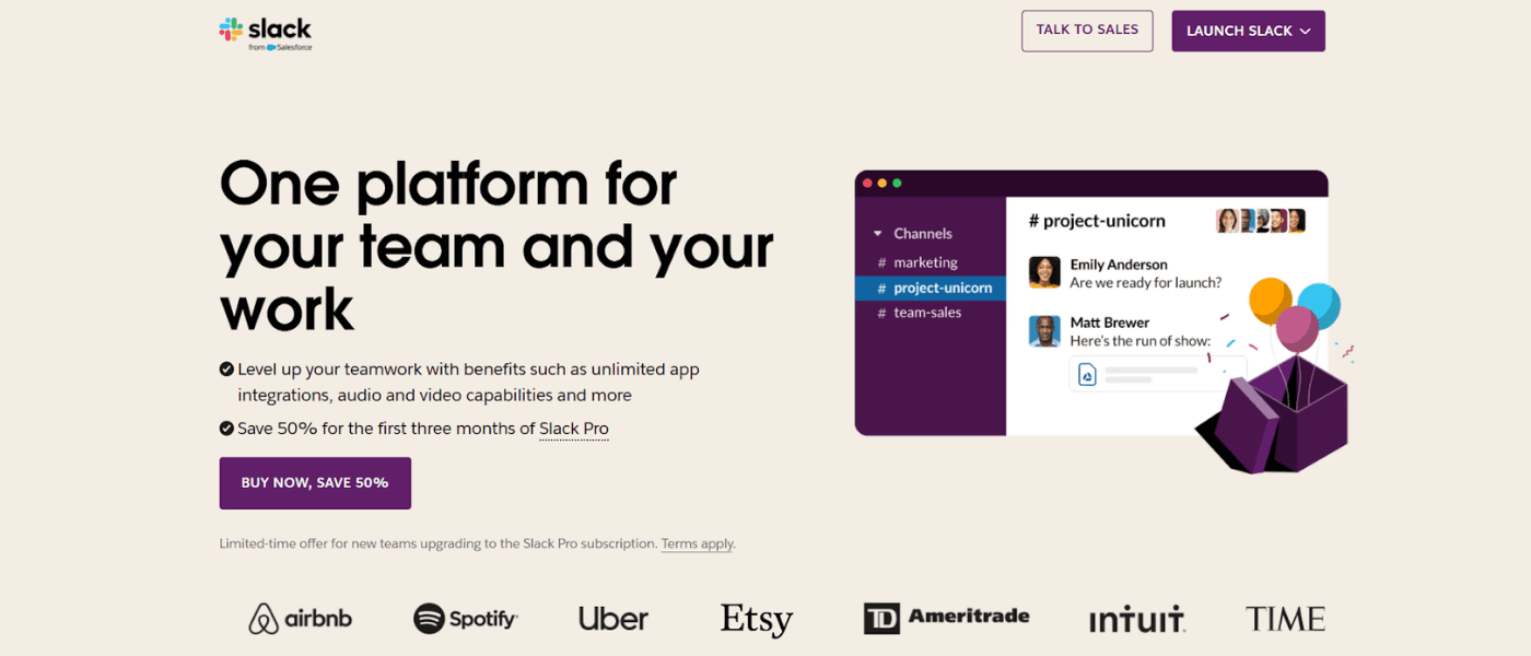
The workplace communication platform has designed a minimal yet impactful landing page that perfectly aligns with its brand identity. Slack's landing page has bright-colored CTAs that immediately grab users' attention.
Plus, it highlights key benefits for users and some of its biggest clients right in the first fold itself.
Why it works so well:
Slack has highlighted the platform's various use cases, positioning itself as more than just a messaging app.
It builds trust by providing quantifiable benefits and ends with a compelling CTA, emphasizing a 50% discount.
The bold CTAs immediately grab attention, so users know exactly what the next step is.
20. Gong.io
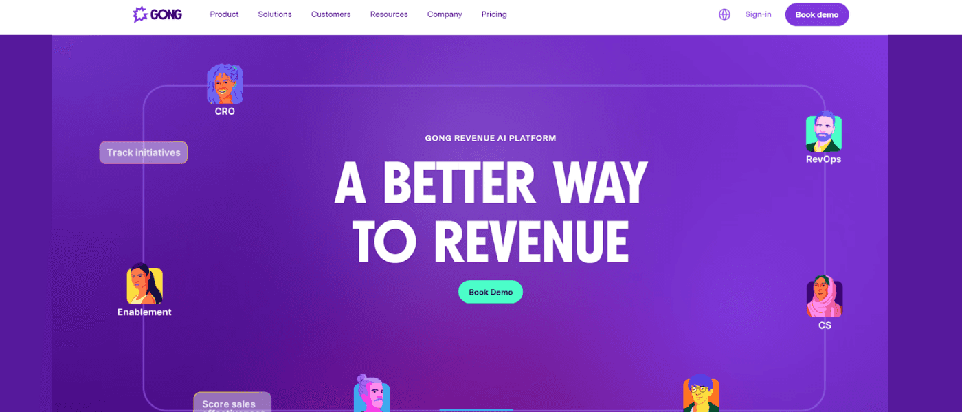
Gong's landing page is the perfect example of a modern and interactive design. It has smartly differentiated itself from its competitors by establishing itself as an AI platform. Gong uses an interactive flowchart to show how it addresses the needs of different stakeholders.
Why it works so well:
What stands out in Gong's landing page is the clever combination of benefits with use cases and success stories.
It not only tells users the benefits they can reap but also highlights how real customers have leveraged these features to drive quantifiable results.
The page further provides various resources for users to nurture them down the sales funnel.
21. ACT Fibernet
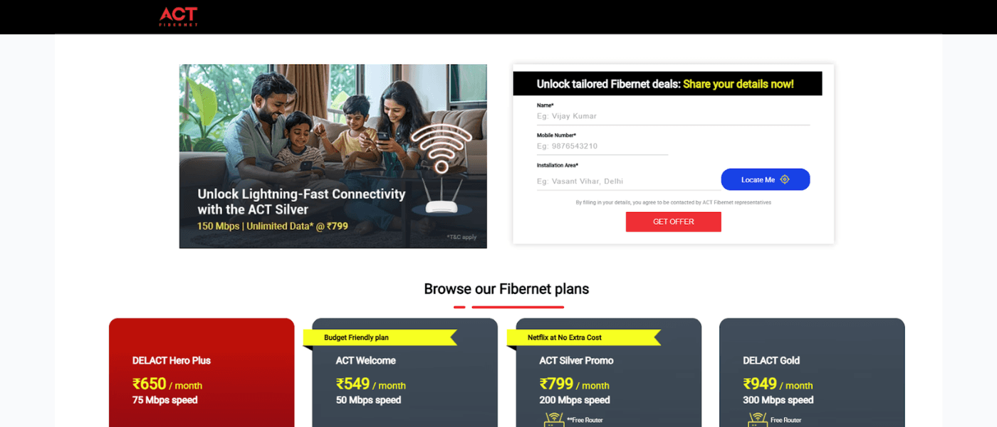
ACT Fibernet is an excellent example of a clean yet highly personalized landing page. It features tailored content that matches the user’s intent and location. With the help of Fibr AI, ACT Fibernet used city-level, keyword-based, and image-based personalization, ensuring users from different regions see offers and plans relevant to their location.
ACT Fibernet’s landing page also features compelling CTAs, clearly defined plans, and benefits for users without overwhelming them with information.
Why it works so well:
Act Fibernet’s hyper-localized content makes the page more relevant and engaging.
The page perfectly aligns with keywords like ‘best broadband’ or ‘best WiFi.’
Clever use of visuals to highlight reliable, high-speed internet.
22. Gartner
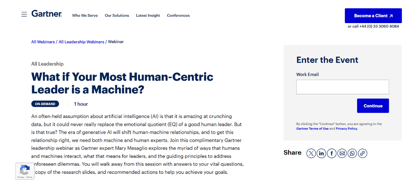
Gartner is a perfect example of a great landing page for webinars. The headline is a clever take on the ongoing human vs. machine debate and immediately builds curiosity.
The page also briefly answers all potential queries:
What to expect from the webinar
Who is the host
How can users watch it
Who should they contact if they have any questions
Why it works so well:
The headline immediately sparks curiosity, prompting users to learn more.
The sign-up form is pretty straightforward, requiring only the user's email.
The clean and minimal design allows users to quickly access the information they need.
23.ActiveCampaign
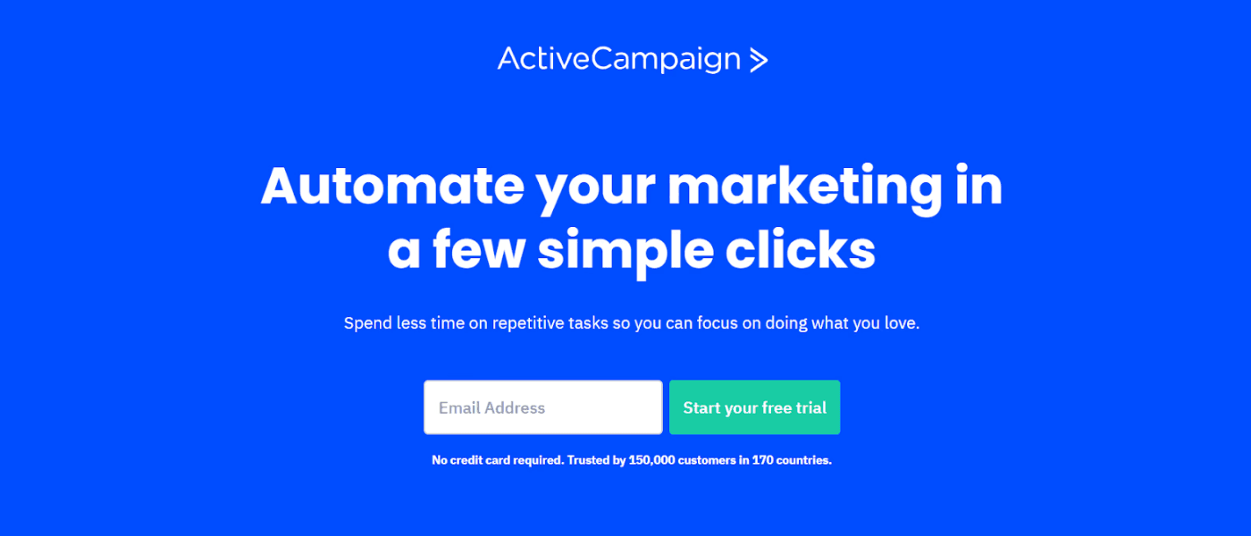
ActiveCampaign's landing page gets straight to the point - from the direct headline to the clear CTA. It has smartly used trust signals by:
Ensuring no requirement for credit card details
Highlighting its extensive userbase
Showcasing its impressive G2 rankings across different categories
Why it works so well:
The landing page features simple flowcharts to guide users through different features, along with an interactive video demo.
ActiveCampaign also uses logos to highlight its app integration capabilities, showing users how the platform can work within their existing systems.
The clever use of trust signals helps build customer trust.
24. Survicate
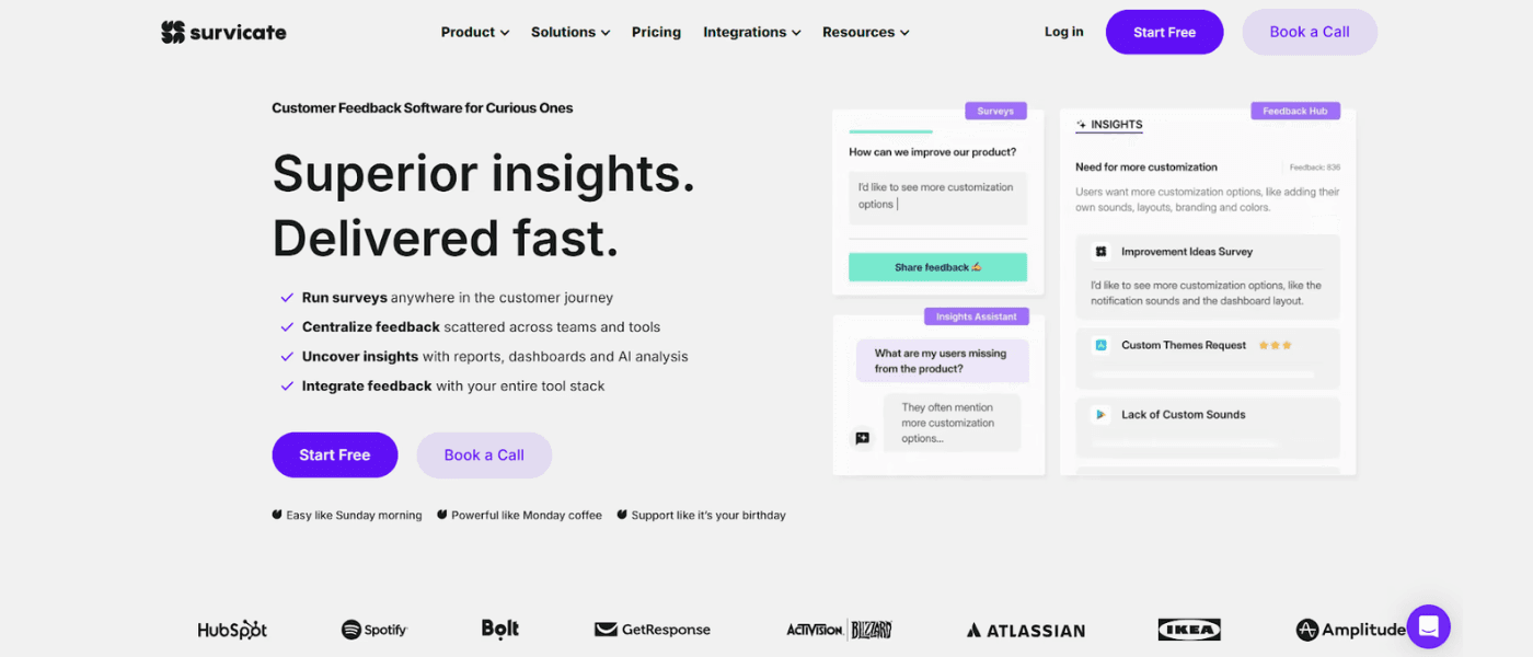
Without even scrolling down the first fold, Survicate managed to:
Explain what it offers
Highlight its USPs
Break down user benefits
Add compelling CTAs, and
Showcase its biggest customers
Why it works so well:
Survicate has made excellent use of white space, while successfully sharing the most important information.
It uses interactive buttons and visuals to show why it is better than its competitors.
It clearly highlights its integration capabilities to help users make informed decisions.
25. Conversion Lab
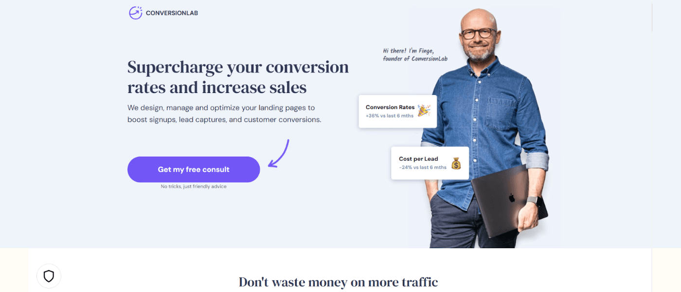
Another top landing page example is from the web development and brand management platform Conversion Lab. A standout element that we haven't seen in other landing page examples so far is that Conversion Lab has its founder's image on the page, adding a personal touch and putting a face to the business. Even the CTAs are customized and seem to come straight from the founder.
Why it works so well:
The visuals of the founder add a face to the brand.
The minimal design clearly highlights the benefits, services, and optimization process.
The clever use of case studies not only shows who has benefitted from their services but also the results they achieved.
26. Calm
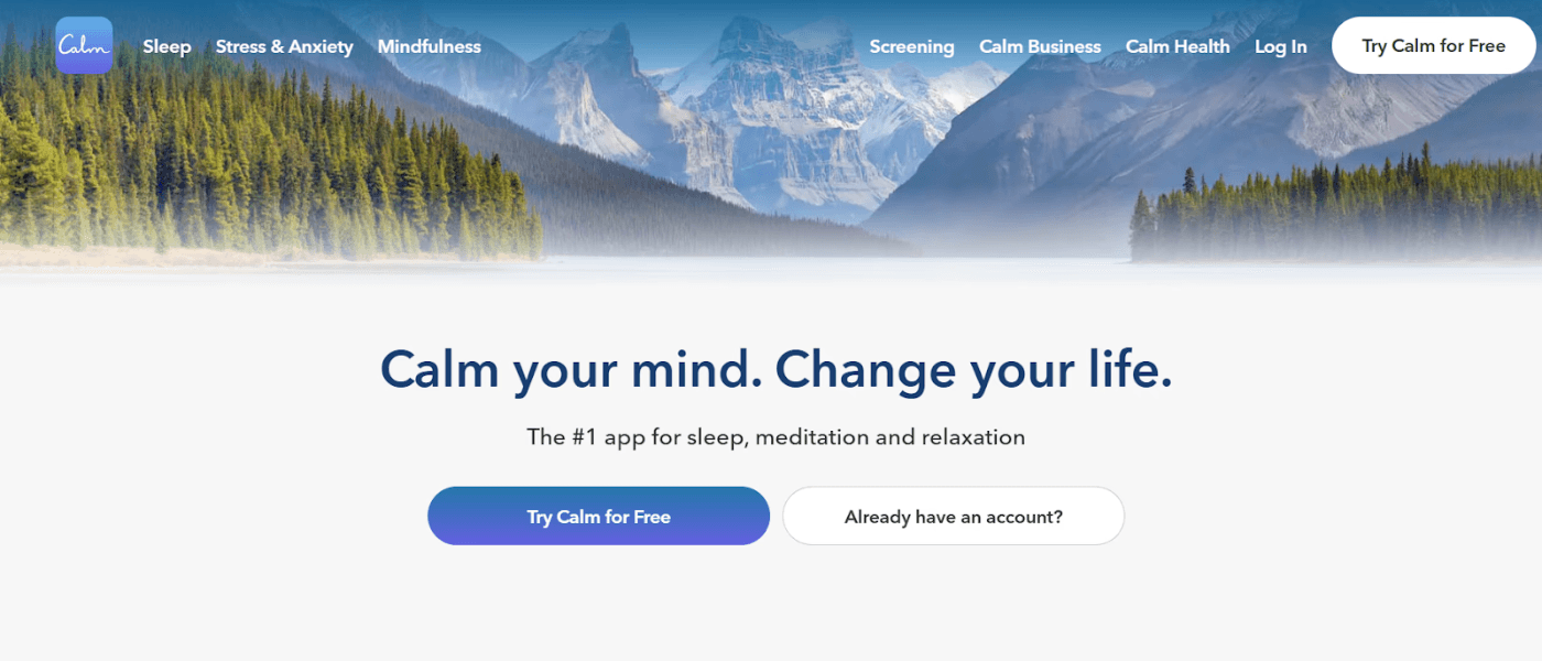
Calm is a meditation and sleep app that creates a serene experience for users right from its landing page. The page clearly reflects the brand's purpose:
Helping users achieve better sleep
Reduced stress
Less anxiety
Why it works so well:
It has a simple yet inviting headline and features clear, concise copy to ensure visitors are not overwhelmed.
Calm uses soothing visuals and prominent CTAs, encouraging users to begin their wellness journey alongside millions of customers.
The visuals perfectly align with the brand’s messaging and purpose.
27. Doordash
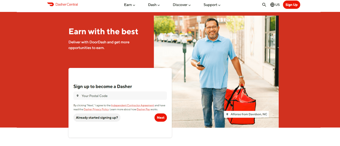
DoorDash's landing page is for recruiting drivers, known as Dashers. The brand prioritizes user-centric messaging, highlighting the benefits of joining the platform. It immediately highlights key benefits for Dashers:
Location flexibility
Schedule flexibility
Start earning immediately
Why it works so well:
The color palette aligns perfectly with DoorDash’s branding.
It clearly highlights how much Dashers can expect to earn from the platform and the support they will receive.
It also lays down the requirements to apply, ensuring a transparent process and helping applicants assess their eligibility.
28. ExpressVPN
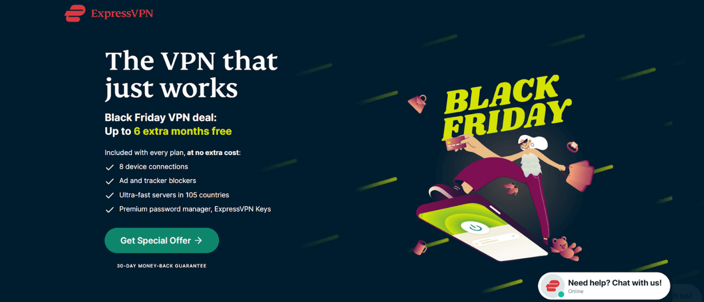
The ExpressVPN landing page effectively communicates the platform's core values:
Secure
Fast
Private internet access
It clearly highlights features like high-speed connections, global server locations, and robust encryption while maintaining a clean design to avoid distractions. ExpressVPN also uses a clever, offer-based CTA to encourage users to take action.
Why it works so well:
Impressive testimonials from user reviews and ratings, social media posts, and quotes from tech experts make for excellent trust signals.
ExpressVPN has also used different CTAs for different sections of the landing page to encourage users to take action, regardless of their stage in the buyer's journey.
The USPs are clearly defined throughout the page, encouraging users to take action.
29. Zillow
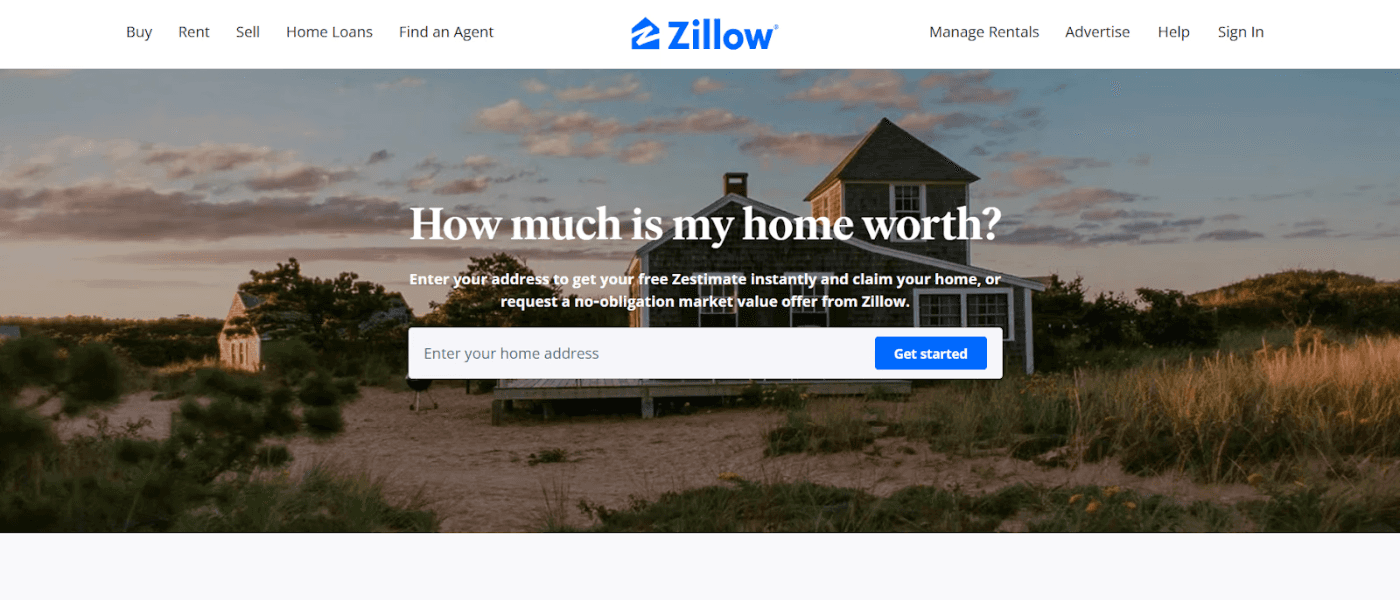
Zillow's landing page uses a clever approach to address two aspects:
It helps homeowners determine the value of their property.
It uses this information to generate leads for its mortgage business.
The page is simple yet effective, featuring an aspirational image to entice visitors.
Why it works so well:
The copy is clean, crisp, and clearly visible against the background, making the information easily digestible.
Zillow features a short landing page with additional details hidden within collapsible FAQs. This is an excellent technique to allow visitors to explore further only if they want to, creating a user-friendly experience.
The minimal design conveys exactly what users need to know without giving too many details.
30. Codeacademy

Codeacademy's landing page smartly appeals to its target audience of learners and aspiring programmers. It immediately grabs attention with a strong headline, encouraging visitors to "learn to code" confidently.
The landing page highlights customer testimonials right in the beginning, along with other benefits for users through interactive visuals.
Why it works so well:
It features a clean layout highlighting various course offerings, catering to all beginners, intermediates, and advanced learners.
Codeacademy uses bright colors for its CTAs too, encouraging users to take different actions in different sections.
It has also linked a 'job readiness' tool and clearly explained what users can expect from different pricing plans.
31. Netflix
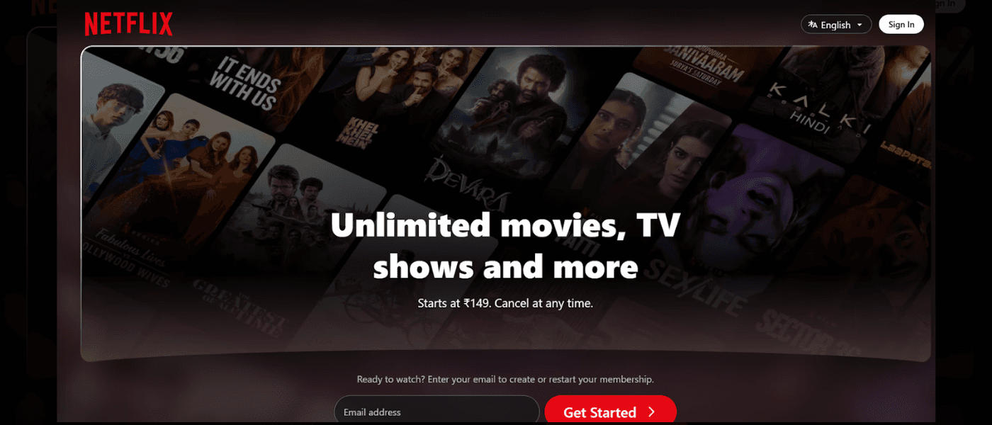
Netflix has nailed all essential elements that make up a high-performing landing page:
A clear and crisp headline
A simple yet eye-catching CTA button
Attractive visuals
Benefits for users
Cost-effective plans
It also uses short, punchy texts to highlight the platform's core benefits without overwhelming visitors:
Unlimited streaming
Easy cancelation and upgrades
Compatible with different devices
Affordable
Why it works so well:
It uses a prominent single-field form inviting users to start by just entering their email address. This is a great way to reduce friction for new users, making the process feel effortless.
FAQs are neatly tucked into a drop-down section at the bottom, allowing users to explore them if they wish.
The content covers all bases without going overboard.
32. ClickFunnels
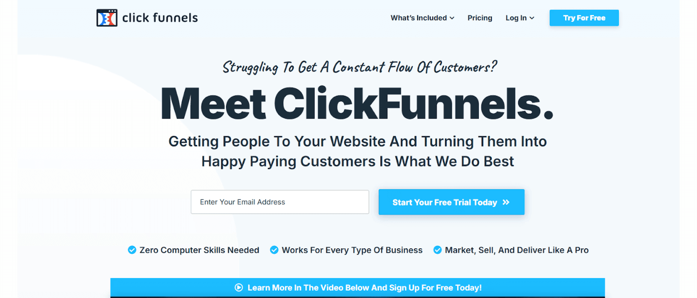
ClickFunnels is another great example of a landing page with a crisp copy, relatable visuals, and smart CTAs. Just one look at their page and the goal is clear: persuading users to start a free trial. It showcases customer success stories with numerous testimonials, particularly from high-profile users, establishing credibility and helping customers visualize similar achievements.
Why it works so well:
ClickFunnels' landing page cleverly addresses user objections and preconceived concerns in a light-hearted manner.
The messaging throughout the page is clear and concise, focusing on the software's potential to generate significant financial returns for businesses.
ClickFunnels has also placed CTAs in different sections, ensuring users can easily take action at any point during their journey.
33. LinkedIn
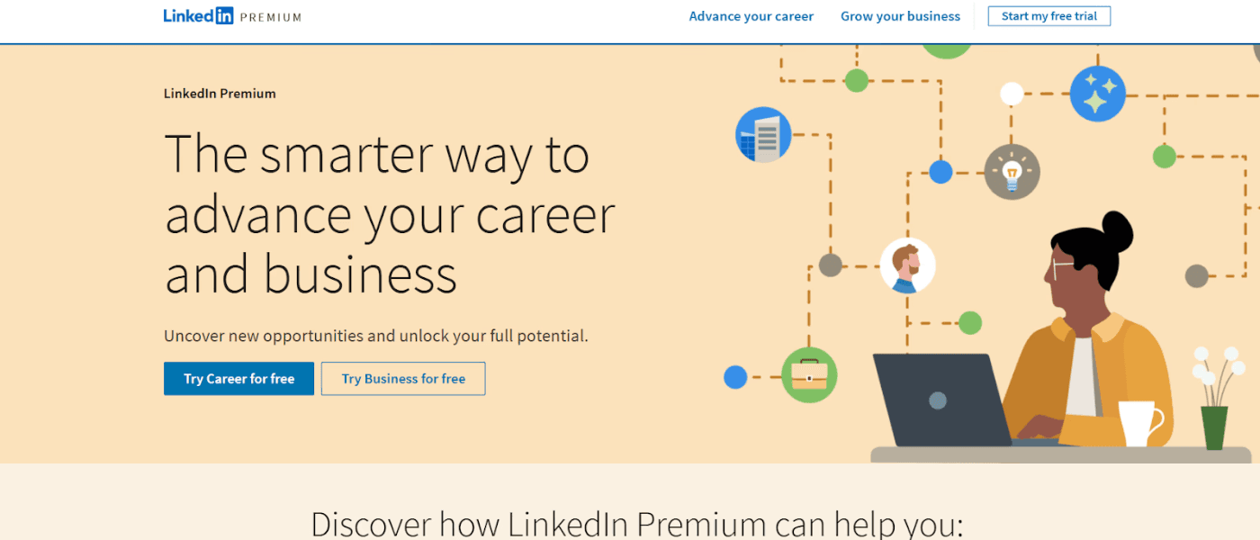
LinkedIn's landing page focuses on convincing job seekers and business owners to upgrade to Premium. It uses 2D images with attention-grabbing CTAs, creating a clean yet appealing copy.
The landing page briefly highlights how job seekers and businesses can benefit from the upgrade, with links to explore the features in detail.
Why it works so well:
The page clearly explains how Premium members can benefit from the platform's AI-powered experiences with quantifiable results.
LinkedIn features a side-by-side comparison of the basic and Premium plans, helping users make informed decisions.
The platform also leverages customer testimonials as social proof to build credibility.
34. Nauto
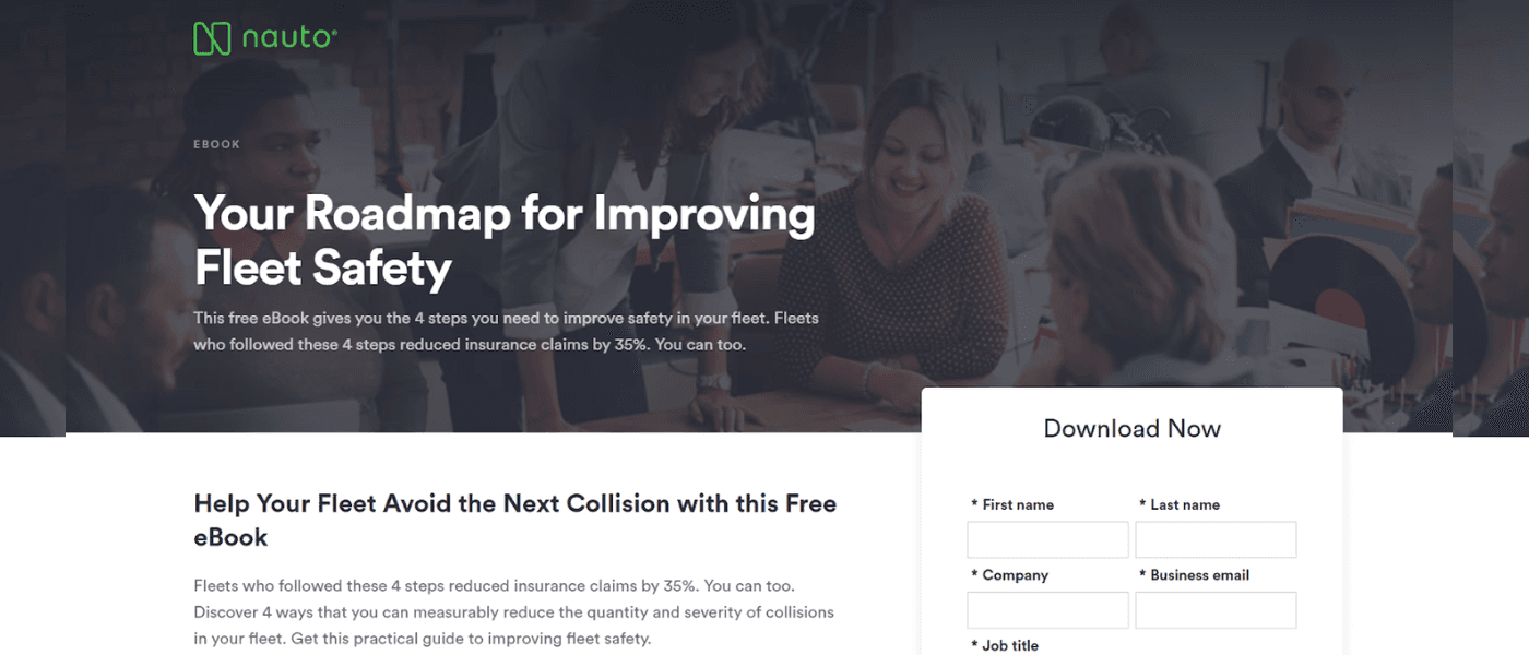
Nauto is a fleet safety platform, which is something it establishes clearly in the headline. It features a pretty short and straightforward landing page for its eBook with several standout elements.
Why it works so well:
It tells users exactly what they can expect from the eBook and briefly explains the key takeaways.
It highlights that users only need to follow 4 steps for better fleet safety, ensuring a quick read.
It uses a pretty comprehensive form to get user details.
35. Squarespace
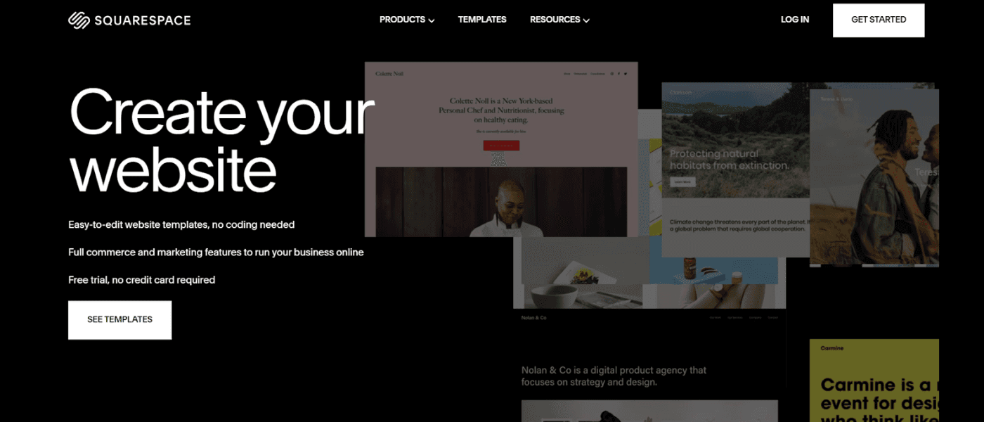
Squarespace has also adopted a minimalist design for its landing page, focusing on one key action: encouraging visitors to explore the templates. It uses a crisp, impactful copy to help users understand what they can expect from the brand:
Easy-to-edit templates
No coding experience needed
End-to-end commerce and marketing features
Free trial
Why it works so well:
Squarespace's landing page does not overwhelm visitors with too much text or too many options.
It lets the visual appeal of the templates speak for itself, showcasing their quality and versatility.
The minimal design avoids distractions, helping users focus on the benefits.
36. Branch Furniture
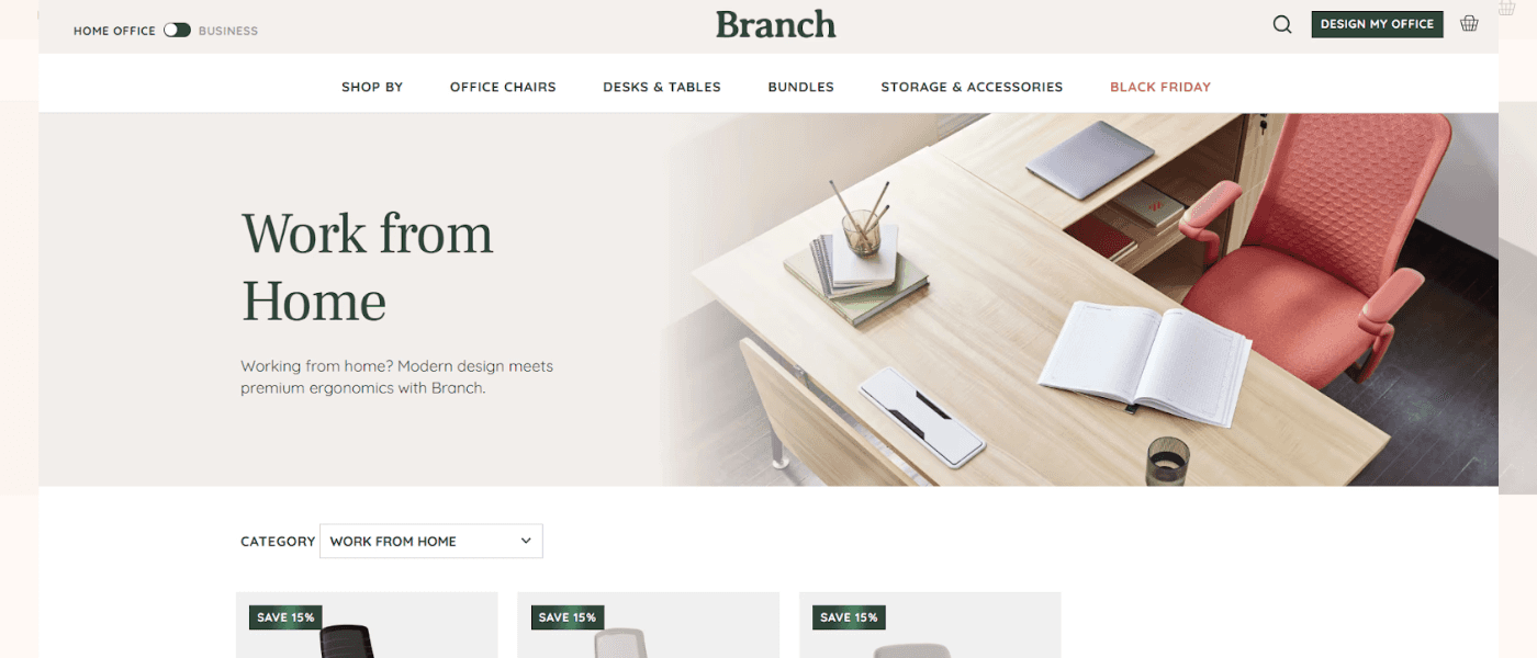
Branch Furniture deals exclusively in office furniture. With a headline that simply reads 'work from home,' its landing page directly addresses customers looking to set up a home office. The page then delves into the different categories of furniture offered by the brand—chairs, desks, accessories, and bundles—with clear one-line explanations to maintain a clean design.
Why it works so well:
To build social credibility, Branch Furniture has leveraged press mentions from prominent media houses.
The landing page also briefly explains what the brand does, followed by key benefits for customers.
The page uses short- crisp sentences to get the message across quickly.
37. Campaign Monitor
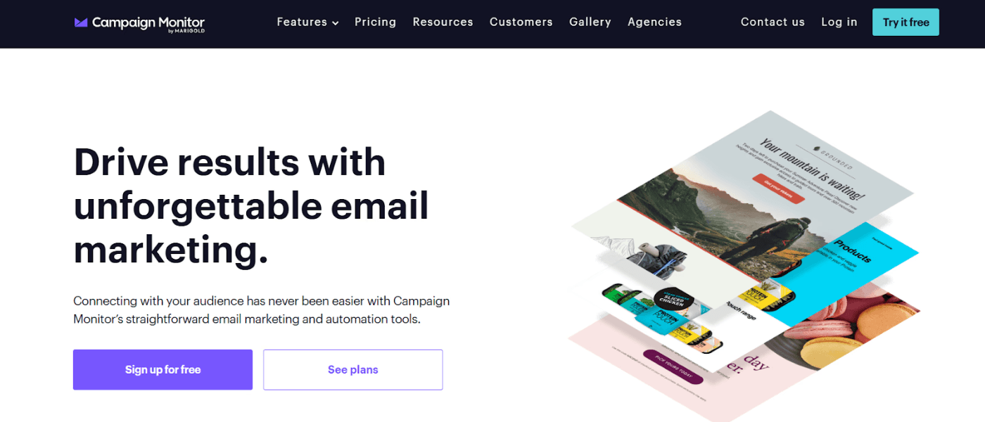
Last on our list of the best landing page design examples is the email marketing platform Campaign Monitor. Like other top examples, Campaign Monitor's landing page has a crisp, compelling headline that ticks two boxes:
It tells users what they can expect (access to email marketing and automation tools)
It tells users what they can achieve (connecting with a wider audience)
Why it works so well:
The landing page showcases social proof by prominently placing logos of businesses they've worked with and highlighting customer testimonials.
It emphasizes its core features and uses a ton of visuals in every section for a visually appealing design.
The CTAs are also prominently highlighted and tailored to each section, allowing users to select what they want to do next.
Discover the 10 best 2024 landing page examples for high conversion rates. See how these brands use clear messaging, strong hooks and CTAs, and perfect design elements to stand out amidst competitors. Each example shows different yet effective ways to convert your website visitors into future clients.
Creating a landing page is no less than writing a captivating story. There are so many elements involved, each with its unique importance. Our team at Fibr AI analyzed the landing pages of some renowned and new companies and concluded that the best landing pages commonly have a compelling hook, a straightforward messaging style, and a clean design.
Below, we present this analysis or the best landing page examples to help you strategize for maximum conversion. We have sectioned them per industry type for better clarity.
1.Asana

A good landing page example would be Asana– a work management and productivity software that companies and teams use to assign tasks and track progress and goals.
With simple features, and solutions specifically designed for Healthcare, Retail, Education, and Nonprofit industries, Asana comes on the top when it comes to work management.
Why it works so well?
Asana sells its USP well–that it is the ‘only’ work management platform that is built for scale. If an organization that is planning to scale in the future views this statement, they know Asana is an option they have to rely on.
Asana’s placement of awards and certification right at the top of its landing page can be deemed smart as it aims to establish trust quickly.
The page is decluttered, and simple, and balances well design elements.
2.Semrush


When it comes to product landing page examples, Semrush tops the list.
Semrush is a proper marketing tool that offers solutions like SEO, content marketing, data analytics, competitor research, and much more, all in one place.
The solutions are catered to the ever-changing dynamics of the marketing industry and help companies increase visibility and grow their audience.
Why it works so well?
Semrush’s landing page avoids the typical minimalist approach with a dash of dark and vibrant colors, making it more appealing to the younger audience.
The headline works well for Semrush, with words like ‘measurable’ and ‘one platform’ coming right at the top.
The display of numbers such as ‘10M’, and ‘30% 500 Fortune companies’, further cement Semrush’s position as a market leader and motivate potential clients to associate.
3.Basecamp

Basecamp is a project management tool that is designed for companies, startups, and freelancers who handle a large number of projects and clients.
Through Basecamp you can create separate windows for different clients, track projects, assign work, and monitor progress easily.
Why it works so well?
Basecamp’s messaging is bold, yet simple, highlighting that it’s effective for smaller teams.
Basecamp gets creative with an indirect placement of CTAs through doodling. A younger audience may be attracted to this form of marketing.
The actual CTA also goes up and above generic wordings through the ‘enjoy work more’ phrase.
4.Shopify


If you’re into eCommerce, you probably already know Shopify. It is ‘the’ eCommerce platform that lets you create, and manage your online stores.
With a lot of custom templates, and easy-to-use tools, Shopify is perfect for any brand looking to sell online and enter the eCommerce industry without the pain of starting from scratch.
Why it works so well?
Shopify’s headline and messaging couldn’t be more clear. When a potential client lands on Shopify’s page, they are instantly looped in.
The CTA placement and wording work in Shopify’s favor as it lures potential customers to try Shopify for free and get a hands-on experience using the website and its features.
The ‘Start free trial’ is placed right after the headline, ensuring the viewer is closer to signing up.
With features, client base, and testimonials placed strategically on the page, Shopify’s landing page goes one step ahead to cement its position.
5.Alibaba

Alibaba, pioneered in China, is a B2B eCommerce platform that allows retailers to buy and sell products online across countries. It aims to build a global platform for opportunities for both business owners and buyers, with services extending to digital solutions, computing, and more.
Why it works so well?
Alibaba’s headline is simple and directly addresses the audience through targeted words like ‘B2B’ and more.
By adding the ‘Frequently searched’ snippet, Alibaba is showing the user that these products are trending and this is what the audience may probably be looking for. The presence of a search bar in the center of the page is also a smart placement strategy.
6.HubSpot

Topping the list of great landing page examples would be Hubspot.
Argued by most marketers as the top inbound marketing software, Hubspot can be described as your all-in-one CRM (Customer Relationship Management) platform with tools for marketing, customer services, and much more.
Hubspot is popular because it’s easy to use, offers a range of marketing solutions, and unifies your data and team in one place.
Why it works so well?
The headline and subheadline are designed to motivate potential clients to pause, think, and realign their strategies.
The ‘no credit card required’ messaging could be considered a smart CTA placement.
Though a lot of information is shared on the landing page, the design elements are still strong and do not crowd the landing page.
Also read: Why Ever Ad Campaign Needs Its Own Landing Page
7.Canva

Canva is the name that pops first when talking about cool landing pages. It is the marketing world’s most easy-to-use and preferred designing software. Whether you are a beginner or an expert designer, Canva offers a range of templates, tools, and more to help you create designs, and graphics in record time.
From creating presentations to logos to videos and whiteboards, Canva is your perfect design partner.
Why it works so well?
Being quite literally ‘the design website’, Canva nails the blend of simplicity with a dash of vibrant colors. You’d notice how the word ‘art’ in the headline actually is in the color of their logo. Talk about getting creative.
Canva’s messaging is absolutely simple and clear. Even if an individual is unfamiliar with what Canva does, the headline explains it quickly without the usage of any jargon.
8.Netflix


Netflix needs no introduction. It is your go-to streaming platform, packed with movies, TV shows, and more, and supported across continents and languages. With a paid subscription, you can watch high-quality content, anytime and anywhere–on your phone, iPad, laptop, or TV.
Why it works so well?
Neftlix’s headline is short, to the point, and clean. There is no fancy copywriting or phrases.
Right below the headline, Netflix places its pricing and also makes provision for canceling at any time. This messaging style informs the user that they are not bound to a lifelong subscription and can move out if they prefer to.
Netflix has an FAQ section on its website, meaning any common questions that users may have are already answered, making it a top contender when it comes to good landing page examples.
9.Coco Village


Coco Village is a minimalist top and furniture store. It is known for its aesthetic, and gender-neutral toys and furniture items. The company is also environment-first, ensuring its products are eco-friendly yet of premium quality.
Why it works so well?
The landing page is aesthetic and thoughtfully designed keeping in mind the brand’s offering.
The discount percentage which is boldly displayed is followed by a quick CTA that creates urgency.
The product placement and provision to pre-order work in the favor of the brand.
10.Good Eggs


Good Eggs is an online delivery platform offering high-quality, locally sourced food. From premium fruits, and vegetables, to eggs and meat, Good Eggs delivers everything to your drop step.
Why it works so well?
Good Eggs landing page boosts a well-curated message with a soft CTA that drives the mission home.
The landing page is sectioned into different categories helping users to instantly find what they are specifically looking for.
11.Airbnb

Here's another great landing page example from AirBnb. Its landing page is designed to guide potential hosts effortlessly using interactive elements. The page opens with a dynamic calculator that reflects how much someone can potentially earn by renting out their property on Airbnb, depending on their location.
Why it works so well:
The calculator immediately captures users’ attention helping them visualize their potential earnings.
A comprehensive list of USPs showcases the platform’s competitive advantage.
The CTA is neatly placed at the top-right corner without distracting from the page’s overall design.
12.Webflow

Webflow caters to designers, developers, and businesses looking for a no-code solution to create and launch professional websites. However, not all designers are developers, and vice versa. This is precisely where Webflow comes in. Its landing page emphasizes ease of use and the importance of an optimized site through a bold headline and a demo video.
Why it works so well:
The page is tailored to designers who would use the platform.
It highlights key benefits without going overboard.
It showcases customer testimonials through engaging videos.
13. Wix

Wix's landing page is an excellent example of a visually appealing design that goes hand-in-hand with functionality. It is:
Clean
Minimal
Eye-catching
Why it works so well:
This example page features a clear yet impactful message, positioning Wix as a leader in website creation.
It highlights the various product features using a super minimalistic approach.
The page features a clean CTA, all while maintaining a dynamic aesthetic design.
14. Mailchimp

The popular email marketing platform Mailchimp is another excellent example of a landing page. As soon as visitors arrive on the page, their attention is immediately drawn to the two bright yellow-colored CTAs. Plus, the hero section immediately addresses the users' pain point of converting more customers.
The page also briefly highlights Mailchimp's USP, followed by the key benefits users stand to gain:
Creating effective marketing campaigns
Generating ROI
Crafting impactful emails faster
Why it works so well:
The bold CTAs immediately draw attention, making it easier for visitors to take action.
The pricing section offers a clear comparison of plans, helping users determine which option best suits their needs.
The hero section speaks directly to users’ concerns.
15. Zoho

While Zoho's landing page is more text-heavy compared to other page examples, it, in fact, works well to provide users with more information to make a sound decision. Plus, it uses trust signals right in the beginning by:
Highlighting the logos of major brands that use Zoho
Showcasing major industry achievements
Sharing customer reviews on Capterra
Why it works so well:
Zoho's landing page not only lists down the benefits for users but also quantifies them for maximum impact.
It compares Zoho with other popular CRM platforms to highlight its USPs and cost-effectiveness.
It builds customer trust through multiple trust signals.
16. Uber

Uber is one of the best landing page examples when it comes to clean, modern designs with minimal text. It has a short, direct headline and features a dynamic map based on the user's location.
The landing page briefly highlights services for both:
Users: Ride, package, reserve
Drivers: Make money on your own schedule or by renting out your car
Why it works so well:
The page follows a consistent color palette and branding that reflects Uber's modern, tech-focused identity.
Uber's landing page also has clear CTAs placed across the page along with QR codes for the Uber and Driver apps.
Location-based personalization makes the page more relevant to users.
17. Shopify Plus

Shopify Plus caters to eCommerce stores that are looking to scale their business. Its landing page directly addresses their concerns and highlights exactly what they can achieve. In contrast to Uber, Shopify Plus is more text-heavy with extensive features, detailed benefits, and quantifiable benefits.
Why it works so well:
Shopify Plus uses bright-colored, tailored CTAs for different sections of the landing page, allowing customers to select the next step they wish to take.
Its landing page focuses on the challenges eCommerce businesses face and highlights exactly how Shopify Plus can help.
The detailed features and quantifiable benefits help build customer trust.
18. Spotify

Most experts recommend following your brand's color palette when it comes to landing pages. But Spotify ditched its classic green and black for something completely different—purple!
Surprisingly, it also doesn't include any interactive images or videos.
Why it works so well:
The page focuses on the product’s value proposition.
It compares the free plan with the premium one and clearly lists down the pricing.
It answers FAQs in detail to help users navigate common questions independently.
19. Slack

The workplace communication platform has designed a minimal yet impactful landing page that perfectly aligns with its brand identity. Slack's landing page has bright-colored CTAs that immediately grab users' attention.
Plus, it highlights key benefits for users and some of its biggest clients right in the first fold itself.
Why it works so well:
Slack has highlighted the platform's various use cases, positioning itself as more than just a messaging app.
It builds trust by providing quantifiable benefits and ends with a compelling CTA, emphasizing a 50% discount.
The bold CTAs immediately grab attention, so users know exactly what the next step is.
20. Gong.io

Gong's landing page is the perfect example of a modern and interactive design. It has smartly differentiated itself from its competitors by establishing itself as an AI platform. Gong uses an interactive flowchart to show how it addresses the needs of different stakeholders.
Why it works so well:
What stands out in Gong's landing page is the clever combination of benefits with use cases and success stories.
It not only tells users the benefits they can reap but also highlights how real customers have leveraged these features to drive quantifiable results.
The page further provides various resources for users to nurture them down the sales funnel.
21. ACT Fibernet

ACT Fibernet is an excellent example of a clean yet highly personalized landing page. It features tailored content that matches the user’s intent and location. With the help of Fibr AI, ACT Fibernet used city-level, keyword-based, and image-based personalization, ensuring users from different regions see offers and plans relevant to their location.
ACT Fibernet’s landing page also features compelling CTAs, clearly defined plans, and benefits for users without overwhelming them with information.
Why it works so well:
Act Fibernet’s hyper-localized content makes the page more relevant and engaging.
The page perfectly aligns with keywords like ‘best broadband’ or ‘best WiFi.’
Clever use of visuals to highlight reliable, high-speed internet.
22. Gartner

Gartner is a perfect example of a great landing page for webinars. The headline is a clever take on the ongoing human vs. machine debate and immediately builds curiosity.
The page also briefly answers all potential queries:
What to expect from the webinar
Who is the host
How can users watch it
Who should they contact if they have any questions
Why it works so well:
The headline immediately sparks curiosity, prompting users to learn more.
The sign-up form is pretty straightforward, requiring only the user's email.
The clean and minimal design allows users to quickly access the information they need.
23.ActiveCampaign

ActiveCampaign's landing page gets straight to the point - from the direct headline to the clear CTA. It has smartly used trust signals by:
Ensuring no requirement for credit card details
Highlighting its extensive userbase
Showcasing its impressive G2 rankings across different categories
Why it works so well:
The landing page features simple flowcharts to guide users through different features, along with an interactive video demo.
ActiveCampaign also uses logos to highlight its app integration capabilities, showing users how the platform can work within their existing systems.
The clever use of trust signals helps build customer trust.
24. Survicate

Without even scrolling down the first fold, Survicate managed to:
Explain what it offers
Highlight its USPs
Break down user benefits
Add compelling CTAs, and
Showcase its biggest customers
Why it works so well:
Survicate has made excellent use of white space, while successfully sharing the most important information.
It uses interactive buttons and visuals to show why it is better than its competitors.
It clearly highlights its integration capabilities to help users make informed decisions.
25. Conversion Lab

Another top landing page example is from the web development and brand management platform Conversion Lab. A standout element that we haven't seen in other landing page examples so far is that Conversion Lab has its founder's image on the page, adding a personal touch and putting a face to the business. Even the CTAs are customized and seem to come straight from the founder.
Why it works so well:
The visuals of the founder add a face to the brand.
The minimal design clearly highlights the benefits, services, and optimization process.
The clever use of case studies not only shows who has benefitted from their services but also the results they achieved.
26. Calm

Calm is a meditation and sleep app that creates a serene experience for users right from its landing page. The page clearly reflects the brand's purpose:
Helping users achieve better sleep
Reduced stress
Less anxiety
Why it works so well:
It has a simple yet inviting headline and features clear, concise copy to ensure visitors are not overwhelmed.
Calm uses soothing visuals and prominent CTAs, encouraging users to begin their wellness journey alongside millions of customers.
The visuals perfectly align with the brand’s messaging and purpose.
27. Doordash

DoorDash's landing page is for recruiting drivers, known as Dashers. The brand prioritizes user-centric messaging, highlighting the benefits of joining the platform. It immediately highlights key benefits for Dashers:
Location flexibility
Schedule flexibility
Start earning immediately
Why it works so well:
The color palette aligns perfectly with DoorDash’s branding.
It clearly highlights how much Dashers can expect to earn from the platform and the support they will receive.
It also lays down the requirements to apply, ensuring a transparent process and helping applicants assess their eligibility.
28. ExpressVPN

The ExpressVPN landing page effectively communicates the platform's core values:
Secure
Fast
Private internet access
It clearly highlights features like high-speed connections, global server locations, and robust encryption while maintaining a clean design to avoid distractions. ExpressVPN also uses a clever, offer-based CTA to encourage users to take action.
Why it works so well:
Impressive testimonials from user reviews and ratings, social media posts, and quotes from tech experts make for excellent trust signals.
ExpressVPN has also used different CTAs for different sections of the landing page to encourage users to take action, regardless of their stage in the buyer's journey.
The USPs are clearly defined throughout the page, encouraging users to take action.
29. Zillow

Zillow's landing page uses a clever approach to address two aspects:
It helps homeowners determine the value of their property.
It uses this information to generate leads for its mortgage business.
The page is simple yet effective, featuring an aspirational image to entice visitors.
Why it works so well:
The copy is clean, crisp, and clearly visible against the background, making the information easily digestible.
Zillow features a short landing page with additional details hidden within collapsible FAQs. This is an excellent technique to allow visitors to explore further only if they want to, creating a user-friendly experience.
The minimal design conveys exactly what users need to know without giving too many details.
30. Codeacademy

Codeacademy's landing page smartly appeals to its target audience of learners and aspiring programmers. It immediately grabs attention with a strong headline, encouraging visitors to "learn to code" confidently.
The landing page highlights customer testimonials right in the beginning, along with other benefits for users through interactive visuals.
Why it works so well:
It features a clean layout highlighting various course offerings, catering to all beginners, intermediates, and advanced learners.
Codeacademy uses bright colors for its CTAs too, encouraging users to take different actions in different sections.
It has also linked a 'job readiness' tool and clearly explained what users can expect from different pricing plans.
31. Netflix

Netflix has nailed all essential elements that make up a high-performing landing page:
A clear and crisp headline
A simple yet eye-catching CTA button
Attractive visuals
Benefits for users
Cost-effective plans
It also uses short, punchy texts to highlight the platform's core benefits without overwhelming visitors:
Unlimited streaming
Easy cancelation and upgrades
Compatible with different devices
Affordable
Why it works so well:
It uses a prominent single-field form inviting users to start by just entering their email address. This is a great way to reduce friction for new users, making the process feel effortless.
FAQs are neatly tucked into a drop-down section at the bottom, allowing users to explore them if they wish.
The content covers all bases without going overboard.
32. ClickFunnels

ClickFunnels is another great example of a landing page with a crisp copy, relatable visuals, and smart CTAs. Just one look at their page and the goal is clear: persuading users to start a free trial. It showcases customer success stories with numerous testimonials, particularly from high-profile users, establishing credibility and helping customers visualize similar achievements.
Why it works so well:
ClickFunnels' landing page cleverly addresses user objections and preconceived concerns in a light-hearted manner.
The messaging throughout the page is clear and concise, focusing on the software's potential to generate significant financial returns for businesses.
ClickFunnels has also placed CTAs in different sections, ensuring users can easily take action at any point during their journey.
33. LinkedIn

LinkedIn's landing page focuses on convincing job seekers and business owners to upgrade to Premium. It uses 2D images with attention-grabbing CTAs, creating a clean yet appealing copy.
The landing page briefly highlights how job seekers and businesses can benefit from the upgrade, with links to explore the features in detail.
Why it works so well:
The page clearly explains how Premium members can benefit from the platform's AI-powered experiences with quantifiable results.
LinkedIn features a side-by-side comparison of the basic and Premium plans, helping users make informed decisions.
The platform also leverages customer testimonials as social proof to build credibility.
34. Nauto

Nauto is a fleet safety platform, which is something it establishes clearly in the headline. It features a pretty short and straightforward landing page for its eBook with several standout elements.
Why it works so well:
It tells users exactly what they can expect from the eBook and briefly explains the key takeaways.
It highlights that users only need to follow 4 steps for better fleet safety, ensuring a quick read.
It uses a pretty comprehensive form to get user details.
35. Squarespace

Squarespace has also adopted a minimalist design for its landing page, focusing on one key action: encouraging visitors to explore the templates. It uses a crisp, impactful copy to help users understand what they can expect from the brand:
Easy-to-edit templates
No coding experience needed
End-to-end commerce and marketing features
Free trial
Why it works so well:
Squarespace's landing page does not overwhelm visitors with too much text or too many options.
It lets the visual appeal of the templates speak for itself, showcasing their quality and versatility.
The minimal design avoids distractions, helping users focus on the benefits.
36. Branch Furniture

Branch Furniture deals exclusively in office furniture. With a headline that simply reads 'work from home,' its landing page directly addresses customers looking to set up a home office. The page then delves into the different categories of furniture offered by the brand—chairs, desks, accessories, and bundles—with clear one-line explanations to maintain a clean design.
Why it works so well:
To build social credibility, Branch Furniture has leveraged press mentions from prominent media houses.
The landing page also briefly explains what the brand does, followed by key benefits for customers.
The page uses short- crisp sentences to get the message across quickly.
37. Campaign Monitor

Last on our list of the best landing page design examples is the email marketing platform Campaign Monitor. Like other top examples, Campaign Monitor's landing page has a crisp, compelling headline that ticks two boxes:
It tells users what they can expect (access to email marketing and automation tools)
It tells users what they can achieve (connecting with a wider audience)
Why it works so well:
The landing page showcases social proof by prominently placing logos of businesses they've worked with and highlighting customer testimonials.
It emphasizes its core features and uses a ton of visuals in every section for a visually appealing design.
The CTAs are also prominently highlighted and tailored to each section, allowing users to select what they want to do next.
Discover the 10 best 2024 landing page examples for high conversion rates. See how these brands use clear messaging, strong hooks and CTAs, and perfect design elements to stand out amidst competitors. Each example shows different yet effective ways to convert your website visitors into future clients.
Creating a landing page is no less than writing a captivating story. There are so many elements involved, each with its unique importance. Our team at Fibr AI analyzed the landing pages of some renowned and new companies and concluded that the best landing pages commonly have a compelling hook, a straightforward messaging style, and a clean design.
Below, we present this analysis or the best landing page examples to help you strategize for maximum conversion. We have sectioned them per industry type for better clarity.
1.Asana

A good landing page example would be Asana– a work management and productivity software that companies and teams use to assign tasks and track progress and goals.
With simple features, and solutions specifically designed for Healthcare, Retail, Education, and Nonprofit industries, Asana comes on the top when it comes to work management.
Why it works so well?
Asana sells its USP well–that it is the ‘only’ work management platform that is built for scale. If an organization that is planning to scale in the future views this statement, they know Asana is an option they have to rely on.
Asana’s placement of awards and certification right at the top of its landing page can be deemed smart as it aims to establish trust quickly.
The page is decluttered, and simple, and balances well design elements.
2.Semrush


When it comes to product landing page examples, Semrush tops the list.
Semrush is a proper marketing tool that offers solutions like SEO, content marketing, data analytics, competitor research, and much more, all in one place.
The solutions are catered to the ever-changing dynamics of the marketing industry and help companies increase visibility and grow their audience.
Why it works so well?
Semrush’s landing page avoids the typical minimalist approach with a dash of dark and vibrant colors, making it more appealing to the younger audience.
The headline works well for Semrush, with words like ‘measurable’ and ‘one platform’ coming right at the top.
The display of numbers such as ‘10M’, and ‘30% 500 Fortune companies’, further cement Semrush’s position as a market leader and motivate potential clients to associate.
3.Basecamp

Basecamp is a project management tool that is designed for companies, startups, and freelancers who handle a large number of projects and clients.
Through Basecamp you can create separate windows for different clients, track projects, assign work, and monitor progress easily.
Why it works so well?
Basecamp’s messaging is bold, yet simple, highlighting that it’s effective for smaller teams.
Basecamp gets creative with an indirect placement of CTAs through doodling. A younger audience may be attracted to this form of marketing.
The actual CTA also goes up and above generic wordings through the ‘enjoy work more’ phrase.
4.Shopify


If you’re into eCommerce, you probably already know Shopify. It is ‘the’ eCommerce platform that lets you create, and manage your online stores.
With a lot of custom templates, and easy-to-use tools, Shopify is perfect for any brand looking to sell online and enter the eCommerce industry without the pain of starting from scratch.
Why it works so well?
Shopify’s headline and messaging couldn’t be more clear. When a potential client lands on Shopify’s page, they are instantly looped in.
The CTA placement and wording work in Shopify’s favor as it lures potential customers to try Shopify for free and get a hands-on experience using the website and its features.
The ‘Start free trial’ is placed right after the headline, ensuring the viewer is closer to signing up.
With features, client base, and testimonials placed strategically on the page, Shopify’s landing page goes one step ahead to cement its position.
5.Alibaba

Alibaba, pioneered in China, is a B2B eCommerce platform that allows retailers to buy and sell products online across countries. It aims to build a global platform for opportunities for both business owners and buyers, with services extending to digital solutions, computing, and more.
Why it works so well?
Alibaba’s headline is simple and directly addresses the audience through targeted words like ‘B2B’ and more.
By adding the ‘Frequently searched’ snippet, Alibaba is showing the user that these products are trending and this is what the audience may probably be looking for. The presence of a search bar in the center of the page is also a smart placement strategy.
6.HubSpot

Topping the list of great landing page examples would be Hubspot.
Argued by most marketers as the top inbound marketing software, Hubspot can be described as your all-in-one CRM (Customer Relationship Management) platform with tools for marketing, customer services, and much more.
Hubspot is popular because it’s easy to use, offers a range of marketing solutions, and unifies your data and team in one place.
Why it works so well?
The headline and subheadline are designed to motivate potential clients to pause, think, and realign their strategies.
The ‘no credit card required’ messaging could be considered a smart CTA placement.
Though a lot of information is shared on the landing page, the design elements are still strong and do not crowd the landing page.
Also read: Why Ever Ad Campaign Needs Its Own Landing Page
7.Canva

Canva is the name that pops first when talking about cool landing pages. It is the marketing world’s most easy-to-use and preferred designing software. Whether you are a beginner or an expert designer, Canva offers a range of templates, tools, and more to help you create designs, and graphics in record time.
From creating presentations to logos to videos and whiteboards, Canva is your perfect design partner.
Why it works so well?
Being quite literally ‘the design website’, Canva nails the blend of simplicity with a dash of vibrant colors. You’d notice how the word ‘art’ in the headline actually is in the color of their logo. Talk about getting creative.
Canva’s messaging is absolutely simple and clear. Even if an individual is unfamiliar with what Canva does, the headline explains it quickly without the usage of any jargon.
8.Netflix


Netflix needs no introduction. It is your go-to streaming platform, packed with movies, TV shows, and more, and supported across continents and languages. With a paid subscription, you can watch high-quality content, anytime and anywhere–on your phone, iPad, laptop, or TV.
Why it works so well?
Neftlix’s headline is short, to the point, and clean. There is no fancy copywriting or phrases.
Right below the headline, Netflix places its pricing and also makes provision for canceling at any time. This messaging style informs the user that they are not bound to a lifelong subscription and can move out if they prefer to.
Netflix has an FAQ section on its website, meaning any common questions that users may have are already answered, making it a top contender when it comes to good landing page examples.
9.Coco Village


Coco Village is a minimalist top and furniture store. It is known for its aesthetic, and gender-neutral toys and furniture items. The company is also environment-first, ensuring its products are eco-friendly yet of premium quality.
Why it works so well?
The landing page is aesthetic and thoughtfully designed keeping in mind the brand’s offering.
The discount percentage which is boldly displayed is followed by a quick CTA that creates urgency.
The product placement and provision to pre-order work in the favor of the brand.
10.Good Eggs


Good Eggs is an online delivery platform offering high-quality, locally sourced food. From premium fruits, and vegetables, to eggs and meat, Good Eggs delivers everything to your drop step.
Why it works so well?
Good Eggs landing page boosts a well-curated message with a soft CTA that drives the mission home.
The landing page is sectioned into different categories helping users to instantly find what they are specifically looking for.
11.Airbnb

Here's another great landing page example from AirBnb. Its landing page is designed to guide potential hosts effortlessly using interactive elements. The page opens with a dynamic calculator that reflects how much someone can potentially earn by renting out their property on Airbnb, depending on their location.
Why it works so well:
The calculator immediately captures users’ attention helping them visualize their potential earnings.
A comprehensive list of USPs showcases the platform’s competitive advantage.
The CTA is neatly placed at the top-right corner without distracting from the page’s overall design.
12.Webflow

Webflow caters to designers, developers, and businesses looking for a no-code solution to create and launch professional websites. However, not all designers are developers, and vice versa. This is precisely where Webflow comes in. Its landing page emphasizes ease of use and the importance of an optimized site through a bold headline and a demo video.
Why it works so well:
The page is tailored to designers who would use the platform.
It highlights key benefits without going overboard.
It showcases customer testimonials through engaging videos.
13. Wix

Wix's landing page is an excellent example of a visually appealing design that goes hand-in-hand with functionality. It is:
Clean
Minimal
Eye-catching
Why it works so well:
This example page features a clear yet impactful message, positioning Wix as a leader in website creation.
It highlights the various product features using a super minimalistic approach.
The page features a clean CTA, all while maintaining a dynamic aesthetic design.
14. Mailchimp

The popular email marketing platform Mailchimp is another excellent example of a landing page. As soon as visitors arrive on the page, their attention is immediately drawn to the two bright yellow-colored CTAs. Plus, the hero section immediately addresses the users' pain point of converting more customers.
The page also briefly highlights Mailchimp's USP, followed by the key benefits users stand to gain:
Creating effective marketing campaigns
Generating ROI
Crafting impactful emails faster
Why it works so well:
The bold CTAs immediately draw attention, making it easier for visitors to take action.
The pricing section offers a clear comparison of plans, helping users determine which option best suits their needs.
The hero section speaks directly to users’ concerns.
15. Zoho

While Zoho's landing page is more text-heavy compared to other page examples, it, in fact, works well to provide users with more information to make a sound decision. Plus, it uses trust signals right in the beginning by:
Highlighting the logos of major brands that use Zoho
Showcasing major industry achievements
Sharing customer reviews on Capterra
Why it works so well:
Zoho's landing page not only lists down the benefits for users but also quantifies them for maximum impact.
It compares Zoho with other popular CRM platforms to highlight its USPs and cost-effectiveness.
It builds customer trust through multiple trust signals.
16. Uber

Uber is one of the best landing page examples when it comes to clean, modern designs with minimal text. It has a short, direct headline and features a dynamic map based on the user's location.
The landing page briefly highlights services for both:
Users: Ride, package, reserve
Drivers: Make money on your own schedule or by renting out your car
Why it works so well:
The page follows a consistent color palette and branding that reflects Uber's modern, tech-focused identity.
Uber's landing page also has clear CTAs placed across the page along with QR codes for the Uber and Driver apps.
Location-based personalization makes the page more relevant to users.
17. Shopify Plus

Shopify Plus caters to eCommerce stores that are looking to scale their business. Its landing page directly addresses their concerns and highlights exactly what they can achieve. In contrast to Uber, Shopify Plus is more text-heavy with extensive features, detailed benefits, and quantifiable benefits.
Why it works so well:
Shopify Plus uses bright-colored, tailored CTAs for different sections of the landing page, allowing customers to select the next step they wish to take.
Its landing page focuses on the challenges eCommerce businesses face and highlights exactly how Shopify Plus can help.
The detailed features and quantifiable benefits help build customer trust.
18. Spotify

Most experts recommend following your brand's color palette when it comes to landing pages. But Spotify ditched its classic green and black for something completely different—purple!
Surprisingly, it also doesn't include any interactive images or videos.
Why it works so well:
The page focuses on the product’s value proposition.
It compares the free plan with the premium one and clearly lists down the pricing.
It answers FAQs in detail to help users navigate common questions independently.
19. Slack

The workplace communication platform has designed a minimal yet impactful landing page that perfectly aligns with its brand identity. Slack's landing page has bright-colored CTAs that immediately grab users' attention.
Plus, it highlights key benefits for users and some of its biggest clients right in the first fold itself.
Why it works so well:
Slack has highlighted the platform's various use cases, positioning itself as more than just a messaging app.
It builds trust by providing quantifiable benefits and ends with a compelling CTA, emphasizing a 50% discount.
The bold CTAs immediately grab attention, so users know exactly what the next step is.
20. Gong.io

Gong's landing page is the perfect example of a modern and interactive design. It has smartly differentiated itself from its competitors by establishing itself as an AI platform. Gong uses an interactive flowchart to show how it addresses the needs of different stakeholders.
Why it works so well:
What stands out in Gong's landing page is the clever combination of benefits with use cases and success stories.
It not only tells users the benefits they can reap but also highlights how real customers have leveraged these features to drive quantifiable results.
The page further provides various resources for users to nurture them down the sales funnel.
21. ACT Fibernet

ACT Fibernet is an excellent example of a clean yet highly personalized landing page. It features tailored content that matches the user’s intent and location. With the help of Fibr AI, ACT Fibernet used city-level, keyword-based, and image-based personalization, ensuring users from different regions see offers and plans relevant to their location.
ACT Fibernet’s landing page also features compelling CTAs, clearly defined plans, and benefits for users without overwhelming them with information.
Why it works so well:
Act Fibernet’s hyper-localized content makes the page more relevant and engaging.
The page perfectly aligns with keywords like ‘best broadband’ or ‘best WiFi.’
Clever use of visuals to highlight reliable, high-speed internet.
22. Gartner

Gartner is a perfect example of a great landing page for webinars. The headline is a clever take on the ongoing human vs. machine debate and immediately builds curiosity.
The page also briefly answers all potential queries:
What to expect from the webinar
Who is the host
How can users watch it
Who should they contact if they have any questions
Why it works so well:
The headline immediately sparks curiosity, prompting users to learn more.
The sign-up form is pretty straightforward, requiring only the user's email.
The clean and minimal design allows users to quickly access the information they need.
23.ActiveCampaign

ActiveCampaign's landing page gets straight to the point - from the direct headline to the clear CTA. It has smartly used trust signals by:
Ensuring no requirement for credit card details
Highlighting its extensive userbase
Showcasing its impressive G2 rankings across different categories
Why it works so well:
The landing page features simple flowcharts to guide users through different features, along with an interactive video demo.
ActiveCampaign also uses logos to highlight its app integration capabilities, showing users how the platform can work within their existing systems.
The clever use of trust signals helps build customer trust.
24. Survicate

Without even scrolling down the first fold, Survicate managed to:
Explain what it offers
Highlight its USPs
Break down user benefits
Add compelling CTAs, and
Showcase its biggest customers
Why it works so well:
Survicate has made excellent use of white space, while successfully sharing the most important information.
It uses interactive buttons and visuals to show why it is better than its competitors.
It clearly highlights its integration capabilities to help users make informed decisions.
25. Conversion Lab

Another top landing page example is from the web development and brand management platform Conversion Lab. A standout element that we haven't seen in other landing page examples so far is that Conversion Lab has its founder's image on the page, adding a personal touch and putting a face to the business. Even the CTAs are customized and seem to come straight from the founder.
Why it works so well:
The visuals of the founder add a face to the brand.
The minimal design clearly highlights the benefits, services, and optimization process.
The clever use of case studies not only shows who has benefitted from their services but also the results they achieved.
26. Calm

Calm is a meditation and sleep app that creates a serene experience for users right from its landing page. The page clearly reflects the brand's purpose:
Helping users achieve better sleep
Reduced stress
Less anxiety
Why it works so well:
It has a simple yet inviting headline and features clear, concise copy to ensure visitors are not overwhelmed.
Calm uses soothing visuals and prominent CTAs, encouraging users to begin their wellness journey alongside millions of customers.
The visuals perfectly align with the brand’s messaging and purpose.
27. Doordash

DoorDash's landing page is for recruiting drivers, known as Dashers. The brand prioritizes user-centric messaging, highlighting the benefits of joining the platform. It immediately highlights key benefits for Dashers:
Location flexibility
Schedule flexibility
Start earning immediately
Why it works so well:
The color palette aligns perfectly with DoorDash’s branding.
It clearly highlights how much Dashers can expect to earn from the platform and the support they will receive.
It also lays down the requirements to apply, ensuring a transparent process and helping applicants assess their eligibility.
28. ExpressVPN

The ExpressVPN landing page effectively communicates the platform's core values:
Secure
Fast
Private internet access
It clearly highlights features like high-speed connections, global server locations, and robust encryption while maintaining a clean design to avoid distractions. ExpressVPN also uses a clever, offer-based CTA to encourage users to take action.
Why it works so well:
Impressive testimonials from user reviews and ratings, social media posts, and quotes from tech experts make for excellent trust signals.
ExpressVPN has also used different CTAs for different sections of the landing page to encourage users to take action, regardless of their stage in the buyer's journey.
The USPs are clearly defined throughout the page, encouraging users to take action.
29. Zillow

Zillow's landing page uses a clever approach to address two aspects:
It helps homeowners determine the value of their property.
It uses this information to generate leads for its mortgage business.
The page is simple yet effective, featuring an aspirational image to entice visitors.
Why it works so well:
The copy is clean, crisp, and clearly visible against the background, making the information easily digestible.
Zillow features a short landing page with additional details hidden within collapsible FAQs. This is an excellent technique to allow visitors to explore further only if they want to, creating a user-friendly experience.
The minimal design conveys exactly what users need to know without giving too many details.
30. Codeacademy

Codeacademy's landing page smartly appeals to its target audience of learners and aspiring programmers. It immediately grabs attention with a strong headline, encouraging visitors to "learn to code" confidently.
The landing page highlights customer testimonials right in the beginning, along with other benefits for users through interactive visuals.
Why it works so well:
It features a clean layout highlighting various course offerings, catering to all beginners, intermediates, and advanced learners.
Codeacademy uses bright colors for its CTAs too, encouraging users to take different actions in different sections.
It has also linked a 'job readiness' tool and clearly explained what users can expect from different pricing plans.
31. Netflix

Netflix has nailed all essential elements that make up a high-performing landing page:
A clear and crisp headline
A simple yet eye-catching CTA button
Attractive visuals
Benefits for users
Cost-effective plans
It also uses short, punchy texts to highlight the platform's core benefits without overwhelming visitors:
Unlimited streaming
Easy cancelation and upgrades
Compatible with different devices
Affordable
Why it works so well:
It uses a prominent single-field form inviting users to start by just entering their email address. This is a great way to reduce friction for new users, making the process feel effortless.
FAQs are neatly tucked into a drop-down section at the bottom, allowing users to explore them if they wish.
The content covers all bases without going overboard.
32. ClickFunnels

ClickFunnels is another great example of a landing page with a crisp copy, relatable visuals, and smart CTAs. Just one look at their page and the goal is clear: persuading users to start a free trial. It showcases customer success stories with numerous testimonials, particularly from high-profile users, establishing credibility and helping customers visualize similar achievements.
Why it works so well:
ClickFunnels' landing page cleverly addresses user objections and preconceived concerns in a light-hearted manner.
The messaging throughout the page is clear and concise, focusing on the software's potential to generate significant financial returns for businesses.
ClickFunnels has also placed CTAs in different sections, ensuring users can easily take action at any point during their journey.
33. LinkedIn

LinkedIn's landing page focuses on convincing job seekers and business owners to upgrade to Premium. It uses 2D images with attention-grabbing CTAs, creating a clean yet appealing copy.
The landing page briefly highlights how job seekers and businesses can benefit from the upgrade, with links to explore the features in detail.
Why it works so well:
The page clearly explains how Premium members can benefit from the platform's AI-powered experiences with quantifiable results.
LinkedIn features a side-by-side comparison of the basic and Premium plans, helping users make informed decisions.
The platform also leverages customer testimonials as social proof to build credibility.
34. Nauto

Nauto is a fleet safety platform, which is something it establishes clearly in the headline. It features a pretty short and straightforward landing page for its eBook with several standout elements.
Why it works so well:
It tells users exactly what they can expect from the eBook and briefly explains the key takeaways.
It highlights that users only need to follow 4 steps for better fleet safety, ensuring a quick read.
It uses a pretty comprehensive form to get user details.
35. Squarespace

Squarespace has also adopted a minimalist design for its landing page, focusing on one key action: encouraging visitors to explore the templates. It uses a crisp, impactful copy to help users understand what they can expect from the brand:
Easy-to-edit templates
No coding experience needed
End-to-end commerce and marketing features
Free trial
Why it works so well:
Squarespace's landing page does not overwhelm visitors with too much text or too many options.
It lets the visual appeal of the templates speak for itself, showcasing their quality and versatility.
The minimal design avoids distractions, helping users focus on the benefits.
36. Branch Furniture

Branch Furniture deals exclusively in office furniture. With a headline that simply reads 'work from home,' its landing page directly addresses customers looking to set up a home office. The page then delves into the different categories of furniture offered by the brand—chairs, desks, accessories, and bundles—with clear one-line explanations to maintain a clean design.
Why it works so well:
To build social credibility, Branch Furniture has leveraged press mentions from prominent media houses.
The landing page also briefly explains what the brand does, followed by key benefits for customers.
The page uses short- crisp sentences to get the message across quickly.
37. Campaign Monitor

Last on our list of the best landing page design examples is the email marketing platform Campaign Monitor. Like other top examples, Campaign Monitor's landing page has a crisp, compelling headline that ticks two boxes:
It tells users what they can expect (access to email marketing and automation tools)
It tells users what they can achieve (connecting with a wider audience)
Why it works so well:
The landing page showcases social proof by prominently placing logos of businesses they've worked with and highlighting customer testimonials.
It emphasizes its core features and uses a ton of visuals in every section for a visually appealing design.
The CTAs are also prominently highlighted and tailored to each section, allowing users to select what they want to do next.
How to create a high-converting landing page?
Did you know that companies with 40+ landing pages generate 12X more leads than normal landing pages? However, creating multiple landing pages while maintaining consistency in design, tone, and marketing can be a challenge.
This is where Fibr AI comes in.
With Fibr AI, marketers can create personalized landing pages tailored to their audience, ensuring that the keywords, messaging, offers, and visuals that initially captured attention are seamlessly reflected on the landing page.
This alignment creates a smooth, consistent experience, keeping visitors engaged and reducing bounce rates.
Fibr’s AI-driven platform also helps you personalize landing pages based on user behavior, location, or device, making each visitor's experience feel relevant and tailored.
The platform offers bulk page creation, allowing marketers to generate thousands of personalized landing pages at scale, saving hours of effort.
Enhance audience personalization to create the best landing pages that drive engagement and conversions.
Fibr also supports A/B testing to help you identify the best-performing versions of your pages, further optimizing for conversions.
What’s more? You can do all this without developer support or tech headaches!
With Fibr AI, you can automate the entire post-click experience, ensuring your landing pages not only attract but convert, maximizing both ROI and customer satisfaction.
Reduce CPC (Cost Per Click), and technical overheads.
Sign up with Fibr AI today!
FAQs
1.What is a landing page and examples?
You can think of a landing page as a web page or lead channel specifically created with the purpose of marketing a brand, company, product, or service. The best landing page examples 2024 are covered in the blog above.
2. What should a landing page include?
A landing page should include a strong headline and hook, proper CTAs, features, services offered, and testimonials. Ensure this is done while keeping aesthetics and design in mind.
3.Do landing pages need SEO?
Yes, most definitely. Performing an in-depth on-page and off-page SEO analysis and ensuring the top-ranking keywords (of your field or industry) are part of your messaging can directly impact your conversion rates.
About the author

Ankur Goyal
Ankur Goyal, a visionary entrepreneur, is the driving force behind Fibr, a groundbreaking AI co-pilot for websites. With a dual degree from Stanford University and IIT Delhi, Ankur brings a unique blend of technical prowess and business acumen to the table. This isn't his first rodeo; Ankur is a seasoned entrepreneur with a keen understanding of consumer behavior, web dynamics, and AI. Through Fibr, he aims to revolutionize the way websites engage with users, making digital interactions smarter and more intuitive.
Related Articles
SERVICES
FREE AI TOOLS
Copyright ©SeamlessAI. All rights reserved.
SERVICES
FREE AI TOOLS
Copyright ©SeamlessAI. All rights reserved.
RESOURCES
FREE AI TOOLS
Copyright ©SeamlessAI. All rights reserved.


