Read summarized version with
TLDR
Most copy fails not because it’s bad, but because it’s untested.
Copy testing tells you what people understand, feel, and do after reading your copy.
Beyond A/B testing, methods like preference tests, five-second tests, and surveys are used for copy testing.
Best results come from testing microcopy, segmenting by audience, and combining quantitative and qualitative feedback.
Fibr lets you scale copy testing with AI insights, personalization, and automatic traffic shifting.
Smart copy testing reduces wasted advertising spend and helps you ship with confidence.
Most marketers spend weeks crafting copy and just hours validating it. That’s a problem.
An average user spends just around 2.7 minutes on a web page. If your message doesn’t land fast, it gets ignored. Worse, teams often rely on instinct or internal opinions to decide what “sounds good.” That’s how vague headlines, bloated value props, and underperforming CTAs slip through.
Copy testing fixes that. It shows you how real people interpret, react to, and act on your messaging before you ship it.
Read on as we break down the benefits of copy testing, practical methods beyond A/B tests, and show you how to get the most from your efforts.
But first…
What’s Copy Testing?
Copy testing is the process of measuring the effectiveness of written content before it goes live. This includes taking stock of engagement, persuasiveness, conversion rates, or brand recall.
An important first step, and what we’re mostly concerned with, is a type of copy testing, ensuring message clarity and comprehension. Unlike regular A/B testing focused on conversion lifts or preference tests gauging appeal, this copy testing checks if your audience understands what you're trying to communicate.
The aim is simple – your audience should be able to quickly get the main point, purpose, and intended meaning of your copy.
Why Should You Test Your Copy?
Most teams use copy testing to validate headlines or optimize email subject lines. That’s basic utility.
But value shows up when you use it to understand how your messaging performs across different contexts, audiences, and intentions.
Below are seven benefits you might not be thinking about, but should:
1.It surfaces false confidence in internal messaging
Teams often rally around language that “feels right” internally. Copy testing punctures that bubble.
For instance, a B2B SaaS team might favor the phrase “intelligent automation” in their hero copy because it signals innovation. But tests might show that users find the term vague, even pretentious. It tells you your internal vocabulary isn’t mapping to real-world understanding.
When this happens, it forces a reassessment of how the product is being framed across decks, demos, and outbound.
2.It clarifies which benefits are valued, not just noticed
A common mistake is thinking that just because someone remembers a line, it worked. Memorability doesn’t equal motivation. With copy testing, you can measure what spikes preference or intent.
You might be A/B testing two feature descriptions for a project management tool. One promises “easy collaboration,” the other “fewer update meetings.” Both are understood, but the latter triggers higher engagement because it speaks to a pain, not a feature.
3.It highlights audience-level contradictions
Audiences aren’t homogeneous, and copy testing makes that very clear. Technical buyers usually prefer detail-heavy copy, while economic buyers disengage when things get too granular. If both groups influence purchasing, then you’ve got a content architecture issue, not a copy issue.
These gaps are hard to detect without testing until sales cycles drag or conversion rates stagnate.
4.It de-risks positioning pivots before a full launch
Before changing your narrative across the site, ads, and investor pitch deck, copy testing gives you a lightweight way to stress test new angles. This is needed because repositioning is expensive.
One team we know of with was moving from a productivity tool to a revenue enablement platform. Instead of overhauling their site, they tested phrases and framing in isolation. Results showed that while the new language scored high on novelty, it also triggered skepticism.
That insight saved them from overcommitting to a message that would’ve needed months of re-education.
5.It lets you measure emotional friction
Sometimes copy fails not because it's unclear, but because it makes people uncomfortable.
A copy that says replace 80% of your support team might be technically true, but it will trigger anxiety in roles you’re also trying to sell to. Copy testing exposes this emotional friction.
These are insights you won’t get from heatmaps or A/B tests alone.
6.It tells you where to trim, not just what to add
Marketers often default to overexplaining. Copy testing helps you learn what can be cut without harming clarity. If multiple respondents correctly interpret your offer without reading the second or third line, that’s a cue to simplify.
Removing unnecessary lines creates more space for the ideas that matter. It also means faster load times, better mobile UX, and fewer drop-offs.
7.It exposes channel-specific weaknesses
Copy that works in a sales deck will fall flat in a paid ad. Testing by channel helps you isolate performance issues that are easy to misattribute.
For example, a headline like Turn data into decisions might do fine on a homepage, but fail in a retargeting ad where users want specificity. Copy testing across environments shows you what context adds and what it demands.
This allows you to adjust tone, depth, or format before spending budget on underperforming creative.
Different Methods of Copy Testing
Copy testing depends on what you’re testing, who your audience is, how much time or traffic you have, and what decisions you're trying to make. There’s a difference between validating a homepage headline and understanding how a feature explanation lands with technical buyers.
Let’s break down the most useful copy testing methods, how they actually work, and when to use them.
1.Preference Testing
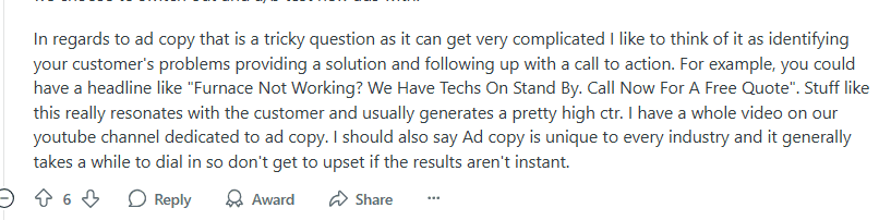
This is the quickest and most common way teams validate copy variants. You present two or more options, say, different headlines, subject lines, or CTA buttons, to a panel of target users and ask which they prefer.
Where this becomes useful isn’t just in finding the winner, but in understanding patterns in preference. You might find users gravitating toward copy with benefit-led phrasing over clever or abstract ones. If you include a follow-up question like Why did you prefer this version?, you start finding insights you can apply across assets.
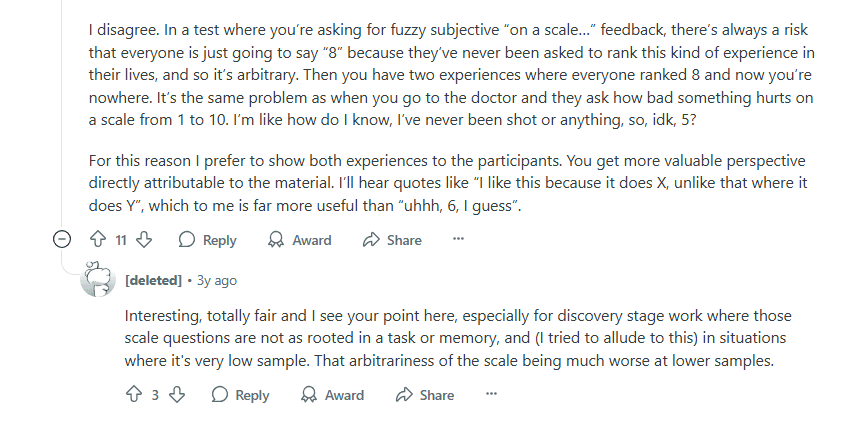
Via Reddit
However, preference testing is decontextualized by nature. You're removing layout, design, and product flow. That means results need to be viewed as a directional input, not a final verdict.
2.Comprehension Testing
Here, you show someone a section of copy and ask them to explain it back to you in their own words. The goal is to see whether they understood it the way you intended.
Comprehension testing is necessary when you're dealing with complexity, or when you have new categories, technical products, or products with multiple use cases.
Let’s say your copy reads Optimize resource planning with predictive utilization insights. Sounds impressive. But if users summarize it as “It helps you manage employees or something,” that’s a problem. Your message didn’t land.
3.Five-second testing
Here, users are shown a page or piece of content for exactly five seconds. After the time is up, the content disappears, and you ask users questions like
What was the main message?
What do you remember?
What would you do next?
It’s designed to mimic real-life scanning behavior. Visitors don’t read; they skim, click, and bounce. Five-second tests tell you if your key message is coming through at a glance. If users can’t recall anything about your product or misunderstand the offer after five seconds, your copy likely has a clarity or hierarchy issue.
This method is great for optimizing top-of-funnel touchpoints like hero sections, landing pages, display ads, and email headers.
4.Cloze Testing (Fill-in-the-blank)
This is an old-school but powerful linguistic tool. You show participants a sentence with a key word or phrase removed and ask them to complete it to see if their instincts are the same as yours.
Example: Fibr helps users ___ landing pages in seconds.
If most people say “create” but your original word was “optimize,” you’ve learned something. This way, you also validate cognitive fluency. The more your copy aligns with how your audience thinks, the faster comprehension and trust build.
Cloze testing is useful in UX copy, onboarding, and product messaging; anywhere you want minimal friction and fast comprehension.
5.First-Click Testing
In this method, you present a design mockup and ask users to click where they’d go to complete a certain task, such as “Find out how pricing works” or “Get started with the product.”
It tells you whether your labels, CTAs, and copy hierarchy are directing users correctly. For example, if users mostly click “Learn More” instead of “Get Started,” you’ve got a disconnect between what the buttons imply and what users expect. It’s often a copy problem disguised as a UX issue.
This kind of test is a must when you’re refining navigation, onboarding flows, or CTAs in multi-step funnels.
6.Live A/B Testing in Production
This is the method most people associate with copy testing, but it’s the most resource-heavy. You deploy two or more versions of a live page or asset and let the data tell you which performs better on a given KPI (CTR, signup rate, demo bookings, etc.).
It’s useful for validating ideas in the wild when traffic volume is high enough to reach statistical significance quickly. That said, A/B tests don’t explain why something won. You’ll know version B drove more conversions, but not whether that was due to tone, word choice, visual hierarchy, or context.
Best practice is to use earlier-stage testing (preference, comprehension, five-second) to vet copy before you A/B test it. That way, you’re not wasting time optimizing bad ideas at scale.
7.Moderated Message Testing (Live Panels or Interviews)
If you want depth, this is it. You talk directly with users, through 1:1 interviews or small moderated panels, and walk them through specific pieces of copy in context. You look for confusion, hesitation, emotional reactions, tone mismatches, and behavioral cues that surveys won’t capture.
For instance, you present a new feature announcement and ask: “How does this make you feel?” or “What part stood out or confused you?” Then you follow up.
One person might say a particular phrase like teels vague. Another might say it feels too technical. You now have two interpretations of the same phrase, and you can start triangulating how to revise it for clarity.
This is most useful during positioning pivots, product launches, and category creation.
Which Copy Testing Methods Are Most Commonly Used by Marketers?
Most marketers gravitate toward methods that are easy to implement, quick to analyze, and closely tied to performance metrics. While there are plenty of copy testing techniques out there, only are few are very common.
These are the most commonly used methods in practice:
A/B Testing (Live): Still the default for many teams, especially in paid media, email, and landing pages. Tools like Fibr, VWO, and Optimizely make it easy to test variants in production. Companies like Airbnb often test subject lines and CTA copy on email campaigns to optimize click-through rates.
Preference Testing via Panels: Platforms like Wynter and UsabilityHub let marketers test messaging variations with their exact target audience. B2B marketers often resort to these tools to validate homepage hero copy and positioning statements before launch.
Five-Second Tests: Used by companies like Dropbox and Zapier during early design stages to make sure that users can grasp the core message at a glance. These are usually run through tools like Maze during pre-launch validation.
Live User Surveys + Polls: Often embedded in apps or post-purchase flows. Amazon routinely asks users, “Was this page helpful?” after presenting a product or policy copy. The responses inform microcopy adjustments.
But how do you get the best results, regardless of the method?
How Can You Maximize Results from Your Copy Testing Efforts?
Running copy tests is one thing. Getting meaningful, usable results is another. Most teams treat copy testing like a checkbox: test, tally, move on. But to improve performance, you need to approach it like a system: one that combines smart setup, tight feedback loops, and the right tools.
Here are 8 lesser-known practices to squeeze more signal from every test
1.Test against a hypothesis, not a hunch
Before running a test, articulate why you think a variation will perform better. Ask yourself: Am I simplifying a value proposition or swapping features for outcomes? Do I want to make the tone more conversational?
Framing the test around a hypothesis keeps you from running random variations and forces you to interpret results with purpose.
Instead of “Let’s test a shorter headline,” try “We believe a benefits-first headline will improve clarity for first-time users.”
2.Segment your results by audience type
A copy variant might outperform overall, but that doesn’t mean it works across all user segments. A headline that resonates with SMBs would fall flat for enterprise buyers. If you have the data, segment feedback by persona, behavior (like new vs. returning), or funnel stage. That’s where nuance lives.
3.Don’t microcopy instead of just headlines
Most teams only test top-of-funnel content like subject lines or hero copy. But microcopy \carries more weight than it gets credit for. ‘
Labels, tooltips, button text, error messages; all of these shape confidence and reduce friction.
4.Use timing windows to control for noise
Avoid running tests across inconsistent periods or high-variance traffic periods. A/B tests run over weekends vs. weekdays will often skew due to behavior differences.
Similarly, email opens at 8AM Monday behaves differently from Friday at 5PM. Use consistent timing windows to isolate copy impact from timing-related noise.
5.Loop in sales and support teams early
These teams hear objections, confusion, and wording issues in real time. They’ll tell you which terms cause friction, which promises feel inflated, and which benefits bring value. Feeding that context into your copy testing roadmap surfaces better ideas and avoids testing in isolation.
6.Avoid relying too much on clicks and conversions
Behavioral data is important, but it lacks intent. A CTA sometimes gets more clicks because it’s vague, but that doesn’t mean it’s better at setting expectations.
Supplement A/B tests with follow-up polls, short surveys, or user interviews to learn why people clicked, or didn’t. That context makes the test actionable.
7.Use the right tools for copy testing
Generic testing tools weren’t built for nuanced copy feedback. If you want actual insight, especially for early-stage copy that’s not live yet, you need platforms designed for messaging validation.
Fibr AI is amazing for this. By embedding Fibr’s script tag on your landing pages or ads, you can kick off hundreds of simultaneous copy tests that adapt in real time to user behavior.
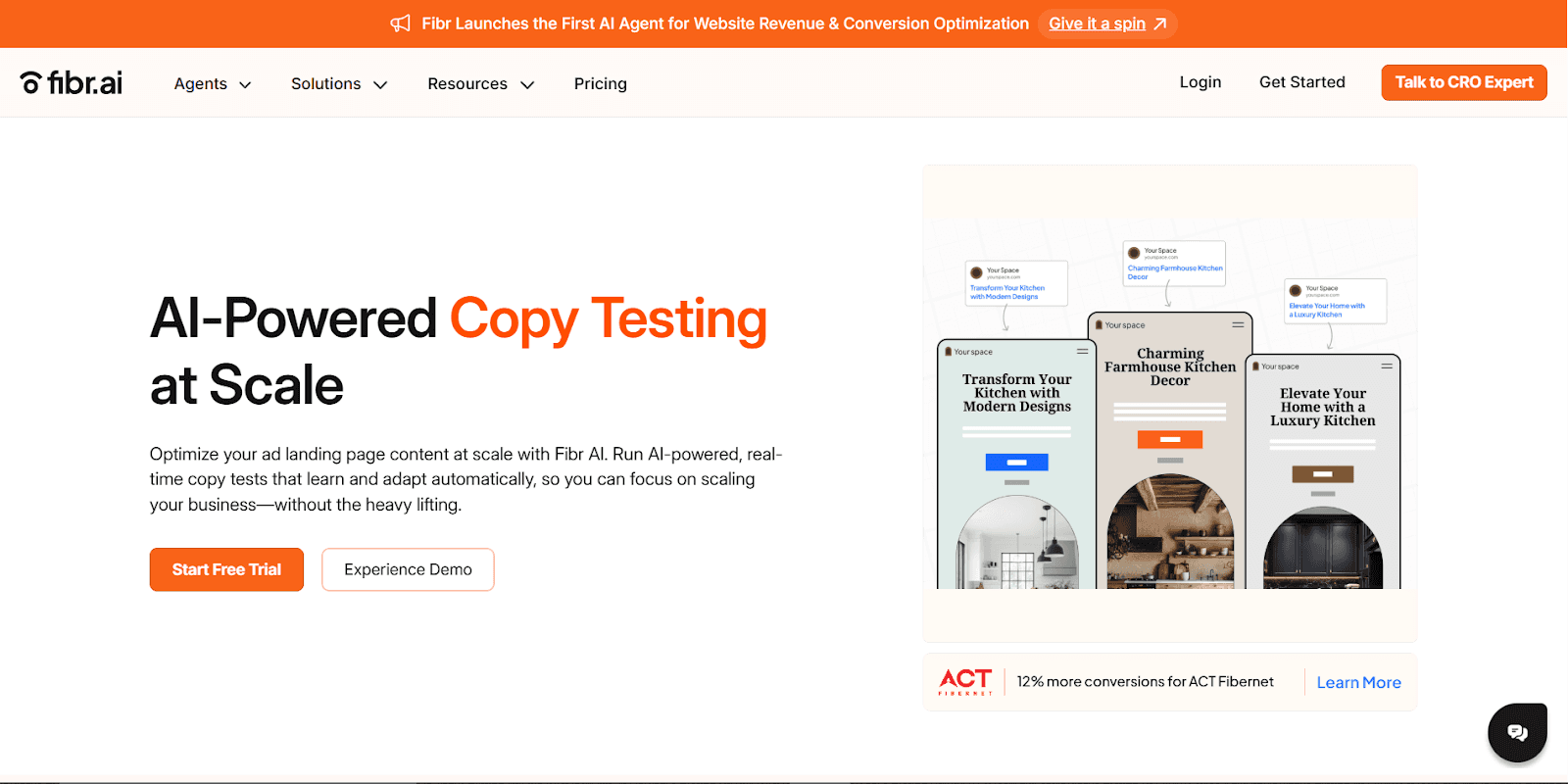
Via Fibr
Behind the scenes, its AI agent evaluates performance metrics—click rates, time on page, conversion events—and automatically reassigns traffic to the top-performing variants.
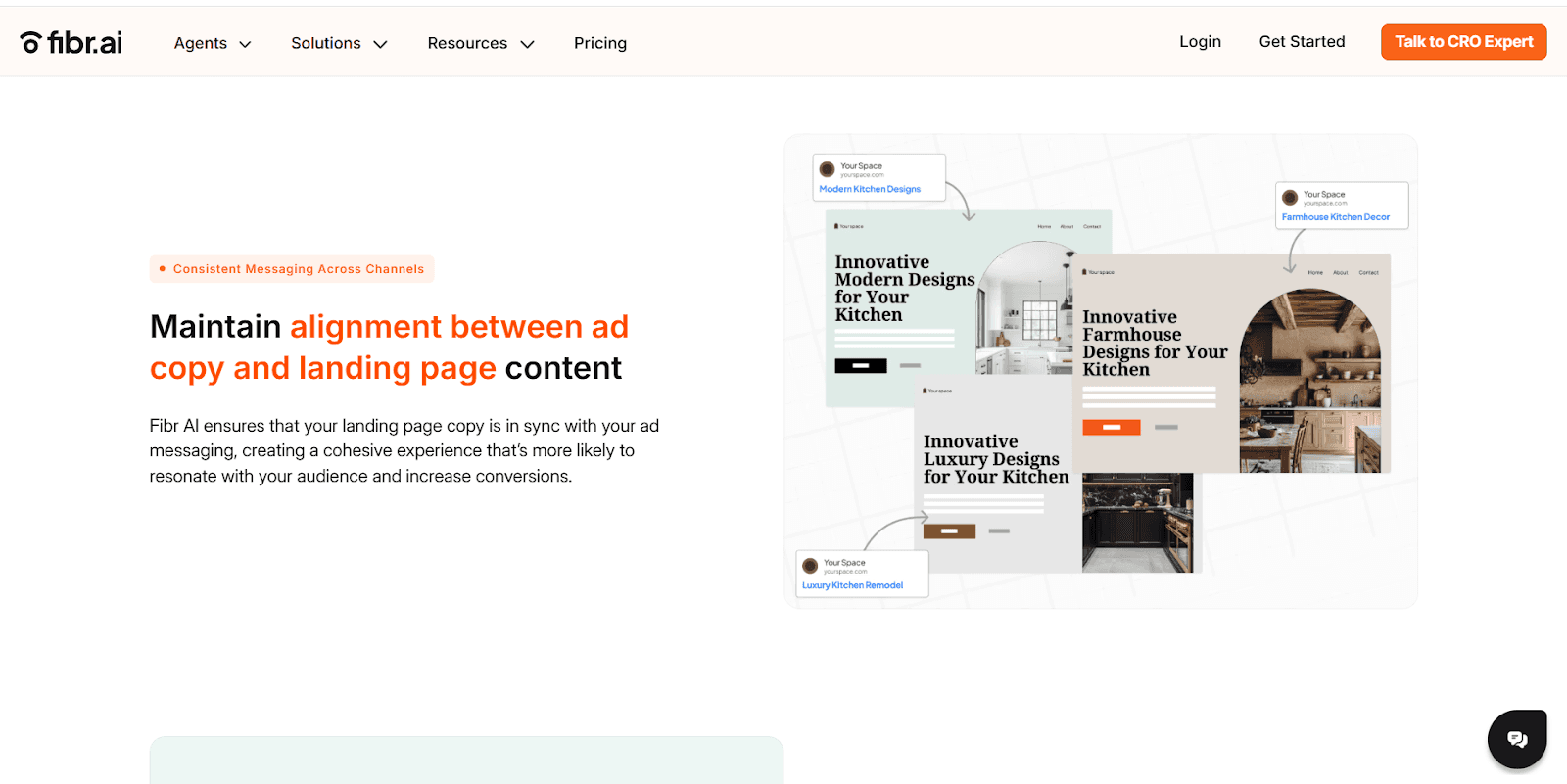
You can even generate on-brand variations in bulk while sticking to your legal and style guidelines. Early adopters like ACT Fibernet saw a 12% lift in conversions and a 25% drop in customer acquisition cost by aligning ad copy with landing page messaging.
8.Document learnings in a centralized copy wiki
This one’s boring but high-leverage: track what you tested, what won, what failed, and why. Include screenshots, context, and next steps. Over time, this builds institutional knowledge and helps new team members avoid repeating the same tests, or worse, the same mistakes.
Tools like Notion or Slab work fine here. The important part is having a system where test learnings turn into reusable insights, not forgotten experiments.
The Last Word on Better Words
Copy testing is one of the fastest ways to sharpen your messaging and avoid expensive rewrites after launch. But the value isn’t in testing for the sake of it. It’s in building a habit of validating what you think sounds good against how people read and respond.
The more consistently you test, the less time you spend debating copy internally, and the more time you spend scaling what works.
If you want a faster, more structured way to test copy with real users, Fibr is just for you. It’s built specifically for marketers and product teams who care about clarity.
Book a demo today.




Ankur Goyal
CEO @ Fibr AI
Ankur Goyal, a visionary entrepreneur, is the driving force behind Fibr, a groundbreaking AI co-pilot for websites. With a dual degree from Stanford University and IIT Delhi, Ankur brings a unique blend of technical prowess and business acumen to the table. This isn't his first rodeo; Ankur is a seasoned entrepreneur with a keen understanding of consumer behavior, web dynamics, and AI. Through Fibr, he aims to revolutionize the way websites engage with users, making digital interactions smarter and more intuitive.
Read summarized version with
TLDR
Most copy fails not because it’s bad, but because it’s untested.
Copy testing tells you what people understand, feel, and do after reading your copy.
Beyond A/B testing, methods like preference tests, five-second tests, and surveys are used for copy testing.
Best results come from testing microcopy, segmenting by audience, and combining quantitative and qualitative feedback.
Fibr lets you scale copy testing with AI insights, personalization, and automatic traffic shifting.
Smart copy testing reduces wasted advertising spend and helps you ship with confidence.
Most marketers spend weeks crafting copy and just hours validating it. That’s a problem.
An average user spends just around 2.7 minutes on a web page. If your message doesn’t land fast, it gets ignored. Worse, teams often rely on instinct or internal opinions to decide what “sounds good.” That’s how vague headlines, bloated value props, and underperforming CTAs slip through.
Copy testing fixes that. It shows you how real people interpret, react to, and act on your messaging before you ship it.
Read on as we break down the benefits of copy testing, practical methods beyond A/B tests, and show you how to get the most from your efforts.
But first…
What’s Copy Testing?
Copy testing is the process of measuring the effectiveness of written content before it goes live. This includes taking stock of engagement, persuasiveness, conversion rates, or brand recall.
An important first step, and what we’re mostly concerned with, is a type of copy testing, ensuring message clarity and comprehension. Unlike regular A/B testing focused on conversion lifts or preference tests gauging appeal, this copy testing checks if your audience understands what you're trying to communicate.
The aim is simple – your audience should be able to quickly get the main point, purpose, and intended meaning of your copy.
Why Should You Test Your Copy?
Most teams use copy testing to validate headlines or optimize email subject lines. That’s basic utility.
But value shows up when you use it to understand how your messaging performs across different contexts, audiences, and intentions.
Below are seven benefits you might not be thinking about, but should:
1.It surfaces false confidence in internal messaging
Teams often rally around language that “feels right” internally. Copy testing punctures that bubble.
For instance, a B2B SaaS team might favor the phrase “intelligent automation” in their hero copy because it signals innovation. But tests might show that users find the term vague, even pretentious. It tells you your internal vocabulary isn’t mapping to real-world understanding.
When this happens, it forces a reassessment of how the product is being framed across decks, demos, and outbound.
2.It clarifies which benefits are valued, not just noticed
A common mistake is thinking that just because someone remembers a line, it worked. Memorability doesn’t equal motivation. With copy testing, you can measure what spikes preference or intent.
You might be A/B testing two feature descriptions for a project management tool. One promises “easy collaboration,” the other “fewer update meetings.” Both are understood, but the latter triggers higher engagement because it speaks to a pain, not a feature.
3.It highlights audience-level contradictions
Audiences aren’t homogeneous, and copy testing makes that very clear. Technical buyers usually prefer detail-heavy copy, while economic buyers disengage when things get too granular. If both groups influence purchasing, then you’ve got a content architecture issue, not a copy issue.
These gaps are hard to detect without testing until sales cycles drag or conversion rates stagnate.
4.It de-risks positioning pivots before a full launch
Before changing your narrative across the site, ads, and investor pitch deck, copy testing gives you a lightweight way to stress test new angles. This is needed because repositioning is expensive.
One team we know of with was moving from a productivity tool to a revenue enablement platform. Instead of overhauling their site, they tested phrases and framing in isolation. Results showed that while the new language scored high on novelty, it also triggered skepticism.
That insight saved them from overcommitting to a message that would’ve needed months of re-education.
5.It lets you measure emotional friction
Sometimes copy fails not because it's unclear, but because it makes people uncomfortable.
A copy that says replace 80% of your support team might be technically true, but it will trigger anxiety in roles you’re also trying to sell to. Copy testing exposes this emotional friction.
These are insights you won’t get from heatmaps or A/B tests alone.
6.It tells you where to trim, not just what to add
Marketers often default to overexplaining. Copy testing helps you learn what can be cut without harming clarity. If multiple respondents correctly interpret your offer without reading the second or third line, that’s a cue to simplify.
Removing unnecessary lines creates more space for the ideas that matter. It also means faster load times, better mobile UX, and fewer drop-offs.
7.It exposes channel-specific weaknesses
Copy that works in a sales deck will fall flat in a paid ad. Testing by channel helps you isolate performance issues that are easy to misattribute.
For example, a headline like Turn data into decisions might do fine on a homepage, but fail in a retargeting ad where users want specificity. Copy testing across environments shows you what context adds and what it demands.
This allows you to adjust tone, depth, or format before spending budget on underperforming creative.
Different Methods of Copy Testing
Copy testing depends on what you’re testing, who your audience is, how much time or traffic you have, and what decisions you're trying to make. There’s a difference between validating a homepage headline and understanding how a feature explanation lands with technical buyers.
Let’s break down the most useful copy testing methods, how they actually work, and when to use them.
1.Preference Testing
This is the quickest and most common way teams validate copy variants. You present two or more options, say, different headlines, subject lines, or CTA buttons, to a panel of target users and ask which they prefer.
Where this becomes useful isn’t just in finding the winner, but in understanding patterns in preference. You might find users gravitating toward copy with benefit-led phrasing over clever or abstract ones. If you include a follow-up question like Why did you prefer this version?, you start finding insights you can apply across assets.
Via Reddit
However, preference testing is decontextualized by nature. You're removing layout, design, and product flow. That means results need to be viewed as a directional input, not a final verdict.
2.Comprehension Testing
Here, you show someone a section of copy and ask them to explain it back to you in their own words. The goal is to see whether they understood it the way you intended.
Comprehension testing is necessary when you're dealing with complexity, or when you have new categories, technical products, or products with multiple use cases.
Let’s say your copy reads Optimize resource planning with predictive utilization insights. Sounds impressive. But if users summarize it as “It helps you manage employees or something,” that’s a problem. Your message didn’t land.
3.Five-second testing
Here, users are shown a page or piece of content for exactly five seconds. After the time is up, the content disappears, and you ask users questions like
What was the main message?
What do you remember?
What would you do next?
It’s designed to mimic real-life scanning behavior. Visitors don’t read; they skim, click, and bounce. Five-second tests tell you if your key message is coming through at a glance. If users can’t recall anything about your product or misunderstand the offer after five seconds, your copy likely has a clarity or hierarchy issue.
This method is great for optimizing top-of-funnel touchpoints like hero sections, landing pages, display ads, and email headers.
4.Cloze Testing (Fill-in-the-blank)
This is an old-school but powerful linguistic tool. You show participants a sentence with a key word or phrase removed and ask them to complete it to see if their instincts are the same as yours.
Example: Fibr helps users ___ landing pages in seconds.
If most people say “create” but your original word was “optimize,” you’ve learned something. This way, you also validate cognitive fluency. The more your copy aligns with how your audience thinks, the faster comprehension and trust build.
Cloze testing is useful in UX copy, onboarding, and product messaging; anywhere you want minimal friction and fast comprehension.
5.First-Click Testing
In this method, you present a design mockup and ask users to click where they’d go to complete a certain task, such as “Find out how pricing works” or “Get started with the product.”
It tells you whether your labels, CTAs, and copy hierarchy are directing users correctly. For example, if users mostly click “Learn More” instead of “Get Started,” you’ve got a disconnect between what the buttons imply and what users expect. It’s often a copy problem disguised as a UX issue.
This kind of test is a must when you’re refining navigation, onboarding flows, or CTAs in multi-step funnels.
6.Live A/B Testing in Production
This is the method most people associate with copy testing, but it’s the most resource-heavy. You deploy two or more versions of a live page or asset and let the data tell you which performs better on a given KPI (CTR, signup rate, demo bookings, etc.).
It’s useful for validating ideas in the wild when traffic volume is high enough to reach statistical significance quickly. That said, A/B tests don’t explain why something won. You’ll know version B drove more conversions, but not whether that was due to tone, word choice, visual hierarchy, or context.
Best practice is to use earlier-stage testing (preference, comprehension, five-second) to vet copy before you A/B test it. That way, you’re not wasting time optimizing bad ideas at scale.
7.Moderated Message Testing (Live Panels or Interviews)
If you want depth, this is it. You talk directly with users, through 1:1 interviews or small moderated panels, and walk them through specific pieces of copy in context. You look for confusion, hesitation, emotional reactions, tone mismatches, and behavioral cues that surveys won’t capture.
For instance, you present a new feature announcement and ask: “How does this make you feel?” or “What part stood out or confused you?” Then you follow up.
One person might say a particular phrase like teels vague. Another might say it feels too technical. You now have two interpretations of the same phrase, and you can start triangulating how to revise it for clarity.
This is most useful during positioning pivots, product launches, and category creation.
Which Copy Testing Methods Are Most Commonly Used by Marketers?
Most marketers gravitate toward methods that are easy to implement, quick to analyze, and closely tied to performance metrics. While there are plenty of copy testing techniques out there, only are few are very common.
These are the most commonly used methods in practice:
A/B Testing (Live): Still the default for many teams, especially in paid media, email, and landing pages. Tools like Fibr, VWO, and Optimizely make it easy to test variants in production. Companies like Airbnb often test subject lines and CTA copy on email campaigns to optimize click-through rates.
Preference Testing via Panels: Platforms like Wynter and UsabilityHub let marketers test messaging variations with their exact target audience. B2B marketers often resort to these tools to validate homepage hero copy and positioning statements before launch.
Five-Second Tests: Used by companies like Dropbox and Zapier during early design stages to make sure that users can grasp the core message at a glance. These are usually run through tools like Maze during pre-launch validation.
Live User Surveys + Polls: Often embedded in apps or post-purchase flows. Amazon routinely asks users, “Was this page helpful?” after presenting a product or policy copy. The responses inform microcopy adjustments.
But how do you get the best results, regardless of the method?
How Can You Maximize Results from Your Copy Testing Efforts?
Running copy tests is one thing. Getting meaningful, usable results is another. Most teams treat copy testing like a checkbox: test, tally, move on. But to improve performance, you need to approach it like a system: one that combines smart setup, tight feedback loops, and the right tools.
Here are 8 lesser-known practices to squeeze more signal from every test
1.Test against a hypothesis, not a hunch
Before running a test, articulate why you think a variation will perform better. Ask yourself: Am I simplifying a value proposition or swapping features for outcomes? Do I want to make the tone more conversational?
Framing the test around a hypothesis keeps you from running random variations and forces you to interpret results with purpose.
Instead of “Let’s test a shorter headline,” try “We believe a benefits-first headline will improve clarity for first-time users.”
2.Segment your results by audience type
A copy variant might outperform overall, but that doesn’t mean it works across all user segments. A headline that resonates with SMBs would fall flat for enterprise buyers. If you have the data, segment feedback by persona, behavior (like new vs. returning), or funnel stage. That’s where nuance lives.
3.Don’t microcopy instead of just headlines
Most teams only test top-of-funnel content like subject lines or hero copy. But microcopy \carries more weight than it gets credit for. ‘
Labels, tooltips, button text, error messages; all of these shape confidence and reduce friction.
4.Use timing windows to control for noise
Avoid running tests across inconsistent periods or high-variance traffic periods. A/B tests run over weekends vs. weekdays will often skew due to behavior differences.
Similarly, email opens at 8AM Monday behaves differently from Friday at 5PM. Use consistent timing windows to isolate copy impact from timing-related noise.
5.Loop in sales and support teams early
These teams hear objections, confusion, and wording issues in real time. They’ll tell you which terms cause friction, which promises feel inflated, and which benefits bring value. Feeding that context into your copy testing roadmap surfaces better ideas and avoids testing in isolation.
6.Avoid relying too much on clicks and conversions
Behavioral data is important, but it lacks intent. A CTA sometimes gets more clicks because it’s vague, but that doesn’t mean it’s better at setting expectations.
Supplement A/B tests with follow-up polls, short surveys, or user interviews to learn why people clicked, or didn’t. That context makes the test actionable.
7.Use the right tools for copy testing
Generic testing tools weren’t built for nuanced copy feedback. If you want actual insight, especially for early-stage copy that’s not live yet, you need platforms designed for messaging validation.
Fibr AI is amazing for this. By embedding Fibr’s script tag on your landing pages or ads, you can kick off hundreds of simultaneous copy tests that adapt in real time to user behavior.
Via Fibr
Behind the scenes, its AI agent evaluates performance metrics—click rates, time on page, conversion events—and automatically reassigns traffic to the top-performing variants.
You can even generate on-brand variations in bulk while sticking to your legal and style guidelines. Early adopters like ACT Fibernet saw a 12% lift in conversions and a 25% drop in customer acquisition cost by aligning ad copy with landing page messaging.
8.Document learnings in a centralized copy wiki
This one’s boring but high-leverage: track what you tested, what won, what failed, and why. Include screenshots, context, and next steps. Over time, this builds institutional knowledge and helps new team members avoid repeating the same tests, or worse, the same mistakes.
Tools like Notion or Slab work fine here. The important part is having a system where test learnings turn into reusable insights, not forgotten experiments.
The Last Word on Better Words
Copy testing is one of the fastest ways to sharpen your messaging and avoid expensive rewrites after launch. But the value isn’t in testing for the sake of it. It’s in building a habit of validating what you think sounds good against how people read and respond.
The more consistently you test, the less time you spend debating copy internally, and the more time you spend scaling what works.
If you want a faster, more structured way to test copy with real users, Fibr is just for you. It’s built specifically for marketers and product teams who care about clarity.
Book a demo today.
Ankur Goyal
CEO @ Fibr AI
Ankur Goyal, a visionary entrepreneur, is the driving force behind Fibr, a groundbreaking AI co-pilot for websites. With a dual degree from Stanford University and IIT Delhi, Ankur brings a unique blend of technical prowess and business acumen to the table. This isn't his first rodeo; Ankur is a seasoned entrepreneur with a keen understanding of consumer behavior, web dynamics, and AI. Through Fibr, he aims to revolutionize the way websites engage with users, making digital interactions smarter and more intuitive.