
Thank You Page Examples: Best Practices, Templates & Conversion Tips
Read thank you pages examples that engage customers, offer personalisation and help build deeper connections with your customers.
‘Thank you for signing up with our newsletter. We are thrilled to have you here!’
Or
‘Thank you for purchasing with us. You are now part of our growing family, and we cannot wait to share more details and upcoming offers with you.’
If you have shopped online or signed up for a newsletter, event, or service, you may have seen similar messaging after completion. Ever wondered what’s the logic behind this? Well, these are thank you pages, designed by brands and companies to express their genuine appreciation for your engagement.
But, the value of a thank you page goes beyond a simple acknowledgment. It is the final point in a customer’s journey before they leave a site—a lasting impression that can shape a brand’s prescription.
And that’s why designing a well-crafted thank you page is more important than one may think.
In this blog, team Fibr AI has explored the what and hows of thank you page designs, and some classic templates that not only say ‘thank you’ but also engage users for further association. Want to explore thank you page examples right away? Head over here directly.
Key elements of an effective thank you page design
A thank you page is where gratitude meets opportunity. Some elements that you can include when designing a thank you page are CTAs, feedback forms, personalization, and more. But remember to not overcrowd your thank you page and omit important information.
Check out our curated list of personalization tools you can use for your landing page.
Let’s discuss these elements a bit more in detail.
1. CTAs (Call to Action)
Arguably, the best way to encourage your user to take the next step is by placing strong and bold CTAs.
Instead of a plain ‘thank you’, you can guide your users to something else—a related article, or a service, your social media pages (Facebook/X/Instagram), community, and more. A good CTA helps the user stay connected to the brand and not leave just after one single engagement.
2. Feedback
Another great way of keeping the momentum going could be by collecting feedback. Once a user has completed an action–sign up or purchase, you could add in a quick feedback form asking about their experience. This shows to your users that you care about how they feel, and are keen to address any shortcomings.
For example, you could ask questions like—‘How was your experience?’ or ‘Is there anything else we can do to provide you better services?’
3. Personalization
Though not often spoken about in this context, personalization is also an excellent way to further user engagement.
Think of a message like— ‘Thank you, Jessica, for signing up with our newsletter. Here’s a quick free guide you can download.’ Such personalization makes the user feel special, shows that you care, and can make your brand/service stand out.
Important note: Don’t confuse a thank you page for a confirmation page. A thank you page offers CTAs, coupons, and more to further engage the user. A confirmation page, on the other hand, focuses on verifying the user’s actions, like successful payments, address details, and more that do not aim to engage the user directly.
How to create a thank you page that encourages next steps
Thinking of using your thank you page for further engagement is already a good starting point. Running tests, adding graphics, and special discount coupons, and sharing with friends, and families can help users stay engaged and commit to the next step.
You already know the elements of designing a solid thank you page. Now, let’s read in detail how you can make the above-mentioned pointers work better.
1. Run A/B tests
It’s impossible to build a perfect thank you page (or any kind of page) in one go. A/B test different aspects of your page—CTAs, content length, wording, and more such elements to figure out what works best. By analyzing user response, you can optimize your page for further engagement and maximum ROI.
Also read: Best A/B Testing Tools And Techniques For Marketers In 2024
2. Encourage social sharing
People love sharing their experiences with family, friends, and followers, especially if a product or service stands out to them. Encourage your users to share their experiences on different social media platforms through easy-to-click and share buttons.
Here, you benefit from leveraging the ‘word-of-mouth’ form of marketing and increase your brand’s visibility.
3. Invite to join communities
Communities build a sense of belonging and loyalty and in the same context (if applicable), you can invite your users to join a community—a dedicated user platform, Facebook pages, Slack, or even Discord!
For instance, if you run a fintech newsletter, you could invite your user to a community page of like-minded readers to join, discuss, and contribute to a conversation.
4. Offer additional value
The user is already a part of your marketing funnel and has converted. Show them love and appreciation by going the extra mile—special discount coupons, 1st-time user offers, free shipping, access to webinars and events, or even a resource download.
Did you know? The probability of selling to an existing customer is 60 – 70%. The probability of selling to a new prospect is 5-20%.
5. Add images and visuals
Graphics catch the attention of the users faster and can make your page memorable. Beautify your page with the right images, videos, visuals, and coloring.
Something like a ‘behind the scenes’ video or a happy user image can help build an emotional connection with your audience and take the engagement further.
Best 10 thank you page examples that drive further engagement
Building thank you pages has been made more complex than it needs to be.
To simplify this, Our team at Fibr AI has created a simple formula, and have also discussed the best thank you page examples—static and real-life—to help you gain a deeper understanding of what goes behind a well optimized thank you page.
First, let’s understand the formula part.
Well converting thank you page= Strong title+ Subtitle+Visuals+Social Proof+CTA
Title: Your title must be simple yet attention-grabbing. A clear title reinforces the action taken and makes the user believe that engagement is valuable.
Subtitle: Subtitles provide additional context. And while many pages don’t invest in a subtitle, make sure you don’t make that mistake. Your subtitle can expand your messaging and let the user know what to expect after taking action.
Visual: Eye-catching images or a video, in the form of a video testimonial, or a related product image, should be a part of your thank you page creation strategy. Visuals can also help break the monotony of text on the page.
Social proof: Don’t miss on social proof. As explained above, social proof displays that others have benefited by associating with you.
CTA: Strong, compelling CTAs are non-negotiable. It keeps your users engaged and opens opportunities for further brand engagement.
With this in mind, let’s explore some thank you page examples below.
1. Thank you for completing your purchase
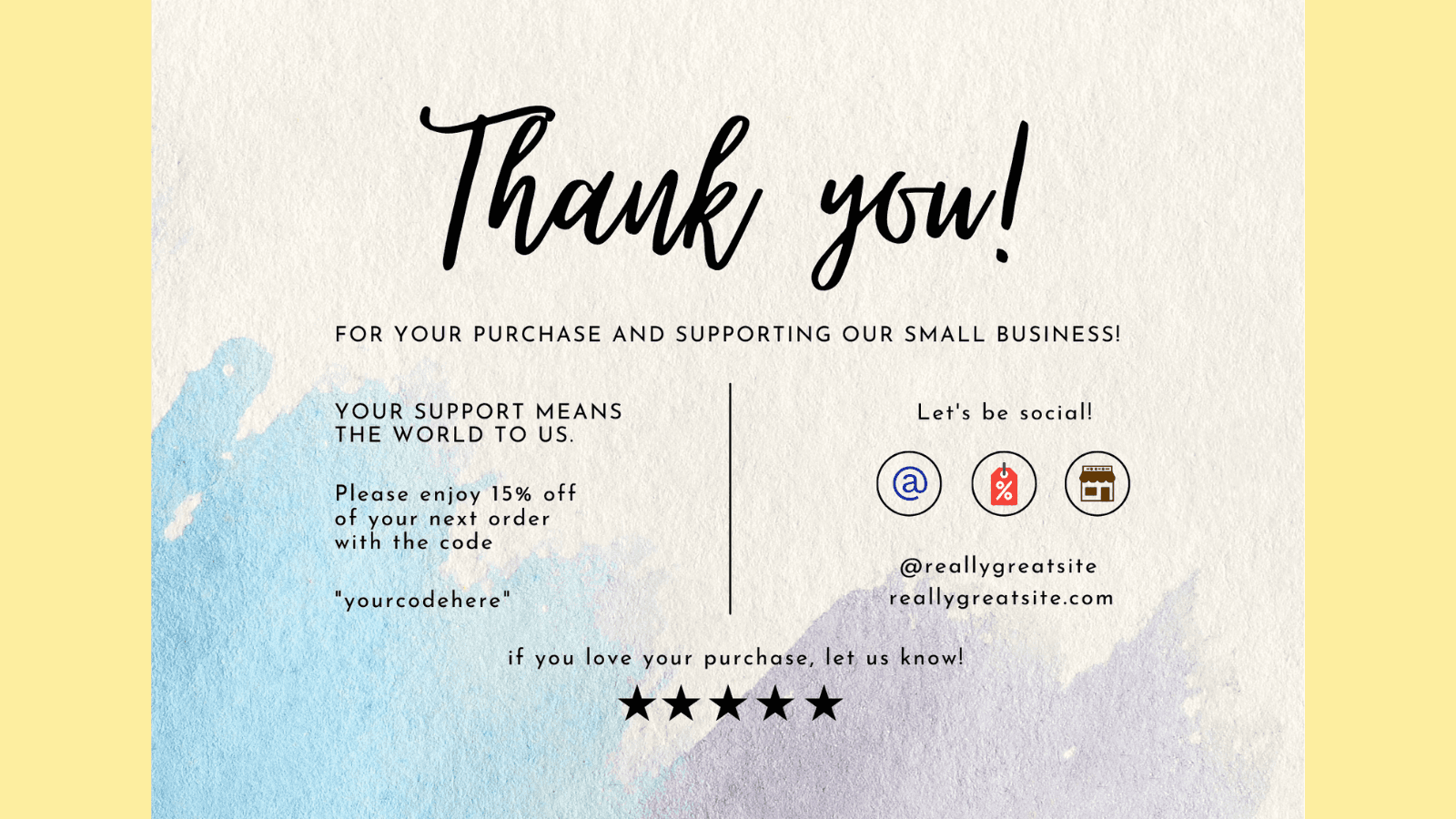
When a website visitor clicks on the ‘buy’ button, they are doing more than just a purchase–they are placing trust in your business. Use this trust to build a thank you page. After you confirm their order, and shipping details, show them what's next.
To seal the deal, and offer beyond logistics, think about how to keep the excitement going—add a special discount coupon or tips to maximize their purchases, or a sneak–peek into related products.
Reassure your visitors in every sense that they are valuable and have made the right choice.
2. Thank you for creating an account with us
If a website visitor is creating an account for you, they are already in a deeper marketing funnel than others. It is only natural that they would want personalization, ease, and a strong reason to keep coming back. Design your thank you page keeping these factors in mind.
After a warm thank you, depict to them what they can access now—an extra resource guide, faster checkouts, and more. Recommendations or a quick user guide showing popular products could also swing clients right in and make them feel welcomed.
Remember this: Visitors who create accounts with you are likely looking for long-term association. Your first interaction with them is going to set the tone for further engagement. Don’t compromise on investing in the same.
In the same context, let’s quickly take a look at the M&S thank you page—a clothing retailer.
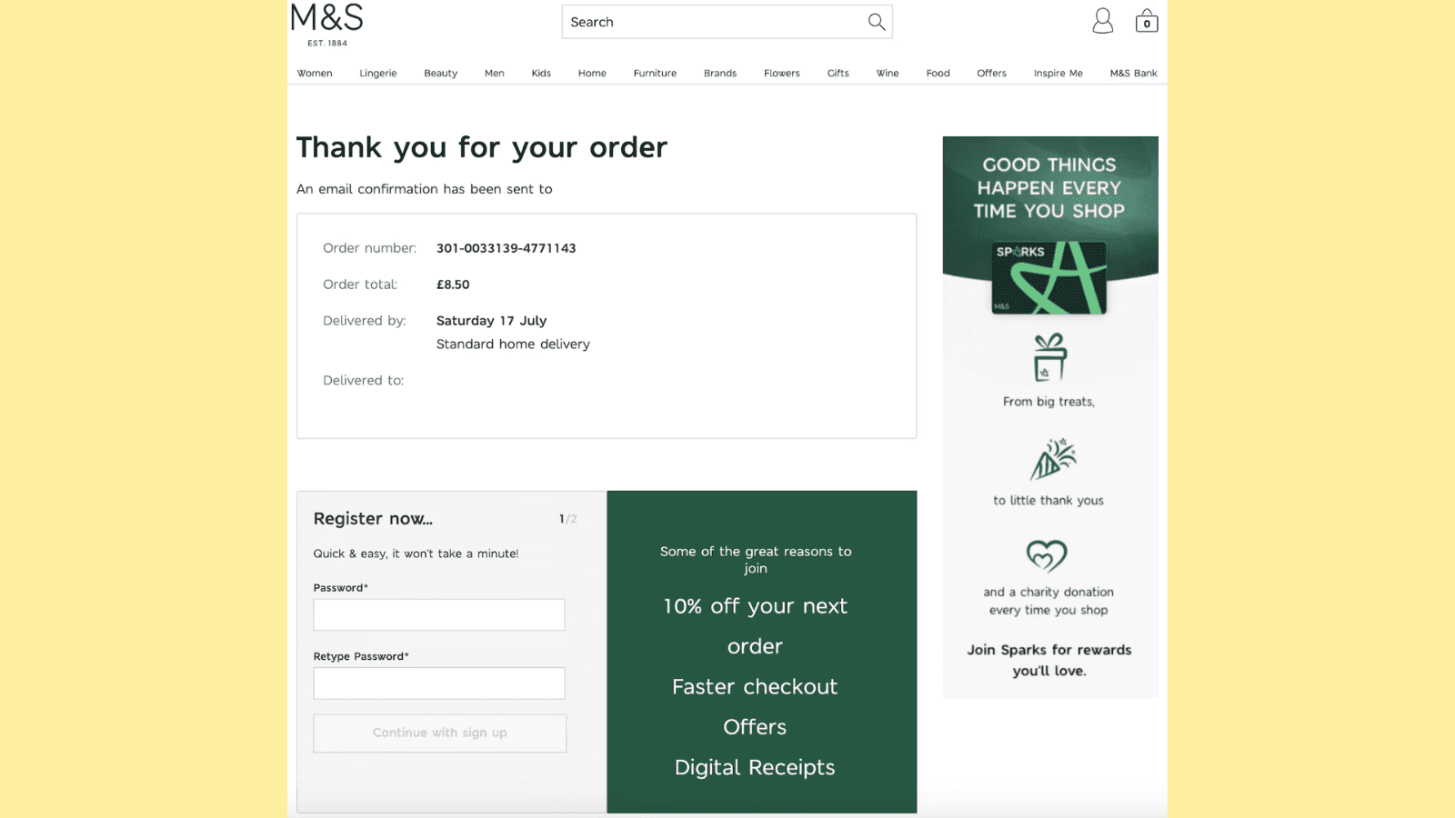
The first thing you’d notice about this page is how clean and well-balanced the page is, with near-perfect design. At the top, you’ll see confirmation details about your order. And, right below, you’ll find the space to register and open an account.
The interesting thing you’d note is how smartly, the company has placed CTAs—0% off, faster checkout, and digital receipts—all of which can further user action.
Did you also notice how they have added an ad for ‘Sparks?’ Talk about smart marketing!
3. Thank you for signing up for our newsletter
Got a new subscriber! Congratulations. Your subscriber may be eager to engage and understand what you offer but may need reassurance to see if the sign-up is worth their time. Mold your thank you page to assure them they made the right choice or build a little anticipation—exclusive offers, material access, insider tips, or testimonials of known persons who're part of the community for extra credibility.
You could also invite them to sign up with other similar newsletters to depict that you care about their learning, and other communities, and are not just not here to gain for yourself.
Here, let’s take the example of CXL’s thank you page, a leading SEO and CRO agency.
The first thing to notice about the CXL thank you page is that it replaces ‘Thank You’ with ‘Success’ . You may think nothing about it but it is a play on human psychology.
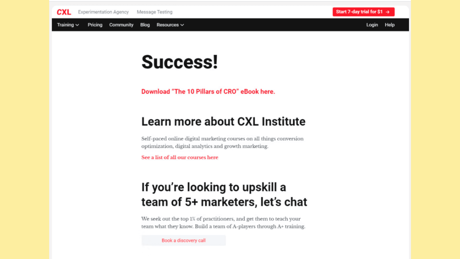
Post this is a direct CTA on downloading an ebook. Following it, you’ll see how CXL subtly promotes its courses and places another CTA on booking a discovery call. Did you also notice the ‘start 7-day free trial for $1’ on the top right side of the page?
Now, the good part about this thank you page is that it’s not overloaded with information and offers a clean design.
4. Thank you for registering for the webinar
If a visitor is signing up for a webinar, it shows they have a serious interest in learning and engaging with expertise. Create a page depicting exactly that—go beyond the regular date and time details—maybe share a fun fact about the speaker, give a peek into topics being covered, or even share a related article.
You could also add the number of people who have signed up for the webinar to build trust. For instance something like this —’ You and 150 others have signed up to the webinar’
For instance here is very interesting thank you page in this category.
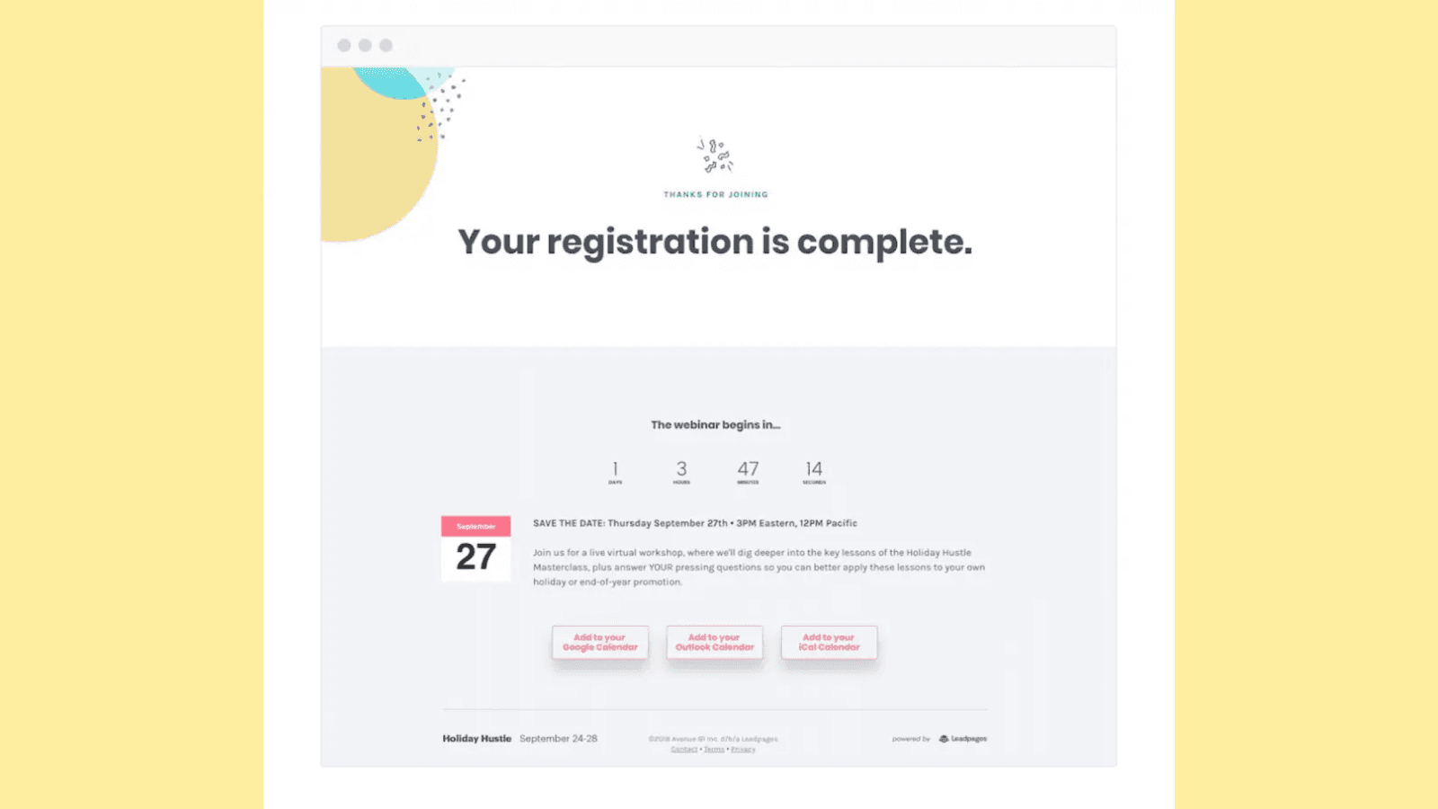
via LeadPages
You’ll also note how the company offers different options to add the webinar on the user's calendar so that it's not missed out.
Plus, the details of the webinar–what the webinar is about, joining date and time and the reminders are all well placed.
5. Thank you for subscribing to our updates
If somebody has subscribed to you for updates, it could mean that they are expecting beyond regular stuff—insights, fresh news, and more. Use the ‘thank you for visiting my website page’ to assure your subscribers that this is exactly what they’ll get.
Guide them on previous updates and the value other subscribers derived from it. You could ask them to share it with their family and friends for a special coupon and more.
The New York Times page here is a great thank you page example.
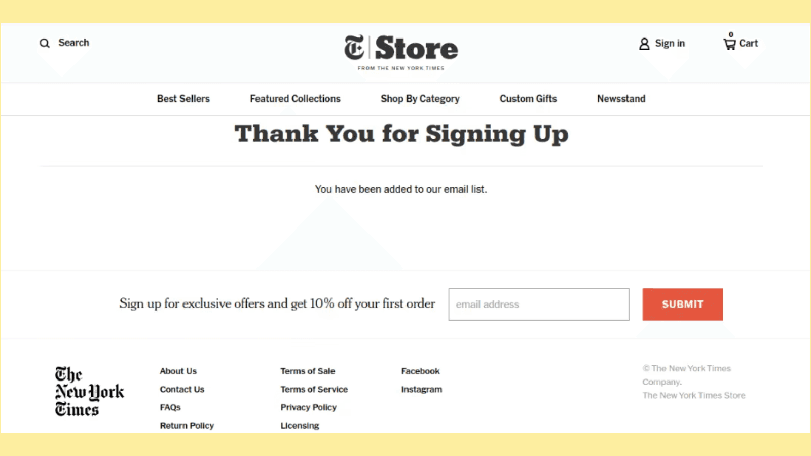
Simple and to the point—the 10% off on first order is also a good CTA example and placement. If you’d notice closely, their font type and design is consistently maintained and well balanced with proper spacing and design.
What’s more, their socials are also listed right below for further engagement.
6. Thank you for downloading our free guide
When users download a guide, it shows that they are interested in that particular subject or are looking to solve an issue through the guide’s help. If your business offers free guides, on the thank you page, reinforce how it solves a problem. You can additionally add a blog link to related guides, or products that users have searched for before.
Like, for example, take a look at Hubspot’s thank you page—
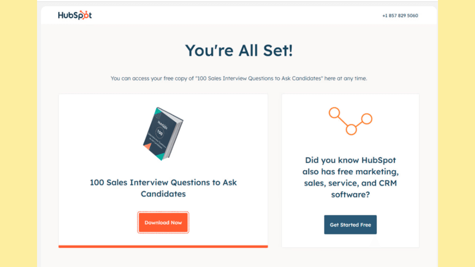
It starts with a ‘You’re all set’ instead of a simple ‘Thank you.’’
Next, is a well-framed subtitle—offering access to ‘free copy.’ The interesting thing Hubspot does next is it places two CTAs once you have downloaded their guide— ‘Download Now’ and ‘Get Started Free.’ Both offers create urgency and promote the brand well.
7. Thank you for scheduling a demo with us
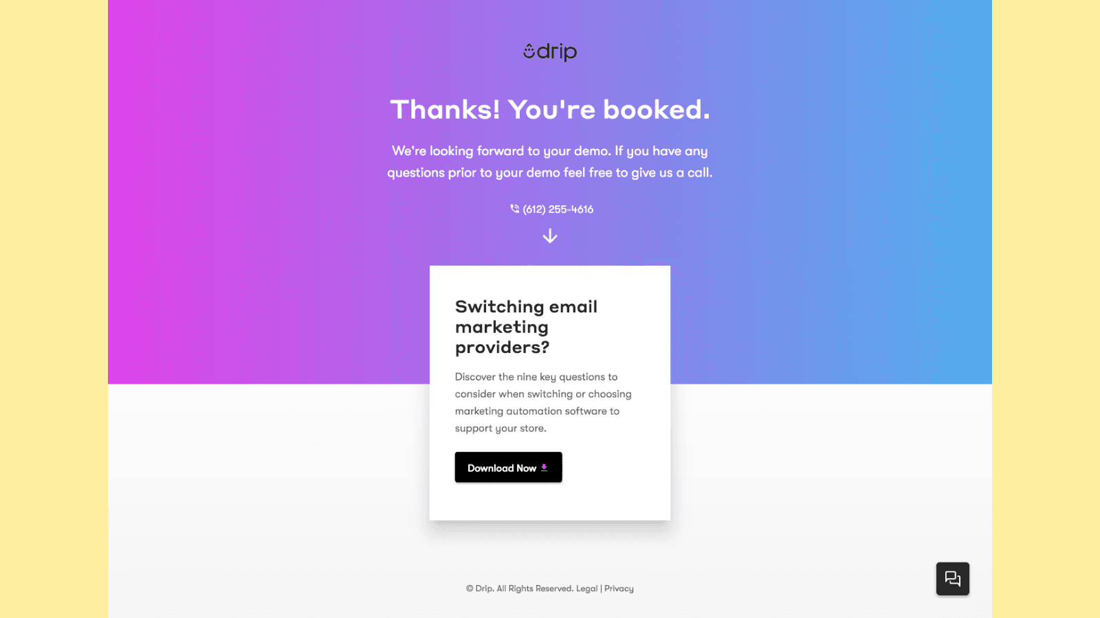
Demo requests could mean clients are further interested in what you offer and are actually ready to get on a call with you to discuss the association. This is excellent news for your business as this could likely mean conversion.
After the demo, you can create a thank you page to show your excitement and sincere gratitude for their time, display testimonials from previous clients, and even guide them to resources and material showing how your business addresses common pain points clients raise.
This rebuilds credibility and shows the client that you offer value for money.
Also read: 10 Must Follow Conversion Rate Optimization Experts In 2024
8. Thank you for booking a consultation
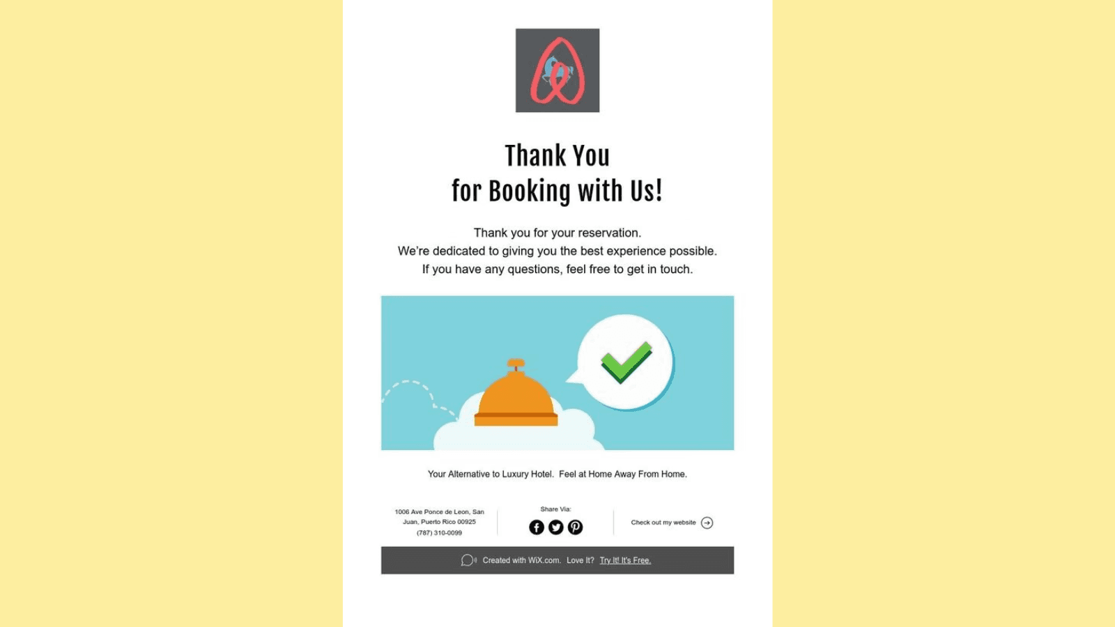
Consultation booking, like demos, depicts that the visitor is interested in knowing your services and offerings more intimately. Customize your thank you page for the same. Add case studies and social proof alongside a warm thank you and other details.
Build confidence and create your page to display to your users that you are ready to engage.
9. Thank you for requesting a free trial
A free trial request could mean your user wants to test your product first. The right way to thank such customers would be by providing resources on what and hows, quick starter tutorials, testimonials, and more.
Take this thank you page example for instance—‘Thank you for requesting a free trial. We are excited to have you try our product! We promise you’re going to love it. Wondering if this trial is helpful? Read what our new customers have to say.’
10. Thank you for signing up for our event
Events are all about build-up and excitement. But they are also about a lot of details and information. Design your thank you page to balance both elements.
Share the excitement of your users, by choosing the right wording and messaging—Ask them to mark their calendar, and share a picture of one or two similar events you organized.
Your thank you page should look like a mini countdown to something interesting while making space for event details at the same time.
Common mistakes to avoid in thank you page design
Brands often fail to provide clear, logical next steps and sometimes even overload their thank you pages. You may also observe that some thank you pages are not optimized for conversion mobiles. These are some very common thank you page mistakes you must be aware of, to ensure your thank you page is unique, and one of a kind.
So, how do you avoid these common mistakes? Read below—
1. Neglecting to provide clear information
A very common mistake observed with thank you pages is that many times, they fail to provide guidance on what’s next. After someone has engaged with your page, product, or service, they should not be left confused.
A good thank you page should include clear, and concise information on the next steps after engagement—this could be anything—suggestions related to the product, or inviting your customers to check out other similar resources.
2. Not optimizing for mobile
You would agree that most signups, purchases, and engagements happen through smartphones today. And in the same context, not optimizing for mobile could be a mistake. Poor optimization for smaller screeners can harm user experience.
Ensure that your thank you page loads quickly and is optimized for all device types.
3. Overloading content
Content overload is a problem that is less spoken about when concerning thank you pages.
It’s good to have engaging and relevant content—but overloading your page with a cluster of texts, unrelated images, and quotes can distract your users and also interfere with the designing aspects of the page.
Try to keep your page clean, clear, and clutter-free.
4. Skipping social proof
Using your thank you page to build credibility for your business or service is a great move. Adding social proof, testimonials, and success stories shows that other users have benefited from associating with your business.
Skipping social proof is skipping an opportunity to promote your brand one last time before the user leaves your page.
So, ensure that you make subtle provisions to include good reviews and social proof.
Conclusion
Most brands treat their thank you page as a formality. Don’t make the same mistake. Your thank you page is a great opportunity to not only thank users for their engagement but also build stronger connections with customers.
Building a strong thank you page basically relies on how well you understand the human psyche. And Fibr AI excels at that.
Build personalized thank you and landing pages in seconds, and get those conversions faster. Don’t wait any longer. To know, visit— https://fibr.ai/
FAQs
1. What to write on a thank you page?
Write your thank you page showing genuine and sincere appreciation for user action. Next, you could direct users to follow your page, social media accounts, and more or place a CTA guiding them to the next step depending on the business you are in. You could also add a discount coupon or special code to further engage your users.
2. What description is required for a thank you page?
The description on a thank you page should be such that it guides users on the next step. This could for instance be a confirmation message, shipping details, or a guide download. Ensure to not overload this page and confuse the user.
3. How do I make a thank you page?
A thank you page is an expression of your gratitude to your customers for their engagement with your product or service. So when making a thank you page, include a soft appreciation message, and add different elements like social proof, or related pages/items to further engage the user.
About the author


