Table of Content
Read summarized version with
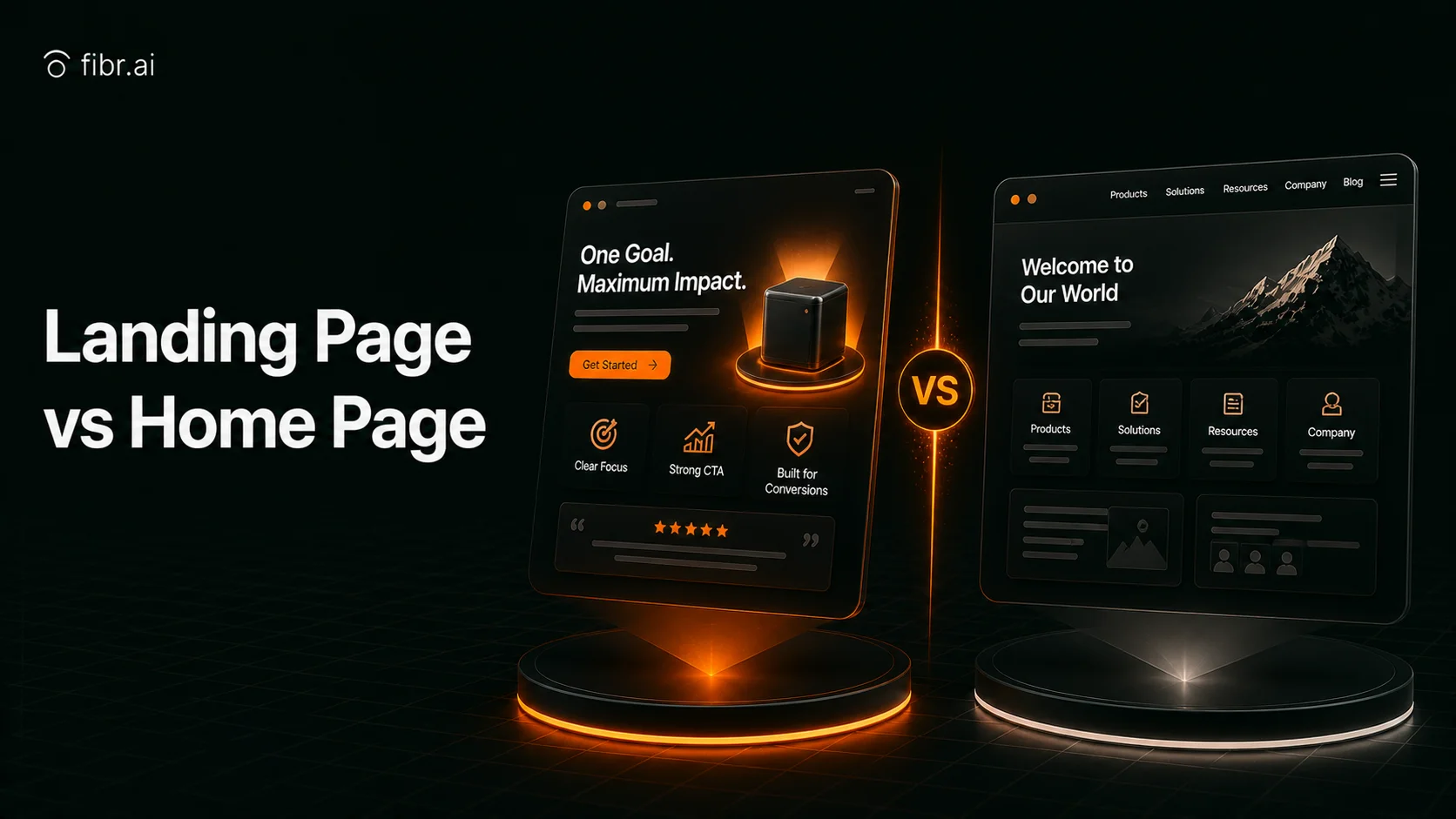
Contrary to popular belief, stuffing your homepage with CTAs and PPC ads doesn’t automatically make it a landing page.
So, what differentiates a landing page from a homepage? The answer lies in their purpose.
At first glance, homepages and landing pages might be hard to tell apart. However, both are designed with entirely different goals in mind and each has its own place in your business strategy.
Let’s break down the core differences between a landing page and a homepage. We’ll break it all down—definitions, must-have elements, and the best ways to use them in your marketing funnel to drive optimal results.
We start at zero: definitions.
Quick Summary
A home page is the door to your website and in extension to your brand and product.
A landing page is a specific page on your website that convinces users to take a particular action, such as downloading a brochure or adding a product to cart.
A homepage needs to be attractive and informational, but a landing page needs to be focused and persuasive.
Navigation is usually removed from landing pages to keep it less distracting, but it is a key component of home pages.
Instead, the call to action takes prominence on a landing page.
Although you can technically make your homepage act like a landing page, doing so will breed inefficiency and user confusion.
What is a Website Landing Page?
A website landing page is a dedicated web page created specifically for a marketing or advertising campaign. The main purpose of a landing page is to nudge visitors toward a single, clear action. This action can be anything—filling out a form, making a purchase, or subscribing to an email newsletter.
Unlike regular pages on your site, landing pages are standalone web pages made just for conversions. They are the optimized entry point for traffic coming from ads, emails, or social media, and they make it easier to guide visitors toward your desired outcome.
What makes a great landing page?
Every landing page is engineered with a conversion-first approach. All of them will have these components:
No navigation bar. Unlike most pages, landing pages usually skip the top navigation. This keeps visitors focused by eliminating distractions and forces them to either take action or leave. It also simplifies tracking conversions, as there are fewer variables at play.
A single, CTA. All roads lead to the same destination on a landing page. Whether you include one button or several, every CTA should direct users to the same goal—be it a form, checkout page, or download link.
High-quality visuals. Great design matters. Pair stunning product images with enough white space to maintain a clean, engaging layout that keeps visitors scrolling.
Separate from your main site. Landing pages are designed to stand alone. They aren’t typically accessible through your site’s navigation but are instead reached via targeted campaigns, like email blasts or paid ads.
Impactful above-the-fold content. The headline should immediately grab attention by addressing a problem your product solves while supporting text reinforces the value you offer.
Benefits-driven features. Once the visitor's interest is captured, these pages highlight what sets the product apart. Concise, benefit-focused copy showcases key features, often with icons to make the information visually digestible.
What is a Website Home Page?
The home page is a website's starting point or the primary interface between users and the site’s content. In its simplest form, it is the default page that loads when a domain name is accessed.
It is not, however, just for navigation—it is a critical element of user experience (UX), SEO branding, and conversion optimization. Essentially, it is the hub of a brand’s website; it introduces who you are and what you sell or provide.
Anatomy of a proper home page
Every memorable home page you visit will satisfy these requirements:
Smooth navigation. Home pages make it effortless for visitors to find what they’re looking for. A well-organized navigation menu with clear product categories guides shoppers directly to their ideal items without any confusion.
Engaging above-the-fold content. There is only one chance to make a first impression. The job of the content at the top of the page is to grab attention and motivate users to explore further.
Quality product visuals. Products need to look their absolute best online. High-quality images excite and inspire and a visually appealing layout that invites users to keep clicking.
Compelling CTAs. Generic phrases like "Click Here" don’t work. Home pages employ action-oriented language that inspires users to act, like "Shop now" or "Discover Your Perfect Match."
Product-first focus. While homepages serve many purposes, their primary job is to highlight your product or offering. Most home pages prioritize showing them over brand detail.
Brand storytelling. Sharing your story helps you connect with your audience. That’s why you’ll find links to your About Us page, mission statement, and social media profiles so visitors can learn more about what makes your brand unique.
Bonus: Do The Home Page and Landing Page Differ In the Backend?
Ok, this is just what you see on your screen. But what’s powering all that?
Remember that the technical framework is the same throughout the website, be it for the homepage or a landing page.
HTML provides the structure and semantic elements of the pages, defining headers, paragraphs, lists, and hyperlinks. CSS handles the visual design, including layout, typography, colors, and responsiveness for various devices.
All interactive elements, such as animations, dropdown menus, and dynamic content loading, are courtesy of Javascript. Server-side rendering (SSR) and Client-side rendering (CSR) decide how the page content reaches the users. SSR pre-renders HTML on the server, while CSR generates the page in the browser.
A content delivery network, or CDN distributes page assets globally for reduced latency. It also helps with load times for users across different regions. Backend integrations are also often connected to CRM systems, email marketing platforms, and databases to capture and process leads optimally.
Home Page vs. Landing page: Shopify Example
Before we discuss the details of landing pages and home pages, let’s examine an example from Shopify.

Via Shopify
This is Shopify’s homepage.
The homepage, if you notice, is made to cater to a wide group of people. It highlights how Shopify can support businesses of all sizes and industries, be it entrepreneurs, small businesses, and enterprises.
Via Shopify
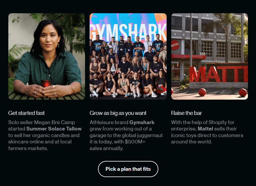
Just below the hero section, you’ll also find success stories from the likes of Gymshark and Mattel to build credibility.
The main goal of any homepage is to give visitors a broad overview of what the site is about.
Via Shopify
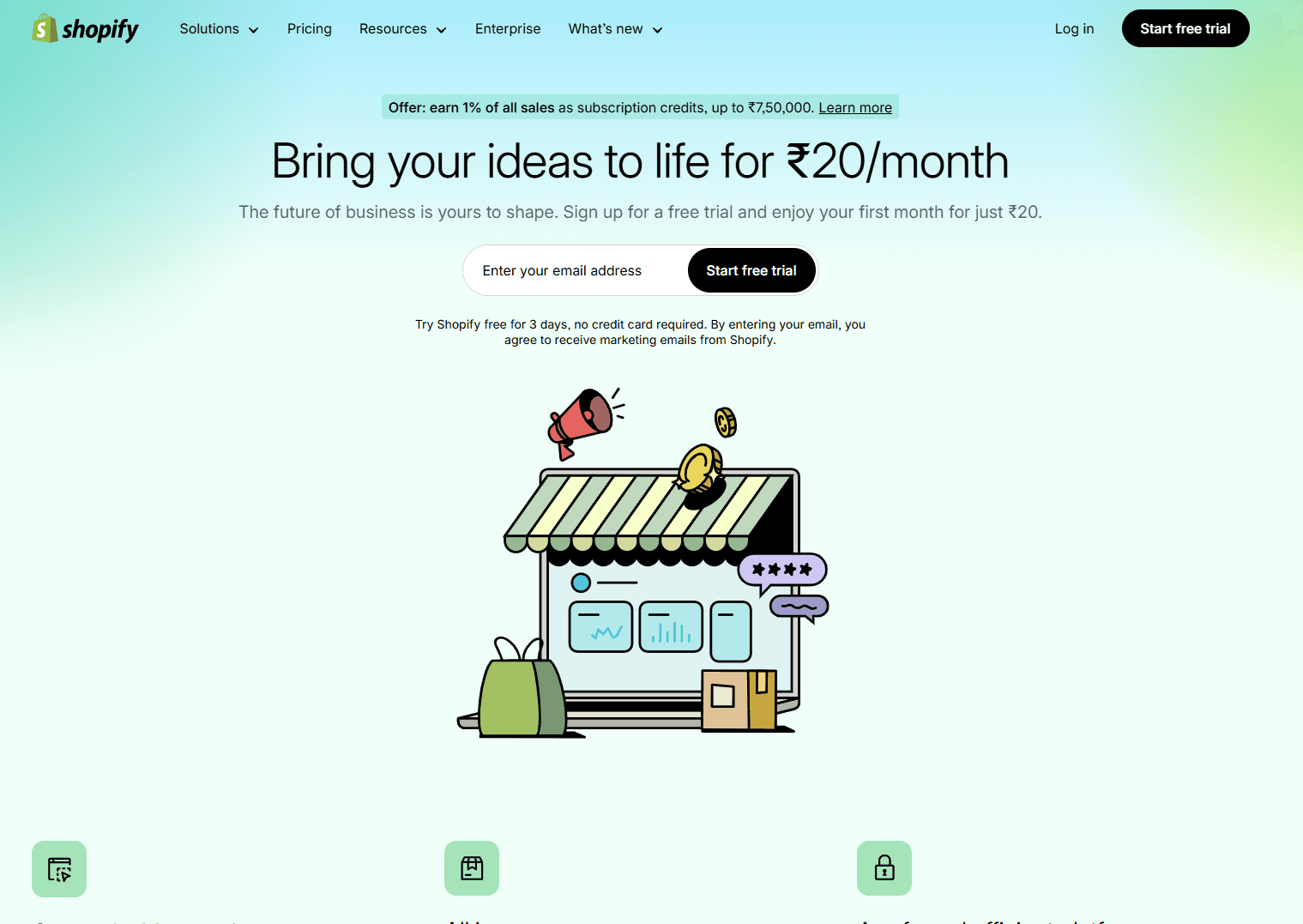
And this is Shopify’s free trial landing page. Quite different, aren’t they?
The first thing you’d notice, compared to the homepage, is how barren it feels.
No, the designers did not run out of budget while designing the landing page. This is intentional—landing pages are kept simple and distraction-free so that users are not diverted from the goal of converting.
Plus, this landing page is made for potential users who are already interested in trying out Shopify or are close to making a decision. There’s no need to tell them what Shopify does and who it is for.
This is why, out of all things, competitive pricing is put front and center. It's supposed to lure the audience at the bottom of the funnel into starting a trial and finding out how Shopify can do so much for so little.
No matter what landing page you design, try Fibr AI to boost conversions, get more traffic, and increase revenue.
Fibr AI personalizes your landing pages for every visitor based on vernacular, location, search query, and more. This means visitors get to see more of what they’re looking for.
How? Check out Fibr AI to learn how to turn your landing pages into high-performing conversion machines.
Differences Between Home Page and Landing Page
Alright, now that we have the basics cleared, let’s dive into the specifics of these differences.
Purpose
The primary purpose of a landing page, as we have already said, is to convert. How?
Unlike homepages, which give a loose overview of the site's content, landing pages are laser-focused. They aim to nudge customers towards one specific action, be it making a purchase or downloading a demo.
They aim to satisfy a specific group with a specific goal. This means that a user group with the intent of purchasing the enterprise edition of X software won’t waste time on the homepage and land straight on the landing page (pun intended).
You won’t find long product overviews or descriptions on a landing page, just targeted messaging that convinces users to take the final step toward conversion.
Naturally, you won’t find any tailored messaging on homepages as they aim to satiate a broader audience.
Via Zola
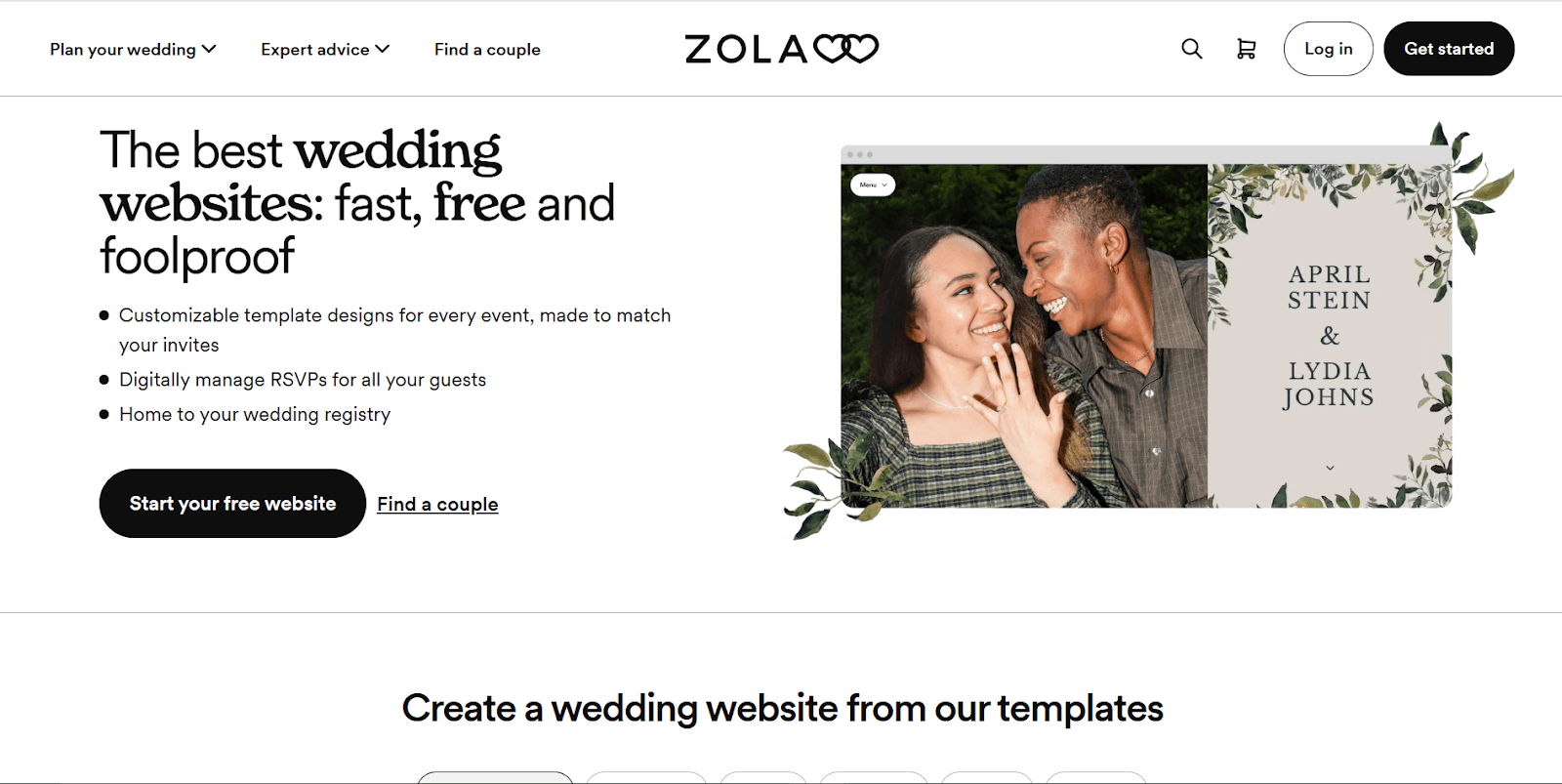
For instance, Zola’s website builder landing page highlights just the three biggest USPs of its platform “fast, free, and foolproof” and doesn’t talk about Zola's other offerings like venues and budgeting (at least not in the hero section).
Structure
Since landing pages are supposed to draw the attention of a particular section, they are usually shorter and more focused than home pages. Home pages are longer and have a variety of links as they are mainly navigational.
A home page should ideally be unique. It educates the audience about the brand while making sure visitors find exactly what they are looking for. It should be appealing enough so that visitors can’t help but scroll.
Homepages are also generally more visual-oriented, for a better and more memorable first impression. You’ll notice plenty of eye-catching product photography or renders designed to make the audience excited about the product or service.
Landing pages, on the other hand, should have a clear CTA. To make conversion easier and clearer, landing pages should ideally lack navigation so as to not confuse visitors.
Traffic
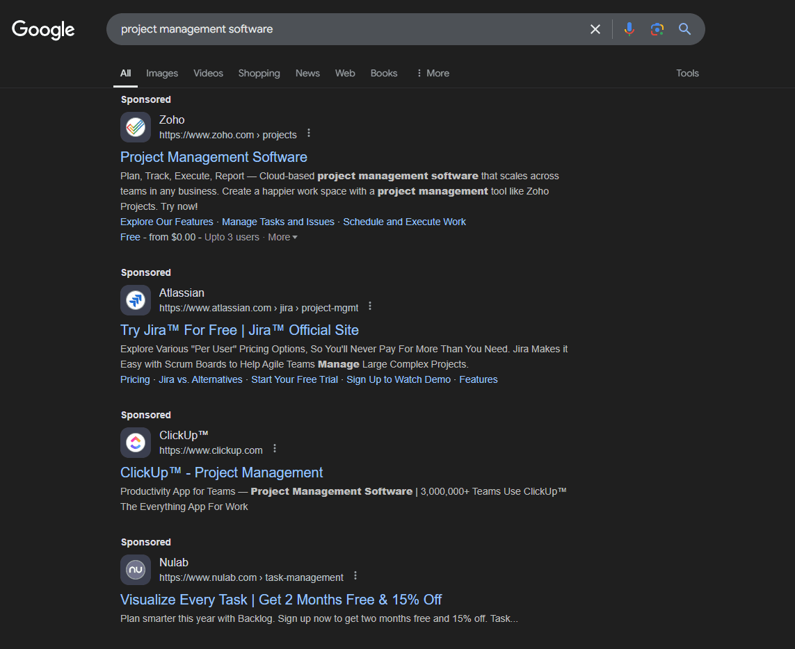
If you search for “project management software” on Google, you’ll likely notice several ads at the top of the results page.
Via Google Search
Since companies are paying for those prime advertising spots, it makes much more sense to send that traffic to a focused landing page rather than a generic homepage.
And that’s exactly what most successful brands do.
For example, here’s Zoho…

Via Zoho CRM
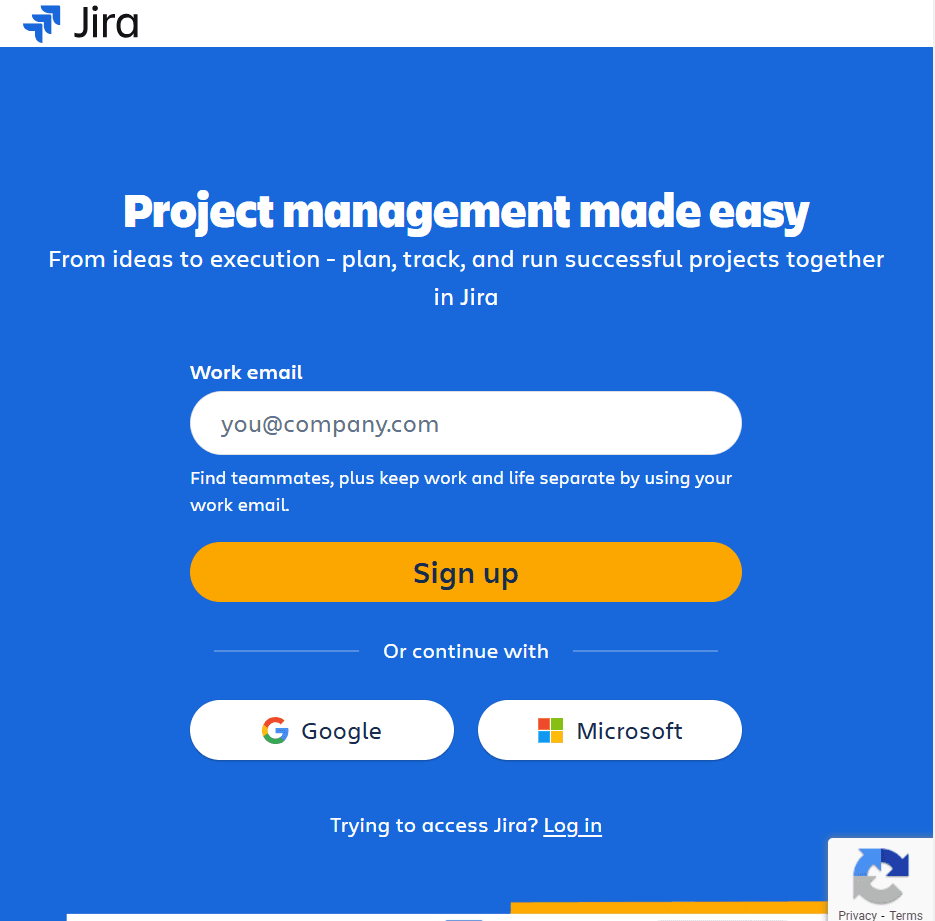
And here’s Jira…
Via Jira
The takeaway? When running paid campaigns—whether on Google, Facebook, or other platforms—you should send traffic to a dedicated landing page with one clear goal. A focused landing page is far more likely to convert visitors and deliver a higher ROAS (Return On Ad Spend).
In contrast, sending paid traffic to your homepage is almost never a good idea. Homepages are aimed at a much broader audience and serve multiple purposes, like building brand awareness or engaging organic traffic from unpaid sources like direct visits, search engine queries, or social media shares.
Navigation
Navigation decides the user experience, accessibility, and conversion rates of any website. It is important because it helps users find what they need while reinforcing brand credibility.
However, regarding landing pages, the navigation approach is very different.
Landing pages prioritize focus and simplicity, and navigation is intentionally minimized or removed altogether. Unlike a homepage, which provides broad navigation options, a landing page is built around a single, specific goal.
Most landing pages omit standard navbars full of links to avoid distractions. The idea is to guide visitors toward the primary CTA without offering exit points or alternative routes.
An internal navbar can be introduced on longer landing pages to help users easily move between sections. It keeps the experience user-friendly without pulling focus from the main goal.
Homepages are the opposite—they are designed to give you a comprehensive overview of your brand and guide users to various parts of your website.
A homepage typically includes a header with a menu bar, links to key sections, CTAs, a search bar, and sometimes dropdowns for easy access to product categories. The footer reinforces the user journey with additional links to important pages like the About Us, Contact, FAQ, and social media profiles.
Let’s go over the differences once more:
The Secret to Better Landing Pages
Fibr AI's personalization engine lets you design 1:1 personalized experiences for every visitor, intelligently adapting content, headlines, visuals, and even CTAs to each visitor's behavior, intent, and preferences.
Knowing the difference between a website home page and a website landing page is the first of many steps you’ll take for a successful, high-converting website.
However, the entire process becomes much easier with a tool like Fibr by your side. Fibr is an all-in-one CRO suite that bundles landing page personalization, AI-powered site and content management and a powerful, lifetime-free A/B testing suite in a single platform.
Book a demo today.
When should I use a website landing page?
Use a landing page when you want to focus on one goal, like capturing leads, promoting a product, or encouraging sign-ups. Landing pages are perfect for paid ads, email campaigns, or any situation where you need to direct visitors to a single action without distractions.
When should I use a website home page?
Your homepage is your website’s welcome mat. Use it when you want to introduce your brand, provide an overview of what you offer, and guide visitors to different sections of your site.
What is the primary purpose of a website landing page and home page?
The primary purpose of a landing page is to drive a specific action; it might be making a purchase, signing up for a newsletter, or downloading a resource. It’s all about conversion.
On the other hand, the homepage’s purpose is to become the central hub, giving visitors easy access to various parts of your website and helping them understand what your brand is about.
Can a website landing page be the same as a homepage?
Technically, yes, but it’s not ideal. While a homepage can technically function as a landing page if you design it with a very specific goal in mind, landing pages are typically more focused. Combining both will confuse visitors and hinder conversions, so it’s usually better to keep them separate.





Pritam Roy
Co-Founder @ Fibr AI
Pritam Roy, the Co-founder of Fibr, is a seasoned entrepreneur with a passion for product development and AI. A graduate of IIT Bombay, Pritam's expertise lies in leveraging technology to create innovative solutions. As a second-time founder, he brings invaluable experience to Fibr, driving the company towards its mission of redefining digital interactions through AI.
Table of Content
Read summarized version with
Contrary to popular belief, stuffing your homepage with CTAs and PPC ads doesn’t automatically make it a landing page.
So, what differentiates a landing page from a homepage? The answer lies in their purpose.
At first glance, homepages and landing pages might be hard to tell apart. However, both are designed with entirely different goals in mind and each has its own place in your business strategy.
Let’s break down the core differences between a landing page and a homepage. We’ll break it all down—definitions, must-have elements, and the best ways to use them in your marketing funnel to drive optimal results.
We start at zero: definitions.
Quick Summary
A home page is the door to your website and in extension to your brand and product.
A landing page is a specific page on your website that convinces users to take a particular action, such as downloading a brochure or adding a product to cart.
A homepage needs to be attractive and informational, but a landing page needs to be focused and persuasive.
Navigation is usually removed from landing pages to keep it less distracting, but it is a key component of home pages.
Instead, the call to action takes prominence on a landing page.
Although you can technically make your homepage act like a landing page, doing so will breed inefficiency and user confusion.
What is a Website Landing Page?
A website landing page is a dedicated web page created specifically for a marketing or advertising campaign. The main purpose of a landing page is to nudge visitors toward a single, clear action. This action can be anything—filling out a form, making a purchase, or subscribing to an email newsletter.
Unlike regular pages on your site, landing pages are standalone web pages made just for conversions. They are the optimized entry point for traffic coming from ads, emails, or social media, and they make it easier to guide visitors toward your desired outcome.
What makes a great landing page?
Every landing page is engineered with a conversion-first approach. All of them will have these components:
No navigation bar. Unlike most pages, landing pages usually skip the top navigation. This keeps visitors focused by eliminating distractions and forces them to either take action or leave. It also simplifies tracking conversions, as there are fewer variables at play.
A single, CTA. All roads lead to the same destination on a landing page. Whether you include one button or several, every CTA should direct users to the same goal—be it a form, checkout page, or download link.
High-quality visuals. Great design matters. Pair stunning product images with enough white space to maintain a clean, engaging layout that keeps visitors scrolling.
Separate from your main site. Landing pages are designed to stand alone. They aren’t typically accessible through your site’s navigation but are instead reached via targeted campaigns, like email blasts or paid ads.
Impactful above-the-fold content. The headline should immediately grab attention by addressing a problem your product solves while supporting text reinforces the value you offer.
Benefits-driven features. Once the visitor's interest is captured, these pages highlight what sets the product apart. Concise, benefit-focused copy showcases key features, often with icons to make the information visually digestible.
What is a Website Home Page?
The home page is a website's starting point or the primary interface between users and the site’s content. In its simplest form, it is the default page that loads when a domain name is accessed.
It is not, however, just for navigation—it is a critical element of user experience (UX), SEO branding, and conversion optimization. Essentially, it is the hub of a brand’s website; it introduces who you are and what you sell or provide.
Anatomy of a proper home page
Every memorable home page you visit will satisfy these requirements:
Smooth navigation. Home pages make it effortless for visitors to find what they’re looking for. A well-organized navigation menu with clear product categories guides shoppers directly to their ideal items without any confusion.
Engaging above-the-fold content. There is only one chance to make a first impression. The job of the content at the top of the page is to grab attention and motivate users to explore further.
Quality product visuals. Products need to look their absolute best online. High-quality images excite and inspire and a visually appealing layout that invites users to keep clicking.
Compelling CTAs. Generic phrases like "Click Here" don’t work. Home pages employ action-oriented language that inspires users to act, like "Shop now" or "Discover Your Perfect Match."
Product-first focus. While homepages serve many purposes, their primary job is to highlight your product or offering. Most home pages prioritize showing them over brand detail.
Brand storytelling. Sharing your story helps you connect with your audience. That’s why you’ll find links to your About Us page, mission statement, and social media profiles so visitors can learn more about what makes your brand unique.
Bonus: Do The Home Page and Landing Page Differ In the Backend?
Ok, this is just what you see on your screen. But what’s powering all that?
Remember that the technical framework is the same throughout the website, be it for the homepage or a landing page.
HTML provides the structure and semantic elements of the pages, defining headers, paragraphs, lists, and hyperlinks. CSS handles the visual design, including layout, typography, colors, and responsiveness for various devices.
All interactive elements, such as animations, dropdown menus, and dynamic content loading, are courtesy of Javascript. Server-side rendering (SSR) and Client-side rendering (CSR) decide how the page content reaches the users. SSR pre-renders HTML on the server, while CSR generates the page in the browser.
A content delivery network, or CDN distributes page assets globally for reduced latency. It also helps with load times for users across different regions. Backend integrations are also often connected to CRM systems, email marketing platforms, and databases to capture and process leads optimally.
Home Page vs. Landing page: Shopify Example
Before we discuss the details of landing pages and home pages, let’s examine an example from Shopify.
Via Shopify
This is Shopify’s homepage.
The homepage, if you notice, is made to cater to a wide group of people. It highlights how Shopify can support businesses of all sizes and industries, be it entrepreneurs, small businesses, and enterprises.
Via Shopify
Just below the hero section, you’ll also find success stories from the likes of Gymshark and Mattel to build credibility.
The main goal of any homepage is to give visitors a broad overview of what the site is about.
Via Shopify
And this is Shopify’s free trial landing page. Quite different, aren’t they?
The first thing you’d notice, compared to the homepage, is how barren it feels.
No, the designers did not run out of budget while designing the landing page. This is intentional—landing pages are kept simple and distraction-free so that users are not diverted from the goal of converting.
Plus, this landing page is made for potential users who are already interested in trying out Shopify or are close to making a decision. There’s no need to tell them what Shopify does and who it is for.
This is why, out of all things, competitive pricing is put front and center. It's supposed to lure the audience at the bottom of the funnel into starting a trial and finding out how Shopify can do so much for so little.
No matter what landing page you design, try Fibr AI to boost conversions, get more traffic, and increase revenue.
Fibr AI personalizes your landing pages for every visitor based on vernacular, location, search query, and more. This means visitors get to see more of what they’re looking for.
How? Check out Fibr AI to learn how to turn your landing pages into high-performing conversion machines.
Differences Between Home Page and Landing Page
Alright, now that we have the basics cleared, let’s dive into the specifics of these differences.
Purpose
The primary purpose of a landing page, as we have already said, is to convert. How?
Unlike homepages, which give a loose overview of the site's content, landing pages are laser-focused. They aim to nudge customers towards one specific action, be it making a purchase or downloading a demo.
They aim to satisfy a specific group with a specific goal. This means that a user group with the intent of purchasing the enterprise edition of X software won’t waste time on the homepage and land straight on the landing page (pun intended).
You won’t find long product overviews or descriptions on a landing page, just targeted messaging that convinces users to take the final step toward conversion.
Naturally, you won’t find any tailored messaging on homepages as they aim to satiate a broader audience.
Via Zola
For instance, Zola’s website builder landing page highlights just the three biggest USPs of its platform “fast, free, and foolproof” and doesn’t talk about Zola's other offerings like venues and budgeting (at least not in the hero section).
Structure
Since landing pages are supposed to draw the attention of a particular section, they are usually shorter and more focused than home pages. Home pages are longer and have a variety of links as they are mainly navigational.
A home page should ideally be unique. It educates the audience about the brand while making sure visitors find exactly what they are looking for. It should be appealing enough so that visitors can’t help but scroll.
Homepages are also generally more visual-oriented, for a better and more memorable first impression. You’ll notice plenty of eye-catching product photography or renders designed to make the audience excited about the product or service.
Landing pages, on the other hand, should have a clear CTA. To make conversion easier and clearer, landing pages should ideally lack navigation so as to not confuse visitors.
Traffic
If you search for “project management software” on Google, you’ll likely notice several ads at the top of the results page.
Via Google Search
Since companies are paying for those prime advertising spots, it makes much more sense to send that traffic to a focused landing page rather than a generic homepage.
And that’s exactly what most successful brands do.
For example, here’s Zoho…
Via Zoho CRM
And here’s Jira…
Via Jira
The takeaway? When running paid campaigns—whether on Google, Facebook, or other platforms—you should send traffic to a dedicated landing page with one clear goal. A focused landing page is far more likely to convert visitors and deliver a higher ROAS (Return On Ad Spend).
In contrast, sending paid traffic to your homepage is almost never a good idea. Homepages are aimed at a much broader audience and serve multiple purposes, like building brand awareness or engaging organic traffic from unpaid sources like direct visits, search engine queries, or social media shares.
Navigation
Navigation decides the user experience, accessibility, and conversion rates of any website. It is important because it helps users find what they need while reinforcing brand credibility.
However, regarding landing pages, the navigation approach is very different.
Landing pages prioritize focus and simplicity, and navigation is intentionally minimized or removed altogether. Unlike a homepage, which provides broad navigation options, a landing page is built around a single, specific goal.
Most landing pages omit standard navbars full of links to avoid distractions. The idea is to guide visitors toward the primary CTA without offering exit points or alternative routes.
An internal navbar can be introduced on longer landing pages to help users easily move between sections. It keeps the experience user-friendly without pulling focus from the main goal.
Homepages are the opposite—they are designed to give you a comprehensive overview of your brand and guide users to various parts of your website.
A homepage typically includes a header with a menu bar, links to key sections, CTAs, a search bar, and sometimes dropdowns for easy access to product categories. The footer reinforces the user journey with additional links to important pages like the About Us, Contact, FAQ, and social media profiles.
Let’s go over the differences once more:
The Secret to Better Landing Pages
Fibr AI's personalization engine lets you design 1:1 personalized experiences for every visitor, intelligently adapting content, headlines, visuals, and even CTAs to each visitor's behavior, intent, and preferences.
Content
Knowing the difference between a website home page and a website landing page is the first of many steps you’ll take for a successful, high-converting website.
However, the entire process becomes much easier with a tool like Fibr by your side. Fibr is an all-in-one CRO suite that bundles landing page personalization, AI-powered site and content management and a powerful, lifetime-free A/B testing suite in a single platform.
Book a demo today.
FAQs
When should I use a website landing page?
Use a landing page when you want to focus on one goal, like capturing leads, promoting a product, or encouraging sign-ups. Landing pages are perfect for paid ads, email campaigns, or any situation where you need to direct visitors to a single action without distractions.
When should I use a website home page?
Your homepage is your website’s welcome mat. Use it when you want to introduce your brand, provide an overview of what you offer, and guide visitors to different sections of your site.
What is the primary purpose of a website landing page and home page?
The primary purpose of a landing page is to drive a specific action; it might be making a purchase, signing up for a newsletter, or downloading a resource. It’s all about conversion.
On the other hand, the homepage’s purpose is to become the central hub, giving visitors easy access to various parts of your website and helping them understand what your brand is about.
Can a website landing page be the same as a homepage?
Technically, yes, but it’s not ideal. While a homepage can technically function as a landing page if you design it with a very specific goal in mind, landing pages are typically more focused. Combining both will confuse visitors and hinder conversions, so it’s usually better to keep them separate.
Pritam Roy
Co-Founder @ Fibr AI
Pritam Roy, the Co-founder of Fibr, is a seasoned entrepreneur with a passion for product development and AI. A graduate of IIT Bombay, Pritam's expertise lies in leveraging technology to create innovative solutions. As a second-time founder, he brings invaluable experience to Fibr, driving the company towards its mission of redefining digital interactions through AI.