Read summarized version with
Ever wondered why your website is getting plenty of visitors, but hardly anyone is converting into a lead or a paying customer? Well, you are not alone. The average website conversion rate is just 2.35%, meaning for every 100 visitors, only about two take action. Even top-performing sites rarely exceed 5% conversion rates.
A low conversion rate isn’t just a metric—it’s lost revenue, wasted ad spend, and potential customers slipping away. So, what’s holding your conversions back? Is it unclear messaging? Poor user experience? A lengthy checkout process? Also, is there any way to fix it? The good news is 'YES'. Once you identify the bottlenecks, you can fix them and start seeing real results.
So, read this blog to understand what a low conversion rate is, why it matters, and how to identify and fix your conversion rates. By the end, you’ll have a clear action plan to boost your conversions, maximise revenue, and get the most out of your website traffic.
TL;DR
A low conversion rate refers to the percentage of users who do not complete a desired action, such as making a purchase or signing up. It indicates inefficiencies in marketing, user experience, or audience targeting.
Common culprits include slow speed, unclear messaging, poor UX, and complicated checkout.
Analytics, heatmaps, A/B testing, and user feedback help pinpoint conversion bottlenecks.
Quick fixes: optimize site speed, simplify checkout, improve CTAs, and add trust signals.
AI-driven CRO tools like Fibr.ai, Optimizely, and Hotjar automate testing and personalization.
CRO is a continuous process—regular optimization ensures sustained growth and better ROI.
What is a Low Conversion Rate?
Low conversion rate is the percentage of visitors to your website, landing page, or marketing campaign who complete the targeted activity. That may include making a purchase, signing up for a newsletter, scheduling a call, or installing an app—essentially anything that advances a potential consumer down the sales funnel.
A low conversion rate indicates that, despite having traffic (via ads, social media, or organic search), only a small percentage of individuals are converting.
But here's the deal: "low" is relative. What is considered a low conversion rate in one industry could be quite average in another. For example, an auto business's conversion rate of 3.7% is good, whereas a real estate company can work with 2.4%.
You can have a low conversion rate due to a complicated checkout process, unclear value proposition, poor web and mobile optimisation, or slow-loading pages. What is the good news? A low conversion rate is not a dead end. It is an opportunity to improve your business.
Why Does a Low Conversion Rate Matter?
A low conversion rate can have a massive impact on your business. Some of the reasons why it matters are as follows:
1. Wasted Marketing Spend
When your conversion rate is low, you are simply investing money in marketing without getting a significant return. Every ad click, email campaign, or social network post directs traffic to your website, which takes time and money.
However, if visitors do not take action—whether by making a purchase, signing up, or filling out a form—you will not receive the value you expect. This increases your cost per acquisition (CPA), making your marketing campaigns less effective. This can eventually lead to budget difficulties, leading you to reduce your advertising spending.
2. Lost Revenue Opportunities
Each visitor who does not convert is a missed revenue opportunity. For instance, if you run an eCommerce store, a low conversion rate indicates that potential customers are leaving without making a purchase. In service-based enterprises, it may result in fewer enquiries or sign-ups.
Low conversion rates can lower the amount of repeat clients and recommendations, making long-term growth more difficult. Small improvements, such as improving conversions from 2% to 4%, can increase your revenue without adding visitors.
3. Poor Return on Investment (ROI)
If you spend money on paid ads, content marketing, or SEO, your ROI is determined by how well your visitors convert. A low conversion rate indicates that your investment is not paying off as intended. Imagine spending thousands of dollars on marketing and only receiving a few conversions—your cost per sale becomes unsustainable.
Poor ROI has a long-term impact on corporate growth. Investors and stakeholders often consider critical performance criteria, such as conversion rates, to determine profitability. If the conversion rate remains poor, scaling your business becomes difficult because you will continually want more traffic to maintain the same revenue level.
4. Signals Underlying Business Problems
A low conversion rate often points to bigger, underlying issues in your business. It could be that your website design is confusing, your pricing is unclear, or your messaging isn’t resonating with the right audience. Sometimes, it’s a technical issue—like a slow website or a complicated checkout process—that drives visitors away before they convert.
Sometimes, it might be a deeper issue, like targeting the wrong audience. If people visit your site but do not convert, they might not be the ideal customers for your offer. Instead of focusing only on increasing traffic, businesses should analyse conversion data to pinpoint and fix these issues.
5. Negative Impact on Customer Experience
A low conversion rate is often a sign that visitors aren’t finding what they need or are facing obstacles along the way. The issue could be the website's speed or a tedious checkout process. Hence, if potential customers are leaving before converting, there’s likely an issue with user experience (UX).
Poor UX doesn’t just hurt conversions—it damages your brand reputation and reduces customer trust. Frustrated users are unlikely to return, which leads to a loss of sales and long-term loyalty. A great user experience = higher conversions + stronger brand loyalty.
Common Reasons of Low Conversion Rates
A low conversion rate can signal inefficiencies in your website, marketing, or sales funnel. Below are some of the common reasons for low conversion rates:
1. Slow Website Speed & Poor Performance
Website speed is a major factor affecting user experience, conversions, and revenue. When visitors land on your site, they expect instant access to information, and even a minor delay can drive them away.
Studies show that 53% of users abandon a site if it takes longer than 3 seconds to load. Even a 1-second delay can reduce conversions by 7%. In the case of mobile commerce, the impact is even worse, as users expect fast, seamless experiences. Every second delay can reduce conversions by 20%.
So, if your site is sluggish, visitors are likely to leave before they even see your offer. Amazon found that a 100-millisecond delay in load time can cost them 1% in revenue, showing how critical speed is for high-traffic businesses.
Beyond user behaviour, website speed also impacts search engine rankings. Google prioritises fast-loading websites in search results, meaning a slow website isn’t just losing conversions—it’s also losing organic traffic. This creates a double loss: fewer visitors landing on your site and fewer of them converting.
For instance, Bukvybag, an online store specialising in multifunctional bags, struggled to communicate its unique value proposition to potential customers effectively. As a result, visitors were not fully engaging with the brand, leading to high bounce rates and missed conversion opportunities.
They tested multiple headlines and identified which messaging resonated most with customers. This data-driven approach boosted conversion rates and revenue, allowing them to refine their value proposition for maximum impact.
Here are the headlines they experimented with, each emphasising a different, unique selling point:
Original: Versatile bags & accessories
Variant A: Stand out from the crowd with our fashion-forward and unique bags
Variant B: Discover the ultimate travel companion that combines style and functionality
Variant C: Premium quality bags designed for exploration and adventure
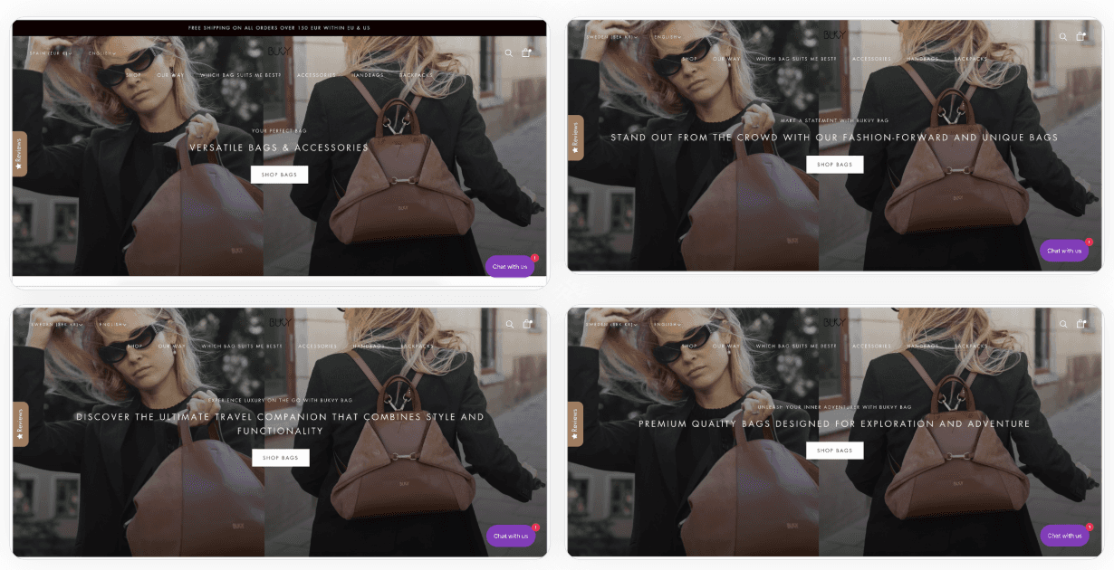
Through strategic A/B testing, this helped them achieve an impressive 45% surge in orders, demonstrating the effectiveness of their optimisation efforts.
2. Unclear or Weak Value Proposition
Your value proposition is the first thing visitors evaluate when deciding whether to take action. If your message is unclear, generic, or uninspiring, they won’t see a reason to stay. A study by HubSpot found that 55% of visitors spend fewer than 15 seconds on a website before leaving if they don’t immediately understand the benefit.
A strong value proposition should answer three questions:
What does your product/service do?
How does it benefit the customer?
Why should they choose you over competitors?
If your website focuses too much on features rather than benefits, visitors may struggle to understand how your solution solves their problem. Instead of saying, “Our software has AI-powered analytics,” a stronger value proposition would be: “Our AI-powered analytics save you 10+ hours per week by automating reporting.”
3. Complicated Checkout or Sign-Up Process
A long or confusing checkout process is one of the biggest reasons for cart abandonment in eCommerce. Research shows that 17% of cart abandonments occur because of a long and complicated checkout process.
Some of the common checkout roadblocks include:
Too many form fields (asking for unnecessary details)
Forcing users to create an account before purchasing
Lack of multiple payment options
Unexpected extra fees (which cause 48% of cart abandonments)
The same applies to sign-up forms for SaaS and service-based businesses. Long, intrusive forms discourage users from completing the process. Even reducing form fields from 4 to 1 can lead to a 50% increase in sign-ups. Businesses that simplify their checkout and sign-up flow see higher conversion rates, lower cart abandonment, and happier customers.
For Example, User tests conducted by Baymard showed that users expect to find the guest checkout on the top-left part of the screen.
When they didn't find the guest checkout there, 14% of desktop users couldn't figure out the checkout process and ended up abandoning the website. The results were even worse on mobile, with 53% of users having severe issues identifying the guest checkout option. Despite this, 65% of ecommerce websites don’t make guest checkout prominent.
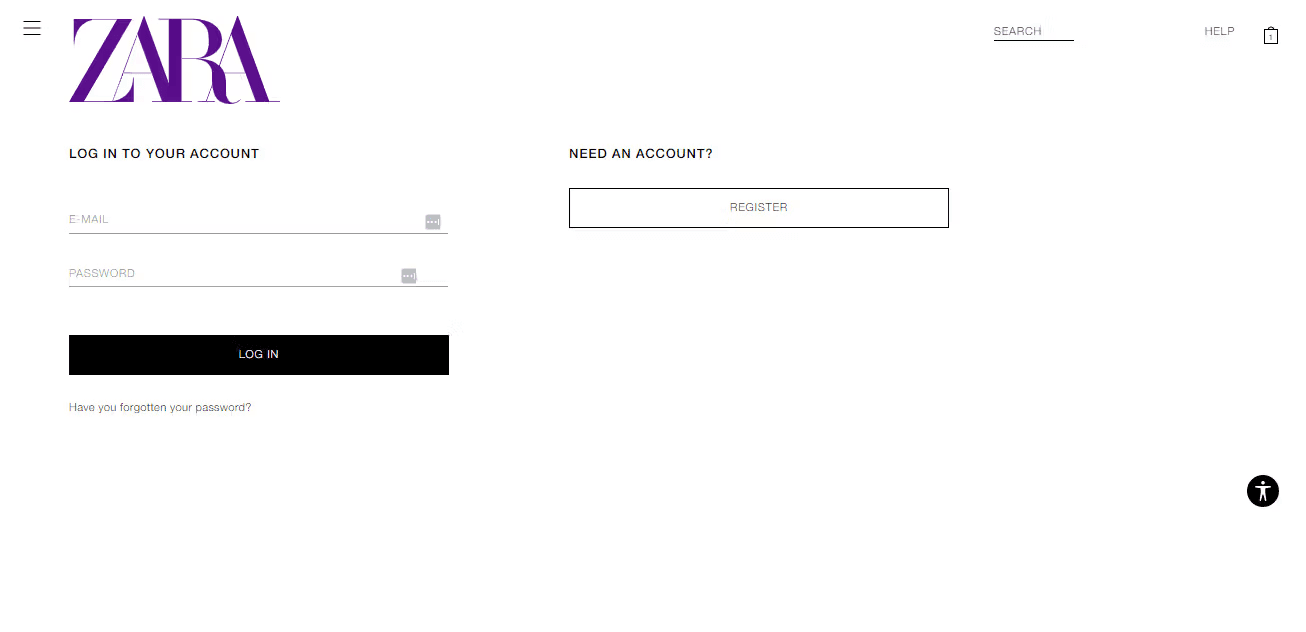
Zara doesn’t even offer a guest checkout option. Every buyer must create an account, which can be problematic as many people would rather not. Moreover, upon landing on the checkout page, the "Log In" option is open by default.
So, to create an account, Zara customers must first click on the "Register" button under the “Need an Account?” heading, which needlessly complicates the checkout process.
4. Lack of Trust & Credibility
Consumers are sceptical when shopping online, and trust plays a huge role in conversions. If your website lacks credibility, visitors will hesitate to enter their details or make a purchase.
Research shows that 92% of consumers hesitate to buy if there are no customer reviews, and 18% of users abandon checkout because they don’t trust the site with their credit card information.
Factors that erode trust include:
Lack of customer reviews or testimonials
No trust badges (e.g., SSL security, payment encryption) on checkout pages
No clear refund/return policy
Missing contact information or poor website design
Businesses that display customer testimonials, trust seals, and transparent policies see a 34% boost in conversions. Pipedrive, a sales CRM, boosted its free trial sign-up rate by 8% by incorporating social proof on a paid landing page.
5. Poor Mobile Experience
With 62.54% of global web traffic coming from mobile devices, a bad mobile experience can kill conversions. Google found that 61% of users won’t return to a site if they had trouble accessing it on mobile, and 40% will go straight to a competitor’s site instead.
Common mobile issues include:
Non-responsive design (text/images too small, hard-to-click buttons)
Slow load times on mobile
Forms that are difficult to fill out on a smartphone
A Google study showed that mobile-optimised sites can increase conversions by 32%. Despite this, many businesses still prioritise desktop experiences, ignoring the fact that most users now browse and shop on mobile.
6. Weak Call-to-Action (CTA)
A weak, unclear, or misplaced call-to-action (CTA) leads to confusion and lost conversions. Studies show that 70% of small business websites lack a clear CTA on their homepage, making it harder for users to take the next step.
A strong CTA should be:
Action-driven (“Get Your Free Trial” instead of “Click Here”)
Visible & bold (contrasting colours, easy-to-spot placement)
Urgent (“Limited Offer – Sign Up Now”)
Moreover, Unbounce research shows that CTA button colour, wording, and placement can impact conversion rates by up to 21%. For instance, small tweaks, like changing a button from green to red, helped HubSpot boost conversions by 21%.
How to Identify Conversion Rate Issues?
Before you can fix a low conversion rate, you need to identify the root cause of the problem. Many businesses struggle to understand why visitors leave without converting, but using data-driven insights; you can pinpoint exactly where users drop off and why. Below are some ways to effectively identify conversion rate issues.
1. Analyse Your Conversion Funnel
A conversion funnel maps the journey visitors take from landing on your site to completing a goal, such as making a purchase, signing up, or requesting a demo. If users are dropping off at a particular stage, that’s where your problem lies.
How to Identify Issues?
Use Google Analytics Funnel Reports or tools like Hotjar to track where users leave.
Look at the drop-off rates between steps (e.g., product page → cart → checkout).
If a high percentage of visitors add products to the cart but abandon checkout, your checkout process may be too complicated.
Example: If 70% of users reach the checkout page but only 15% complete a purchase, your payment options, pricing transparency, or checkout process may be discouraging buyers.
2. Track Website Behavior
Understanding why visitors don’t convert requires more than just looking at numbers—it requires observing real user behaviour. Heatmaps and session recordings provide visual insights into how users interact with your site, showing exactly where they click, how far they scroll, and where they hesitate or drop off.
How to Identify Issues?
Heatmaps display the most-clicked (hot) and least-clicked (cold) areas of your site. If important elements like your CTA buttons are in cold zones, users may not see them, or they may be poorly placed.
Make sure important content (like testimonials, pricing, or sign-up forms) isn’t too far down the page—scroll. Heatmaps can help reveal if users leave before reaching critical information. If yes, then rearranging content is important to make these sections visible.
Use session recordings to monitor visitors' navigation of your site in real-time. If users hesitate, repeatedly click without results, or drop off at certain points, this may signal technical issues or unclear instructions that hinder conversions.
Example: A travel booking site noticed users hovered over flight prices but didn’t click "Book Now." After testing, they realised customers wanted to see price breakdowns before booking—once added, conversions increased by 15%.
3. Measure Website Load Speed & Performance
A slow website can dramatically reduce engagement and conversions. Studies show that 53% of users leave if a page takes longer than 3 seconds to load, and a 1-second delay can reduce conversions by 7%.
How to Identify Issues?
Use Google PageSpeed Insights or GTmetrix to run a speed test and get a performance score.
Optimise site speed by compressing large images without quality loss, removing unnecessary third-party scripts that slow loading times, and upgrading to a faster server or using a CDN to reduce latency.
Mobile users expect fast performance, but many sites aren't optimised for speed. Use Google’s Mobile-Friendly Test to identify and fix issues for a seamless mobile experience.
For example, Walmart increased conversions by 2% for every 1-second improvement in page speed, which resulted in millions in additional revenue.
4. Analyse High Bounce & Exit Rates
Did you know the average bounce rate is between 41% - 55%? A high bounce rate (users leaving after viewing only one page) or high exit rate (users dropping off at a key step) signals a mismatch between user expectations and site experience.
How to Identify Issues?
Go to Google Analytics → Behavior → Site Content → Landing Pages. Identify the pages with the highest bounce rates and analyse whether they provide clear value or an obvious next step.
A high homepage bounce rate indicates unclear messaging or a lack of user engagement. To capture attention, align your message with the user intent, test stronger headlines, clearer CTAs, and engaging visuals.
If users exit the cart page, they may be facing unexpected fees, forced sign-ups, or a complicated checkout process. If they leave the pricing page, they might not see the product’s value or feel confident enough to commit.
Example: A SaaS company found 60% of users abandoned sign-ups on the pricing page. After testing clearer pricing and a free trial option, conversions increased by 25%.
5. Test & Optimise Your Call-to-Action (CTA)
Your Call to Action (CTA) is one of the most crucial elements on your website. It tells users what to do next and encourages them to take action. If your CTA is unclear, uncompelling, or poorly placed, visitors may leave without converting. A weak CTA results in missed opportunities and low engagement.
How to Identify Issues?
A/B Test different CTA colours, sizes, and wording (e.g., "Get Started Now" vs "Start Free Trial") to see what resonates best. Ensure the CTA stands out visually against the background for maximum impact.
Use Google Analytics to track CTA engagement. A low CTR may indicate that users are overlooking or ignoring it—test different placements, designs, and wording to improve visibility and effectiveness.
Use action-oriented language (e.g., "Claim Your Discount Now" instead of "Learn More") and create urgency (e.g., "Limited Offer – Sign Up Today!"). Ensure CTAs are positioned above the fold for maximum visibility.
Example: HubSpot ran an A/B test by changing the colour of its CTA button from green to red and saw a 21% increase in sign-ups. The red button stood out more, making it more eye-catching and clickable.
6. Collect Customer Feedback & Surveys
Sometimes, the most effective way to identify why visitors aren’t converting is simply to ask them directly. While analytics tools can show where users drop off, they often don’t explain why. By gathering real customer feedback, businesses can uncover hidden pain points, such as pricing concerns, unclear product details, or checkout frustrations.
How to Identify Issues?
Use exit-intent popups to capture feedback when users try to leave. Ask questions like “What stopped you from purchasing today?” or “Did you find what you were looking for?” If many users cite pricing, product details, or trust issues, those areas may need improvement.
Send email surveys to users who abandon checkout or sign up, asking about pain points (e.g. “What prevented you from completing your purchase?”). Offering a small incentive like a discount or free shipping can boost response rates.
Categories feedback into common issues like unclear product info, lack of trust signals, or a confusing checkout process. Prioritise changes based on high-impact complaints that affect a large percentage of users to maximise improvements.
Example: A fashion eCommerce brand used surveys to ask users why they abandoned their cart. They found that many shoppers were hesitant because they weren’t sure about sizing. To solve this, they added a detailed size guide and a free return policy—resulting in an 18% increase in conversions.
7. Simplify Your Checkout or Sign-Up Process
A complicated or lengthy checkout process is one of the biggest reasons for cart abandonment and lost conversions. If your signup process has too many steps, unclear instructions, or forced account creation, they are more likely to abandon their purchase and go elsewhere. An easy checkout should be fast, clear, and friction-free to prevent drop-offs and increase completed transactions.
How to Identify Issues?
Use Google Analytics Enhanced eCommerce Tracking to analyse how far users go before abandoning checkout. Identify specific steps where users drop off—billing details, payment, or the review order page—to pinpoint and fix friction points.
Use form analytics to track where users hesitate or abandon the form. If a specific field takes too long to complete or is frequently left blank, it may be unnecessary, confusing, or causing friction—consider simplifying or removing it.
Reduce unnecessary fields to speed up checkout and prevent drop-offs. Offer multiple payment options (PayPal, credit/debit) to accommodate user preferences. Allow users to checkout by eliminating barriers and improving conversions.
Example: Expedia removed one unnecessary field (“Company Name”) in its booking form, increasing revenue by $12 million annually.
8. Segment Traffic to Find Audience Mismatches
Even with a well-designed website and compelling offers, a business can have low conversion rates if you’re attracting the wrong audience. Many companies waste money on marketing efforts that drive unqualified traffic—people who aren’t interested, ready to buy, or even the right fit for the product. Ensuring that your messaging aligns with the right audience is crucial for improving conversion rates.
How to Identify Issues?
Use Google Analytics Audience Reports to see where traffic comes from. Review visitor demographics, locations, and interests. If traffic is high but engagement is low, your targeting may be too broad. Refine your messaging and content to better match user intent.
Analyse conversion rates across organic, paid ads, social media, and referral traffic. If paid ads drive traffic but not conversions, your ad messaging may not align with user intent—adjust targeting and landing page content accordingly.
Ads and landing pages should use consistent messaging to match user expectations and improve conversions. For instance, if an ad promotes “Affordable Marketing Software” but the landing page emphasises “Enterprise-Level Automation,” visitors may feel misled and leave.
Example: Amazon was already a leading eCommerce platform, but they noticed that many visitors were browsing without making a purchase. Their generic product recommendations weren’t resonating with individual users. Amazon implemented AI-driven audience segmentation to track individual browsing behaviour, purchase history, and product preferences. They used this data to deliver personalised product recommendations tailored to each user’s interests. These personalized recommendations increased revenue by 35%.
Tools to Analyze and fix Low Conversion Rates
Some of the tools to analyse and fix low conversion rates are as follows:
1. Fibr AI

Image via Fibr AI
Fibr is your AI-driven CRO powerhouse, relentlessly focused on maximising conversions (Cx) and enhancing customer experience (CX). Unlike traditional CRO teams or agencies, Fibr operates 100x more efficiently, executes optimisations 10x faster, and costs just a fraction of conventional CRO solutions. It helps businesses triple their growth within 3-6 months.
By leveraging advanced AI technology, Fibr enables businesses to deliver conversion-driven experiences tailored to each visitor. This effectively reduces customer acquisition costs and boosts engagement. With a no-code interface, Fibr integrates into existing workflows, creating personalised campaigns across various channels.
Moreover, instead of static pages, businesses get self-optimizing, continuously evolving growth engines. With dynamic personalisation, real-time testing, and proactive monitoring, Fibr solves the biggest challenges faced by marketers.
Key Features
1. Dynamic Personalization
At the heart of creating hyper-personalized user experiences is Fibr's AI-powered personalization engine. It enables marketers to deliver 1:1 tailored experiences for every visitor, ensuring maximum engagement and conversions.
Real-Time Adaptation: Content, headlines, visuals, and CTAs adjust dynamically based on visitor behaviour, intent, and preferences.
Deep Audience Insights: Integrates with Google Ads, Meta Ads, and LinkedIn Ads to align landing pages with campaign goals and audience interests.
Enhanced Engagement: By delivering highly relevant experiences, it increases user interaction, boosts conversions, and maximises marketing ROI.
2. Continuous A/B Testing
Fibr's A/B testing and optimization engine is designed to refine website performance through intelligent experimentation. Unlike traditional testing, it runs 24/7 experiments, ensuring your site is always evolving for better results.
Automated Hypothesis Testing: Analyses website content, visuals, and conversion goals to generate data-backed A/B test variations.
Always-On Optimisation: Run unlimited tests in real time to identify the highest-performing elements without manual effort.
Data-Driven Decision Making: Iterates test outcomes, helping marketers make smarter, ROI-focused improvements that drive measurable business impact.
3. 24/7 Website Monitoring and Protection
Fibr's AI-powered performance engine ensures your website runs smoothly 24/7 and prevents performance issues before they impact user experience or revenue.
Real-Time Monitoring: Constantly scans for downtime, slow load speeds, and performance bottlenecks, ensuring seamless functionality.
Performance Optimisation: Identifies and fixes technical roadblocks that could harm engagement and conversions.
Proactive Alerts: This feature notifies teams of critical issues, allowing for instant troubleshooting to safeguard user experience and maximise revenue.
4. Effortless Integration With Your Marketing Stack
Fibr is built to integrate with the tools marketers already use, enhancing existing workflows without disruption. You can integrate it with CMS platforms, analytics tools, ad platforms, or customer data platforms (CDPs). This helps to amplify the result by:
CMS Compatibility: Syncs with WordPress, Shopify, and custom CMSs, enabling streamlined content personalisation and effortless updates.
Ad Campaign Alignment: Ensures landing pages match ad messaging from Google Ads, Meta Ads, and LinkedIn Ads, increasing relevance and boosting ROI.
Data-Driven Optimization: Leverages analytics tools such as Google Analytics to refine AI-powered personalisation, improving decision-making and targeting.
Cross-Channel Synergy: Unifies email, SMS, and social media efforts to deliver a consistent, high-impact user experience across all touchpoints.
Fibr's connected AI capabilities work together to create a self-optimising, high-converting digital experience. This allows you to focus on growth while it handles the optimisation.
2. Optimizely

Image via Optimizely
Optimizely is a powerful A/B testing and digital experience optimisation platform that enables businesses to improve website performance, conversion rates, and user engagement through data-driven experimentation.
Optimizely helps companies enhance their digital experiences by enabling marketers and developers to test different variations of web pages, content, and app features. It empowers businesses to maximise ROI and improve customer satisfaction through ongoing testing and AI-driven recommendations.
Key Features
A/B & Multivariate Testing: Experiment with different page layouts, messaging, and features to determine what drives the best results.
AI-Powered Personalisation: Deliver customised experiences based on user behaviour, location, and preferences.
Advanced Analytics & Reporting: Gain real-time insights into experiment performance and key conversion metrics.
3. HotJar

Image via HotJar
Hotjar is an all-in-one user behaviour analytics and feedback platform that helps businesses understand how visitors interact with their websites. It provides deep insights into user behaviour, pain points, and drop-off areas through heatmaps, session recordings, surveys, and real-time feedback.
This enables businesses to optimise their website design, improve user experience (UX), and increase conversion rates. By visually analysing user interactions, Hotjar helps teams make data-driven decisions to enhance engagement and remove friction points.
Key Features
Heatmaps & Click Tracking: Its heatmaps show where users click, tap, and scroll, helping businesses optimise CTA placement, layouts, and navigation for better engagement.
Session Recordings: Captures real user interactions, revealing friction points, usability issues, and conversion barriers to refine key pages.
User Feedback & Surveys: On-site surveys and exit-intent popups collect direct user feedback, helping businesses understand why visitors don’t convert and what needs improvement.
4. Crazy Egg

Image via Crazy Egg
Crazy Egg is a website optimisation tool that helps businesses understand how visitors interact with their web pages. It uses heatmaps, scrollmaps, and confetti reports to visualise user behaviour, showing where people click, how far they scroll, and what parts of the page they interact with most.
This data allows businesses to identify areas for improvement in design, content, and user experience. Crazy Egg also offers A/B testing functionality, enabling users to test different versions of their pages to see which performs best. By providing clear visual insights into user behaviour, Crazy Egg empowers businesses to make data-driven decisions.
Key Features
Heatmaps & Scroll Maps: These reveal user clicks, hovers, and scrolling behaviour, helping businesses place key content and CTAs in high-engagement areas.
Session Recordings: Watch real user interactions to track clicks, navigation flows, and friction points, making it easier to identify and fix UX issues.
A/B Testing & Traffic Analysis: Test different page designs, content, and CTAs to find the best-performing version. Then, use detailed traffic analysis to optimise it based on data.
5. VWO

Image via VWO
VWO (Visual Website Optimizer) is a powerful experimentation and conversion rate optimisation (CRO) platform that helps businesses improve website performance through A/B testing, multivariate testing, heatmaps, and user insights.
It allows marketers, product managers, and UX designers to test different variations of a webpage, track user behaviour, and optimise for higher conversions. With a no-code visual editor, businesses can make real-time changes without needing developers.
Key Features
A/B & Multivariate Testing: Lets businesses test headlines, CTAs, and layouts to find the best-performing version—no coding required with its drag-and-drop editor.
Behaviour Analytics & Heatmaps: Heatmaps, scroll maps, and session recordings visualise user interactions, helping optimise content placement, navigation, and design for better engagement.
AI-Powered Personalisation: VWO’s AI-driven engine delivers personalised content, offers, and recommendations based on visitor behaviour, boosting engagement and sales.
Tools to Analyze and fix Low Conversion Rates
A low conversion rate is not just a statistic. It’s a direct indicator of lost revenue, wasted ad spend, and missed opportunities. But the good news is that conversion rates are not fixed—they can be improved with the right data-driven strategies and continuous optimisation.
By identifying conversion bottlenecks, businesses can implement effective changes that drive more leads, sales, and customer engagement. The key takeaway? Conversion optimization is not a one-time fix—it’s an ongoing process. Successful brands continuously analyse, test, and refine their digital experiences to maximise their marketing ROI and sustain long-term growth.
Want to skyrocket your conversion rates effortlessly? Fibr.ai is the ultimate AI-powered conversion rate optimisation (CRO) platform. It automates, personalizes, and optimizes your website and landing pages 24/7. Leverage the power of AI to boost engagement, increase sales, and unlock higher growth. Book a demo of Fibr.ai today and see how effortless CRO can be!
Q1. How to fix low conversion rate?
To fix a low conversion rate, optimise your website’s user experience, simplify navigation, and enhance page load speed. Also, improve your call-to-action (CTA), ensure mobile responsiveness, and refine content using A/B testing.
Q2. What causes a drop in conversion rate?
A drop in the conversion rate can be caused by poor user experience, slow webpage loading speed, improper or weak CTAs, or unoptimised mobile websites. Other factors, such as ineffective pricing, a wrongly targeted audience, and market competitiveness, can also contribute to a drop in conversions.
Q3. How do I increase my conversion rate?
To increase conversation, you should optimise your website for both mobile phones and desktops, have a clear selling proposition, an uncomplicated check-out process, and a persuasive UX design. You should optimise the landing pages with A/B testing to ensure your audience is getting what they need.





Ankur Goyal
CEO @ Fibr AI
Ankur Goyal, a visionary entrepreneur, is the driving force behind Fibr, a groundbreaking AI co-pilot for websites. With a dual degree from Stanford University and IIT Delhi, Ankur brings a unique blend of technical prowess and business acumen to the table. This isn't his first rodeo; Ankur is a seasoned entrepreneur with a keen understanding of consumer behavior, web dynamics, and AI. Through Fibr, he aims to revolutionize the way websites engage with users, making digital interactions smarter and more intuitive.
Read summarized version with
Ever wondered why your website is getting plenty of visitors, but hardly anyone is converting into a lead or a paying customer? Well, you are not alone. The average website conversion rate is just 2.35%, meaning for every 100 visitors, only about two take action. Even top-performing sites rarely exceed 5% conversion rates.
A low conversion rate isn’t just a metric—it’s lost revenue, wasted ad spend, and potential customers slipping away. So, what’s holding your conversions back? Is it unclear messaging? Poor user experience? A lengthy checkout process? Also, is there any way to fix it? The good news is 'YES'. Once you identify the bottlenecks, you can fix them and start seeing real results.
So, read this blog to understand what a low conversion rate is, why it matters, and how to identify and fix your conversion rates. By the end, you’ll have a clear action plan to boost your conversions, maximise revenue, and get the most out of your website traffic.
TL;DR
A low conversion rate refers to the percentage of users who do not complete a desired action, such as making a purchase or signing up. It indicates inefficiencies in marketing, user experience, or audience targeting.
Common culprits include slow speed, unclear messaging, poor UX, and complicated checkout.
Analytics, heatmaps, A/B testing, and user feedback help pinpoint conversion bottlenecks.
Quick fixes: optimize site speed, simplify checkout, improve CTAs, and add trust signals.
AI-driven CRO tools like Fibr.ai, Optimizely, and Hotjar automate testing and personalization.
CRO is a continuous process—regular optimization ensures sustained growth and better ROI.
What is a Low Conversion Rate?
Low conversion rate is the percentage of visitors to your website, landing page, or marketing campaign who complete the targeted activity. That may include making a purchase, signing up for a newsletter, scheduling a call, or installing an app—essentially anything that advances a potential consumer down the sales funnel.
A low conversion rate indicates that, despite having traffic (via ads, social media, or organic search), only a small percentage of individuals are converting.
But here's the deal: "low" is relative. What is considered a low conversion rate in one industry could be quite average in another. For example, an auto business's conversion rate of 3.7% is good, whereas a real estate company can work with 2.4%.
You can have a low conversion rate due to a complicated checkout process, unclear value proposition, poor web and mobile optimisation, or slow-loading pages. What is the good news? A low conversion rate is not a dead end. It is an opportunity to improve your business.
Why Does a Low Conversion Rate Matter?
A low conversion rate can have a massive impact on your business. Some of the reasons why it matters are as follows:
1. Wasted Marketing Spend
When your conversion rate is low, you are simply investing money in marketing without getting a significant return. Every ad click, email campaign, or social network post directs traffic to your website, which takes time and money.
However, if visitors do not take action—whether by making a purchase, signing up, or filling out a form—you will not receive the value you expect. This increases your cost per acquisition (CPA), making your marketing campaigns less effective. This can eventually lead to budget difficulties, leading you to reduce your advertising spending.
2. Lost Revenue Opportunities
Each visitor who does not convert is a missed revenue opportunity. For instance, if you run an eCommerce store, a low conversion rate indicates that potential customers are leaving without making a purchase. In service-based enterprises, it may result in fewer enquiries or sign-ups.
Low conversion rates can lower the amount of repeat clients and recommendations, making long-term growth more difficult. Small improvements, such as improving conversions from 2% to 4%, can increase your revenue without adding visitors.
3. Poor Return on Investment (ROI)
If you spend money on paid ads, content marketing, or SEO, your ROI is determined by how well your visitors convert. A low conversion rate indicates that your investment is not paying off as intended. Imagine spending thousands of dollars on marketing and only receiving a few conversions—your cost per sale becomes unsustainable.
Poor ROI has a long-term impact on corporate growth. Investors and stakeholders often consider critical performance criteria, such as conversion rates, to determine profitability. If the conversion rate remains poor, scaling your business becomes difficult because you will continually want more traffic to maintain the same revenue level.
4. Signals Underlying Business Problems
A low conversion rate often points to bigger, underlying issues in your business. It could be that your website design is confusing, your pricing is unclear, or your messaging isn’t resonating with the right audience. Sometimes, it’s a technical issue—like a slow website or a complicated checkout process—that drives visitors away before they convert.
Sometimes, it might be a deeper issue, like targeting the wrong audience. If people visit your site but do not convert, they might not be the ideal customers for your offer. Instead of focusing only on increasing traffic, businesses should analyse conversion data to pinpoint and fix these issues.
5. Negative Impact on Customer Experience
A low conversion rate is often a sign that visitors aren’t finding what they need or are facing obstacles along the way. The issue could be the website's speed or a tedious checkout process. Hence, if potential customers are leaving before converting, there’s likely an issue with user experience (UX).
Poor UX doesn’t just hurt conversions—it damages your brand reputation and reduces customer trust. Frustrated users are unlikely to return, which leads to a loss of sales and long-term loyalty. A great user experience = higher conversions + stronger brand loyalty.
Common Reasons of Low Conversion Rates
A low conversion rate can signal inefficiencies in your website, marketing, or sales funnel. Below are some of the common reasons for low conversion rates:
1. Slow Website Speed & Poor Performance
Website speed is a major factor affecting user experience, conversions, and revenue. When visitors land on your site, they expect instant access to information, and even a minor delay can drive them away.
Studies show that 53% of users abandon a site if it takes longer than 3 seconds to load. Even a 1-second delay can reduce conversions by 7%. In the case of mobile commerce, the impact is even worse, as users expect fast, seamless experiences. Every second delay can reduce conversions by 20%.
So, if your site is sluggish, visitors are likely to leave before they even see your offer. Amazon found that a 100-millisecond delay in load time can cost them 1% in revenue, showing how critical speed is for high-traffic businesses.
Beyond user behaviour, website speed also impacts search engine rankings. Google prioritises fast-loading websites in search results, meaning a slow website isn’t just losing conversions—it’s also losing organic traffic. This creates a double loss: fewer visitors landing on your site and fewer of them converting.
For instance, Bukvybag, an online store specialising in multifunctional bags, struggled to communicate its unique value proposition to potential customers effectively. As a result, visitors were not fully engaging with the brand, leading to high bounce rates and missed conversion opportunities.
They tested multiple headlines and identified which messaging resonated most with customers. This data-driven approach boosted conversion rates and revenue, allowing them to refine their value proposition for maximum impact.
Here are the headlines they experimented with, each emphasising a different, unique selling point:
Original: Versatile bags & accessories
Variant A: Stand out from the crowd with our fashion-forward and unique bags
Variant B: Discover the ultimate travel companion that combines style and functionality
Variant C: Premium quality bags designed for exploration and adventure
Through strategic A/B testing, this helped them achieve an impressive 45% surge in orders, demonstrating the effectiveness of their optimisation efforts.
2. Unclear or Weak Value Proposition
Your value proposition is the first thing visitors evaluate when deciding whether to take action. If your message is unclear, generic, or uninspiring, they won’t see a reason to stay. A study by HubSpot found that 55% of visitors spend fewer than 15 seconds on a website before leaving if they don’t immediately understand the benefit.
A strong value proposition should answer three questions:
What does your product/service do?
How does it benefit the customer?
Why should they choose you over competitors?
If your website focuses too much on features rather than benefits, visitors may struggle to understand how your solution solves their problem. Instead of saying, “Our software has AI-powered analytics,” a stronger value proposition would be: “Our AI-powered analytics save you 10+ hours per week by automating reporting.”
3. Complicated Checkout or Sign-Up Process
A long or confusing checkout process is one of the biggest reasons for cart abandonment in eCommerce. Research shows that 17% of cart abandonments occur because of a long and complicated checkout process.
Some of the common checkout roadblocks include:
Too many form fields (asking for unnecessary details)
Forcing users to create an account before purchasing
Lack of multiple payment options
Unexpected extra fees (which cause 48% of cart abandonments)
The same applies to sign-up forms for SaaS and service-based businesses. Long, intrusive forms discourage users from completing the process. Even reducing form fields from 4 to 1 can lead to a 50% increase in sign-ups. Businesses that simplify their checkout and sign-up flow see higher conversion rates, lower cart abandonment, and happier customers.
For Example, User tests conducted by Baymard showed that users expect to find the guest checkout on the top-left part of the screen.
When they didn't find the guest checkout there, 14% of desktop users couldn't figure out the checkout process and ended up abandoning the website. The results were even worse on mobile, with 53% of users having severe issues identifying the guest checkout option. Despite this, 65% of ecommerce websites don’t make guest checkout prominent.
Zara doesn’t even offer a guest checkout option. Every buyer must create an account, which can be problematic as many people would rather not. Moreover, upon landing on the checkout page, the "Log In" option is open by default.
So, to create an account, Zara customers must first click on the "Register" button under the “Need an Account?” heading, which needlessly complicates the checkout process.
4. Lack of Trust & Credibility
Consumers are sceptical when shopping online, and trust plays a huge role in conversions. If your website lacks credibility, visitors will hesitate to enter their details or make a purchase.
Research shows that 92% of consumers hesitate to buy if there are no customer reviews, and 18% of users abandon checkout because they don’t trust the site with their credit card information.
Factors that erode trust include:
Lack of customer reviews or testimonials
No trust badges (e.g., SSL security, payment encryption) on checkout pages
No clear refund/return policy
Missing contact information or poor website design
Businesses that display customer testimonials, trust seals, and transparent policies see a 34% boost in conversions. Pipedrive, a sales CRM, boosted its free trial sign-up rate by 8% by incorporating social proof on a paid landing page.
5. Poor Mobile Experience
With 62.54% of global web traffic coming from mobile devices, a bad mobile experience can kill conversions. Google found that 61% of users won’t return to a site if they had trouble accessing it on mobile, and 40% will go straight to a competitor’s site instead.
Common mobile issues include:
Non-responsive design (text/images too small, hard-to-click buttons)
Slow load times on mobile
Forms that are difficult to fill out on a smartphone
A Google study showed that mobile-optimised sites can increase conversions by 32%. Despite this, many businesses still prioritise desktop experiences, ignoring the fact that most users now browse and shop on mobile.
6. Weak Call-to-Action (CTA)
A weak, unclear, or misplaced call-to-action (CTA) leads to confusion and lost conversions. Studies show that 70% of small business websites lack a clear CTA on their homepage, making it harder for users to take the next step.
A strong CTA should be:
Action-driven (“Get Your Free Trial” instead of “Click Here”)
Visible & bold (contrasting colours, easy-to-spot placement)
Urgent (“Limited Offer – Sign Up Now”)
Moreover, Unbounce research shows that CTA button colour, wording, and placement can impact conversion rates by up to 21%. For instance, small tweaks, like changing a button from green to red, helped HubSpot boost conversions by 21%.
How to Identify Conversion Rate Issues?
Before you can fix a low conversion rate, you need to identify the root cause of the problem. Many businesses struggle to understand why visitors leave without converting, but using data-driven insights; you can pinpoint exactly where users drop off and why. Below are some ways to effectively identify conversion rate issues.
1. Analyse Your Conversion Funnel
A conversion funnel maps the journey visitors take from landing on your site to completing a goal, such as making a purchase, signing up, or requesting a demo. If users are dropping off at a particular stage, that’s where your problem lies.
How to Identify Issues?
Use Google Analytics Funnel Reports or tools like Hotjar to track where users leave.
Look at the drop-off rates between steps (e.g., product page → cart → checkout).
If a high percentage of visitors add products to the cart but abandon checkout, your checkout process may be too complicated.
Example: If 70% of users reach the checkout page but only 15% complete a purchase, your payment options, pricing transparency, or checkout process may be discouraging buyers.
2. Track Website Behavior
Understanding why visitors don’t convert requires more than just looking at numbers—it requires observing real user behaviour. Heatmaps and session recordings provide visual insights into how users interact with your site, showing exactly where they click, how far they scroll, and where they hesitate or drop off.
How to Identify Issues?
Heatmaps display the most-clicked (hot) and least-clicked (cold) areas of your site. If important elements like your CTA buttons are in cold zones, users may not see them, or they may be poorly placed.
Make sure important content (like testimonials, pricing, or sign-up forms) isn’t too far down the page—scroll. Heatmaps can help reveal if users leave before reaching critical information. If yes, then rearranging content is important to make these sections visible.
Use session recordings to monitor visitors' navigation of your site in real-time. If users hesitate, repeatedly click without results, or drop off at certain points, this may signal technical issues or unclear instructions that hinder conversions.
Example: A travel booking site noticed users hovered over flight prices but didn’t click "Book Now." After testing, they realised customers wanted to see price breakdowns before booking—once added, conversions increased by 15%.
3. Measure Website Load Speed & Performance
A slow website can dramatically reduce engagement and conversions. Studies show that 53% of users leave if a page takes longer than 3 seconds to load, and a 1-second delay can reduce conversions by 7%.
How to Identify Issues?
Use Google PageSpeed Insights or GTmetrix to run a speed test and get a performance score.
Optimise site speed by compressing large images without quality loss, removing unnecessary third-party scripts that slow loading times, and upgrading to a faster server or using a CDN to reduce latency.
Mobile users expect fast performance, but many sites aren't optimised for speed. Use Google’s Mobile-Friendly Test to identify and fix issues for a seamless mobile experience.
For example, Walmart increased conversions by 2% for every 1-second improvement in page speed, which resulted in millions in additional revenue.
4. Analyse High Bounce & Exit Rates
Did you know the average bounce rate is between 41% - 55%? A high bounce rate (users leaving after viewing only one page) or high exit rate (users dropping off at a key step) signals a mismatch between user expectations and site experience.
How to Identify Issues?
Go to Google Analytics → Behavior → Site Content → Landing Pages. Identify the pages with the highest bounce rates and analyse whether they provide clear value or an obvious next step.
A high homepage bounce rate indicates unclear messaging or a lack of user engagement. To capture attention, align your message with the user intent, test stronger headlines, clearer CTAs, and engaging visuals.
If users exit the cart page, they may be facing unexpected fees, forced sign-ups, or a complicated checkout process. If they leave the pricing page, they might not see the product’s value or feel confident enough to commit.
Example: A SaaS company found 60% of users abandoned sign-ups on the pricing page. After testing clearer pricing and a free trial option, conversions increased by 25%.
5. Test & Optimise Your Call-to-Action (CTA)
Your Call to Action (CTA) is one of the most crucial elements on your website. It tells users what to do next and encourages them to take action. If your CTA is unclear, uncompelling, or poorly placed, visitors may leave without converting. A weak CTA results in missed opportunities and low engagement.
How to Identify Issues?
A/B Test different CTA colours, sizes, and wording (e.g., "Get Started Now" vs "Start Free Trial") to see what resonates best. Ensure the CTA stands out visually against the background for maximum impact.
Use Google Analytics to track CTA engagement. A low CTR may indicate that users are overlooking or ignoring it—test different placements, designs, and wording to improve visibility and effectiveness.
Use action-oriented language (e.g., "Claim Your Discount Now" instead of "Learn More") and create urgency (e.g., "Limited Offer – Sign Up Today!"). Ensure CTAs are positioned above the fold for maximum visibility.
Example: HubSpot ran an A/B test by changing the colour of its CTA button from green to red and saw a 21% increase in sign-ups. The red button stood out more, making it more eye-catching and clickable.
6. Collect Customer Feedback & Surveys
Sometimes, the most effective way to identify why visitors aren’t converting is simply to ask them directly. While analytics tools can show where users drop off, they often don’t explain why. By gathering real customer feedback, businesses can uncover hidden pain points, such as pricing concerns, unclear product details, or checkout frustrations.
How to Identify Issues?
Use exit-intent popups to capture feedback when users try to leave. Ask questions like “What stopped you from purchasing today?” or “Did you find what you were looking for?” If many users cite pricing, product details, or trust issues, those areas may need improvement.
Send email surveys to users who abandon checkout or sign up, asking about pain points (e.g. “What prevented you from completing your purchase?”). Offering a small incentive like a discount or free shipping can boost response rates.
Categories feedback into common issues like unclear product info, lack of trust signals, or a confusing checkout process. Prioritise changes based on high-impact complaints that affect a large percentage of users to maximise improvements.
Example: A fashion eCommerce brand used surveys to ask users why they abandoned their cart. They found that many shoppers were hesitant because they weren’t sure about sizing. To solve this, they added a detailed size guide and a free return policy—resulting in an 18% increase in conversions.
7. Simplify Your Checkout or Sign-Up Process
A complicated or lengthy checkout process is one of the biggest reasons for cart abandonment and lost conversions. If your signup process has too many steps, unclear instructions, or forced account creation, they are more likely to abandon their purchase and go elsewhere. An easy checkout should be fast, clear, and friction-free to prevent drop-offs and increase completed transactions.
How to Identify Issues?
Use Google Analytics Enhanced eCommerce Tracking to analyse how far users go before abandoning checkout. Identify specific steps where users drop off—billing details, payment, or the review order page—to pinpoint and fix friction points.
Use form analytics to track where users hesitate or abandon the form. If a specific field takes too long to complete or is frequently left blank, it may be unnecessary, confusing, or causing friction—consider simplifying or removing it.
Reduce unnecessary fields to speed up checkout and prevent drop-offs. Offer multiple payment options (PayPal, credit/debit) to accommodate user preferences. Allow users to checkout by eliminating barriers and improving conversions.
Example: Expedia removed one unnecessary field (“Company Name”) in its booking form, increasing revenue by $12 million annually.
8. Segment Traffic to Find Audience Mismatches
Even with a well-designed website and compelling offers, a business can have low conversion rates if you’re attracting the wrong audience. Many companies waste money on marketing efforts that drive unqualified traffic—people who aren’t interested, ready to buy, or even the right fit for the product. Ensuring that your messaging aligns with the right audience is crucial for improving conversion rates.
How to Identify Issues?
Use Google Analytics Audience Reports to see where traffic comes from. Review visitor demographics, locations, and interests. If traffic is high but engagement is low, your targeting may be too broad. Refine your messaging and content to better match user intent.
Analyse conversion rates across organic, paid ads, social media, and referral traffic. If paid ads drive traffic but not conversions, your ad messaging may not align with user intent—adjust targeting and landing page content accordingly.
Ads and landing pages should use consistent messaging to match user expectations and improve conversions. For instance, if an ad promotes “Affordable Marketing Software” but the landing page emphasises “Enterprise-Level Automation,” visitors may feel misled and leave.
Example: Amazon was already a leading eCommerce platform, but they noticed that many visitors were browsing without making a purchase. Their generic product recommendations weren’t resonating with individual users. Amazon implemented AI-driven audience segmentation to track individual browsing behaviour, purchase history, and product preferences. They used this data to deliver personalised product recommendations tailored to each user’s interests. These personalized recommendations increased revenue by 35%.
Tools to Analyze and fix Low Conversion Rates
Some of the tools to analyse and fix low conversion rates are as follows:
1. Fibr AI
Image via Fibr AI
Fibr is your AI-driven CRO powerhouse, relentlessly focused on maximising conversions (Cx) and enhancing customer experience (CX). Unlike traditional CRO teams or agencies, Fibr operates 100x more efficiently, executes optimisations 10x faster, and costs just a fraction of conventional CRO solutions. It helps businesses triple their growth within 3-6 months.
By leveraging advanced AI technology, Fibr enables businesses to deliver conversion-driven experiences tailored to each visitor. This effectively reduces customer acquisition costs and boosts engagement. With a no-code interface, Fibr integrates into existing workflows, creating personalised campaigns across various channels.
Moreover, instead of static pages, businesses get self-optimizing, continuously evolving growth engines. With dynamic personalisation, real-time testing, and proactive monitoring, Fibr solves the biggest challenges faced by marketers.
Key Features
1. Dynamic Personalization
At the heart of creating hyper-personalized user experiences is Fibr's AI-powered personalization engine. It enables marketers to deliver 1:1 tailored experiences for every visitor, ensuring maximum engagement and conversions.
Real-Time Adaptation: Content, headlines, visuals, and CTAs adjust dynamically based on visitor behaviour, intent, and preferences.
Deep Audience Insights: Integrates with Google Ads, Meta Ads, and LinkedIn Ads to align landing pages with campaign goals and audience interests.
Enhanced Engagement: By delivering highly relevant experiences, it increases user interaction, boosts conversions, and maximises marketing ROI.
2. Continuous A/B Testing
Fibr's A/B testing and optimization engine is designed to refine website performance through intelligent experimentation. Unlike traditional testing, it runs 24/7 experiments, ensuring your site is always evolving for better results.
Automated Hypothesis Testing: Analyses website content, visuals, and conversion goals to generate data-backed A/B test variations.
Always-On Optimisation: Run unlimited tests in real time to identify the highest-performing elements without manual effort.
Data-Driven Decision Making: Iterates test outcomes, helping marketers make smarter, ROI-focused improvements that drive measurable business impact.
3. 24/7 Website Monitoring and Protection
Fibr's AI-powered performance engine ensures your website runs smoothly 24/7 and prevents performance issues before they impact user experience or revenue.
Real-Time Monitoring: Constantly scans for downtime, slow load speeds, and performance bottlenecks, ensuring seamless functionality.
Performance Optimisation: Identifies and fixes technical roadblocks that could harm engagement and conversions.
Proactive Alerts: This feature notifies teams of critical issues, allowing for instant troubleshooting to safeguard user experience and maximise revenue.
4. Effortless Integration With Your Marketing Stack
Fibr is built to integrate with the tools marketers already use, enhancing existing workflows without disruption. You can integrate it with CMS platforms, analytics tools, ad platforms, or customer data platforms (CDPs). This helps to amplify the result by:
CMS Compatibility: Syncs with WordPress, Shopify, and custom CMSs, enabling streamlined content personalisation and effortless updates.
Ad Campaign Alignment: Ensures landing pages match ad messaging from Google Ads, Meta Ads, and LinkedIn Ads, increasing relevance and boosting ROI.
Data-Driven Optimization: Leverages analytics tools such as Google Analytics to refine AI-powered personalisation, improving decision-making and targeting.
Cross-Channel Synergy: Unifies email, SMS, and social media efforts to deliver a consistent, high-impact user experience across all touchpoints.
Fibr's connected AI capabilities work together to create a self-optimising, high-converting digital experience. This allows you to focus on growth while it handles the optimisation.
2. Optimizely
Image via Optimizely
Optimizely is a powerful A/B testing and digital experience optimisation platform that enables businesses to improve website performance, conversion rates, and user engagement through data-driven experimentation.
Optimizely helps companies enhance their digital experiences by enabling marketers and developers to test different variations of web pages, content, and app features. It empowers businesses to maximise ROI and improve customer satisfaction through ongoing testing and AI-driven recommendations.
Key Features
A/B & Multivariate Testing: Experiment with different page layouts, messaging, and features to determine what drives the best results.
AI-Powered Personalisation: Deliver customised experiences based on user behaviour, location, and preferences.
Advanced Analytics & Reporting: Gain real-time insights into experiment performance and key conversion metrics.
3. HotJar
Image via HotJar
Hotjar is an all-in-one user behaviour analytics and feedback platform that helps businesses understand how visitors interact with their websites. It provides deep insights into user behaviour, pain points, and drop-off areas through heatmaps, session recordings, surveys, and real-time feedback.
This enables businesses to optimise their website design, improve user experience (UX), and increase conversion rates. By visually analysing user interactions, Hotjar helps teams make data-driven decisions to enhance engagement and remove friction points.
Key Features
Heatmaps & Click Tracking: Its heatmaps show where users click, tap, and scroll, helping businesses optimise CTA placement, layouts, and navigation for better engagement.
Session Recordings: Captures real user interactions, revealing friction points, usability issues, and conversion barriers to refine key pages.
User Feedback & Surveys: On-site surveys and exit-intent popups collect direct user feedback, helping businesses understand why visitors don’t convert and what needs improvement.
4. Crazy Egg
Image via Crazy Egg
Crazy Egg is a website optimisation tool that helps businesses understand how visitors interact with their web pages. It uses heatmaps, scrollmaps, and confetti reports to visualise user behaviour, showing where people click, how far they scroll, and what parts of the page they interact with most.
This data allows businesses to identify areas for improvement in design, content, and user experience. Crazy Egg also offers A/B testing functionality, enabling users to test different versions of their pages to see which performs best. By providing clear visual insights into user behaviour, Crazy Egg empowers businesses to make data-driven decisions.
Key Features
Heatmaps & Scroll Maps: These reveal user clicks, hovers, and scrolling behaviour, helping businesses place key content and CTAs in high-engagement areas.
Session Recordings: Watch real user interactions to track clicks, navigation flows, and friction points, making it easier to identify and fix UX issues.
A/B Testing & Traffic Analysis: Test different page designs, content, and CTAs to find the best-performing version. Then, use detailed traffic analysis to optimise it based on data.
5. VWO
Image via VWO
VWO (Visual Website Optimizer) is a powerful experimentation and conversion rate optimisation (CRO) platform that helps businesses improve website performance through A/B testing, multivariate testing, heatmaps, and user insights.
It allows marketers, product managers, and UX designers to test different variations of a webpage, track user behaviour, and optimise for higher conversions. With a no-code visual editor, businesses can make real-time changes without needing developers.
Key Features
A/B & Multivariate Testing: Lets businesses test headlines, CTAs, and layouts to find the best-performing version—no coding required with its drag-and-drop editor.
Behaviour Analytics & Heatmaps: Heatmaps, scroll maps, and session recordings visualise user interactions, helping optimise content placement, navigation, and design for better engagement.
AI-Powered Personalisation: VWO’s AI-driven engine delivers personalised content, offers, and recommendations based on visitor behaviour, boosting engagement and sales.
Tools to Analyze and fix Low Conversion Rates
A low conversion rate is not just a statistic. It’s a direct indicator of lost revenue, wasted ad spend, and missed opportunities. But the good news is that conversion rates are not fixed—they can be improved with the right data-driven strategies and continuous optimisation.
By identifying conversion bottlenecks, businesses can implement effective changes that drive more leads, sales, and customer engagement. The key takeaway? Conversion optimization is not a one-time fix—it’s an ongoing process. Successful brands continuously analyse, test, and refine their digital experiences to maximise their marketing ROI and sustain long-term growth.
Want to skyrocket your conversion rates effortlessly? Fibr.ai is the ultimate AI-powered conversion rate optimisation (CRO) platform. It automates, personalizes, and optimizes your website and landing pages 24/7. Leverage the power of AI to boost engagement, increase sales, and unlock higher growth. Book a demo of Fibr.ai today and see how effortless CRO can be!
Frequently Asked Questions
Q1. How to fix low conversion rate?
To fix a low conversion rate, optimise your website’s user experience, simplify navigation, and enhance page load speed. Also, improve your call-to-action (CTA), ensure mobile responsiveness, and refine content using A/B testing.
Q2. What causes a drop in conversion rate?
A drop in the conversion rate can be caused by poor user experience, slow webpage loading speed, improper or weak CTAs, or unoptimised mobile websites. Other factors, such as ineffective pricing, a wrongly targeted audience, and market competitiveness, can also contribute to a drop in conversions.
Q3. How do I increase my conversion rate?
To increase conversation, you should optimise your website for both mobile phones and desktops, have a clear selling proposition, an uncomplicated check-out process, and a persuasive UX design. You should optimise the landing pages with A/B testing to ensure your audience is getting what they need.
Ankur Goyal
CEO @ Fibr AI
Ankur Goyal, a visionary entrepreneur, is the driving force behind Fibr, a groundbreaking AI co-pilot for websites. With a dual degree from Stanford University and IIT Delhi, Ankur brings a unique blend of technical prowess and business acumen to the table. This isn't his first rodeo; Ankur is a seasoned entrepreneur with a keen understanding of consumer behavior, web dynamics, and AI. Through Fibr, he aims to revolutionize the way websites engage with users, making digital interactions smarter and more intuitive.