Read summarized version with
Vibrant colors, compelling copy, custom visuals, and a cleverly placed CTA—all essential elements of an attractive landing page copy.
You could use them to design the most visually appealing, out-of-this-world, amazingly creative landing page. But if it doesn't do its job, sadly, all your efforts are doomed.
The job? Driving conversions.
Don't get us wrong!
A great landing page design is absolutely needed to grab attention and bring visitors to the site. But it's only half the battle won. To actually create a high-converting landing page, you also need a clear message, a compelling value proposition, and an intuitive user experience that nudges visitors to take action.
But let's be honest. Determining what works for your landing page and what doesn't could take months of trial and error. So why not take inspiration from pages that have nailed the art of conversion?
In this comprehensive guide, we'll look at the top 10 high-converting landing page examples so you can create a landing page that not only rakes in visitors but also converts them into long-term customers.
TL;DR
A high-converting landing page strikes the perfect balance between visual appeal and functionality. It includes a creative hero section, compelling CTAs, attractive visuals, and a strong value proposition.
Some websites that have nailed their landing page game include ACT Fibernet, DoorDash, Airbnb, HubSpot, The Expert Editor, Row House, ExpressVPN, Spotify, Skillshare, and Canva.
To optimize the landing page for conversions, it is also important to match the landing page copy with the ad messaging that brought visitors in.
With AI-powered tools like Fibr AI, you can personalize landing pages at scale based on uer behavior, location, and search intent..
What is a High-Converting Landing Page?
A high-converting landing page is your standard landing page but optimized for conversions. It has perfected all the ingredients needed to grab attention, build trust, and compel visitors to take action. These include a persuasive copy, compelling visuals, a perfect design, a seamless user experience, heaps of social proof, and, of course, a clear CTA.Leveraging a graphic design subscription service can help maintain consistent, conversion-focused visuals that elevate credibility and drive better results.
Research conducted by WordStream revealed the average landing page conversion rate across different industries is 2.35%, with the top 10% recording conversions of 11.45% or higher. If your conversions are lower than the average, analyzing some of the best landing pages for conversions is a great place to start.
Let's jump right in.
1. ACT Fibernet
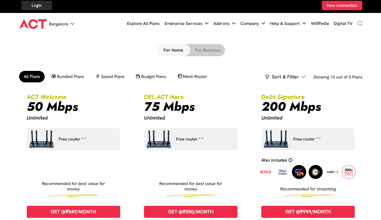
ACT Fibernet is among the leading broadband providers in India, delivering high-speed internet powered by advanced fiber optic technology. Fibr AI helped them create hyper-personalized landing pages based on city, search keywords, and images. This helped them increase their reach, boost conversions by 12%, and enhance customer acquisition by 25%.
ACT Fibernet's landing page features a cohesive color palette in line with its brand colors and a highlighted CTA right on top of the page that immediately grabs attention. The page clearly highlights the company's offerings and inclusions without overwhelming the visitor with too much info.
The landing page also neatly features the company's most prominent customers, providing social proof. The page ends with an accordion-style FAQ section to let visitors find quick answers to common questions without cluttering the page.
Key takeaways from ACT Fibernet's landing page design:
Highlight the most important info first: ACT Fibernet clearly lists its broadband plans, along with the pricing and inclusions based on the visitor's city.
Keep your copy concise: ACT Fibernet has summed up its value proposition in a neat, crisp copy. The page outlines all key details, including internet speed, device connectivity, zero buffering, high-speed gaming, and more.
Add social proof: The landing page not only highlights a big user base of over 8,000 businesses but also mentions prominent brands for an extra touch of credibility.
Use white space: ACT Fibernet's landing page features a minimalistic layout with clever use of whitespace that improves readability and ensures key elements stand out.
Clear CTAs: The landing page includes multiple CTAs for visitors based on their stage in the buyer's journey.
Read the full case study in detail here
2. DoorDash
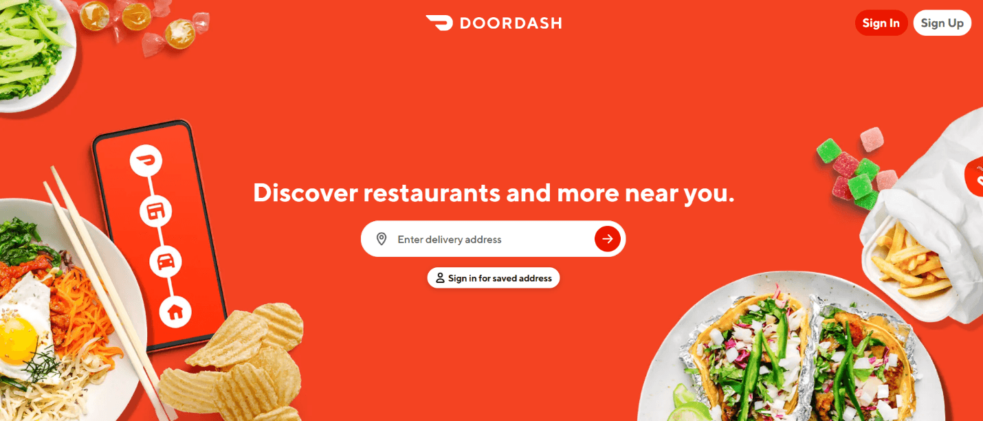
DoorDash is one of America's leading food delivery platforms, helping customers connect with restaurants, grocery stores, and convenience shops all in one place. The page highlights perks for delivery drivers, merchants, and customers and uses big, custom images to highlight its services.
Here's why this landing page design works:
Strong, clear, hero section: DoorDash's landing page clearly establishes what users can expect from the platform—finding restaurants and more near them.
Great use of images: The landing page uses minimal text, conveying the message through custom images. With Fibr AI, you can instantly personalize your landing page based on images to give it a more personalized touch and boost conversions.
All offerings are laid out in one place: From food and groceries to flowers and pet supplies, customers can know exactly what they can order through the platform without switching to a different page.
Clean layout: The landing page has a simple layout, making it easier for visitors to navigate between options. A sticky menu allows quick access to the sign-in option.
3. Airbnb
Next on our list of the top landing pages that convert is the short-term rental platform Airbnb. It connects travelers from across the world with unique accommodations, from cozy apartments to luxury villas and even offbeat stays like treehouses and yurts. Hosts can simply list their properties, and travelers can find the perfect stays, often at a more affordable rate than traditional hotels.
Here's why Airbnb's landing page works:
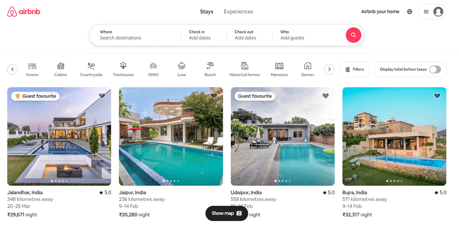
Smart categorization: Airbnb highlights pre-set categories like beachfront stays, cabins, or homes with amazing views. This allows users to quickly discover properties that match their interests without starting from scratch.
Seamless browsing: Clicking on a listing reveals detailed visuals, pricing, testimonials, and availability all in one place, reducing friction in the booking process.
Clean design: Airbnb's landing page immediately presents a search bar as the main focus, so users can start browsing rentals without additional scrolling or clicking.
Personalized recommendations: The page offers personalized stay recommendations based on the visitor’s past bookings, travel preferences, and browsing habits.
4. HubSpot
It's impossible to make a list of the highest-converting landing pages and not mention HubSpot. It provides a suite of tools for CRM, email marketing, automation, and more, making it a go-to platform for businesses looking to scale their digital marketing efforts.
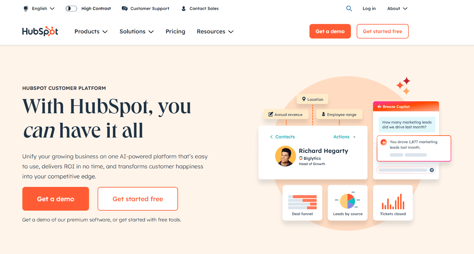
Here's why HubSpot's landing page works:
Strategic CTAs: HubSpot uses multiple CTAs like "Get started free" and "Get a Demo" placed at multiple touchpoints, so users always have an action to take no matter where they are on the page.
A balanced flow of information: The page effectively highlights HubSpot's key features without overwhelming users with technical jargon.
Social proof: Unlike other landing pages that feature prominent customers, HubSpot highlights quantitative results in terms of website traffic, deals closed, and support tickets resolved.
A sticky navigation menu: HubSpot's landing page includes a sticky menu, allowing visitors to navigate important sections without having to scroll back up.
5. The Expert Editor
The Expert Editor is an Australian professional proofreading and editing service provider. It helps authors, students, and businesses polish their written content, something that can easily be figured out with one look at its landing page. You can take inspiration from The Expert Editor’s strategy and leverage Fibr AI to create highly personalized landing pages that resonate with your audience. By giving visitors exactly what they are looking for, you can boost engagement and drive more conversions.
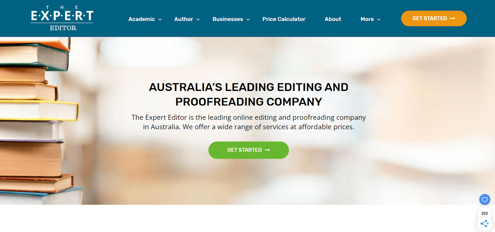
Here are other reasons why this is a good example of a high-converting landing page:
Minimalist design: The Expert Editor's landing page is simple, with a clean design and concise copy. The limited use of visuals further helps visitors focus on the key message.
Persuasive and informative copy: The copy clearly explains the services offered and highlights their value proposition without sounding overly pushy.
A no-frills contact form: The page features a simple contact form with only two mandatory questions. This reduces friction, enhancing conversion rates.
Solid social proof: The landing page highlights the business has been featured in prominent publications like Business Insider, Financial Review, Writer's Digest, and more.
Redirects for more information: If visitors need detailed information about the business's services, value proposition, or other common queries, they are redirected to dedicated pages to avoid cluttering the landing page.
6. Row House
If a minimal, direct, and fuss-free design is your idea of a perfect landing page, this is just the high-converting landing page example you need for inspiration. Row House is a fitness brand that offers a variety of rowing-based workout classes for individuals of all fitness levels. Although Row House's landing page is quite simple, it nails all key elements required for conversions—an attention-grabbing headline, benefits for members, a minimal contact form, and a simple CTA.
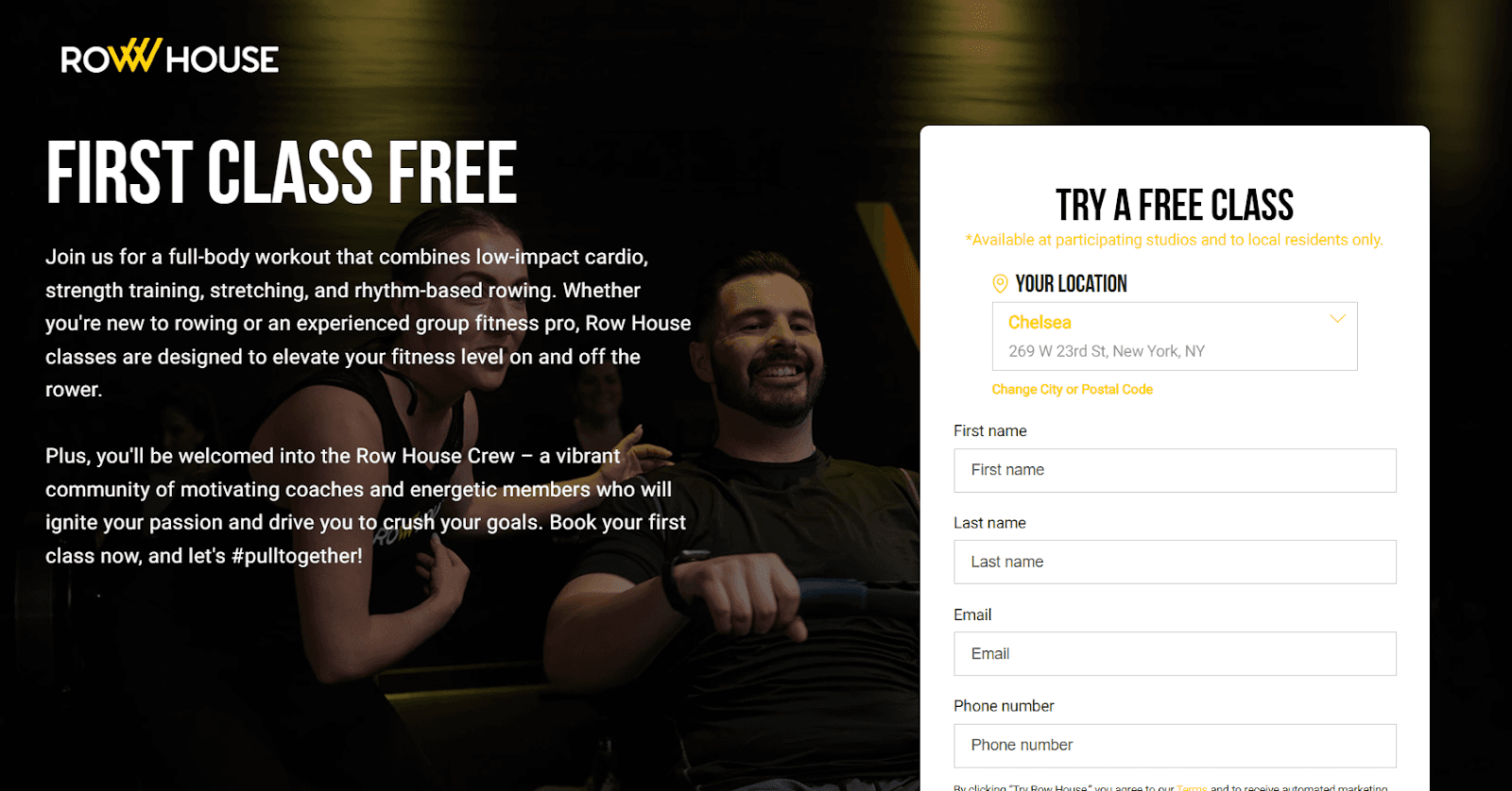
Here's why Row House's landing page stands out:
Minimalist design focused on content: The landing page is simple, clean, and concise. It features a headline, value proposition, and contact form.
Compelling headline: The headline immediately grabs attention with a strong, enticing offer: a free first class. This encourages members to try the service firsthand, making it an effective conversion tactic.
Tailored copy: The landing page's copy is inclusive, speaking directly to both new and experienced fitness enthusiasts. This simple approach makes it highly relevant to a wide range of potential customers.
Community access: A standout feature on Row House's landing page is the mention of a fitness community. It conveys how Row House offers more than just fitness classes, giving members access to a supportive fitness community.
Sleek, user-friendly layout: The landing page features a sleek design with a quick form and strategically placed CTA button. The benefit? Better user experience and a seamless signing-up process.
7. ExpressVPN
ExpressVPN, as the name suggests, is a VPN service that provides users with secure, private internet access. It lets users browse the web anonymously and access content from around the world by masking their IP address and encrypting internet traffic. Its landing page perfectly communicates its value and reliability through a crisp, effective copy and a variety of social proof categorized by platform.
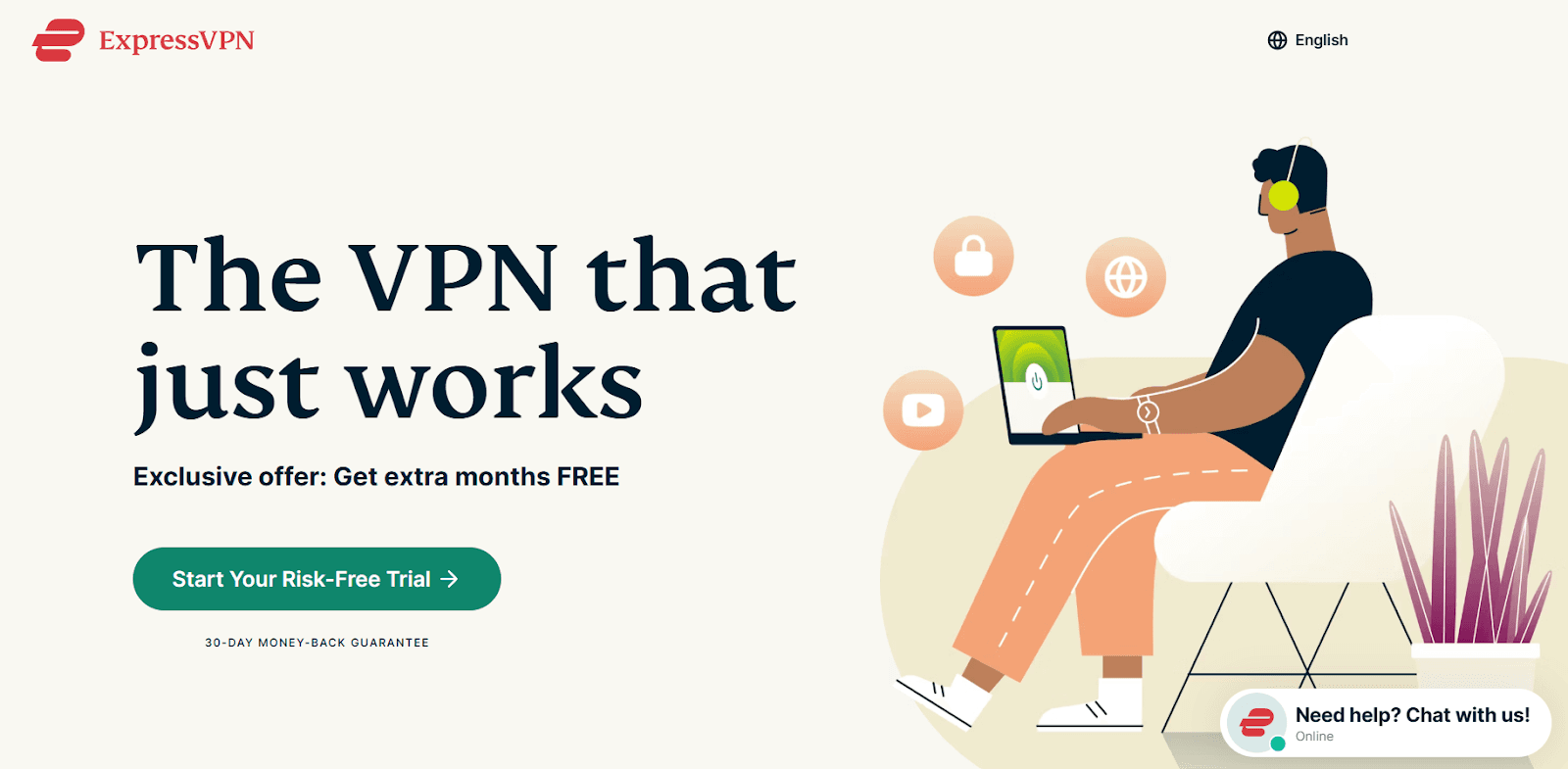
Here's why ExpressVPN's landing page works:
Impactful hero section: ExpressVPN's landing page has a crisp headline, immediately followed by an exclusive offer. The section features a simple image, along with highlighting a 30-day money-back guarantee to build trust.
Use of simple and trustworthy language: The landing page copy is concise, straightforward, and non-technical. Instead of overwhelming users with complex jargon, ExpressVPN focuses on simplicity, making the product feel more user-friendly.
Trust signals with social proof: As a security tool, building trust is the top priority for the platform. It does this by including user reviews, social media mentions, prominent customers, and mentions by leading tech experts.
Clever CTA: Unlike standard CTAs, ExpressVPN doesn't just ask users to sign up for a free trial. Instead, it asks them to start a "risk-free" trial, highlighting the platform's security standards.
Accessible customer support: The landing page not only drives users toward the main CTA (getting a free trial) but also lets them connect with their 24/7 tech support.
8. Spotify
Spotify, the popular music streaming platform, is another great example of landing pages that convert. Their landing page perfectly blends design and simplicity to boost conversions. The eye-catching color choices, clear CTAs, and overall visual style all come together to create a user experience that's both attractive and action-oriented. Plus, they keep it simple—offering just what users need: easy access to pricing info and a straightforward path to signing up.
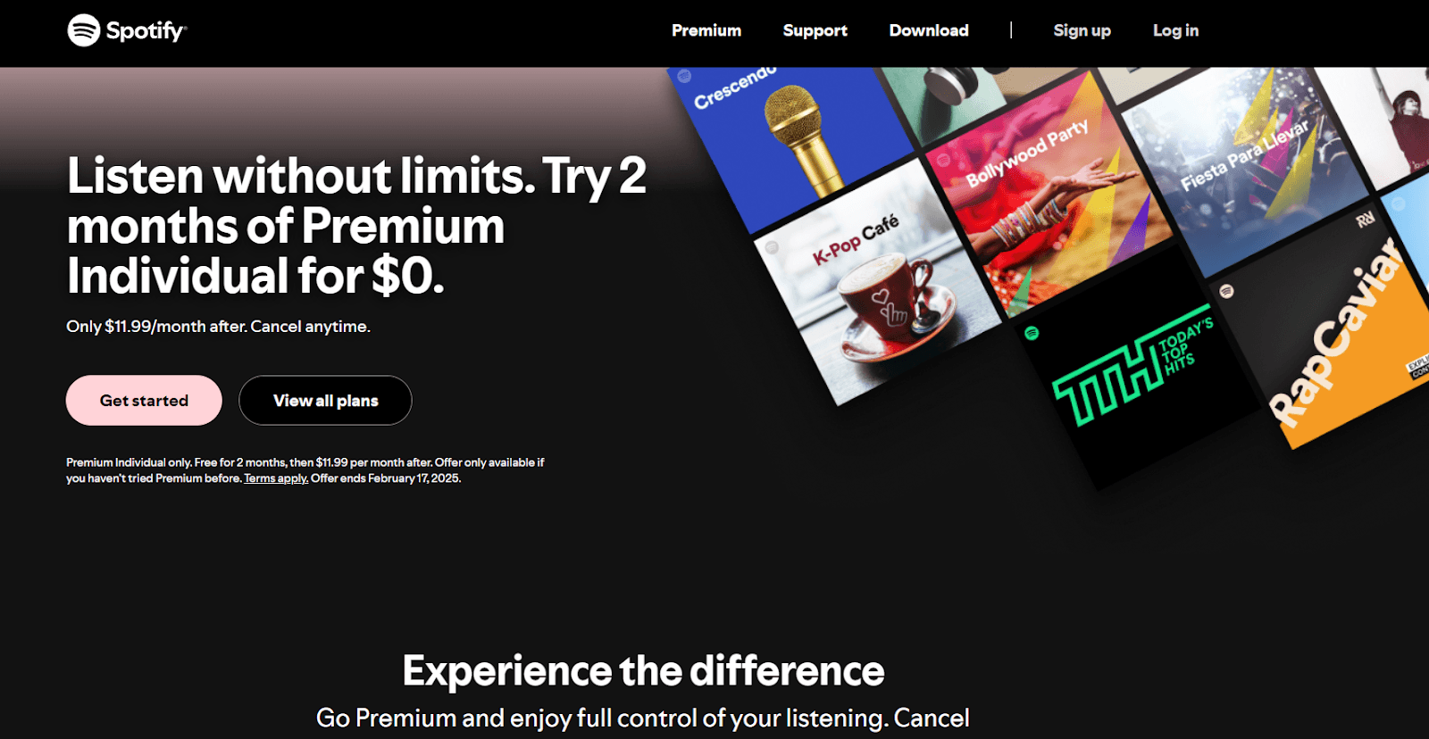
Here's what stands out in Spotify's landing page:
No use of brand colors: Unlike Spotify's typical green and black theme, the landing page uses a completely different color, pushing the focus towards the text and CTA.
Clear, actionable CTAs: Spotify has placed CTAs strategically throughout the landing page. Using words like "Get Started" or "View all Plans" makes it easier for visitors to move to the next step, ultimately boosting conversions.
Tailored pricing plans: The landing page features a detailed pricing section for different audience segments, offering individual plans, family plans, and student discounts.
Clear value proposition: The page clearly highlights the benefits of selecting a premium plan, the inclusions, and the available payment methods.
Extremely focused on conversion: Spotify's landing page features focused CTAs, along with segmented pricing plans, encouraging users to take action immediately.
9. Skillshare
Skillshare is an online learning platform with tons of classes across various creative, business, and technical fields. Their landing page strikes a great balance between aesthetics and functionality to drive high engagement and make signing up a breeze.
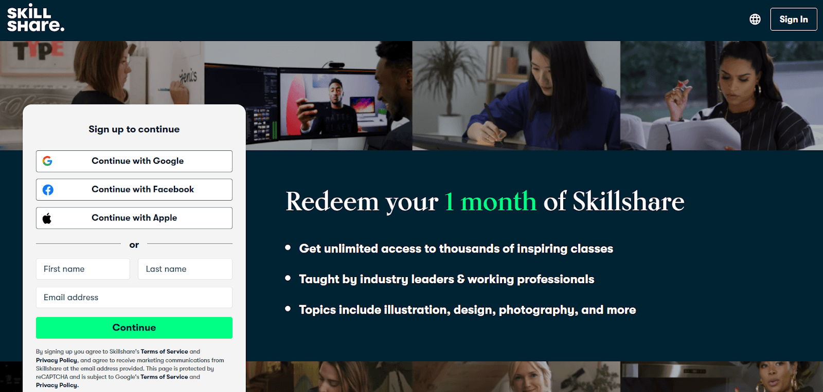
Here's why Skillshare's landing page works:
Eye-catching design: The landing page features a navy blue background with white and lime green text that gives it a fresh, energetic appeal.
F-pattern layout: The page follows an F-pattern layout that naturally directs users' attention from left to right and top to bottom. The right-hand side highlights three key differentiators, while the left side features a crisp sign-up form.
A seamless sign-up process: The landing page minimizes sign-up friction by requiring only a name and an email address. Users also have the option to sign up with existing social media logins, reducing barriers.
Excellent use of imagery: Instead of listing courses in plain text, the landing page represents them visually. This is a great way to showcase different course categories and encourage users to engage with the platform.
Clear CTA: The sign-up CTA is clear and well-placed, urging visitors to take action right away.
10. Canva
We're wrapping up our examples of high-converting landing pages with the popular graphic design platform Canva. From aesthetics and functionality to a user-focused design, Canva has nailed its landing page conversion game. The landing page focuses on the value proposition, makes good use of white space, and addresses potential concerns through an accordion-style FAQ section.
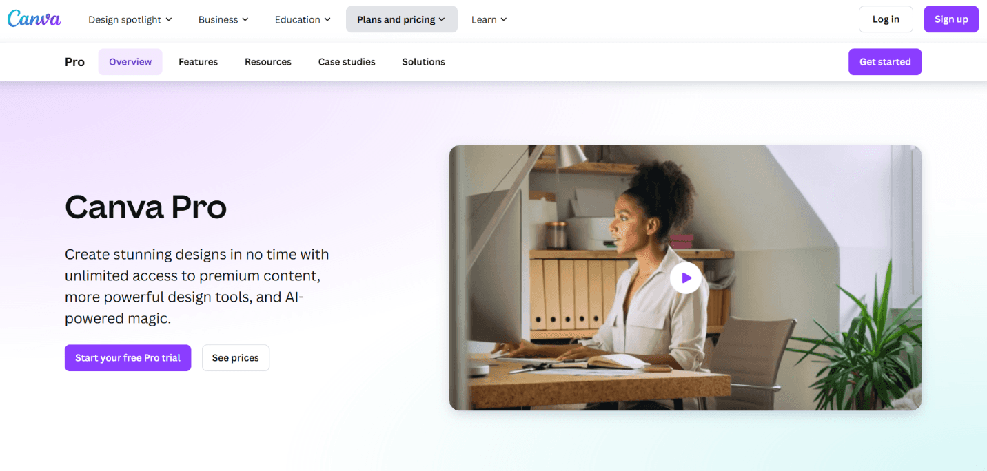
Here's why Canva's landing page stands out:
Minimal elements with great use of white space: The landing page uses plenty of white space, making the text and visuals stand out. The color palette aligns with the brand and helps highlight key features.
Clever product integration into the design: Canva's landing page doesn't just describe the benefits of upgrading to Pro. It uses live images and interactive mockups to help visitors visualize how they can benefit from the tool.
A well-placed FAQ section: The page ends with a dedicated FAQ section, proactively addressing common concerns prospects may have.
A low-risk CTA: Canva's CTA is simple: sign up for a free trial. This makes it easier for visitors to commit without hesitation.
Key Takeaways from High-Converting Landing Pages
We've made our case. The best landing pages aren't just pleasing to the eye—they're creative and strategic to gently guide visitors toward taking the desired action. From ACT Fibernet to Canva, these high-performing landing pages share some common elements:
Strategically placed, action-driven CTAs
Clever use of personalization techniques
Excellent use of white space, color contrast, and visual elements
Trust signals to eliminate those pangs of doubts
Minimal form fields to speed up the onboarding process
But there's one more element that you must focus on—maintaining consistency between ad messaging and landing page copies. And it's not as complicated as it sounds. With AI-powered personalization tools like Fibr AI, you can personalize landing pages at scale, ensuring the messaging aligns perfectly with the ad copy that brought visitors in.
So what are you waiting for? Book a demo with Fibr AI today and turn those precious clicks into valuable conversions.
FAQs
1. What are high-converting landing pages?
High-converting landing pages are optimized specifically to drive higher conversions than the average. They typically include an attention-grabbing hero section, a compelling copy, custom visuals, and a clear CTA.
2. How to increase conversions on landing pages?
You can increase landing page conversions by optimizing different elements like the images, value proposition, CTA, etc. Make sure to also optimize technical aspects like mobile optimization, page load time, etc.
3. How to calculate the landing page conversion rate?
You can calculate the landing page conversion rate by dividing the number of people who converted by the total number of page visits.

Pritam Roy
Co-Founder @ Fibr AI
Pritam Roy, the Co-founder of Fibr, is a seasoned entrepreneur with a passion for product development and AI. A graduate of IIT Bombay, Pritam's expertise lies in leveraging technology to create innovative solutions. As a second-time founder, he brings invaluable experience to Fibr, driving the company towards its mission of redefining digital interactions through AI.
Read summarized version with
Vibrant colors, compelling copy, custom visuals, and a cleverly placed CTA—all essential elements of an attractive landing page copy.
You could use them to design the most visually appealing, out-of-this-world, amazingly creative landing page. But if it doesn't do its job, sadly, all your efforts are doomed.
The job? Driving conversions.
Don't get us wrong!
A great landing page design is absolutely needed to grab attention and bring visitors to the site. But it's only half the battle won. To actually create a high-converting landing page, you also need a clear message, a compelling value proposition, and an intuitive user experience that nudges visitors to take action.
But let's be honest. Determining what works for your landing page and what doesn't could take months of trial and error. So why not take inspiration from pages that have nailed the art of conversion?
In this comprehensive guide, we'll look at the top 10 high-converting landing page examples so you can create a landing page that not only rakes in visitors but also converts them into long-term customers.
TL;DR
A high-converting landing page strikes the perfect balance between visual appeal and functionality. It includes a creative hero section, compelling CTAs, attractive visuals, and a strong value proposition.
Some websites that have nailed their landing page game include ACT Fibernet, DoorDash, Airbnb, HubSpot, The Expert Editor, Row House, ExpressVPN, Spotify, Skillshare, and Canva.
To optimize the landing page for conversions, it is also important to match the landing page copy with the ad messaging that brought visitors in.
With AI-powered tools like Fibr AI, you can personalize landing pages at scale based on uer behavior, location, and search intent..
What is a High-Converting Landing Page?
A high-converting landing page is your standard landing page but optimized for conversions. It has perfected all the ingredients needed to grab attention, build trust, and compel visitors to take action. These include a persuasive copy, compelling visuals, a perfect design, a seamless user experience, heaps of social proof, and, of course, a clear CTA.Leveraging a graphic design subscription service can help maintain consistent, conversion-focused visuals that elevate credibility and drive better results.
Research conducted by WordStream revealed the average landing page conversion rate across different industries is 2.35%, with the top 10% recording conversions of 11.45% or higher. If your conversions are lower than the average, analyzing some of the best landing pages for conversions is a great place to start.
Let's jump right in.
1. ACT Fibernet
ACT Fibernet is among the leading broadband providers in India, delivering high-speed internet powered by advanced fiber optic technology. Fibr AI helped them create hyper-personalized landing pages based on city, search keywords, and images. This helped them increase their reach, boost conversions by 12%, and enhance customer acquisition by 25%.
ACT Fibernet's landing page features a cohesive color palette in line with its brand colors and a highlighted CTA right on top of the page that immediately grabs attention. The page clearly highlights the company's offerings and inclusions without overwhelming the visitor with too much info.
The landing page also neatly features the company's most prominent customers, providing social proof. The page ends with an accordion-style FAQ section to let visitors find quick answers to common questions without cluttering the page.

Key takeaways from ACT Fibernet's landing page design:
Highlight the most important info first: ACT Fibernet clearly lists its broadband plans, along with the pricing and inclusions based on the visitor's city.
Keep your copy concise: ACT Fibernet has summed up its value proposition in a neat, crisp copy. The page outlines all key details, including internet speed, device connectivity, zero buffering, high-speed gaming, and more.
Add social proof: The landing page not only highlights a big user base of over 8,000 businesses but also mentions prominent brands for an extra touch of credibility.
Use white space: ACT Fibernet's landing page features a minimalistic layout with clever use of whitespace that improves readability and ensures key elements stand out.
Clear CTAs: The landing page includes multiple CTAs for visitors based on their stage in the buyer's journey.
Read the full case study in detail here
2. DoorDash
DoorDash is one of America's leading food delivery platforms, helping customers connect with restaurants, grocery stores, and convenience shops all in one place. The page highlights perks for delivery drivers, merchants, and customers and uses big, custom images to highlight its services.

Here's why this landing page design works:
Strong, clear, hero section: DoorDash's landing page clearly establishes what users can expect from the platform—finding restaurants and more near them.
Great use of images: The landing page uses minimal text, conveying the message through custom images. With Fibr AI, you can instantly personalize your landing page based on images to give it a more personalized touch and boost conversions.
All offerings are laid out in one place: From food and groceries to flowers and pet supplies, customers can know exactly what they can order through the platform without switching to a different page.
Clean layout: The landing page has a simple layout, making it easier for visitors to navigate between options. A sticky menu allows quick access to the sign-in option.
3. Airbnb
Next on our list of the top landing pages that convert is the short-term rental platform Airbnb. It connects travelers from across the world with unique accommodations, from cozy apartments to luxury villas and even offbeat stays like treehouses and yurts. Hosts can simply list their properties, and travelers can find the perfect stays, often at a more affordable rate than traditional hotels.

Here's why Airbnb's landing page works:
Smart categorization: Airbnb highlights pre-set categories like beachfront stays, cabins, or homes with amazing views. This allows users to quickly discover properties that match their interests without starting from scratch.
Seamless browsing: Clicking on a listing reveals detailed visuals, pricing, testimonials, and availability all in one place, reducing friction in the booking process.
Clean design: Airbnb's landing page immediately presents a search bar as the main focus, so users can start browsing rentals without additional scrolling or clicking.
Personalized recommendations: The page offers personalized stay recommendations based on the visitor’s past bookings, travel preferences, and browsing habits.
4. HubSpot
It's impossible to make a list of the highest-converting landing pages and not mention HubSpot. It provides a suite of tools for CRM, email marketing, automation, and more, making it a go-to platform for businesses looking to scale their digital marketing efforts.

Here's why HubSpot's landing page works:
Strategic CTAs: HubSpot uses multiple CTAs like "Get started free" and "Get a Demo" placed at multiple touchpoints, so users always have an action to take no matter where they are on the page.
A balanced flow of information: The page effectively highlights HubSpot's key features without overwhelming users with technical jargon.
Social proof: Unlike other landing pages that feature prominent customers, HubSpot highlights quantitative results in terms of website traffic, deals closed, and support tickets resolved.
A sticky navigation menu: HubSpot's landing page includes a sticky menu, allowing visitors to navigate important sections without having to scroll back up.
5. The Expert Editor
The Expert Editor is an Australian professional proofreading and editing service provider. It helps authors, students, and businesses polish their written content, something that can easily be figured out with one look at its landing page. You can take inspiration from The Expert Editor’s strategy and leverage Fibr AI to create highly personalized landing pages that resonate with your audience. By giving visitors exactly what they are looking for, you can boost engagement and drive more conversions.

Here are other reasons why this is a good example of a high-converting landing page:
Minimalist design: The Expert Editor's landing page is simple, with a clean design and concise copy. The limited use of visuals further helps visitors focus on the key message.
Persuasive and informative copy: The copy clearly explains the services offered and highlights their value proposition without sounding overly pushy.
A no-frills contact form: The page features a simple contact form with only two mandatory questions. This reduces friction, enhancing conversion rates.
Solid social proof: The landing page highlights the business has been featured in prominent publications like Business Insider, Financial Review, Writer's Digest, and more.
Redirects for more information: If visitors need detailed information about the business's services, value proposition, or other common queries, they are redirected to dedicated pages to avoid cluttering the landing page.
6. Row House
If a minimal, direct, and fuss-free design is your idea of a perfect landing page, this is just the high-converting landing page example you need for inspiration. Row House is a fitness brand that offers a variety of rowing-based workout classes for individuals of all fitness levels. Although Row House's landing page is quite simple, it nails all key elements required for conversions—an attention-grabbing headline, benefits for members, a minimal contact form, and a simple CTA.

Here's why Row House's landing page stands out:
Minimalist design focused on content: The landing page is simple, clean, and concise. It features a headline, value proposition, and contact form.
Compelling headline: The headline immediately grabs attention with a strong, enticing offer: a free first class. This encourages members to try the service firsthand, making it an effective conversion tactic.
Tailored copy: The landing page's copy is inclusive, speaking directly to both new and experienced fitness enthusiasts. This simple approach makes it highly relevant to a wide range of potential customers.
Community access: A standout feature on Row House's landing page is the mention of a fitness community. It conveys how Row House offers more than just fitness classes, giving members access to a supportive fitness community.
Sleek, user-friendly layout: The landing page features a sleek design with a quick form and strategically placed CTA button. The benefit? Better user experience and a seamless signing-up process.
7. ExpressVPN
ExpressVPN, as the name suggests, is a VPN service that provides users with secure, private internet access. It lets users browse the web anonymously and access content from around the world by masking their IP address and encrypting internet traffic. Its landing page perfectly communicates its value and reliability through a crisp, effective copy and a variety of social proof categorized by platform.

Here's why ExpressVPN's landing page works:
Impactful hero section: ExpressVPN's landing page has a crisp headline, immediately followed by an exclusive offer. The section features a simple image, along with highlighting a 30-day money-back guarantee to build trust.
Use of simple and trustworthy language: The landing page copy is concise, straightforward, and non-technical. Instead of overwhelming users with complex jargon, ExpressVPN focuses on simplicity, making the product feel more user-friendly.
Trust signals with social proof: As a security tool, building trust is the top priority for the platform. It does this by including user reviews, social media mentions, prominent customers, and mentions by leading tech experts.
Clever CTA: Unlike standard CTAs, ExpressVPN doesn't just ask users to sign up for a free trial. Instead, it asks them to start a "risk-free" trial, highlighting the platform's security standards.
Accessible customer support: The landing page not only drives users toward the main CTA (getting a free trial) but also lets them connect with their 24/7 tech support.
8. Spotify
Spotify, the popular music streaming platform, is another great example of landing pages that convert. Their landing page perfectly blends design and simplicity to boost conversions. The eye-catching color choices, clear CTAs, and overall visual style all come together to create a user experience that's both attractive and action-oriented. Plus, they keep it simple—offering just what users need: easy access to pricing info and a straightforward path to signing up.

Here's what stands out in Spotify's landing page:
No use of brand colors: Unlike Spotify's typical green and black theme, the landing page uses a completely different color, pushing the focus towards the text and CTA.
Clear, actionable CTAs: Spotify has placed CTAs strategically throughout the landing page. Using words like "Get Started" or "View all Plans" makes it easier for visitors to move to the next step, ultimately boosting conversions.
Tailored pricing plans: The landing page features a detailed pricing section for different audience segments, offering individual plans, family plans, and student discounts.
Clear value proposition: The page clearly highlights the benefits of selecting a premium plan, the inclusions, and the available payment methods.
Extremely focused on conversion: Spotify's landing page features focused CTAs, along with segmented pricing plans, encouraging users to take action immediately.
9. Skillshare
Skillshare is an online learning platform with tons of classes across various creative, business, and technical fields. Their landing page strikes a great balance between aesthetics and functionality to drive high engagement and make signing up a breeze.

Here's why Skillshare's landing page works:
Eye-catching design: The landing page features a navy blue background with white and lime green text that gives it a fresh, energetic appeal.
F-pattern layout: The page follows an F-pattern layout that naturally directs users' attention from left to right and top to bottom. The right-hand side highlights three key differentiators, while the left side features a crisp sign-up form.
A seamless sign-up process: The landing page minimizes sign-up friction by requiring only a name and an email address. Users also have the option to sign up with existing social media logins, reducing barriers.
Excellent use of imagery: Instead of listing courses in plain text, the landing page represents them visually. This is a great way to showcase different course categories and encourage users to engage with the platform.
Clear CTA: The sign-up CTA is clear and well-placed, urging visitors to take action right away.
10. Canva
We're wrapping up our examples of high-converting landing pages with the popular graphic design platform Canva. From aesthetics and functionality to a user-focused design, Canva has nailed its landing page conversion game. The landing page focuses on the value proposition, makes good use of white space, and addresses potential concerns through an accordion-style FAQ section.

Here's why Canva's landing page stands out:
Minimal elements with great use of white space: The landing page uses plenty of white space, making the text and visuals stand out. The color palette aligns with the brand and helps highlight key features.
Clever product integration into the design: Canva's landing page doesn't just describe the benefits of upgrading to Pro. It uses live images and interactive mockups to help visitors visualize how they can benefit from the tool.
A well-placed FAQ section: The page ends with a dedicated FAQ section, proactively addressing common concerns prospects may have.
A low-risk CTA: Canva's CTA is simple: sign up for a free trial. This makes it easier for visitors to commit without hesitation.
Key Takeaways from High-Converting Landing Pages
We've made our case. The best landing pages aren't just pleasing to the eye—they're creative and strategic to gently guide visitors toward taking the desired action. From ACT Fibernet to Canva, these high-performing landing pages share some common elements:
Strategically placed, action-driven CTAs
Clever use of personalization techniques
Excellent use of white space, color contrast, and visual elements
Trust signals to eliminate those pangs of doubts
Minimal form fields to speed up the onboarding process
But there's one more element that you must focus on—maintaining consistency between ad messaging and landing page copies. And it's not as complicated as it sounds. With AI-powered personalization tools like Fibr AI, you can personalize landing pages at scale, ensuring the messaging aligns perfectly with the ad copy that brought visitors in.
So what are you waiting for? Book a demo with Fibr AI today and turn those precious clicks into valuable conversions.
FAQs
1. What are high-converting landing pages?
High-converting landing pages are optimized specifically to drive higher conversions than the average. They typically include an attention-grabbing hero section, a compelling copy, custom visuals, and a clear CTA.
2. How to increase conversions on landing pages?
You can increase landing page conversions by optimizing different elements like the images, value proposition, CTA, etc. Make sure to also optimize technical aspects like mobile optimization, page load time, etc.
3. How to calculate the landing page conversion rate?
You can calculate the landing page conversion rate by dividing the number of people who converted by the total number of page visits.

Pritam Roy
Co-Founder @ Fibr AI
Pritam Roy, the Co-founder of Fibr, is a seasoned entrepreneur with a passion for product development and AI. A graduate of IIT Bombay, Pritam's expertise lies in leveraging technology to create innovative solutions. As a second-time founder, he brings invaluable experience to Fibr, driving the company towards its mission of redefining digital interactions through AI.
Featured Blogs
Featured Blogs
Delaware, USA
Subscribe to our newsletter for exclusive updates and insights.
By clicking submit, you agree to the terms and conditions and acknowledge the privacy policy.


Delaware, USA
Subscribe to our newsletter for exclusive updates and insights.
By clicking submit, you agree to the terms and conditions and acknowledge the privacy policy.


Delaware, USA
Subscribe to our newsletter for exclusive updates and insights.
By clicking submit, you agree to the terms and conditions and acknowledge the privacy policy.


