CRO Strategies That Actually Work: A Complete Guide to Increasing Conversions

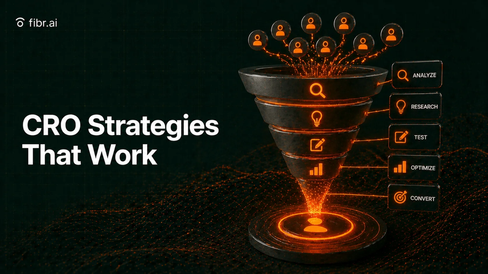
Table of Content
Read summarized version with
Every day, thousands of potential customers visit your website and leave without taking action. They browse your products, read your content and hover over your call-to-action buttons.
Then they disappear. For most businesses, only a minuscule portion of visitors convert into customers while the remaining 97% slip away.
Most CRO advice stops at what to do. The real pain is doing it across hundreds of URLs, audiences, and journeys without turning your team into a deployment machine. That’s why modern CRO in 2026 is shifting from one-off changes to experiences that adapt to signals automatically, so improvements compound instead of resetting every week.
According to Baymard Institute, 70% of online shopping carts are abandoned before checkout. That translates to $260 billion in recoverable lost orders across US and EU markets annually.
Think about what that means for your business specifically. If you generate $1 million in online revenue, there could be another $2.3 million sitting in abandoned carts, waiting to be captured through smarter optimization.
Yet the solutions are largely within your control. McKinsey reveals that companies achieving top-quartile performance in personalization would generate over $1 trillion in additional value across US industries alone.
The opportunity exists. The question is whether you will capture it before your competitors do.
This guide presents conversion rate optimization strategies grounded in data from the organizations that study these problems most rigorously. Without wasting any time, let’s go!
1. Start with Your Baseline Conversion Data
What the benchmarks actually tell you
Before optimizing anything, you need context.
The median landing page conversion rate across all industries is 6.6%, according to Unbounce's analysis of 41,000 landing pages and 57 million conversions.
That number provides a starting reference point, but comparing yourself to a universal average is like comparing your marathon time to everyone who has ever run one. The useful comparison is against runners in your age group and experience level.
Financial services landing pages convert at a median rate of 8.4%, while ecommerce pages convert at 4.2%.
SaaS companies see different patterns than healthcare providers. Entertainment industry top performers achieve conversion rates of 40.8% while SaaS top performers hit 11.6%. The gap between average and excellent performance varies dramatically by sector.
The more important benchmark is your own historical performance. Track your conversion rates over time, segment them by traffic source, device type and landing page, then identify where improvement potential is highest.
Your biggest wins usually come from mapping each visitor signal to the right experience. Source, geo, device, intent, and journey stage matter. Fibr does this by turning each URL into an autonomous agent that rewrites the experience before it renders, so you can scale relevance without hand-building variants. |
A page converting at 2% when your average is 5% represents a bigger opportunity than trying to push a 5% page to 6%.
Why device-specific analysis reveals hidden opportunities
Mobile devices now drive five times more traffic than desktops, yet they consistently convert at lower rates.
Unbounce's 2024 data shows desktop converting 8% higher on average. In health and wellness, desktop converts 22% better despite mobile driving seven times more traffic. Professional services see a 40% desktop conversion advantage with four times more mobile traffic.
This gap represents one of the largest optimization opportunities available.
If you can close even part of that mobile conversion deficit, you unlock substantial revenue from your largest traffic source. The businesses capturing this opportunity are redesigning their mobile experiences from scratch rather than simply adapting desktop designs to smaller screens.
2. Build a Personalization Strategy That Scales
Personalization in 2026 is not a set of manual rules you maintain forever. The best teams treat it as signal-to-experience generation. Visitors arrive with context already baked in, the keyword they searched, the content they came from, the geo they are in, the device constraints they have. Your job is to respond to that moment without making them work for it.
McKinsey's Next in Personalization research quantifies that personalization drives measurable revenue growth.
Companies that grow faster derive 40% more of their revenue from personalization activities than slower-growing counterparts. The research found personalization typically drives 10 to 15% revenue lift, with the range spanning 5% to 25% depending on sector and execution quality.
The consumer expectation side of this equation creates urgency.
71% of consumers expect companies to deliver personalized interactions. 76% get frustrated when this expectation goes unmet.
In an environment where 75% of consumers switched to a new store, product or buying method during the pandemic, failing to personalize is effectively choosing to lose customers.
What distinguishes high performers?
According to McKinsey,
they approach personalization as an organization-wide opportunity rather than a marketing or analytics problem
they prioritize customer lifetime value over short-term wins
they invest in rapid activation capabilities powered by advanced analytics, and
they create agile operating models with cross-functional teams that run hundreds of tests annually.
This is exactly where an Agentic Experience Layer fits. Instead of building a few versions and hoping they cover your segments, Fibr generates signal-matched experiences per visitor and lets winning patterns self-scale to similar cohorts.
Personalized CTAs convert at dramatically higher rates
One of the most accessible personalization tactics involves call-to-action buttons.
According to HubSpot research, personalized CTAs convert 202% better than generic versions.
The implementation requires analyzing what you know about each visitor, including their industry, company size, previous interactions with your content and stage in the buying journey, then serving CTAs tailored to that context.
A first-time visitor to a B2B software site might see "Download the Complete Guide" while a returning visitor who already downloaded that guide might see "Schedule Your Custom Demo."
The returning visitor already demonstrated interest through their previous action. Serving them the same entry-level offer ignores that progression.
The mechanism behind this performance difference is straightforward. Generic CTAs force visitors to self-select whether an offer is relevant.
Personalized CTAs show that you understand where customers are in their journey. This reduces cognitive load and friction at the same time.
3. Optimize Your Checkout to Recover Abandoned Revenue
Baymard Institute's comprehensive research across 49 different studies establishes that 70.19% of online shopping carts are abandoned.
A portion of that abandonment is unavoidable from natural browsing behavior like price comparison, saving items for later or exploring gift options. In fact, 48% of US shoppers who abandoned a cart cited "I was just browsing / not ready to buy" as their reason.
The remaining abandonment reasons are from fixable problems
48% cited extra costs like shipping, taxes and fees appearing at checkout
26% abandoned because the site required account creation
25% left due to credit card security concerns
23% found delivery too slow
22% encountered a checkout process that was too long or complicated
These percentages point toward specific solutions.
Hidden fees trigger nearly half of all abandonment, suggesting radical pricing transparency would materially improve conversion rates. Forced account creation loses a quarter of potential customers, so guest checkout is essential. Security concerns also indicate a need for visible trust signals.
The 35% conversion lift available through better checkout design
Baymard Institute's most striking finding involves the optimization opportunity itself.
Their large-scale checkout usability testing, conducted with major ecommerce sites including Walmart, Amazon, Wayfair and ASOS, found the average site can increase conversion rates by 35.26% through checkout design improvements alone.
Applied to $738 billion in combined US and EU ecommerce sales, that percentage translates to $260 billion in recoverable lost orders.
The research identified 140 documented causes for checkout usability issues. For example, 22% of shoppers abandoned due to a "too long or complicated checkout process," yet most checkouts could reduce default form elements by 20-60%.
An ideal checkout flow can be as short as 12 to 14 form elements or 7 to 8 actual form fields. Many sites present significantly more.
Form field reduction delivers measurable results
The relationship between form length and conversion follows predictable patterns.
Reducing form fields from 11 to 4 increases conversions by 120%. Each field represents a decision point and an opportunity for the visitor to reconsider whether the effort is worthwhile.
This does not mean every form should be minimized to email capture only.
The appropriate form length depends on what you are offering and what information you need.
A free newsletter signup justifies minimal fields. A quote request for enterprise software reasonably requires more information to deliver a relevant response. The principle is eliminating fields that do not serve a clear purpose in the current transaction.
Checkout optimization tactics ranked by impact
Tactic | Impact |
Comprehensive checkout UX improvements | 35% average conversion rate increase |
Display upfront shipping costs | Addresses 48% abandonment cause |
Offer guest checkout option | Addresses 26% abandonment cause |
Add visible security trust badges | Addresses 25% abandonment cause |
Reduce form fields from 11 to 4 | 120% conversion increase |
4. Accelerate Page Speed to Capture Impatient Visitors
Google and SOASTA research established that as page load time increases from one second to ten seconds, the probability of bounce increases by 123%. The relationship follows a curve rather than a straight line.
Moving from one to three seconds increases bounce probability by 32%. Moving from one to five seconds increases it by 90%. Each additional second of delay compounds the previous damage.
The threshold matters more than you might expect.
53% of mobile visitors leave a site if it takes longer than three seconds to load. Your traffic acquisition efforts, whether paid search, content marketing or social campaigns, deliver visitors to your site. Page speed determines how many of them stay long enough to consider your offer.
Conversion rates drop sharply as load times increase
Speed impacts more than bounce rates. Research shows pages loading in one second achieve conversion rates near 40%. At two seconds, conversion drops to around 20%. By five seconds, conversion rates settle into single digits.
The decline accelerates in the first few seconds, then levels off as you reach visitors willing to wait regardless of load time.
Amazon quantified this relationship in their own testing. A 100-millisecond increase in page load time led to a 1% decrease in sales. Conversely, 100 milliseconds of improvement produced a 1% revenue increase.
For a company operating at Amazon's scale, that percentage represents billions in annual revenue tied to fractions of a second.
The Google & Deloitte Speed Impact study found a mere 0.1-second improvement in load time influenced every step of the user journey. Mobile users seeing faster load times viewed 6.9% more pages per session.
Practical speed optimization priorities
Image compression represents low-hanging fruit for most sites.
Google's analysis of mobile landing pages found 79% were over 1MB, 53% over 2MB and 23% over 4MB.
Simply compressing images and text could save 25% of pages more than 250KB, with 10% able to save more than 1MB. The retail, travel and healthcare sectors showed the most room for improvement.
Core Web Vitals provide specific metrics to target.
Largest Contentful Paint (LCP) measures how quickly the main content loads
First Input Delay measures responsiveness
Cumulative Layout Shift measures visual stability
Mobile optimization deserves particular attention given traffic patterns.
Most users expect mobile sites to load faster than desktop versions, yet mobile historically performs worse. To fix this, you need to prioritize mobile-first development, implement lazy loading for below-the-fold content and minimize requests and payload sizes specifically for mobile connections.
5. Write Landing Page Copy That Converts
Simpler copy performs dramatically better
Unbounce's 2024 Conversion Benchmark Report analyzed the relationship between reading level and conversion across industries.
Landing pages written at a 5th to 7th grade reading level convert at 11.1%
Pages written at an 8th to 9th grade level convert at 7.1%
Professional-level writing converts at just 5.3%
The implication is counterintuitive for many B2B marketers who believe that audiences expect sophisticated language. The data suggests otherwise.
Simpler copy outperforms complex copy by a factor of two. This holds even in technical industries where you might expect jargon and complexity to show expertise.
In fact, the correlation between complex copy and poor conversion has strengthened over time.
Unbounce found the negative impact of complexity increased 62% compared to their 2020 analysis. Attention spans appear to be shrinking, and that has made clear and accessible copy more valuable.
For reference, achieving a 5th to 6th-grade reading level means writing more simply than Harry Potter books.
Traffic source influences expected conversion rates
Where visitors come from also shapes how they convert.
Email traffic converts at 19.3%, the highest rate among common channels
Instagram achieves 17.9%
Facebook delivers 13%
Google paid search produces 11.3%
These differences show the varying levels of relationship and intent across channels.
Email outperforms paid search by 77%. Visitors from your email list already have a relationship with your brand. Afterall, they opted in to hear from you. Paid search visitors discovered you through a query and clicked an ad. The intent levels and trust baselines differ fundamentally.
First-party data audiences convert higher than cold traffic. This multiplier makes list building and audience development really valuable as third-party tracking becomes restricted. The visitors you already know convert dramatically better than strangers.
What to test on your landing pages
Headlines deserve early testing attention
Headlines determine whether visitors continue reading or leave. Test clarity against cleverness, benefit-focused against feature-focused and short against long. Small wording changes can produce meaningful conversion differences.
Call-to-action button copy influences click rates
"Get Started" performs differently than "Book a Demo" or "Talk to a Human." The more human and specific phrasing outperformed the generic alternative.
Social proof placement also affects trust formation
Testimonials near CTAs can increase conversion by 34% according to case study findings. At the moment visitors consider taking action, evidence that others benefited from that action reduces perceived risk. Strategic placement matters as much as having social proof at all.
7. Deploy Social Proof to Build Trust and Reduce Risk
Reviews dramatically influence purchasing decisions
The statistics around review influence are quite something. According to research from the Spiegel Research Center, displaying reviews can increase conversion rates by up to 270%.
Products with five or more reviews are 270% more likely to be purchased than products with no reviews. The presence of reviews provides social validation that reduces purchase anxiety.
Review recency matters as well. 85% of consumers consider reviews older than three months irrelevant.
The internet moves quickly, and buyers want evidence that recent customers had positive experiences. A stream of recent five-star reviews carries more weight than a collection of older testimonials.
Trust badges signal security and credibility
88% of online shoppers in America report being more likely to trust a website displaying trust badges.
Security badges from providers like Norton, McAfee or industry certification bodies communicate that the site meets established standards. Similarly, payment badges showing accepted methods reduce uncertainty about transaction completion.
You have to note that the placement of trust badges also influences their effectiveness.
Badges near checkout address the specific security concerns that drive abandonment at that stage
Badges in footers provide baseline credibility signals throughout the browsing experience
Badges near CTAs reduce friction at the moment of decision.
Moreover, industry-specific certifications carry particular weight. A software company displaying SOC 2 compliance signals serious attention to security practices. In the same vein, a food company showing organic certifications validates claims that might otherwise seem like marketing language.
The more relevant the certification to your industry's specific trust concerns, the more impact it carries.
Testimonials work best when specific and verifiable
This is kind of expected. Generic testimonials like "Great product!" provide minimal persuasive value. On the other hand, specific testimonials that talk about particular problems solved, outcomes achieved or experiences had carry substantially more weight. A testimonial stating "We increased qualified leads by 47% in the first quarter" gives prospects concrete evidence of results.
Verified buyer labels also increase testimonial credibility. When a review system confirms the reviewer actually purchased the product, readers trust the feedback more than unverified claims.
Photo or video testimonials add another layer of verification and shows real people willing to associate their face with their endorsement.
B2B environments particularly benefit from case studies that go beyond testimonial quotes. Case studies documenting the problem, solution and measurable results give prospects the detail they need to evaluate whether similar outcomes are achievable in their context. The more closely the case study subject resembles the prospect's situation, the more persuasive it becomes.
7. Deploy Social Proof to Build Trust and Reduce Risk
While analytics show what is happening, user research reveals why.
Heatmaps for visualizing behavior
Heatmaps challenge assumptions with observable evidence. However, they require interpretation rather than literal reading:
Click maps identify which elements attract interaction. High activity on non-clickable elements suggests users expect missing interactivity
Scroll maps reveal if users miss critical info below the fold
Move maps show where attention dwells
Session recordings to trace the user journey
Recordings capture qualitative details that numbers miss, such as a user hesitating between options or encountering form errors.
Don't watch every session. Filter for high-value sessions or those ending in drop-offs at key friction points to identify usability issues quickly.
Surveys to capture the why
Surveys provide direct feedback on friction points.
Exit intent: Ask "What stopped you?" at the moment of abandonment to minimize recall error
Post-purchase: Ask "What almost stopped you?" to uncover friction that successful buyers managed to overcome.
Format: Combine multiple-choice questions for easy processing with open-ended follow-ups for rich insights.
Mobile drives traffic but underconverts
The mobile conversion gap represents one of the largest untapped opportunities in digital marketing. Mobile devices drive the majority of traffic for most sites, yet they consistently convert at lower rates than desktops. This pattern holds across industries and geographies.
The causes are structural.
Mobile screens limit the information visible at any moment
Typing on mobile keyboards introduces friction that desktop users avoid
Mobile users frequently browse in interrupted contexts, picking up their phones between other activities rather than sitting focused at a desk
Checkout processes designed for desktops translate poorly to smaller screens
Yet mobile is where your customers are. Fighting this reality makes no sense. Adapting to it by creating genuinely mobile-first experiences captures value that desktop-focused competitors miss.
Mobile-specific optimization tactics
Touch targets need an adequate size
Buttons that work fine for mouse clicks can be frustratingly small for finger taps. Industry guidelines suggest touch targets of at least 44x44 pixels, with adequate spacing between interactive elements to prevent accidental taps.
Form fields benefit from mobile-specific input types
Email fields should invoke email-optimized keyboards. Phone fields should invoke numeric keypads. Date fields should invoke date pickers. These small adjustments reduce keystrokes and prevent format errors.
Autofill and password manager integration smooth checkout processes
Mobile users particularly appreciate not having to type long strings of information on small keyboards. Supporting browser autofill and password managers removes friction at the most critical conversion moments.
Thumb-zone design considers how people hold phones
The most easily reached screen areas for one-handed use are the middle and bottom of the screen. Important interactions placed in hard-to-reach corners require users to adjust their grip or use a second hand. Optimizing for the thumb zone makes mobile experiences feel more natural
CRO in 2026 has a very specific problem: the gap between knowing what works and deploying it fast enough across your site. You can have the right playbook and still lose because your website resets every visit to the same generic experience.
Fibr.ai closes that gap by acting as the AI-native experience layer for your site. It turns each URL into an autonomous agent that can detect visitor signals like source, referring content, location, device, and journey stage, then rewrite the experience before it renders. So your best ideas do not stay trapped in a doc or a backlog. They show up in the live experience, at scale.
Here’s how teams use it in practice:
Location-based relevance: Generate region-aware experiences automatically without building separate campaigns for every market.
Referring URL continuity: If someone arrives from a deep educational post, the experience reflects that context instead of starting from scratch.
Journey continuity: Keep the intent consistent across multi-step flows, not just the first URL.
Genesis for launch speed: When you need a new campaign URL quickly, Genesis helps marketers generate brand-aligned pages from requirements and inspiration URLs, then hand off clean assets for deployment.
If your goal is to turn CRO strategy into compounding outcomes, the fastest path is making your URLs capable of learning and evolving from every session.Want to see what an agentic URL looks like on your own site? Book a demo.
1. Why is personalization considered the biggest driver of revenue growth?
According to McKinsey research, companies that excel at personalization generate 40% more revenue from those activities than average players. It reduces customer acquisition costs (CAC) by up to 50% and improves marketing spend efficiency by 30% because it delivers the right message to the right person at the right time.
2. How does page speed specifically impact my bottom line?
Data from Google shows that as page load time increases from one to ten seconds, the probability of a bounce increases by 123%. Sites that load in one second can see conversion rates near 32%, whereas five-second sites often drop to single digits. Fibr is built to rewrite experiences before render and keep the experience lightweight, so you can scale relevance without turning speed into a tradeoff.
3. What is the "Mobile-Desktop Gap," and how do I fix it?
The "Mobile-Desktop Gap" refers to the trend where mobile traffic accounts for over 50% of web visits, yet mobile conversion rates are often significantly lower than desktop. You can bridge this gap by using larger, touch-friendly CTAs, simplifying forms, and using AI tools like Fibr to deliver mobile-specific page variations that cater to the "interrupted" nature of mobile browsing.
4. Can I run A/B tests if I don’t have a technical background?
Yes. You do not need a technical background to run iterative improvement. The key is removing manual variant creation and deployment bottlenecks. With an agentic layer like Fibr, marketers can define what signals matter, then let the system generate and evolve experiences per cohort while winners replicate automatically.
5. How does Fibr AI help improve my Google Ad Quality Score?
Fibr improves Quality Score by ensuring "message match"; aligning your landing page content exactly with the keywords and intent of your ads. By matching ad intent to the on-site experience per signal and reducing bounce through relevance, you send stronger quality signals back to ad platforms.





Meenal Chirana
Content Marketing Manager
Meenal Chirana, Content Marketer at Fibr, brings five years of experience in the content field to the team. Her passion for creating engaging content is matched only by her expertise in writing, SEO and content marketing . Passionate about all things content and digital marketing, she is always on the lookout for innovative ways to connect with audiences and elevate brands.
Table of Content
Read summarized version with
Every day, thousands of potential customers visit your website and leave without taking action. They browse your products, read your content and hover over your call-to-action buttons.
Then they disappear. For most businesses, only a minuscule portion of visitors convert into customers while the remaining 97% slip away.
Most CRO advice stops at what to do. The real pain is doing it across hundreds of URLs, audiences, and journeys without turning your team into a deployment machine. That’s why modern CRO in 2026 is shifting from one-off changes to experiences that adapt to signals automatically, so improvements compound instead of resetting every week.
According to Baymard Institute, 70% of online shopping carts are abandoned before checkout. That translates to $260 billion in recoverable lost orders across US and EU markets annually.
Think about what that means for your business specifically. If you generate $1 million in online revenue, there could be another $2.3 million sitting in abandoned carts, waiting to be captured through smarter optimization.
Yet the solutions are largely within your control. McKinsey reveals that companies achieving top-quartile performance in personalization would generate over $1 trillion in additional value across US industries alone.
The opportunity exists. The question is whether you will capture it before your competitors do.
This guide presents conversion rate optimization strategies grounded in data from the organizations that study these problems most rigorously. Without wasting any time, let’s go!
1. Start with Your Baseline Conversion Data
What the benchmarks actually tell you
Before optimizing anything, you need context.
The median landing page conversion rate across all industries is 6.6%, according to Unbounce's analysis of 41,000 landing pages and 57 million conversions.
That number provides a starting reference point, but comparing yourself to a universal average is like comparing your marathon time to everyone who has ever run one. The useful comparison is against runners in your age group and experience level.
Financial services landing pages convert at a median rate of 8.4%, while ecommerce pages convert at 4.2%.
SaaS companies see different patterns than healthcare providers. Entertainment industry top performers achieve conversion rates of 40.8% while SaaS top performers hit 11.6%. The gap between average and excellent performance varies dramatically by sector.
The more important benchmark is your own historical performance. Track your conversion rates over time, segment them by traffic source, device type and landing page, then identify where improvement potential is highest.
Your biggest wins usually come from mapping each visitor signal to the right experience. Source, geo, device, intent, and journey stage matter. Fibr does this by turning each URL into an autonomous agent that rewrites the experience before it renders, so you can scale relevance without hand-building variants. |
A page converting at 2% when your average is 5% represents a bigger opportunity than trying to push a 5% page to 6%.
Why device-specific analysis reveals hidden opportunities
Mobile devices now drive five times more traffic than desktops, yet they consistently convert at lower rates.
Unbounce's 2024 data shows desktop converting 8% higher on average. In health and wellness, desktop converts 22% better despite mobile driving seven times more traffic. Professional services see a 40% desktop conversion advantage with four times more mobile traffic.
This gap represents one of the largest optimization opportunities available.
If you can close even part of that mobile conversion deficit, you unlock substantial revenue from your largest traffic source. The businesses capturing this opportunity are redesigning their mobile experiences from scratch rather than simply adapting desktop designs to smaller screens.
2. Build a Personalization Strategy That Scales
Personalization in 2026 is not a set of manual rules you maintain forever. The best teams treat it as signal-to-experience generation. Visitors arrive with context already baked in, the keyword they searched, the content they came from, the geo they are in, the device constraints they have. Your job is to respond to that moment without making them work for it.
McKinsey's Next in Personalization research quantifies that personalization drives measurable revenue growth.
Companies that grow faster derive 40% more of their revenue from personalization activities than slower-growing counterparts. The research found personalization typically drives 10 to 15% revenue lift, with the range spanning 5% to 25% depending on sector and execution quality.
The consumer expectation side of this equation creates urgency.
71% of consumers expect companies to deliver personalized interactions. 76% get frustrated when this expectation goes unmet.
In an environment where 75% of consumers switched to a new store, product or buying method during the pandemic, failing to personalize is effectively choosing to lose customers.
What distinguishes high performers?
According to McKinsey,
they approach personalization as an organization-wide opportunity rather than a marketing or analytics problem
they prioritize customer lifetime value over short-term wins
they invest in rapid activation capabilities powered by advanced analytics, and
they create agile operating models with cross-functional teams that run hundreds of tests annually.
This is exactly where an Agentic Experience Layer fits. Instead of building a few versions and hoping they cover your segments, Fibr generates signal-matched experiences per visitor and lets winning patterns self-scale to similar cohorts.
Personalized CTAs convert at dramatically higher rates
One of the most accessible personalization tactics involves call-to-action buttons.
According to HubSpot research, personalized CTAs convert 202% better than generic versions.
The implementation requires analyzing what you know about each visitor, including their industry, company size, previous interactions with your content and stage in the buying journey, then serving CTAs tailored to that context.
A first-time visitor to a B2B software site might see "Download the Complete Guide" while a returning visitor who already downloaded that guide might see "Schedule Your Custom Demo."
The returning visitor already demonstrated interest through their previous action. Serving them the same entry-level offer ignores that progression.
The mechanism behind this performance difference is straightforward. Generic CTAs force visitors to self-select whether an offer is relevant.
Personalized CTAs show that you understand where customers are in their journey. This reduces cognitive load and friction at the same time.
3. Optimize Your Checkout to Recover Abandoned Revenue
Baymard Institute's comprehensive research across 49 different studies establishes that 70.19% of online shopping carts are abandoned.
A portion of that abandonment is unavoidable from natural browsing behavior like price comparison, saving items for later or exploring gift options. In fact, 48% of US shoppers who abandoned a cart cited "I was just browsing / not ready to buy" as their reason.
The remaining abandonment reasons are from fixable problems
48% cited extra costs like shipping, taxes and fees appearing at checkout
26% abandoned because the site required account creation
25% left due to credit card security concerns
23% found delivery too slow
22% encountered a checkout process that was too long or complicated
These percentages point toward specific solutions.
Hidden fees trigger nearly half of all abandonment, suggesting radical pricing transparency would materially improve conversion rates. Forced account creation loses a quarter of potential customers, so guest checkout is essential. Security concerns also indicate a need for visible trust signals.
The 35% conversion lift available through better checkout design
Baymard Institute's most striking finding involves the optimization opportunity itself.
Their large-scale checkout usability testing, conducted with major ecommerce sites including Walmart, Amazon, Wayfair and ASOS, found the average site can increase conversion rates by 35.26% through checkout design improvements alone.
Applied to $738 billion in combined US and EU ecommerce sales, that percentage translates to $260 billion in recoverable lost orders.
The research identified 140 documented causes for checkout usability issues. For example, 22% of shoppers abandoned due to a "too long or complicated checkout process," yet most checkouts could reduce default form elements by 20-60%.
An ideal checkout flow can be as short as 12 to 14 form elements or 7 to 8 actual form fields. Many sites present significantly more.
Form field reduction delivers measurable results
The relationship between form length and conversion follows predictable patterns.
Reducing form fields from 11 to 4 increases conversions by 120%. Each field represents a decision point and an opportunity for the visitor to reconsider whether the effort is worthwhile.
This does not mean every form should be minimized to email capture only.
The appropriate form length depends on what you are offering and what information you need.
A free newsletter signup justifies minimal fields. A quote request for enterprise software reasonably requires more information to deliver a relevant response. The principle is eliminating fields that do not serve a clear purpose in the current transaction.
Checkout optimization tactics ranked by impact
Tactic | Impact |
Comprehensive checkout UX improvements | 35% average conversion rate increase |
Display upfront shipping costs | Addresses 48% abandonment cause |
Offer guest checkout option | Addresses 26% abandonment cause |
Add visible security trust badges | Addresses 25% abandonment cause |
Reduce form fields from 11 to 4 | 120% conversion increase |
4. Accelerate Page Speed to Capture Impatient Visitors
Google and SOASTA research established that as page load time increases from one second to ten seconds, the probability of bounce increases by 123%. The relationship follows a curve rather than a straight line.
Moving from one to three seconds increases bounce probability by 32%. Moving from one to five seconds increases it by 90%. Each additional second of delay compounds the previous damage.
The threshold matters more than you might expect.
53% of mobile visitors leave a site if it takes longer than three seconds to load. Your traffic acquisition efforts, whether paid search, content marketing or social campaigns, deliver visitors to your site. Page speed determines how many of them stay long enough to consider your offer.
Conversion rates drop sharply as load times increase
Speed impacts more than bounce rates. Research shows pages loading in one second achieve conversion rates near 40%. At two seconds, conversion drops to around 20%. By five seconds, conversion rates settle into single digits.
The decline accelerates in the first few seconds, then levels off as you reach visitors willing to wait regardless of load time.
Amazon quantified this relationship in their own testing. A 100-millisecond increase in page load time led to a 1% decrease in sales. Conversely, 100 milliseconds of improvement produced a 1% revenue increase.
For a company operating at Amazon's scale, that percentage represents billions in annual revenue tied to fractions of a second.
The Google & Deloitte Speed Impact study found a mere 0.1-second improvement in load time influenced every step of the user journey. Mobile users seeing faster load times viewed 6.9% more pages per session.
Practical speed optimization priorities
Image compression represents low-hanging fruit for most sites.
Google's analysis of mobile landing pages found 79% were over 1MB, 53% over 2MB and 23% over 4MB.
Simply compressing images and text could save 25% of pages more than 250KB, with 10% able to save more than 1MB. The retail, travel and healthcare sectors showed the most room for improvement.
Core Web Vitals provide specific metrics to target.
Largest Contentful Paint (LCP) measures how quickly the main content loads
First Input Delay measures responsiveness
Cumulative Layout Shift measures visual stability
Mobile optimization deserves particular attention given traffic patterns.
Most users expect mobile sites to load faster than desktop versions, yet mobile historically performs worse. To fix this, you need to prioritize mobile-first development, implement lazy loading for below-the-fold content and minimize requests and payload sizes specifically for mobile connections.
5. Write Landing Page Copy That Converts
Simpler copy performs dramatically better
Unbounce's 2024 Conversion Benchmark Report analyzed the relationship between reading level and conversion across industries.
Landing pages written at a 5th to 7th grade reading level convert at 11.1%
Pages written at an 8th to 9th grade level convert at 7.1%
Professional-level writing converts at just 5.3%
The implication is counterintuitive for many B2B marketers who believe that audiences expect sophisticated language. The data suggests otherwise.
Simpler copy outperforms complex copy by a factor of two. This holds even in technical industries where you might expect jargon and complexity to show expertise.
In fact, the correlation between complex copy and poor conversion has strengthened over time.
Unbounce found the negative impact of complexity increased 62% compared to their 2020 analysis. Attention spans appear to be shrinking, and that has made clear and accessible copy more valuable.
For reference, achieving a 5th to 6th-grade reading level means writing more simply than Harry Potter books.
Traffic source influences expected conversion rates
Where visitors come from also shapes how they convert.
Email traffic converts at 19.3%, the highest rate among common channels
Instagram achieves 17.9%
Facebook delivers 13%
Google paid search produces 11.3%
These differences show the varying levels of relationship and intent across channels.
Email outperforms paid search by 77%. Visitors from your email list already have a relationship with your brand. Afterall, they opted in to hear from you. Paid search visitors discovered you through a query and clicked an ad. The intent levels and trust baselines differ fundamentally.
First-party data audiences convert higher than cold traffic. This multiplier makes list building and audience development really valuable as third-party tracking becomes restricted. The visitors you already know convert dramatically better than strangers.
What to test on your landing pages
Headlines deserve early testing attention
Headlines determine whether visitors continue reading or leave. Test clarity against cleverness, benefit-focused against feature-focused and short against long. Small wording changes can produce meaningful conversion differences.
Call-to-action button copy influences click rates
"Get Started" performs differently than "Book a Demo" or "Talk to a Human." The more human and specific phrasing outperformed the generic alternative.
Social proof placement also affects trust formation
Testimonials near CTAs can increase conversion by 34% according to case study findings. At the moment visitors consider taking action, evidence that others benefited from that action reduces perceived risk. Strategic placement matters as much as having social proof at all.
7. Deploy Social Proof to Build Trust and Reduce Risk
Reviews dramatically influence purchasing decisions
The statistics around review influence are quite something. According to research from the Spiegel Research Center, displaying reviews can increase conversion rates by up to 270%.
Products with five or more reviews are 270% more likely to be purchased than products with no reviews. The presence of reviews provides social validation that reduces purchase anxiety.
Review recency matters as well. 85% of consumers consider reviews older than three months irrelevant.
The internet moves quickly, and buyers want evidence that recent customers had positive experiences. A stream of recent five-star reviews carries more weight than a collection of older testimonials.
Trust badges signal security and credibility
88% of online shoppers in America report being more likely to trust a website displaying trust badges.
Security badges from providers like Norton, McAfee or industry certification bodies communicate that the site meets established standards. Similarly, payment badges showing accepted methods reduce uncertainty about transaction completion.
You have to note that the placement of trust badges also influences their effectiveness.
Badges near checkout address the specific security concerns that drive abandonment at that stage
Badges in footers provide baseline credibility signals throughout the browsing experience
Badges near CTAs reduce friction at the moment of decision.
Moreover, industry-specific certifications carry particular weight. A software company displaying SOC 2 compliance signals serious attention to security practices. In the same vein, a food company showing organic certifications validates claims that might otherwise seem like marketing language.
The more relevant the certification to your industry's specific trust concerns, the more impact it carries.
Testimonials work best when specific and verifiable
This is kind of expected. Generic testimonials like "Great product!" provide minimal persuasive value. On the other hand, specific testimonials that talk about particular problems solved, outcomes achieved or experiences had carry substantially more weight. A testimonial stating "We increased qualified leads by 47% in the first quarter" gives prospects concrete evidence of results.
Verified buyer labels also increase testimonial credibility. When a review system confirms the reviewer actually purchased the product, readers trust the feedback more than unverified claims.
Photo or video testimonials add another layer of verification and shows real people willing to associate their face with their endorsement.
B2B environments particularly benefit from case studies that go beyond testimonial quotes. Case studies documenting the problem, solution and measurable results give prospects the detail they need to evaluate whether similar outcomes are achievable in their context. The more closely the case study subject resembles the prospect's situation, the more persuasive it becomes.
7. Deploy Social Proof to Build Trust and Reduce Risk
While analytics show what is happening, user research reveals why.
Heatmaps for visualizing behavior
Heatmaps challenge assumptions with observable evidence. However, they require interpretation rather than literal reading:
Click maps identify which elements attract interaction. High activity on non-clickable elements suggests users expect missing interactivity
Scroll maps reveal if users miss critical info below the fold
Move maps show where attention dwells
Session recordings to trace the user journey
Recordings capture qualitative details that numbers miss, such as a user hesitating between options or encountering form errors.
Don't watch every session. Filter for high-value sessions or those ending in drop-offs at key friction points to identify usability issues quickly.
Surveys to capture the why
Surveys provide direct feedback on friction points.
Exit intent: Ask "What stopped you?" at the moment of abandonment to minimize recall error
Post-purchase: Ask "What almost stopped you?" to uncover friction that successful buyers managed to overcome.
Format: Combine multiple-choice questions for easy processing with open-ended follow-ups for rich insights.
10. Close the Mobile Conversion Gap
Mobile drives traffic but underconverts
The mobile conversion gap represents one of the largest untapped opportunities in digital marketing. Mobile devices drive the majority of traffic for most sites, yet they consistently convert at lower rates than desktops. This pattern holds across industries and geographies.
The causes are structural.
Mobile screens limit the information visible at any moment
Typing on mobile keyboards introduces friction that desktop users avoid
Mobile users frequently browse in interrupted contexts, picking up their phones between other activities rather than sitting focused at a desk
Checkout processes designed for desktops translate poorly to smaller screens
Yet mobile is where your customers are. Fighting this reality makes no sense. Adapting to it by creating genuinely mobile-first experiences captures value that desktop-focused competitors miss.
Mobile-specific optimization tactics
Touch targets need an adequate size
Buttons that work fine for mouse clicks can be frustratingly small for finger taps. Industry guidelines suggest touch targets of at least 44x44 pixels, with adequate spacing between interactive elements to prevent accidental taps.
Form fields benefit from mobile-specific input types
Email fields should invoke email-optimized keyboards. Phone fields should invoke numeric keypads. Date fields should invoke date pickers. These small adjustments reduce keystrokes and prevent format errors.
Autofill and password manager integration smooth checkout processes
Mobile users particularly appreciate not having to type long strings of information on small keyboards. Supporting browser autofill and password managers removes friction at the most critical conversion moments.
Thumb-zone design considers how people hold phones
The most easily reached screen areas for one-handed use are the middle and bottom of the screen. Important interactions placed in hard-to-reach corners require users to adjust their grip or use a second hand. Optimizing for the thumb zone makes mobile experiences feel more natural
From Strategy to Execution with Fibr.ai
CRO in 2026 has a very specific problem: the gap between knowing what works and deploying it fast enough across your site. You can have the right playbook and still lose because your website resets every visit to the same generic experience.
Fibr.ai closes that gap by acting as the AI-native experience layer for your site. It turns each URL into an autonomous agent that can detect visitor signals like source, referring content, location, device, and journey stage, then rewrite the experience before it renders. So your best ideas do not stay trapped in a doc or a backlog. They show up in the live experience, at scale.
Here’s how teams use it in practice:
Location-based relevance: Generate region-aware experiences automatically without building separate campaigns for every market.
Referring URL continuity: If someone arrives from a deep educational post, the experience reflects that context instead of starting from scratch.
Journey continuity: Keep the intent consistent across multi-step flows, not just the first URL.
Genesis for launch speed: When you need a new campaign URL quickly, Genesis helps marketers generate brand-aligned pages from requirements and inspiration URLs, then hand off clean assets for deployment.
If your goal is to turn CRO strategy into compounding outcomes, the fastest path is making your URLs capable of learning and evolving from every session.Want to see what an agentic URL looks like on your own site? Book a demo.
1. Why is personalization considered the biggest driver of revenue growth?
According to McKinsey research, companies that excel at personalization generate 40% more revenue from those activities than average players. It reduces customer acquisition costs (CAC) by up to 50% and improves marketing spend efficiency by 30% because it delivers the right message to the right person at the right time.
2. How does page speed specifically impact my bottom line?
Data from Google shows that as page load time increases from one to ten seconds, the probability of a bounce increases by 123%. Sites that load in one second can see conversion rates near 32%, whereas five-second sites often drop to single digits. Fibr is built to rewrite experiences before render and keep the experience lightweight, so you can scale relevance without turning speed into a tradeoff.
3. What is the "Mobile-Desktop Gap," and how do I fix it?
The "Mobile-Desktop Gap" refers to the trend where mobile traffic accounts for over 50% of web visits, yet mobile conversion rates are often significantly lower than desktop. You can bridge this gap by using larger, touch-friendly CTAs, simplifying forms, and using AI tools like Fibr to deliver mobile-specific page variations that cater to the "interrupted" nature of mobile browsing.
4. Can I run A/B tests if I don’t have a technical background?
Yes. You do not need a technical background to run iterative improvement. The key is removing manual variant creation and deployment bottlenecks. With an agentic layer like Fibr, marketers can define what signals matter, then let the system generate and evolve experiences per cohort while winners replicate automatically.
5. How does Fibr AI help improve my Google Ad Quality Score?
Fibr improves Quality Score by ensuring "message match"; aligning your landing page content exactly with the keywords and intent of your ads. By matching ad intent to the on-site experience per signal and reducing bounce through relevance, you send stronger quality signals back to ad platforms.
Meenal Chirana
Content Marketing Manager
Meenal Chirana, Content Marketer at Fibr, brings five years of experience in the content field to the team. Her passion for creating engaging content is matched only by her expertise in writing, SEO and content marketing . Passionate about all things content and digital marketing, she is always on the lookout for innovative ways to connect with audiences and elevate brands.