Read summarized version with
Have you ever searched for something only to land on an ad page that is nowhere related to what you searched for? Frustrating, right? Conversely, has an ad redirected you to exactly what you are looking for? Magic!
The whole mechanics behind this is the way Google ad landing pages work.
Google’s main job is to connect people with what they are looking for. If the landing page does not match user intent or deliver what it promises, Google notices! Ad costs will skyrocket and conversions will likely tank.
But here's the silver lining–Google ad landing page optimization can boost visibility, reduce ad spend, and bring in better ROI. If the next question in your mind is ‘How do I optimize my Google ad landing page?’ this blog answers it.
What is a Google ad landing page?
A Google ad landing page is a dedicated webpage that users ‘land’ upon after clicking on a Google advertisement.
The purpose is to target a specific keyword through laser-focussed content and design and help visitors take action–whether making a purchase, signing up for a newsletter, downloading a guide/ebook, and more.
You can think of it as a sales pitch specially curated to welcome potential customers and convert them by showing highly relevant, super specific content.
Now, you may wonder about the mechanics behind this. Let’s take a simple example to decode Google ad landing pages.
Imagine you’re running a fitness studio offering gym sessions, yoga, sauna, zumba, and more. Your Google ad appears when somebody searches for ‘online yoga classes.’ Now, when the visitor clicks on this ad, the individual is guided or ‘lands’ on a single webpage specially curated for yoga classes. This page will not speak about your other offerings.
In this example, the user (on clicking the ad) will see only one landing page that is laser-focused on depicting the benefits, testimonials, and more about your yoga classes.
Now, you may wonder, why businesses invest so much time in creating these pages. That’s a valid question. After all, a common website listing all the offerings of the company should work, right?
Actually, no!
Read below to understand the humongous benefits of Google ad landing pages and why you should also invest in creating one.
Fun Fact: Ads in the top three paid slots attract 46% of all the clicks!
Also read: Top Google Optimize Alternatives To Boost Your CRO Strategy In 2025
What are the benefits of a Google ads landing page?
Did you know that websites with 40 or more landing pages generate ~12X more leads than websites with 1-5 landing pages?
Yup, there is a reason why marketers and SEO experts swear by Google ad landing pages. Let’s read some in detail below:
1. Boosts conversions
If you're selling boots, your landing page must only discuss boots. It should not mention gloves or any other related item that adds no value. The same logic applies to all businesses, selling services and products online. You do not want to distract your visitors with unnecessary information, especially when they have the intent to purchase or take action.
Google ad landing pages help you achieve exactly this. A well-designed ad landing page ensures your promise (or offering) aligns perfectly with your messaging, making it easier for visitors to trust your business and take action.
2. Helps measure performance
How do you measure if your campaign is working? Through tracking and data analysis. Google ad landing pages provide incredible insights through their advanced tracking capabilities.
You can analyze what ads users click on and what they do after landing on your page through Google Analytics. Further, you can measure landing page metrics like conversions, impressions, click-through rates, and other stats as shown below:
Bounce rates: No of users who land on a page but don’t take action
Average session duration: Average time a user stays on the website
Pages/sessions: No of pages viewed per section
All these metrics allow you to fine-tune your strategies, see what’s working, and understand user behavior better. Such detailed insights transform your Google landing page from a static marketing asset to a page that brings in revenue and more conversions. You may not find such detailed insights through a regular landing page.
Did you know? Google Analytics is used by ~65% of the top 500 US retailers, 45% of Fortune 500 companies, 56% of the top 1 million domains, and is installed on at least 10 million websites!
3. Improves ad performance to maximize ROI
Google values relevance and rewards businesses that create relevant and useful ad landing pages. This search engine uses a diagnostic tool called ‘Quality Score’ to compare the quality of your ad against competitors. It is a score that is measured on a scale of 1-10 and is calculated based on three factors:
Expected click-through rate: Probability of your ad being shown
Ad relevance: How relevant your ad is to user search intent
Landing page UX: How useful your landing page is designed to be
Now, here’s what you need to note: ‘Quality Score’ directly impacts your cost per click (CPC).
If two bidders are staking for the same keyword, Google will reward the bidder with a higher ‘Quality Score.’ Simply put, the bidder with a better score pays less per click and could achieve a better ad position.
Looking for a partner to help you game your Google ad landing page? Fibr AI can help you create dynamic, super-relevant personalized landing pages in seconds without hassle. The platforms connects to multiple ad platforms like Google and Meta and ensure each ad has a unique landing page with keyword-specific headlines, visuals, and more!
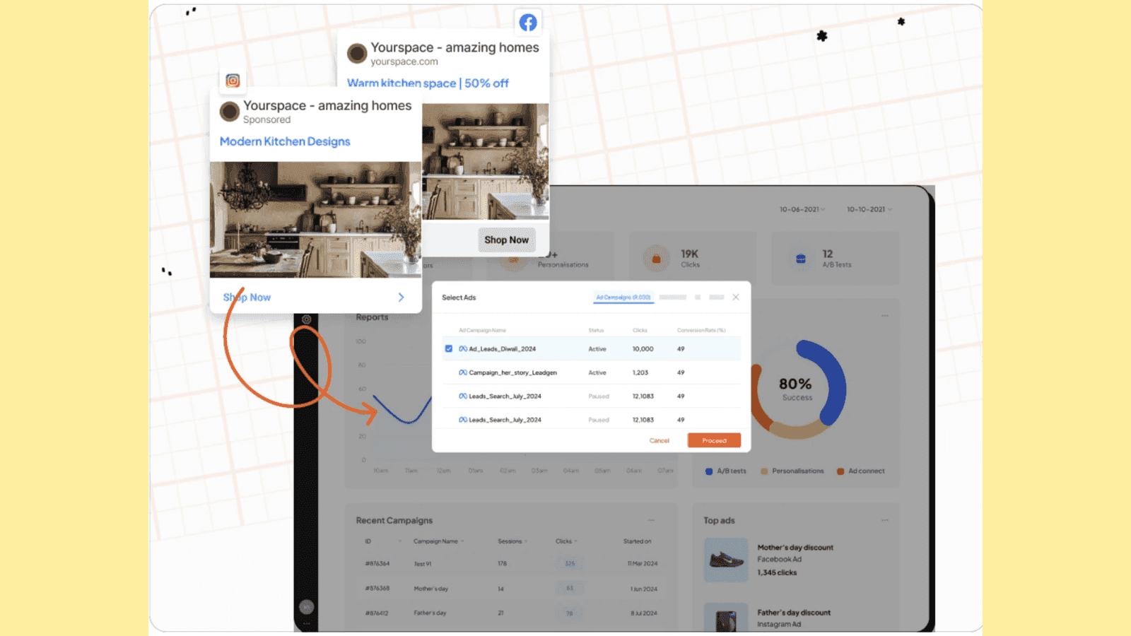
What’s more? Fibr’s intelligent platform sets the seal on broader campaign goals such as sales and holiday seasons. Plus its AI-powered solutions ensure bulk creation and automation second to none. Click here to sign up now:https://fibr.ai/pilot/ad-personalization
4. Better user experience (UX)
Think for a second. When you click on an ad, you want to be redirected to immediate solutions and answers.
When a landing page is well-optimized, loads fast, and is clutter-free, the user is more likely to take action. Google ad landing pages give utmost importance to user experience (as explained above) directly impacting your leads and conversions.
Now, the benefits and everything in between sound great. But, the real question is this: are Google landing pages complex to create?
The answer is no, especially when you partner with Fibr AI. In line with the best landing page practices, the platform helps create personalized landing pages for every location, trend, campaign, keyword, SMS, email, communication, and more!
Create 1000s of Google ad landing pages for your business and convert your traffic for a fraction of the cost. To know more, click here.
Google ads landing page vs other landing pages
Most people often confuse Google ads and regular landing pages. It’s natural, after all the main purpose of any landing page is to generate leads and get conversions. However, it’s important to note that Google ad landing pages and regular landing pages are two separate concepts that serve distinct purposes and are designed differently.
Google ad landing pages are specifically crafted to match ad user intent and audience, who may be looking for a particular service or product. Regular landing pages on the other hand target general site traffic and can promote several products and services at once.
Google ad landing pages tightly circle around main keywords or use keywords from ads to ensure users instantly find what they are looking for. Regular landing pages conversely may not target one keyword and have a broader focus range.
Lastly, Google landing pages rank higher when it comes to conversions and optimization, allowing businesses to market their products at lower ad costs. Regular landing pages may fail to deliver ad-specific revenue.
Here’s a table summarizing the differences between the two:
| Factor              | Google Ad Landing Page                                                   | Other Landing Pages                                                   |
|---------------------|-------------------------------------------------------------------------|------------------------------------------------------------------------|
| Goal            | Focused on achieving a single, specific action from a visitor (e.g., downloading, signup, or purchase). | Goals can include increasing site traffic, exploring a website, or engaging visitors with multiple services. |
| Traffic Source  | Cater to traffic specifically from Google Ads campaigns through keyword alignment. | Cater to traffic from various sources like social media, organic search, email campaigns, and more. |
| Performance Tracking | Integrated with Google Ad tracking tools and features like 'Quality Score' to measure campaign success. | May rely on a broad number of tracking tools. |
| Speed          | Prioritize speed and quick load time to avoid losing ad-driven traffic. | Speed may be important, but it might not be as rigorously optimized as a Google Ad landing page. |
| Content         | Laser-focused content with minimal distractions to maximize conversions. | Can include a broader range of content or be generic with links to other parts of the website
Now that you understand the difference between the two, let’s quickly glance at some real-life Google ad landing pages.
Best real-life Google ad landing page examples
Team Fibr AI thought the best way to explain the concept of ad landing pages is through real-life Google ad landing page examples. Below we explore how top companies leverage Google and keywords together to create landing pages that click and convert.
Let’s dive straight into it.
1. ClickUp
When you search ‘best project management software 2024’, ClickUp ranks 1st on the search engine.
Google ad:

Now, when you click on the ad, you’ll be guided to an ad landing page that looks like this:

What do you notice first? The headline probably. Why? Because it’s bold, highlighted properly, and placed right at eye level. Next, the subtitle quickly explains why ClickUp is the right choice with words like ‘everyone; ‘faster’ ‘smarter’ ‘save time’, and more.
The page’s content also highlights (with overloading) the features of this project management software. The page has also smartly placed social proof, alongside CTAs like ‘Get Started’ ‘Free Forever’ and ‘No Credit Card.’
The design, color, image, and CTA placement all work in favor of ClickUp. Don’t you agree?
2. Fiverr
We’ve all heard about Fiverr a marketplace that connects freelancers and businesses in one place.
Google ad:
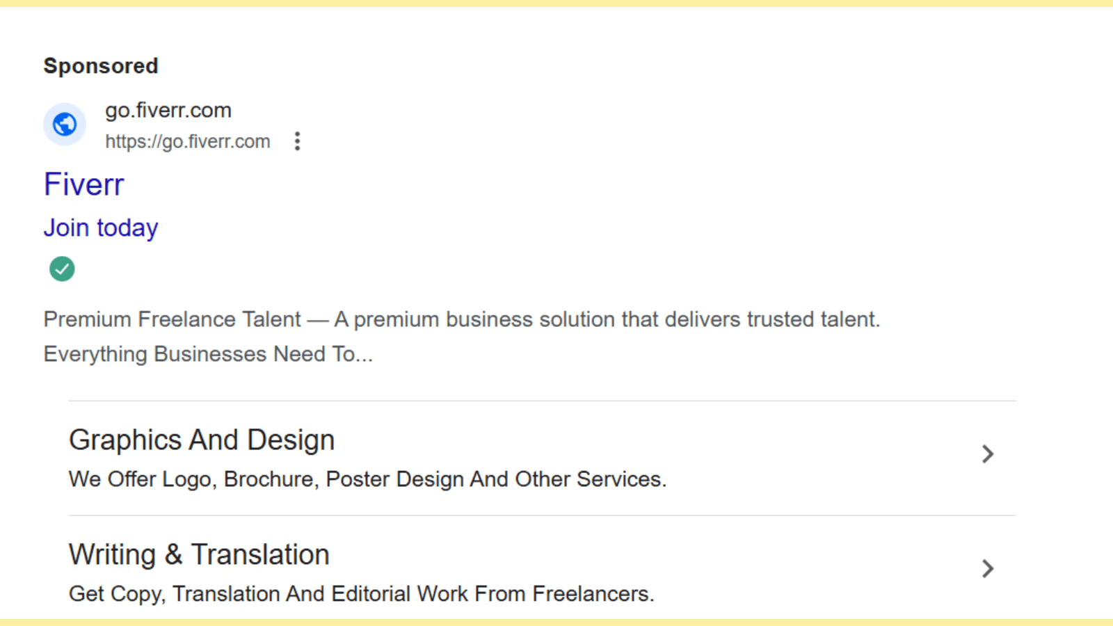
When you click on this ad, here’s what you’re going to see on this page:

Fiverr’s ad landing page is a good example of color balancing and design. With a clear value proposition in the center alongside a search bar, Fiverr’s landing page successfully convinces you to engage with them for your business needs.
Also, the social proof and industries in which they offer services are formatted neatly, with clean and simple designs.
3. Salesforce
When you search best CRM tools, Salesforce ranks in the 1st three results.
Google ad:

Upon clicking this ad, you’ll be redirected to a page that looks like this:

Though old school, the page does a pretty decent job at design, CTA, and proof. The page has a simple form asking for details alongside a smaller section highlighting how Salesforce is helping businesses with lead and sales management.
The ad landing page also provides contact details if the users have a question. And if you must have noticed, Saleforce’s bold headline at the top does solid marketing for the company.
4. Zoho People
Beating the likes of ‘Toggle’, and many other top time tracking software, Zoho People ranks 2nd when you search ‘ top time management apps.’
Google ad:

When you click on the ad, this is the ad landing page you’ll see:

If there was a page that had a well-balanced design, CTA, forms, social proof, and headline, it would be this ad landing page.
The headline is clear and very simple, followed by the top features of the software. Next, you’ll find a simple form on the left with a ‘FREE SIGN UP’ CTA in the red button. And you’ll also observe social proof, ratings and clients all neatly placed alongside the page.
5. Asana
Asana, a top collaboration tool used across the globe ranks 2nd on search engines when you search for ‘free collaboration tools.’
Google ad:

This is what Asana’s landing page looks like when you click on the ad:
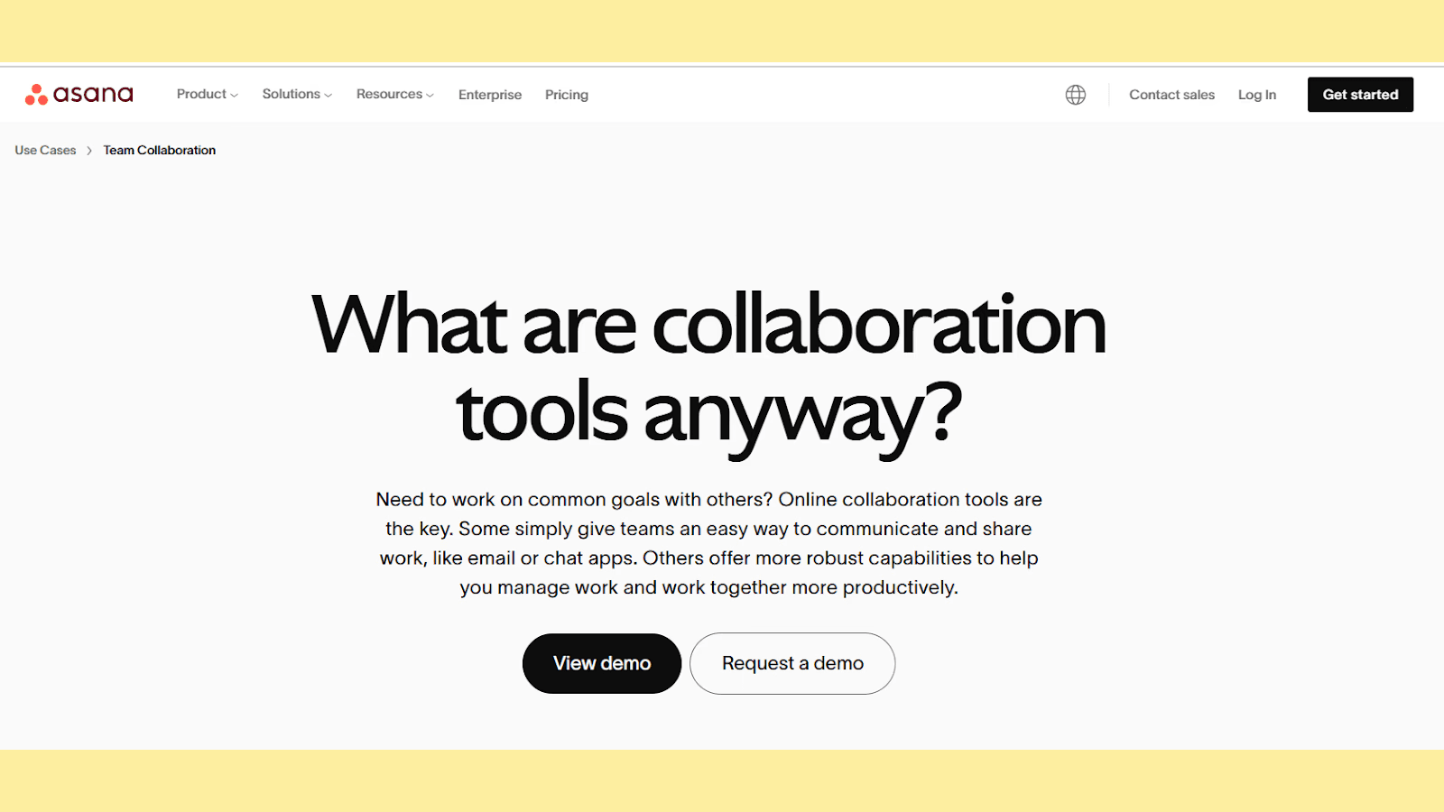
Asana’s Google landing page is very interesting. You will not find your typical landing page elements or design here.
The approach here has been more on content: look at the headline and subtext; it is rare, especially for collaboration software, to have a question as a headline and a whole para as a subtext.
The design is super minimalist and the CTA is also framed differently.
6. Mailchimp
When you think of email campaigns, you think about Mailchimp. Even Google thinks the same way! Mailchimp ranks 1st when the search is for ‘top email marketing tools.’
Google ad:

Here’s how Mailchimp’s ad landing page has been designed:

You’ll notice that the landing page is quite similar to Zoho People’s landing page, following the minimalist approach. The page is simple, with minimal design and content. It also has an interesting CTA: ‘Start Creating’ and a discount offer placement right at the top.
In all the above examples, you must have noticed some common elements–CTA design, content, or anything else. Now, the point here is that these brands have optimized their page and messaging well to reach the target audience when a keyword related to their industry is searched for.
If you are wondering how, read below!
Google ads landing page best practices
If you are looking for Google ad landing best practices, we’ve got you covered! Read practical tips below to make your landing pages work for you, just like in the above examples.
1. Ensure your landing page matches your ad and keywords
Lesser spoken about, but arguably the most important factor you must watch out for on your Google ad landing page is matching your ads with keywords.
For instance, if you are selling a piece of furniture at a 15% discount, then your visitor should be able to find the discounted furniture piece on your Google ad landing page without any trouble.
In other words, your visitor should be able to instantly understand what your offer is and how it solves their problem. This can be achieved by thoroughly understanding what keywords your users are searching for and how to target them. Also, use clear, bold headlines, and straightforward messaging while incorporating the exact keywords to match user search intent.
Fibr AI can ensure ad relevance and boost your conversions, the platform auto-matches your keywords dynamically with your headline and content to ensure your user only sees relevant content.

No more wasteful ad experience. Sign up with Fibr AI to personalize your ad campaigns, bulk-create relevant landing pages, and much more.
2. Provide useful, relevant content
Another factor that can make your Google ad landing page stand out is content.
Invest in content that speaks clearly to the pain point of your audience. Avoid content and language that is full of fluff, or is confusing. Think for yourself: would you engage with a confusing landing page? Unlikely, right?
Explain in jargon-free and simple terms what your product or service does. Rely on original content and avoiding rephrasing or copy-pasting content blindly.
3. Optimize for mobile
More than 50% of website traffic comes from mobile. Not optimizing for the same is leaving money on the table. It is a prerequisite in today’s age that your landing page is mobile friendly and this does not just mean in terms of responsiveness or page speed, your Google ad landing page must be able to provide a seamless mobile user experience.
Ensure text is readable with zooming, and images are relevant and properly optimized. Try using larger, user-friendly buttons and test on different devices (iPad, Android, and more) to guarantee a smooth experience.
4. Work on your UX
Google values UX and uses it as a top-ranking factor. And as explained above, UX can directly impact your landing page’s ‘Quality Score’ and in return, your cost and revenues.
A clean, professionally designed Google ads landing page with a proper hierarchy can push users to action and boost your CRO metrics. So, first, ensure your page loads quickly. The longer it takes, the more clients you lose.
Next, do not overload or clutter your ad landing page with excessive designs, content, or mismatched colors. Also, work on placing your CTAs (call to action) at the right eye level in the right color. Use action-oriented words like , ’ Start your free trial today’ or ‘Claim your discount now.’
Optimize your images and web speed. Keep the form field minimal and ensure every landing page element is direct and to the point.
5. Include social proof
‘1k users purchased this product’ or ‘ 98% customer satisfaction rates’ all these phrases that act as social proof build a bridge between user intent and action.
Add testimonials and social proof to your Google ad landing page to build trust. Avoid generic praise or feedback. If possible, incorporate real names, companies, trust badges, ratings, certifications, and more to show your offering’s effectiveness.
Remember this: the goal is to showcase how real customers benefited by engaging with your product or service in the past.
Conclusion
With personalization becoming more important than ever, Google ad landing pages are not an option anymore it’s a necessity for serious brands. If you are not leveraging Google for your landing page ads, you’re leaving revenue and conversion on the table.
Don’t make the mistake your competitors are making. Attract and convert more clients with hyper-personalized messaging and advanced targeting. Also, track how your marketing strategies are working and where you need additional optimization.
Fibr AI can be your most reliable partner here helping you create super-relevant Google and Meta ads in seconds. The platform also integrates Google Analytics 4 to help track campaign results, attributed revenue, and more.
Create, test, and iterate by leveraging the power of the most advanced AI and industry-best A/B testing today: more scattered campaigns and irrelevant content.
Don’t wait! Sign up with Fibr AI today to join the likes of Swiggy, ACT Fibernet, and more and scale your marketing effortlessly to the next level.
FAQs
1. What makes a Google ad landing page effective?
An effective Google ad landing page is one that aligns perfectly with the ad's messaging and the user’s search intent. It focuses on a specific goal, such as promoting a single product or encouraging a particular action, like signing up or purchasing. The page should feature clear, relevant content, an engaging headline, strategically placed CTAs, and a smooth user experience to drive conversions.
2. Why do businesses prioritize Google ad landing pages over general web pages?
Google ad landing pages are designed to provide a focused and tailored experience for visitors coming from a specific ad. Unlike general web pages, which may cover multiple products or services, these pages are crafted to address the specific intent of users, improving relevance and boosting conversion rates. This precision often leads to better ad performance, lower costs, and higher ROI.
3. How do Google ad landing pages improve campaign performance?
Google ad landing pages are essential for improving campaign performance because they directly influence the Quality Score, a metric Google uses to evaluate the relevance of your ad and landing page. Higher Quality Scores reduce cost-per-click and improve ad placement, making campaigns more cost-effective. Additionally, optimized landing pages keep users engaged, increasing the likelihood of conversions and maximizing the return on ad spend.
4. Can tools like Fibr AI help create better Google ad landing pages?
Yes, tools like Fibr AI are specifically designed to simplify and enhance the creation of Google ad landing pages. Fibr AI automates the process of crafting personalized, keyword-aligned landing pages for each ad campaign. By leveraging AI for dynamic content personalization and bulk creation, Fibr AI helps businesses create landing pages that resonate with users, drive conversions, and reduce advertising costs, all without the need for technical expertise.




Meenal Chirana
Content Marketing Manager
Meenal Chirana, Content Marketer at Fibr, brings five years of experience in the content field to the team. Her passion for creating engaging content is matched only by her expertise in writing, SEO and content marketing . Passionate about all things content and digital marketing, she is always on the lookout for innovative ways to connect with audiences and elevate brands.
Read summarized version with
Have you ever searched for something only to land on an ad page that is nowhere related to what you searched for? Frustrating, right? Conversely, has an ad redirected you to exactly what you are looking for? Magic!
The whole mechanics behind this is the way Google ad landing pages work.
Google’s main job is to connect people with what they are looking for. If the landing page does not match user intent or deliver what it promises, Google notices! Ad costs will skyrocket and conversions will likely tank.
But here's the silver lining–Google ad landing page optimization can boost visibility, reduce ad spend, and bring in better ROI. If the next question in your mind is ‘How do I optimize my Google ad landing page?’ this blog answers it.
What is a Google ad landing page?
A Google ad landing page is a dedicated webpage that users ‘land’ upon after clicking on a Google advertisement.
The purpose is to target a specific keyword through laser-focussed content and design and help visitors take action–whether making a purchase, signing up for a newsletter, downloading a guide/ebook, and more.
You can think of it as a sales pitch specially curated to welcome potential customers and convert them by showing highly relevant, super specific content.
Now, you may wonder about the mechanics behind this. Let’s take a simple example to decode Google ad landing pages.
Imagine you’re running a fitness studio offering gym sessions, yoga, sauna, zumba, and more. Your Google ad appears when somebody searches for ‘online yoga classes.’ Now, when the visitor clicks on this ad, the individual is guided or ‘lands’ on a single webpage specially curated for yoga classes. This page will not speak about your other offerings.
In this example, the user (on clicking the ad) will see only one landing page that is laser-focused on depicting the benefits, testimonials, and more about your yoga classes.
Now, you may wonder, why businesses invest so much time in creating these pages. That’s a valid question. After all, a common website listing all the offerings of the company should work, right?
Actually, no!
Read below to understand the humongous benefits of Google ad landing pages and why you should also invest in creating one.
Fun Fact: Ads in the top three paid slots attract 46% of all the clicks!
Also read: Top Google Optimize Alternatives To Boost Your CRO Strategy In 2025
What are the benefits of a Google ads landing page?
Did you know that websites with 40 or more landing pages generate ~12X more leads than websites with 1-5 landing pages?
Yup, there is a reason why marketers and SEO experts swear by Google ad landing pages. Let’s read some in detail below:
1. Boosts conversions
If you're selling boots, your landing page must only discuss boots. It should not mention gloves or any other related item that adds no value. The same logic applies to all businesses, selling services and products online. You do not want to distract your visitors with unnecessary information, especially when they have the intent to purchase or take action.
Google ad landing pages help you achieve exactly this. A well-designed ad landing page ensures your promise (or offering) aligns perfectly with your messaging, making it easier for visitors to trust your business and take action.
2. Helps measure performance
How do you measure if your campaign is working? Through tracking and data analysis. Google ad landing pages provide incredible insights through their advanced tracking capabilities.
You can analyze what ads users click on and what they do after landing on your page through Google Analytics. Further, you can measure landing page metrics like conversions, impressions, click-through rates, and other stats as shown below:
Bounce rates: No of users who land on a page but don’t take action
Average session duration: Average time a user stays on the website
Pages/sessions: No of pages viewed per section
All these metrics allow you to fine-tune your strategies, see what’s working, and understand user behavior better. Such detailed insights transform your Google landing page from a static marketing asset to a page that brings in revenue and more conversions. You may not find such detailed insights through a regular landing page.
Did you know? Google Analytics is used by ~65% of the top 500 US retailers, 45% of Fortune 500 companies, 56% of the top 1 million domains, and is installed on at least 10 million websites!
3. Improves ad performance to maximize ROI
Google values relevance and rewards businesses that create relevant and useful ad landing pages. This search engine uses a diagnostic tool called ‘Quality Score’ to compare the quality of your ad against competitors. It is a score that is measured on a scale of 1-10 and is calculated based on three factors:
Expected click-through rate: Probability of your ad being shown
Ad relevance: How relevant your ad is to user search intent
Landing page UX: How useful your landing page is designed to be
Now, here’s what you need to note: ‘Quality Score’ directly impacts your cost per click (CPC).
If two bidders are staking for the same keyword, Google will reward the bidder with a higher ‘Quality Score.’ Simply put, the bidder with a better score pays less per click and could achieve a better ad position.
Looking for a partner to help you game your Google ad landing page? Fibr AI can help you create dynamic, super-relevant personalized landing pages in seconds without hassle. The platforms connects to multiple ad platforms like Google and Meta and ensure each ad has a unique landing page with keyword-specific headlines, visuals, and more!
What’s more? Fibr’s intelligent platform sets the seal on broader campaign goals such as sales and holiday seasons. Plus its AI-powered solutions ensure bulk creation and automation second to none. Click here to sign up now:https://fibr.ai/pilot/ad-personalization
4. Better user experience (UX)
Think for a second. When you click on an ad, you want to be redirected to immediate solutions and answers.
When a landing page is well-optimized, loads fast, and is clutter-free, the user is more likely to take action. Google ad landing pages give utmost importance to user experience (as explained above) directly impacting your leads and conversions.
Now, the benefits and everything in between sound great. But, the real question is this: are Google landing pages complex to create?
The answer is no, especially when you partner with Fibr AI. In line with the best landing page practices, the platform helps create personalized landing pages for every location, trend, campaign, keyword, SMS, email, communication, and more!
Create 1000s of Google ad landing pages for your business and convert your traffic for a fraction of the cost. To know more, click here.
Google ads landing page vs other landing pages
Most people often confuse Google ads and regular landing pages. It’s natural, after all the main purpose of any landing page is to generate leads and get conversions. However, it’s important to note that Google ad landing pages and regular landing pages are two separate concepts that serve distinct purposes and are designed differently.
Google ad landing pages are specifically crafted to match ad user intent and audience, who may be looking for a particular service or product. Regular landing pages on the other hand target general site traffic and can promote several products and services at once.
Google ad landing pages tightly circle around main keywords or use keywords from ads to ensure users instantly find what they are looking for. Regular landing pages conversely may not target one keyword and have a broader focus range.
Lastly, Google landing pages rank higher when it comes to conversions and optimization, allowing businesses to market their products at lower ad costs. Regular landing pages may fail to deliver ad-specific revenue.
Here’s a table summarizing the differences between the two:
| Factor              | Google Ad Landing Page                                                   | Other Landing Pages                                                   |
|---------------------|-------------------------------------------------------------------------|------------------------------------------------------------------------|
| Goal            | Focused on achieving a single, specific action from a visitor (e.g., downloading, signup, or purchase). | Goals can include increasing site traffic, exploring a website, or engaging visitors with multiple services. |
| Traffic Source  | Cater to traffic specifically from Google Ads campaigns through keyword alignment. | Cater to traffic from various sources like social media, organic search, email campaigns, and more. |
| Performance Tracking | Integrated with Google Ad tracking tools and features like 'Quality Score' to measure campaign success. | May rely on a broad number of tracking tools. |
| Speed          | Prioritize speed and quick load time to avoid losing ad-driven traffic. | Speed may be important, but it might not be as rigorously optimized as a Google Ad landing page. |
| Content         | Laser-focused content with minimal distractions to maximize conversions. | Can include a broader range of content or be generic with links to other parts of the website
Now that you understand the difference between the two, let’s quickly glance at some real-life Google ad landing pages.
Best real-life Google ad landing page examples
Team Fibr AI thought the best way to explain the concept of ad landing pages is through real-life Google ad landing page examples. Below we explore how top companies leverage Google and keywords together to create landing pages that click and convert.
Let’s dive straight into it.
1. ClickUp
When you search ‘best project management software 2024’, ClickUp ranks 1st on the search engine.
Google ad:
Now, when you click on the ad, you’ll be guided to an ad landing page that looks like this:
What do you notice first? The headline probably. Why? Because it’s bold, highlighted properly, and placed right at eye level. Next, the subtitle quickly explains why ClickUp is the right choice with words like ‘everyone; ‘faster’ ‘smarter’ ‘save time’, and more.
The page’s content also highlights (with overloading) the features of this project management software. The page has also smartly placed social proof, alongside CTAs like ‘Get Started’ ‘Free Forever’ and ‘No Credit Card.’
The design, color, image, and CTA placement all work in favor of ClickUp. Don’t you agree?
2. Fiverr
We’ve all heard about Fiverr a marketplace that connects freelancers and businesses in one place.
Google ad:
When you click on this ad, here’s what you’re going to see on this page:
Fiverr’s ad landing page is a good example of color balancing and design. With a clear value proposition in the center alongside a search bar, Fiverr’s landing page successfully convinces you to engage with them for your business needs.
Also, the social proof and industries in which they offer services are formatted neatly, with clean and simple designs.
3. Salesforce
When you search best CRM tools, Salesforce ranks in the 1st three results.
Google ad:
Upon clicking this ad, you’ll be redirected to a page that looks like this:
Though old school, the page does a pretty decent job at design, CTA, and proof. The page has a simple form asking for details alongside a smaller section highlighting how Salesforce is helping businesses with lead and sales management.
The ad landing page also provides contact details if the users have a question. And if you must have noticed, Saleforce’s bold headline at the top does solid marketing for the company.
4. Zoho People
Beating the likes of ‘Toggle’, and many other top time tracking software, Zoho People ranks 2nd when you search ‘ top time management apps.’
Google ad:
When you click on the ad, this is the ad landing page you’ll see:
If there was a page that had a well-balanced design, CTA, forms, social proof, and headline, it would be this ad landing page.
The headline is clear and very simple, followed by the top features of the software. Next, you’ll find a simple form on the left with a ‘FREE SIGN UP’ CTA in the red button. And you’ll also observe social proof, ratings and clients all neatly placed alongside the page.
5. Asana
Asana, a top collaboration tool used across the globe ranks 2nd on search engines when you search for ‘free collaboration tools.’
Google ad:
This is what Asana’s landing page looks like when you click on the ad:
Asana’s Google landing page is very interesting. You will not find your typical landing page elements or design here.
The approach here has been more on content: look at the headline and subtext; it is rare, especially for collaboration software, to have a question as a headline and a whole para as a subtext.
The design is super minimalist and the CTA is also framed differently.
6. Mailchimp
When you think of email campaigns, you think about Mailchimp. Even Google thinks the same way! Mailchimp ranks 1st when the search is for ‘top email marketing tools.’
Google ad:
Here’s how Mailchimp’s ad landing page has been designed:
You’ll notice that the landing page is quite similar to Zoho People’s landing page, following the minimalist approach. The page is simple, with minimal design and content. It also has an interesting CTA: ‘Start Creating’ and a discount offer placement right at the top.
In all the above examples, you must have noticed some common elements–CTA design, content, or anything else. Now, the point here is that these brands have optimized their page and messaging well to reach the target audience when a keyword related to their industry is searched for.
If you are wondering how, read below!
Google ads landing page best practices
If you are looking for Google ad landing best practices, we’ve got you covered! Read practical tips below to make your landing pages work for you, just like in the above examples.
1. Ensure your landing page matches your ad and keywords
Lesser spoken about, but arguably the most important factor you must watch out for on your Google ad landing page is matching your ads with keywords.
For instance, if you are selling a piece of furniture at a 15% discount, then your visitor should be able to find the discounted furniture piece on your Google ad landing page without any trouble.
In other words, your visitor should be able to instantly understand what your offer is and how it solves their problem. This can be achieved by thoroughly understanding what keywords your users are searching for and how to target them. Also, use clear, bold headlines, and straightforward messaging while incorporating the exact keywords to match user search intent.
Fibr AI can ensure ad relevance and boost your conversions, the platform auto-matches your keywords dynamically with your headline and content to ensure your user only sees relevant content.
No more wasteful ad experience. Sign up with Fibr AI to personalize your ad campaigns, bulk-create relevant landing pages, and much more.
2. Provide useful, relevant content
Another factor that can make your Google ad landing page stand out is content.
Invest in content that speaks clearly to the pain point of your audience. Avoid content and language that is full of fluff, or is confusing. Think for yourself: would you engage with a confusing landing page? Unlikely, right?
Explain in jargon-free and simple terms what your product or service does. Rely on original content and avoiding rephrasing or copy-pasting content blindly.
3. Optimize for mobile
More than 50% of website traffic comes from mobile. Not optimizing for the same is leaving money on the table. It is a prerequisite in today’s age that your landing page is mobile friendly and this does not just mean in terms of responsiveness or page speed, your Google ad landing page must be able to provide a seamless mobile user experience.
Ensure text is readable with zooming, and images are relevant and properly optimized. Try using larger, user-friendly buttons and test on different devices (iPad, Android, and more) to guarantee a smooth experience.
4. Work on your UX
Google values UX and uses it as a top-ranking factor. And as explained above, UX can directly impact your landing page’s ‘Quality Score’ and in return, your cost and revenues.
A clean, professionally designed Google ads landing page with a proper hierarchy can push users to action and boost your CRO metrics. So, first, ensure your page loads quickly. The longer it takes, the more clients you lose.
Next, do not overload or clutter your ad landing page with excessive designs, content, or mismatched colors. Also, work on placing your CTAs (call to action) at the right eye level in the right color. Use action-oriented words like , ’ Start your free trial today’ or ‘Claim your discount now.’
Optimize your images and web speed. Keep the form field minimal and ensure every landing page element is direct and to the point.
5. Include social proof
‘1k users purchased this product’ or ‘ 98% customer satisfaction rates’ all these phrases that act as social proof build a bridge between user intent and action.
Add testimonials and social proof to your Google ad landing page to build trust. Avoid generic praise or feedback. If possible, incorporate real names, companies, trust badges, ratings, certifications, and more to show your offering’s effectiveness.
Remember this: the goal is to showcase how real customers benefited by engaging with your product or service in the past.
Conclusion
With personalization becoming more important than ever, Google ad landing pages are not an option anymore it’s a necessity for serious brands. If you are not leveraging Google for your landing page ads, you’re leaving revenue and conversion on the table.
Don’t make the mistake your competitors are making. Attract and convert more clients with hyper-personalized messaging and advanced targeting. Also, track how your marketing strategies are working and where you need additional optimization.
Fibr AI can be your most reliable partner here helping you create super-relevant Google and Meta ads in seconds. The platform also integrates Google Analytics 4 to help track campaign results, attributed revenue, and more.
Create, test, and iterate by leveraging the power of the most advanced AI and industry-best A/B testing today: more scattered campaigns and irrelevant content.
Don’t wait! Sign up with Fibr AI today to join the likes of Swiggy, ACT Fibernet, and more and scale your marketing effortlessly to the next level.
FAQs
1. What makes a Google ad landing page effective?
An effective Google ad landing page is one that aligns perfectly with the ad's messaging and the user’s search intent. It focuses on a specific goal, such as promoting a single product or encouraging a particular action, like signing up or purchasing. The page should feature clear, relevant content, an engaging headline, strategically placed CTAs, and a smooth user experience to drive conversions.
2. Why do businesses prioritize Google ad landing pages over general web pages?
Google ad landing pages are designed to provide a focused and tailored experience for visitors coming from a specific ad. Unlike general web pages, which may cover multiple products or services, these pages are crafted to address the specific intent of users, improving relevance and boosting conversion rates. This precision often leads to better ad performance, lower costs, and higher ROI.
3. How do Google ad landing pages improve campaign performance?
Google ad landing pages are essential for improving campaign performance because they directly influence the Quality Score, a metric Google uses to evaluate the relevance of your ad and landing page. Higher Quality Scores reduce cost-per-click and improve ad placement, making campaigns more cost-effective. Additionally, optimized landing pages keep users engaged, increasing the likelihood of conversions and maximizing the return on ad spend.
4. Can tools like Fibr AI help create better Google ad landing pages?
Yes, tools like Fibr AI are specifically designed to simplify and enhance the creation of Google ad landing pages. Fibr AI automates the process of crafting personalized, keyword-aligned landing pages for each ad campaign. By leveraging AI for dynamic content personalization and bulk creation, Fibr AI helps businesses create landing pages that resonate with users, drive conversions, and reduce advertising costs, all without the need for technical expertise.
Meenal Chirana
Content Marketing Manager
Meenal Chirana, Content Marketer at Fibr, brings five years of experience in the content field to the team. Her passion for creating engaging content is matched only by her expertise in writing, SEO and content marketing . Passionate about all things content and digital marketing, she is always on the lookout for innovative ways to connect with audiences and elevate brands.