Landing Page Conversion Rate: 9 Elements Of A High Converting Landing Page

Meenal Chirana
Read summarized version with
You've poured your heart and soul into crafting landing page after landing page, tweaking every element, hoping for that magic formula. But after launch? Crickets. No conversions, no clicks, just a digital ghost town.
Sound familiar? If your landing pages consistently fall flat, it's time to get serious about one metric: your landing page conversion rate. This number is a report card for your landing page's performance, revealing how effectively it's turning visitors into customers.
Why is this so important? Beyond simply telling you if your page is "good" or "bad," understanding and optimizing your conversion rate helps achieve sustainable growth. When you focus on boosting conversions, you're improving a single page while also refining your entire marketing funnel.
A higher conversion rate means more leads, more sales, and a better return on your marketing investment. Plus, it gives you valuable insights into your audience and helps you understand what motivates them and what makes them click. It allows you to make data-driven decisions rather than relying on guesswork.
In this blog we will break down what a landing page conversion rate really means, how it's calculated, and the secret strategies to optimize it for maximum impact.
Ready? Let’s start.
🕰️ 30 Second Summary
The landing page conversion rate depicts how many users are taking action on your landing page.
It can be calculated by dividing total conversion by total trafficking and multiplying the whole value by 100.
The average landing page conversion rate across industries ranges from 4.3-5.8%. The median range can vary depending on the industry, target audience, and more.
How to improve landing page conversion rate
Understand your audience
Optimize your call-to-action (CTA)
Leverage social proof
Use high-quality visuals
Improve page speed
Perform A/B test
Optimization for mobile
Create a sense of urgency
Personalization
What is a landing page conversion rate?
In simple terms, landing page conversion rate measures the percentage of visitors who complete a desired action after arriving on a specific page. The action could be anything–purchasing a product, signing up for a newsletter, downloading a resource, or filling up a form.
It is a key metric that reflects how effectively a landing page is able to convert visitors and leads. A high landing page conversion rate could indicate that your page is being well-received by visitors a.k.a the landing page is doing its job well. Conversely, a low landing page conversion rate could mean the landing page is not resonating well, suggesting room for improvement.
Now, why is the landing page conversion metric important? Well, it’s simple.
Firstly low conversion rate=low revenue. This could be indicative that your traffic is not being utilized to its full potential. Secondly, this metric can help you gauge the success of your marketing efforts. For instance, if the rate is low, you know there is a problem to be addressed.
So, if you’re wondering how this rate is calculated, continue reading.
➕ Did you know? Business websites that had 10-15 landing pages have been reported to have ~55% more conversions than those with less than 10 landing pages.
How to calculate landing page conversion rate?
Calculating the landing page conversion rate is fairly simple. All you have to do is divide the conversions by the total number of visitors or traffic and multiply it by 100.
Landing page conversion rate formula= Total conversion/ Total number of visitors *100
Let’s understand this quickly with an example. Suppose a landing page has 1500 total visitors and 50 conversions. Then, per the landing page conversion rate formula
50/1500*100=3.3%
So the landing page conversion rate in this example is 3.3%.
Now, just knowing your conversion rate isn't enough. A number by itself doesn't tell you if your page is performing well. You need a benchmark to compare against. This benchmark tells you whether your landing page is exceeding expectations or falling short.
You can use two main benchmarks:
1. Your historical data: This means comparing your current conversion rate to your past performance. Have your conversion rates been steadily improving? Are they higher or lower than they were last quarter? Tracking your own progress shows you whether you are creating the right type of landing pages.
2. Industry standards: Every industry has an average landing page conversion rate. For example, the e-commerce industry has a conversion rate of 4.2%, whereas in the financial services industry, it is 8.2%. The goal is to perform better than your industry average. Comparing against an industry-standard benchmark shows how your landing page stacks up against the competition and helps identify areas for improvement.
Build AI-powered landing pages that actually sell. Book a demo with Fibr AI today!
How to improve landing page conversion rate?
That’s basically the question on the mind of every business owner. The secret is to take immense care when crafting each and every part of your landing page. Your goal is to present your visitors with a seamless, persuasive, and personalized experience that makes them want to take action. This means understanding their needs, addressing their pain points, and showcasing the value you offer in a clear and compelling way.
Below, we decode some factors and real life landing page examples to help you boost your landing page conversion rates:
Understand your audience
Identify their pain points
There is no secret or genius ingredient when building a landing page or a website. It’s just simply understanding the pain point of your target audience. As a business or brand, you need to understand your audience’s needs and challenges.
Tailor your messaging to address their specific pain points to drive up landing page conversion rate
But, how to do this? Conduct surveys, primary and secondary research, scan social media, analyze and gather customer feedback, or use tools like Google Analytics to gather insights.
Let’s understand this with an example. Take a look at Express VPN’s landing page below:
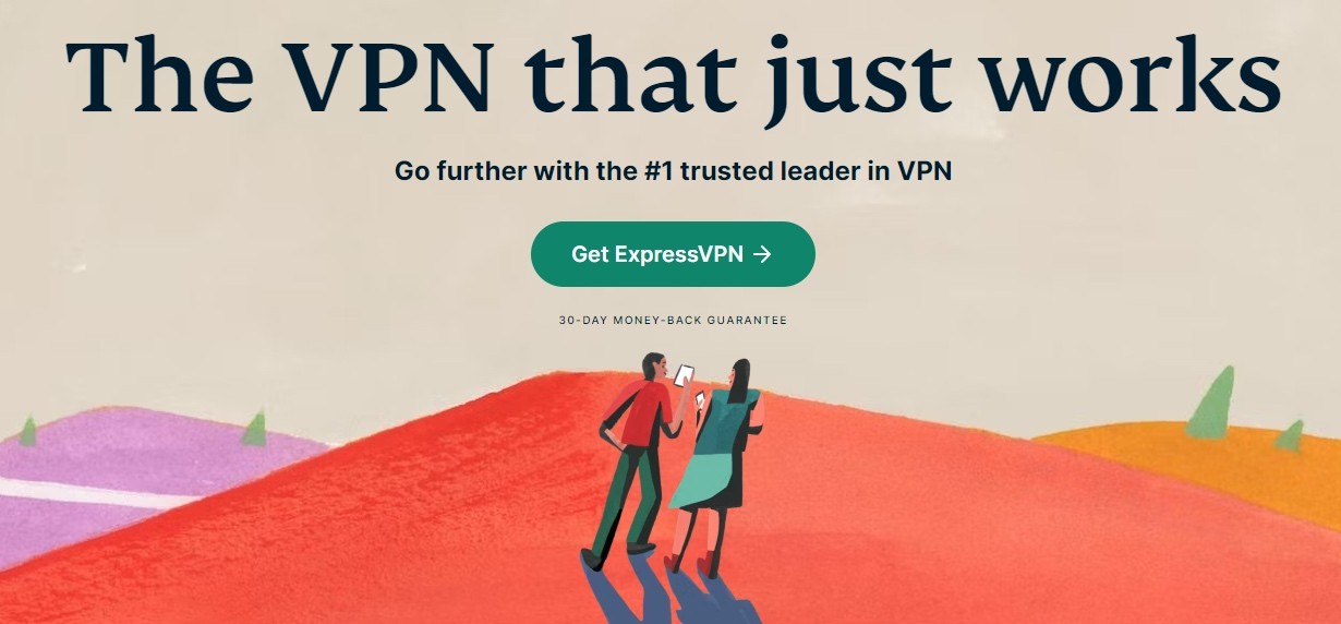
Note the messaging. It’s super simple with the headline and other elements directly targeting the pain point about VPN usage.
Speak their language
It’s paramount that you use words and phrases that actually resonate with your target audience. Avoid jargon or overly complex language. Everything—your headline, subheading, and body copy should clearly communicate how your product or service solves customer problem.
Take the same example of VPN Express. The messaging is simple, clear, and clear to the point. This helps visitors connect immediately with the brand and boost conversions. If you want a quick foundational understanding of how VPNs work from a user’s perspective, you can also learn more to better grasp how to tailor your messaging.
If you’re struggling to optimize your landing page, don’t worry–Fibr AI can help you. With bulk landing page creation features and ad optimization, the platform ensures you are always one step ahead of your competitors. Target every keyword, ad, and campaign with high-converting landing pages
Reduce CPC and the time and resources you spend. Let Fibr AI turn around your landing page conversion rates in the shortest time period.
Craft a compelling CTA
Use action-oriented language
Your CTA is arguably the most important factor when concerning landing page conversion rate. Instead of designing ‘Know More’ and such generic CTA, try using action words to entice your visitor
Take a look at Hootsuite’s CTA for example:
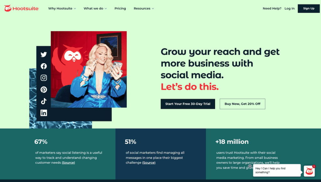
Did you notice ‘Start Your Free 30-Day Trial’ and ‘Buy Now, Get 20% Off.’ You’d agree that these CTAs have been crafted tactfully to make users take action and boost conversions.
Keep it short and impactful
In the above example, did you notice how the CTAs are short and crisp? There is no point in having lengthy meaningless CTAs that bore out visitors. Ensure it’s on the shorter side and grabs attention immediately–whether through design or content.
Leverage social proof
Showcase testimonials and reviews
Authentic testimonials and reviews build credibility. Landing pages are an excellent option to build that ‘credibility’ and promote, advertise, and broadcast all the positive reviews about your business.
Let’s take Shopify as an example here:

Take notice of ‘Trust by 600,000 business worldwide’ and the testimonial placed below (short and by a trusted brand).
Such elements can have a major impact on your landing page conversion rate.
Display trust badges and client association
If your business has been featured in big publications or is associated with big industry names, you can leverage them to further cement your brand’s authenticity and credibility.
Again, taking the example of Shopify, notice in the above image how they have strategically placed their association with ‘The Wall Street Journal’ and ‘The New York Times’ and more.
This can bolster the brand’s image and establish it as a trusted name–an important factor for conversion. |
Use high-quality visuals
Include relevant images or videos
Visual content can present your message faster than text. Using relevant images and videos can enhance the quality of communication you have with your visitors and help push the conversion needle.
Airbnb is a good example here:
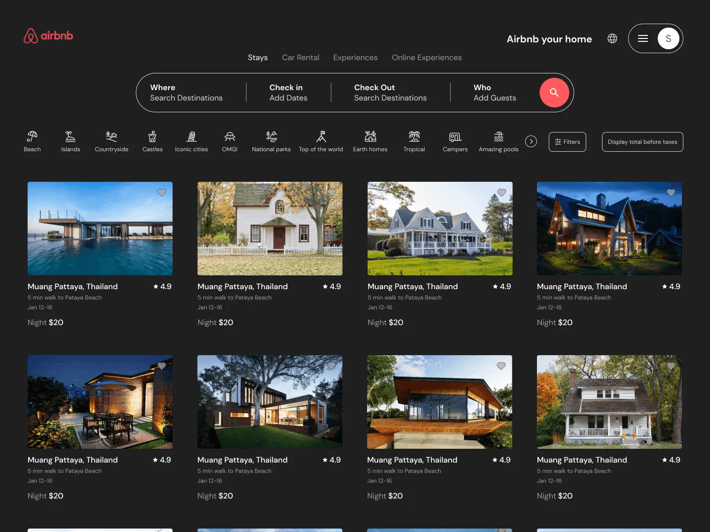
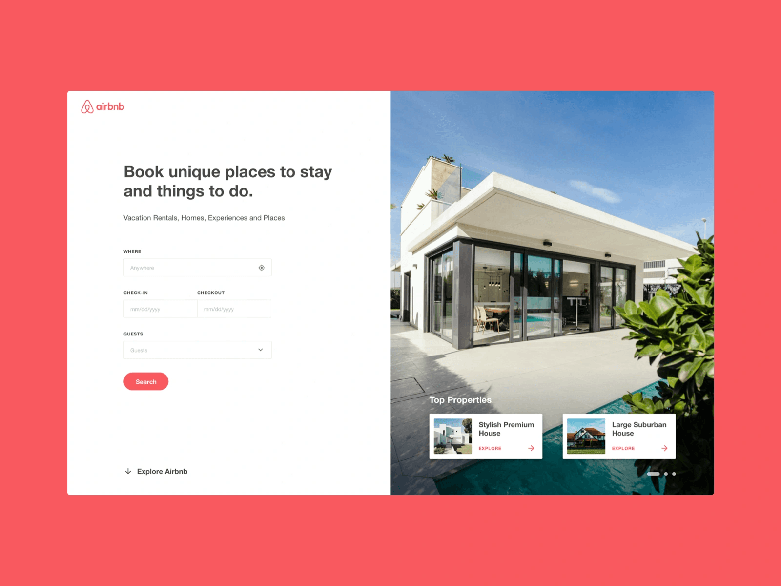
You’d agree that images help the case of Airbnb immensely and enhance the visual appeal of the page.
🙂 Pro-tip: Avoid using generic stock images as they may feel impersonal and not resonate with your audience. Go for images and videos that match the style of your messaging and brand.
Make message match a must
Reinforce the Message
The core message conveyed in your ad should be instantly reinforced on your landing page. If your ad promises a "free trial," your landing page headline shouldn't be about a "limited-time discount." The narrative needs to flow smoothly from the ad to the landing page, reiterating the same core value proposition. Visitors should feel like they've landed exactly where they expected to be based on the ad they clicked.
Expand on the Promise
The content on your landing page should expand on the promise made in your ad. It should provide more details, address potential objections, and build a stronger case for your offer. If your ad highlights a specific product feature, your landing page content should delve deeper into that feature, explaining its benefits and how it solves a problem for the visitor.
Maintain Visual Consistency
If your ad features a particular image or video, that same visual (or a very similar one) should be prominently displayed on your landing page. This creates a visual connection between the ad and the landing page, reinforcing the message and building trust. Avoid using completely different visuals, as this can create confusion and make visitors question whether they're in the right place.
Align Functionality
The functionality of your landing page should also align with the ad's message. For example, if your ad copy emphasizes the ease of use of your software, your landing page should have a clean and intuitive design that demonstrates that ease of use. If your ad promotes a special offer, the landing page should make it easy for visitors to redeem that offer. Any disconnect in functionality can create friction and prevent conversions.
Message match is the first step in showing visitors that you are trustworthy, that you understand their needs, and that you're delivering on the promise made in your ad.
Improve page speed
Compress images and videos
Large files, images, and videos can severely impact the speed of your landing page. Ensure to compress your marketing assets to optimize for speed.
Minimize redirects and scripts
If there are too many redirects (say from the homepage to the landing page), it can increase the load time of your page. This can translate to slower loading time, high bounce rates, and bad user experience.
Audit your page regularly to remove unnecessary elements and minimize redirects.
7. Test and iterate
Run A/B tests
The smallest of changes can have the biggest impact when it comes to landing pages and conversions. Regularly experiment with different elements of your landing page–headline, CTA, image, and more to understand what the users resonate with and how it can be best optimized.
Nobody comes close to Fibr AI when it comes to A/B testing. Run 100s and 1000s of experiments with ease, quickly edit with the WYSIWYG editor, and optimize landing pages for headlines, CTAs, and more! Target audience across devices and locations minus manual processes!
Analyze user behavior
User behavior cannot be static. Make use of heat maps, session recordings, and more to understand user interaction. Identify areas where they drop off and make adjustments accordingly.
8. Mobile optimization
Ensure responsive design
The UI and UX of your landing page are a super important conversion rate factor. And if a majority of your traffic comes from mobile phones, it becomes paramount to optimize for the same.
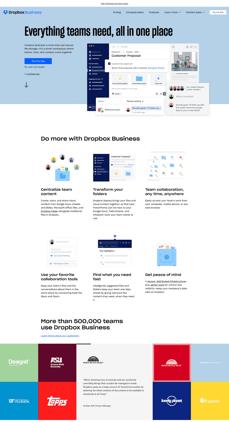
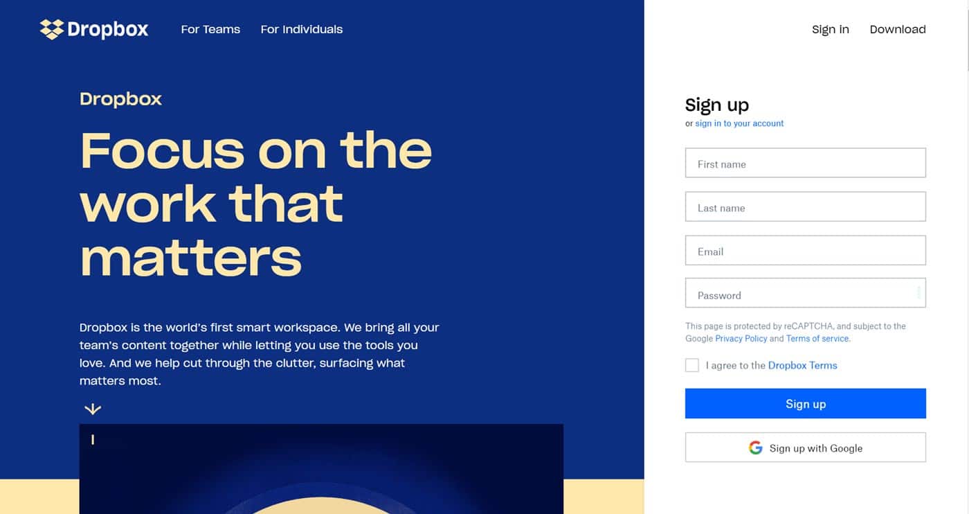
Ensure your landing page loads and works equally well on all devices–whether phone, desktop, or iPad. DropBox’ landing page can be a good example here, take a look:
Use larger buttons and fonts
Having a cluttered headline or CTA hidden somewhere for instance can negatively impact conversions. Always make sure you are using larger tappable buttons in readable fonts. Avoid using text sizes that would require readers or visitors to squeeze in harder or make navigation painful.
Again, you can take the example of Dropbox’s landing page and see how its headline is formatted (different color, made bold) when compared to other elements on the page.
9. Create a sense of urgency
Use time-sensitive offers
Phrases like ‘Limited Offer’ or Only ‘5 seats left’ can help create a sense of urgency and invoke action at the visitor’s end. But be honest and do not create fake urgency as it can hamper visitor’s trust.
10. Personalize the experience
Use dynamic content
Your landing page’s content should add value to the visitor and ensure that your brand’s message is being communicated properly. Take a look a Slack’s landing page of instance below:
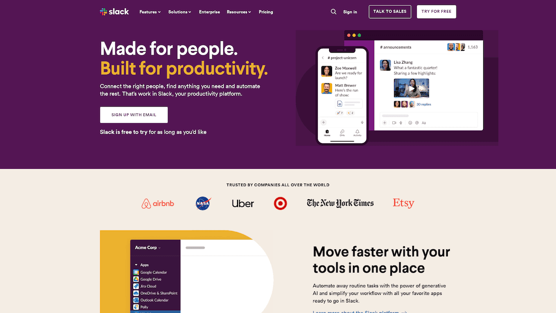
Slack’s content and messaging– ‘Made for people’ and ‘Build for productivity’ alongside the subtext ‘Connect the right people, find anything you need and automate the rest…’ reinforce Slack as the most competent productivity tool.
Address visitors by name
If you have access to visitor data, you may look to address the visitor by their name. This can add an extra touch of personalization and warm your leads.
Build smarter and convert faster.
Try’s Fibr AI’s landing page builder today!
Why do different industries have different landing page conversion rates?
The ‘ideal landing page conversion rate’ debate is an interesting one. The metric could vary from industry to industry depending on distinct audience behavior, goals, and more.
Per many reports and publications, the average landing page conversion rate ranges anywhere from 4.3-5.8%
Catering and restaurants for instance enjoy an average conversion rate of 10%. Reasoning? The need to make quick decisions. Conversely, SaaS companies and services-based industries have lower rates–3%-4%. This is because these industries require deeper trust-building and consideration.
The nature of the product, service, and industry impacts landing page conversion rates. It’s important to understand the average landing page conversion rate of your industry to set realistic targets. For instance, eCommerce has an average rate of ~5-5.5%. If you’re in the same industry, setting a 20% average conversion target could be considered insane and impossible to reach.
It’s best to see what rates your competitors are achieving, and the things they are doing right, and then replicating them for the best results.
Create high-converting landing pages with Fibr AI
It is no hidden fact that landing page conversion rate as a metric has been made overtly complex for no reason whatsoever. If you as a brand have faced this issue and are looking for a smart landing page builder, the answer is Fibr AI.
Create bulk landing pages with audience personalization in seconds. What’s more? Craft AI-powered landing pages for every ad, audience, SMS, keyword, trend, campaign, and more. Integrate seamlessly with Google and Meta ads to reach audiences across the globe.
Best part? You no longer need to worry about development, code, and all the backend work–Fibr AI takes care of that for you.
Don’t wait any longer. Sign up with Fibr AI today and watch your conversions soar!
Maximize reach, and minimize resources!
FAQ
How do you calculate landing page conversion rate?
To calculate the landing page conversion rate, you simply need to divide conversion by total visitors and multiply the value by 100. This value gives you insights into how many visitors are actually taking action and if the landing page is doing its job well.
What is a good conversion rate for a landing page?
10% is considered a good median landing page conversion rate. But the average rate can hover around 4-5%.





Meenal Chirana
Content Marketing Manager
Meenal Chirana, Content Marketer at Fibr, brings five years of experience in the content field to the team. Her passion for creating engaging content is matched only by her expertise in writing, SEO and content marketing . Passionate about all things content and digital marketing, she is always on the lookout for innovative ways to connect with audiences and elevate brands.
Read summarized version with
You've poured your heart and soul into crafting landing page after landing page, tweaking every element, hoping for that magic formula. But after launch? Crickets. No conversions, no clicks, just a digital ghost town.
Sound familiar? If your landing pages consistently fall flat, it's time to get serious about one metric: your landing page conversion rate. This number is a report card for your landing page's performance, revealing how effectively it's turning visitors into customers.
Why is this so important? Beyond simply telling you if your page is "good" or "bad," understanding and optimizing your conversion rate helps achieve sustainable growth. When you focus on boosting conversions, you're improving a single page while also refining your entire marketing funnel.
A higher conversion rate means more leads, more sales, and a better return on your marketing investment. Plus, it gives you valuable insights into your audience and helps you understand what motivates them and what makes them click. It allows you to make data-driven decisions rather than relying on guesswork.
In this blog we will break down what a landing page conversion rate really means, how it's calculated, and the secret strategies to optimize it for maximum impact.
Ready? Let’s start.
🕰️ 30 Second Summary
The landing page conversion rate depicts how many users are taking action on your landing page.
It can be calculated by dividing total conversion by total trafficking and multiplying the whole value by 100.
The average landing page conversion rate across industries ranges from 4.3-5.8%. The median range can vary depending on the industry, target audience, and more.
How to improve landing page conversion rate
Understand your audience
Optimize your call-to-action (CTA)
Leverage social proof
Use high-quality visuals
Improve page speed
Perform A/B test
Optimization for mobile
Create a sense of urgency
Personalization
What is a landing page conversion rate?
In simple terms, landing page conversion rate measures the percentage of visitors who complete a desired action after arriving on a specific page. The action could be anything–purchasing a product, signing up for a newsletter, downloading a resource, or filling up a form.
It is a key metric that reflects how effectively a landing page is able to convert visitors and leads. A high landing page conversion rate could indicate that your page is being well-received by visitors a.k.a the landing page is doing its job well. Conversely, a low landing page conversion rate could mean the landing page is not resonating well, suggesting room for improvement.
Now, why is the landing page conversion metric important? Well, it’s simple.
Firstly low conversion rate=low revenue. This could be indicative that your traffic is not being utilized to its full potential. Secondly, this metric can help you gauge the success of your marketing efforts. For instance, if the rate is low, you know there is a problem to be addressed.
So, if you’re wondering how this rate is calculated, continue reading.
➕ Did you know? Business websites that had 10-15 landing pages have been reported to have ~55% more conversions than those with less than 10 landing pages.
How to calculate landing page conversion rate?
Calculating the landing page conversion rate is fairly simple. All you have to do is divide the conversions by the total number of visitors or traffic and multiply it by 100.
Landing page conversion rate formula= Total conversion/ Total number of visitors *100
Let’s understand this quickly with an example. Suppose a landing page has 1500 total visitors and 50 conversions. Then, per the landing page conversion rate formula
50/1500*100=3.3%
So the landing page conversion rate in this example is 3.3%.
Now, just knowing your conversion rate isn't enough. A number by itself doesn't tell you if your page is performing well. You need a benchmark to compare against. This benchmark tells you whether your landing page is exceeding expectations or falling short.
You can use two main benchmarks:
1. Your historical data: This means comparing your current conversion rate to your past performance. Have your conversion rates been steadily improving? Are they higher or lower than they were last quarter? Tracking your own progress shows you whether you are creating the right type of landing pages.
2. Industry standards: Every industry has an average landing page conversion rate. For example, the e-commerce industry has a conversion rate of 4.2%, whereas in the financial services industry, it is 8.2%. The goal is to perform better than your industry average. Comparing against an industry-standard benchmark shows how your landing page stacks up against the competition and helps identify areas for improvement.
Build AI-powered landing pages that actually sell. Book a demo with Fibr AI today!
How to improve landing page conversion rate?
That’s basically the question on the mind of every business owner. The secret is to take immense care when crafting each and every part of your landing page. Your goal is to present your visitors with a seamless, persuasive, and personalized experience that makes them want to take action. This means understanding their needs, addressing their pain points, and showcasing the value you offer in a clear and compelling way.
Below, we decode some factors and real life landing page examples to help you boost your landing page conversion rates:
Understand your audience
Identify their pain points
There is no secret or genius ingredient when building a landing page or a website. It’s just simply understanding the pain point of your target audience. As a business or brand, you need to understand your audience’s needs and challenges.
Tailor your messaging to address their specific pain points to drive up landing page conversion rate
But, how to do this? Conduct surveys, primary and secondary research, scan social media, analyze and gather customer feedback, or use tools like Google Analytics to gather insights.
Let’s understand this with an example. Take a look at Express VPN’s landing page below:
Note the messaging. It’s super simple with the headline and other elements directly targeting the pain point about VPN usage.
Speak their language
It’s paramount that you use words and phrases that actually resonate with your target audience. Avoid jargon or overly complex language. Everything—your headline, subheading, and body copy should clearly communicate how your product or service solves customer problem.
Take the same example of VPN Express. The messaging is simple, clear, and clear to the point. This helps visitors connect immediately with the brand and boost conversions. If you want a quick foundational understanding of how VPNs work from a user’s perspective, you can also learn more to better grasp how to tailor your messaging.
If you’re struggling to optimize your landing page, don’t worry–Fibr AI can help you. With bulk landing page creation features and ad optimization, the platform ensures you are always one step ahead of your competitors. Target every keyword, ad, and campaign with high-converting landing pages
Reduce CPC and the time and resources you spend. Let Fibr AI turn around your landing page conversion rates in the shortest time period.
Craft a compelling CTA
Use action-oriented language
Your CTA is arguably the most important factor when concerning landing page conversion rate. Instead of designing ‘Know More’ and such generic CTA, try using action words to entice your visitor
Take a look at Hootsuite’s CTA for example:
Did you notice ‘Start Your Free 30-Day Trial’ and ‘Buy Now, Get 20% Off.’ You’d agree that these CTAs have been crafted tactfully to make users take action and boost conversions.
Keep it short and impactful
In the above example, did you notice how the CTAs are short and crisp? There is no point in having lengthy meaningless CTAs that bore out visitors. Ensure it’s on the shorter side and grabs attention immediately–whether through design or content.
Leverage social proof
Showcase testimonials and reviews
Authentic testimonials and reviews build credibility. Landing pages are an excellent option to build that ‘credibility’ and promote, advertise, and broadcast all the positive reviews about your business.
Let’s take Shopify as an example here:
Take notice of ‘Trust by 600,000 business worldwide’ and the testimonial placed below (short and by a trusted brand).
Such elements can have a major impact on your landing page conversion rate.
Display trust badges and client association
If your business has been featured in big publications or is associated with big industry names, you can leverage them to further cement your brand’s authenticity and credibility.
Again, taking the example of Shopify, notice in the above image how they have strategically placed their association with ‘The Wall Street Journal’ and ‘The New York Times’ and more.
This can bolster the brand’s image and establish it as a trusted name–an important factor for conversion. |
Use high-quality visuals
Include relevant images or videos
Visual content can present your message faster than text. Using relevant images and videos can enhance the quality of communication you have with your visitors and help push the conversion needle.
Airbnb is a good example here:
You’d agree that images help the case of Airbnb immensely and enhance the visual appeal of the page.
🙂 Pro-tip: Avoid using generic stock images as they may feel impersonal and not resonate with your audience. Go for images and videos that match the style of your messaging and brand.
Make message match a must
Reinforce the Message
The core message conveyed in your ad should be instantly reinforced on your landing page. If your ad promises a "free trial," your landing page headline shouldn't be about a "limited-time discount." The narrative needs to flow smoothly from the ad to the landing page, reiterating the same core value proposition. Visitors should feel like they've landed exactly where they expected to be based on the ad they clicked.
Expand on the Promise
The content on your landing page should expand on the promise made in your ad. It should provide more details, address potential objections, and build a stronger case for your offer. If your ad highlights a specific product feature, your landing page content should delve deeper into that feature, explaining its benefits and how it solves a problem for the visitor.
Maintain Visual Consistency
If your ad features a particular image or video, that same visual (or a very similar one) should be prominently displayed on your landing page. This creates a visual connection between the ad and the landing page, reinforcing the message and building trust. Avoid using completely different visuals, as this can create confusion and make visitors question whether they're in the right place.
Align Functionality
The functionality of your landing page should also align with the ad's message. For example, if your ad copy emphasizes the ease of use of your software, your landing page should have a clean and intuitive design that demonstrates that ease of use. If your ad promotes a special offer, the landing page should make it easy for visitors to redeem that offer. Any disconnect in functionality can create friction and prevent conversions.
Message match is the first step in showing visitors that you are trustworthy, that you understand their needs, and that you're delivering on the promise made in your ad.
Improve page speed
Compress images and videos
Large files, images, and videos can severely impact the speed of your landing page. Ensure to compress your marketing assets to optimize for speed.
Minimize redirects and scripts
If there are too many redirects (say from the homepage to the landing page), it can increase the load time of your page. This can translate to slower loading time, high bounce rates, and bad user experience.
Audit your page regularly to remove unnecessary elements and minimize redirects.
7. Test and iterate
Run A/B tests
The smallest of changes can have the biggest impact when it comes to landing pages and conversions. Regularly experiment with different elements of your landing page–headline, CTA, image, and more to understand what the users resonate with and how it can be best optimized.
Nobody comes close to Fibr AI when it comes to A/B testing. Run 100s and 1000s of experiments with ease, quickly edit with the WYSIWYG editor, and optimize landing pages for headlines, CTAs, and more! Target audience across devices and locations minus manual processes!
Analyze user behavior
User behavior cannot be static. Make use of heat maps, session recordings, and more to understand user interaction. Identify areas where they drop off and make adjustments accordingly.
8. Mobile optimization
Ensure responsive design
The UI and UX of your landing page are a super important conversion rate factor. And if a majority of your traffic comes from mobile phones, it becomes paramount to optimize for the same.
Ensure your landing page loads and works equally well on all devices–whether phone, desktop, or iPad. DropBox’ landing page can be a good example here, take a look:
Use larger buttons and fonts
Having a cluttered headline or CTA hidden somewhere for instance can negatively impact conversions. Always make sure you are using larger tappable buttons in readable fonts. Avoid using text sizes that would require readers or visitors to squeeze in harder or make navigation painful.
Again, you can take the example of Dropbox’s landing page and see how its headline is formatted (different color, made bold) when compared to other elements on the page.
9. Create a sense of urgency
Use time-sensitive offers
Phrases like ‘Limited Offer’ or Only ‘5 seats left’ can help create a sense of urgency and invoke action at the visitor’s end. But be honest and do not create fake urgency as it can hamper visitor’s trust.
10. Personalize the experience
Use dynamic content
Your landing page’s content should add value to the visitor and ensure that your brand’s message is being communicated properly. Take a look a Slack’s landing page of instance below:
Slack’s content and messaging– ‘Made for people’ and ‘Build for productivity’ alongside the subtext ‘Connect the right people, find anything you need and automate the rest…’ reinforce Slack as the most competent productivity tool.
Address visitors by name
If you have access to visitor data, you may look to address the visitor by their name. This can add an extra touch of personalization and warm your leads.
Build smarter and convert faster.
Try’s Fibr AI’s landing page builder today!
Why do different industries have different landing page conversion rates?
The ‘ideal landing page conversion rate’ debate is an interesting one. The metric could vary from industry to industry depending on distinct audience behavior, goals, and more.
Per many reports and publications, the average landing page conversion rate ranges anywhere from 4.3-5.8%
Catering and restaurants for instance enjoy an average conversion rate of 10%. Reasoning? The need to make quick decisions. Conversely, SaaS companies and services-based industries have lower rates–3%-4%. This is because these industries require deeper trust-building and consideration.
The nature of the product, service, and industry impacts landing page conversion rates. It’s important to understand the average landing page conversion rate of your industry to set realistic targets. For instance, eCommerce has an average rate of ~5-5.5%. If you’re in the same industry, setting a 20% average conversion target could be considered insane and impossible to reach.
It’s best to see what rates your competitors are achieving, and the things they are doing right, and then replicating them for the best results.
Create high-converting landing pages with Fibr AI
It is no hidden fact that landing page conversion rate as a metric has been made overtly complex for no reason whatsoever. If you as a brand have faced this issue and are looking for a smart landing page builder, the answer is Fibr AI.
Create bulk landing pages with audience personalization in seconds. What’s more? Craft AI-powered landing pages for every ad, audience, SMS, keyword, trend, campaign, and more. Integrate seamlessly with Google and Meta ads to reach audiences across the globe.
Best part? You no longer need to worry about development, code, and all the backend work–Fibr AI takes care of that for you.
Don’t wait any longer. Sign up with Fibr AI today and watch your conversions soar!
Maximize reach, and minimize resources!
FAQ
How do you calculate landing page conversion rate?
To calculate the landing page conversion rate, you simply need to divide conversion by total visitors and multiply the value by 100. This value gives you insights into how many visitors are actually taking action and if the landing page is doing its job well.
What is a good conversion rate for a landing page?
10% is considered a good median landing page conversion rate. But the average rate can hover around 4-5%.
Meenal Chirana
Content Marketing Manager
Meenal Chirana, Content Marketer at Fibr, brings five years of experience in the content field to the team. Her passion for creating engaging content is matched only by her expertise in writing, SEO and content marketing . Passionate about all things content and digital marketing, she is always on the lookout for innovative ways to connect with audiences and elevate brands.