37 Landing Page Best Practices & Top Strategies to Optimize Conversions
Published by
Dec 10, 2025

Meenal Chirana
Published on
Table of Content
You’ve poured all your precious time and money into your campaigns, traffic is flowing into your landing page. But conversions aren’t happening.
Isn’t this frustrating?
Of course, it is.
Unlike other website pages, the landing page is designed to help your business in achieving one key goal:
To drive sales and generate revenue by attracting more prospects and converting them into customers.
A well-optimized landing page can make a great difference.
Wondering how to create a high-converting landing page?
In this detailed guide , we discuss practical landing page best practices to help you design landing pages that attract and turn website visitors into leads and customers.
These landing page optimization tips will help you whether you want to drive leads, signups, or sales.
We’ve taken them from practical landing page optimization case studies, so you know they are effective.Use them to optimize your landing pages and boost conversion rates.
Landing Page Best Practices: A Quick Summary
Effective landing pages ensure better audience engagement, improve brand perception, and maximize conversions by reducing friction and enhancing user experience.
Key Strategies for Performance Optimization include focusing on fast load times, mobile responsiveness, and clear, value-driven messaging to attract and retain visitors.
Effective landing page design and layout best practices encompass maintaining a clean, visually appealing layout with intuitive navigation, a clear hierarchy, and strategically placed white space.
To improve landing page UX use simple forms, limited distractions, and seamless navigation to guide visitors toward conversion goals effortlessly.
To avoid common landing page optimization mistakes, fix issues like cluttered designs, excessive form fields, and slow-loading pages to avoid losing potential leads.
To testing and measure landing page effectiveness, regularly A/B test elements like headlines, CTAs, and layouts while tracking performance metrics (e.g., conversion rates, bounce rates) to refine your strategy.
Why Following Landing Page Best Practices Is Essential
HubSpot says the average conversion rate across all industries is 5.89%. The benchmark for a good conversion rate is 10%. However, you must create high-converting landing pages that benefit you and your target audience to hit this mark.
To achieve this, you must follow landing page design best practices that have consistently increased conversions for other online businesses.
Following these practices will help you:
Improve the landing page experience: A clean design, clear navigation, and fast loading times help visitors find the information they need quickly, reducing bounce rates.
Boost conversions: Landing page best practices like crafting compelling CTAs, strategically placing forms, and focusing on benefits help guide users toward desired actions, which increases lead generation and sales.
Boost credibility: Including trust signals like testimonials, badges, and clear contact information builds confidence in your offering.
Optimize landing pages for mobile users: With mobile traffic dominating, responsive designs make your landing pages accessible and usable across devices.
Make data-driven decisions: These practices emphasize implementing analytics tools and A/B testing which allows you to refine performance and make data-backed decisions to improve ROI.
Overall, if you want high conversion rates in your landing pages, follow these practices when creating or from the moment you create landing pages.
Also Read: Conversion Rate Optimization Tips for Landing Pages
Best Practices for Landing Page Design and Layout
An effective landing page needs to be clear with a focused layout. The page layout should be well-structured, organized, and easy to navigate. Above all, it should focus users’ attention on the most crucial elements such as headline, copy, and call-to-action.
Here are landing page design best practices that can help you design layouts that captivate your audience, convey your message clearly, and encourage action.
1. Get to Know Your Audience
Do you know your target customers enough? You probably don’t and that could make it impossible to create a landing page design and layout that resonates with them.
According to a HubSpot survey, just about 42% of marketers know the basic demographic information of their target audience—their name, gender, and location.
Understanding your audience is the cornerstone of any successful landing page. Knowing their preferences, pain points, and behaviors allows you to tailor content that resonates and drives engagement. When your audience feels understood, they’re more likely to trust your brand and convert.
Here are tips to uncover your target audience:
Conduct surveys or interviews to gather insights.
Use analytics tools to track user behavior.
Create detailed buyer personas.
Test different approaches to see what resonates most.
Also Read: 7 Best User Behavior Tools to Consider in 2025
2. Know Where Your Visitors Are Coming From, Plus Their Main Goal
Visitors arrive at your landing page through various channels—from ads, email, and social media—and each has its intent. Knowing their source helps you align the page's content and design with their expectations and objectives. No one wants to click on an ad on social media, only to land on a page that doesn’t align with the ad copy.
Here are handy tips to help you with this:
Set up UTM parameters to track traffic sources.
Use heatmaps to see how users interact with the page.
Tailor messaging to reflect the channel’s tone and purpose.
Identify user goals through A/B testing.
3. Know the Objectives of Your Landing Page
What goals do you want your landing page to help you achieve?
Defining the objective of your landing page ensures every design element serves a purpose, from the headline to the copy and call-to-action. Whether the goal is collecting leads, driving sales, or encouraging sign-ups, clarity prevents distractions and improves conversions.
Here are tips to help you clearly define the objectives of your landing page:
Understand who you’re trying to reach by analyzing demographics, preferences, and behaviors to tailor your landing page content.
Determine the specific action you want visitors to take, such as signing up, making a purchase, or downloading content.
Ensure the landing page objectives are consistent with your broader marketing or business goals, such as increasing conversions or building brand awareness.
Avoid overwhelming visitors by focusing on one primary objective to drive better results and avoid distractions.
Establish measurable KPIs (e.g., click-through rates, form submissions, etc.) to gauge whether your landing page is meeting its objectives effectively.
Write a single, clear call-to-action (CTA).
Remove unnecessary elements that don’t support the goal.
Use analytics to measure the success of the objective.
4. Keep the Design Simple to Make Conversion Easy
One of the common mistakes people make when designing their landing pages is to use a cluttered design. This makes the landing page complicated and confusing for visitors, hindering conversions.
You need to use a clutter-free design that improves usability and keeps visitors focused on your offer.
Like this one:
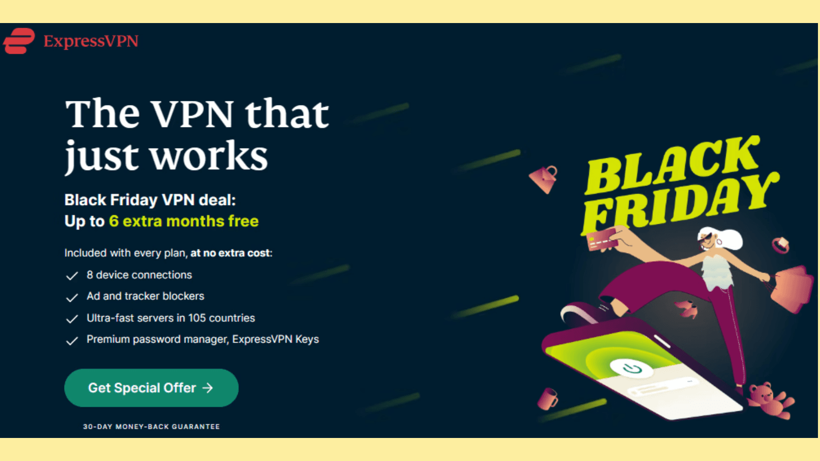
Simple designs load faster, reduce cognitive overload, and lead to higher conversion rates.
Here are simple tips to make your landing page design simple
Use minimalistic layouts with plenty of whitespace.
Limit the number of form fields to essentials (if you have them).
Highlight the CTA prominently.
Make the landing page mobile responsive for seamless navigation.
5. Leave the Key Information ‘Above-the-Fold’
Above-the-fold is the part of your landing page that visitors see right away when they land on your website before they scroll.
Here’s Slack’s landing page with above-the-fold content:
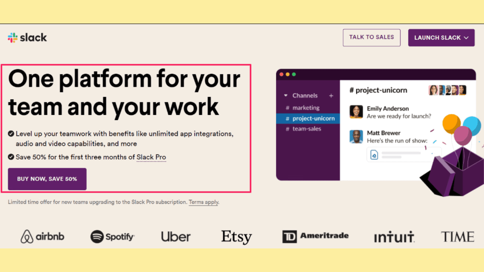
It typically includes:
A catchy and compelling headline that speaks to the audience’s pain points or highlights a benefit.
Clear, legible, and concise lead text (a sub-headline or paragraph below the headline with smaller fonts that expands on the headline). This should communicate the main value proposition.
An optimized CTA or form fields urging prospects to take action—depending on the landing page goal.
A high-quality image. No stock photo here.
You must make this part grab their attention right away and include key information. Placing vital content above the fold captures attention quickly and reduces the risk of visitors bouncing.
Here are practical tips to help you with this:
Place your value proposition and CTA at the top.
Include a compelling headline to draw attention.
Use visuals to support key messages.
Test different placements of elements to optimize visibility.
6. Use the Right Mix of Contrasting Colors
For most people, when it comes to using contrasting colors, think about the CTA button alone.
Here is the thing: You can use contrasting colors to highlight other essential landing page elements like headlines, features/benefits, percentage discounts, add-to-cart buttons, etc.
Like this:
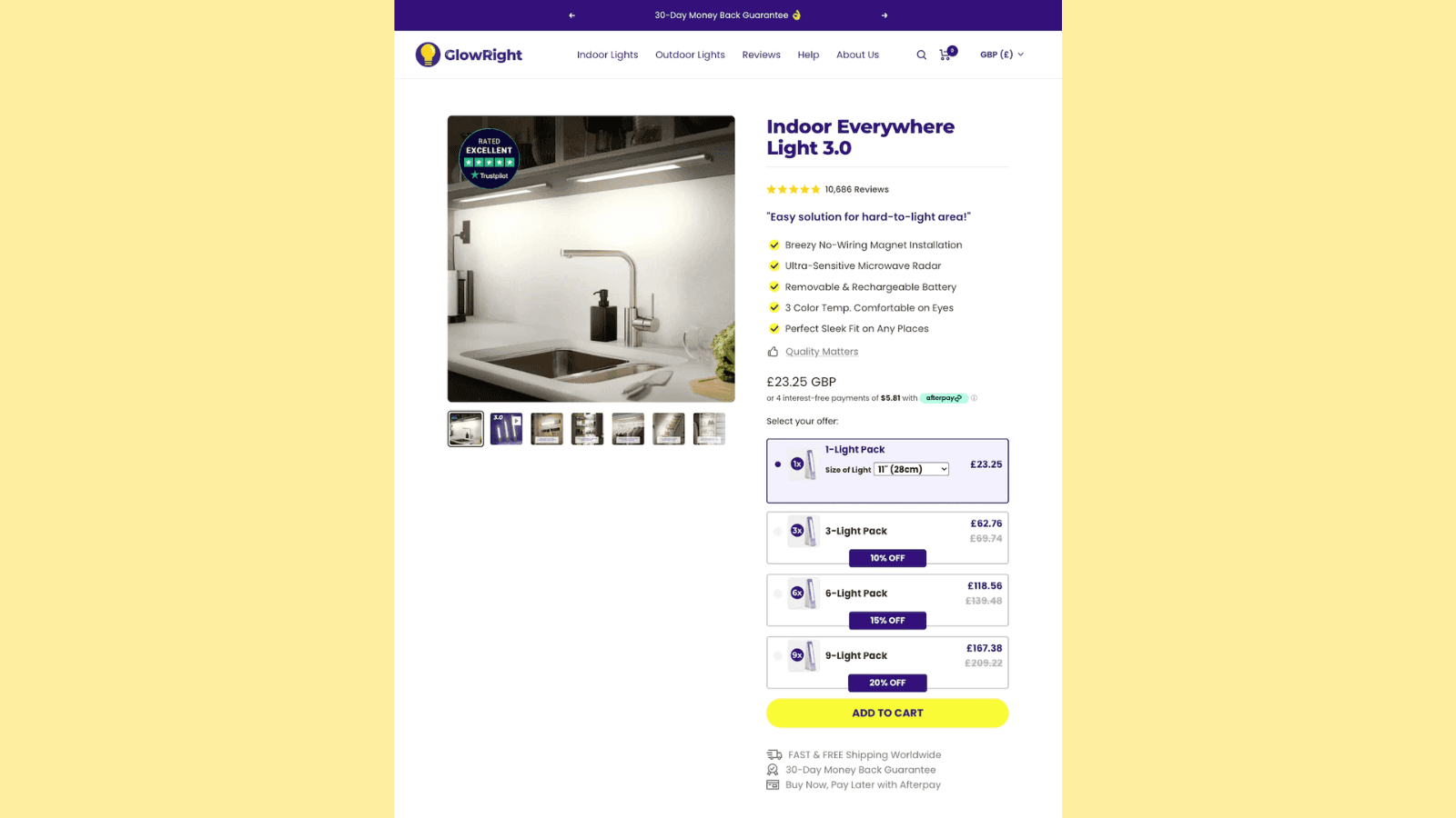
Using a mix of contrasting colors makes your landing page visually appealing and guides the visitor’s eye to essential elements like CTAs.
Here are powerful landing page strategies for using contrasting colors:
Use a color wheel to find complementary colors.
Highlight CTAs with bold, contrasting hues.
Stick to a consistent color scheme throughout the page.
Test color combinations to find what converts best.
Note that the colors you use should match your brand colors.
7. Make The Design and Layout Consistent With Traffic Sources
Imagine boarding a plane destined for Ukraine only to land in a place that feels completely different from the promised destination.
When people click on an ad or link in an email, there must be consistency with the landing page they land on. Everything from the language, tone, images, and color scheme should be consistent.
Here is a typical example. When you click on these ads on Google, you will be taken to the respective landing pages of the project management tools with the same consistency as in the ads.
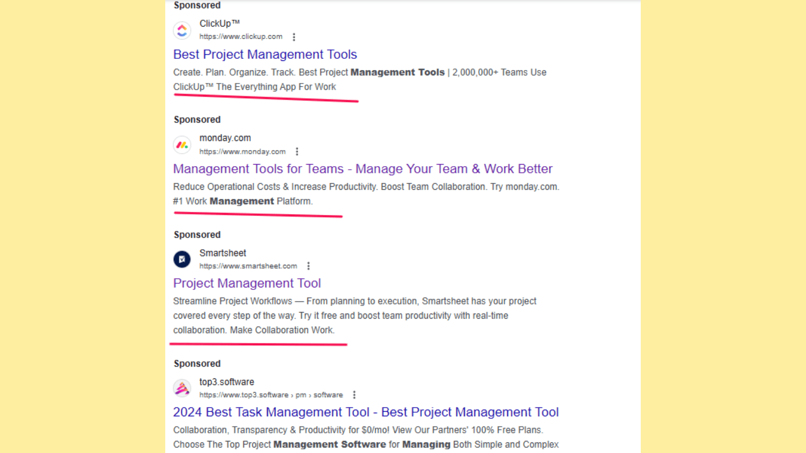
Consistency between traffic sources and your landing page reassures visitors they’re in the right place. It builds trust and avoids confusion which can improve the likelihood of conversions.
Here are practical tips to make your landing page design and layout consistent with traffic sources:
Match the headline and visuals with ad creatives.
Use similar language and tone from the referral source.
Ensure the offer is the same as promised in the ad or link.
Test consistency across multiple traffic sources.
8. Use Ample Whitespace in Your Landing Page Layout
Whitespaces, or negative spaces enhance readability so users can focus on what’s important.
Like in this landing page by AnyRoad:
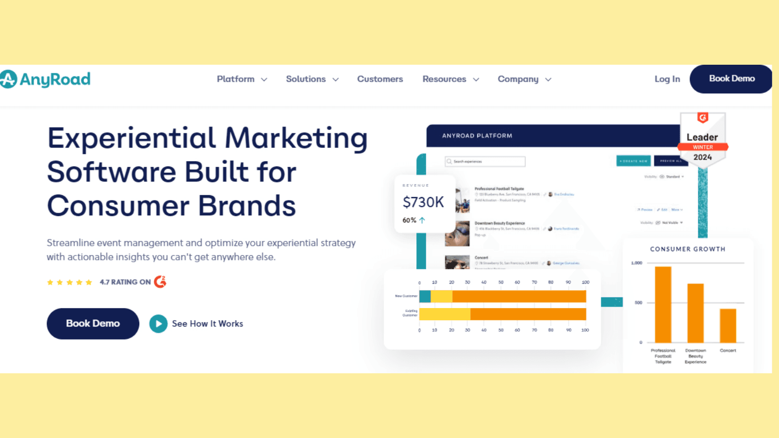
These white spaces allow key landing page elements to stand out, making the page less overwhelming and more user-friendly.
Here are tips to incorporate whitespace in your landing page layout:
Avoid overcrowding text or images.
Space out sections and elements.
Use margins and padding to create visual balance.
Test layouts to see which whitespace distribution works best.
9. Segment Your Landing Pages Based on Audiences
People landing on your page aren’t the same, plus they have different goals and expectations. That’s why you need to segment your landing page based on audiences.
Tailoring landing pages for specific audiences improves relevance and engagement. Segmentation allows you to address unique needs, behaviors, and expectations.
For instance, Mogul.io segments based on use case—targeting only SaaS founders and CEOs:
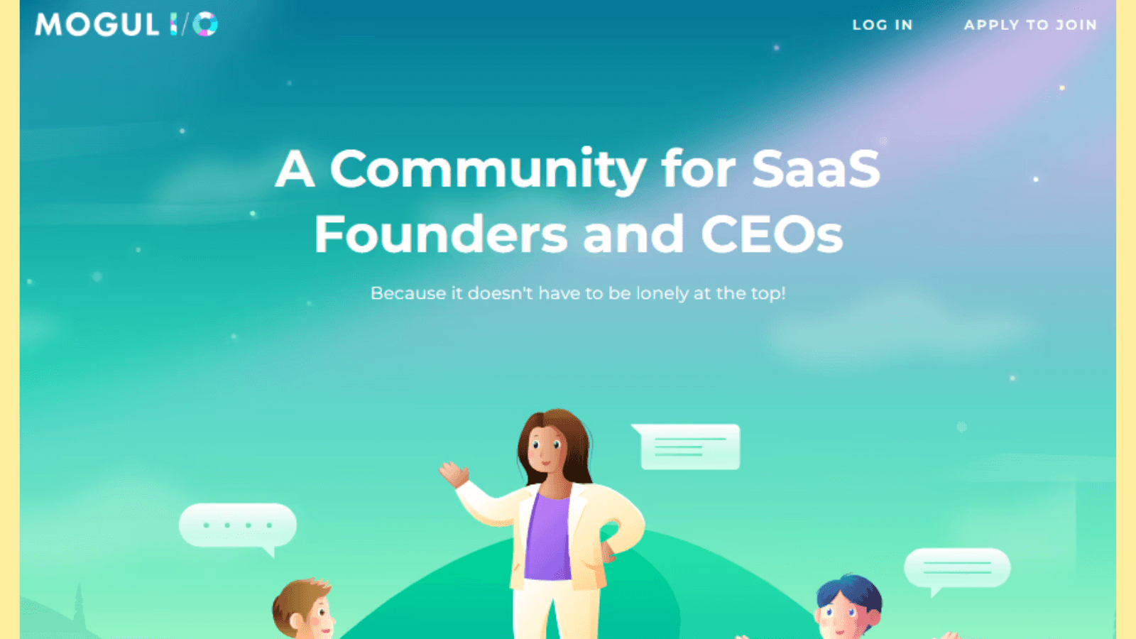
Use the following tips to segment your landing page audiences effectively:
Create separate landing pages for different campaigns.
Use dynamic content to personalize pages.
Optimize CTAs and messaging for each audience.
Analyze segmented traffic data to refine strategies.
10. Use Directional Cues to Direct the Eye
Capturing your website visitors’ attention is half the battle. You need to point them at your landing page’s conversion goal. That’s where using directional cues becomes helpful.
Directional cues such as arrows or visual hierarchies guide visitors to the most critical elements of your page. These cues create a smooth user journey and encourage users to take desired actions.
You can use various directional cues including:
Colored call-to-action
White space cues
Arrows/linear cues
Eye-direction cues
Here is an example of arrow cues:
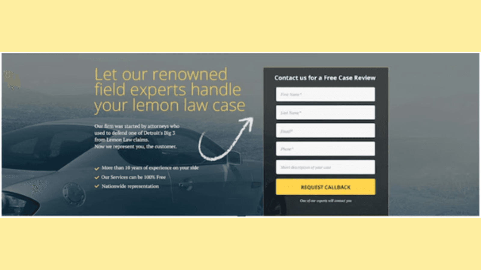
Follow these handy tips to use directional cues on your landing pages:
Use arrows or lines to point toward CTAs or signup forms.
Position images to direct focus naturally.
Apply visual hierarchy with fonts and colors.
A/B test cues to determine effectiveness.
Implementing these landing page optimization best practices will help you design pages that engage visitors and drive conversions. Each strategy serves to optimize the user experience and achieve your goals.
Landing Page Best Practices for Crafting Effective Headlines
Your landing page headlines and CTAs are the first touchpoints for visitors. They are the most important elements for driving engagement and conversions.
A well-crafted headline communicates value and relevance, while a strong CTA encourages users to act decisively.
Let’s explore some practical landing page tips for crafting them.
Great headlines build curiosity and create excitement, and enthusiasm to click or continue reading. Remember that when visitors come to your landing page, you only have one shot to succeed.
Here are useful tips to craft killer landing page headlines that convert prospects:
11. Align Your Headline with the Overall Campaign
Consistency across marketing channels builds trust and credibility. Ensure that your landing page headline aligns with the messaging in your ads, emails, or social media posts.
For example, if your ad promises “50% Off on Premium Subscriptions,” the headline should explicitly reflect this offer. This alignment strengthens your brand message and reduces bounce rates.
Pro Tip: One of the key landing page best practices is to use the same tone and keywords from your campaign to create a seamless experience.
12. Keep the Headline Clear and Straightforward
Avoid overcomplicating your headline with jargon or overly creative language. Instead, focus on clarity. Like Happy forms does with their landing page headline below:
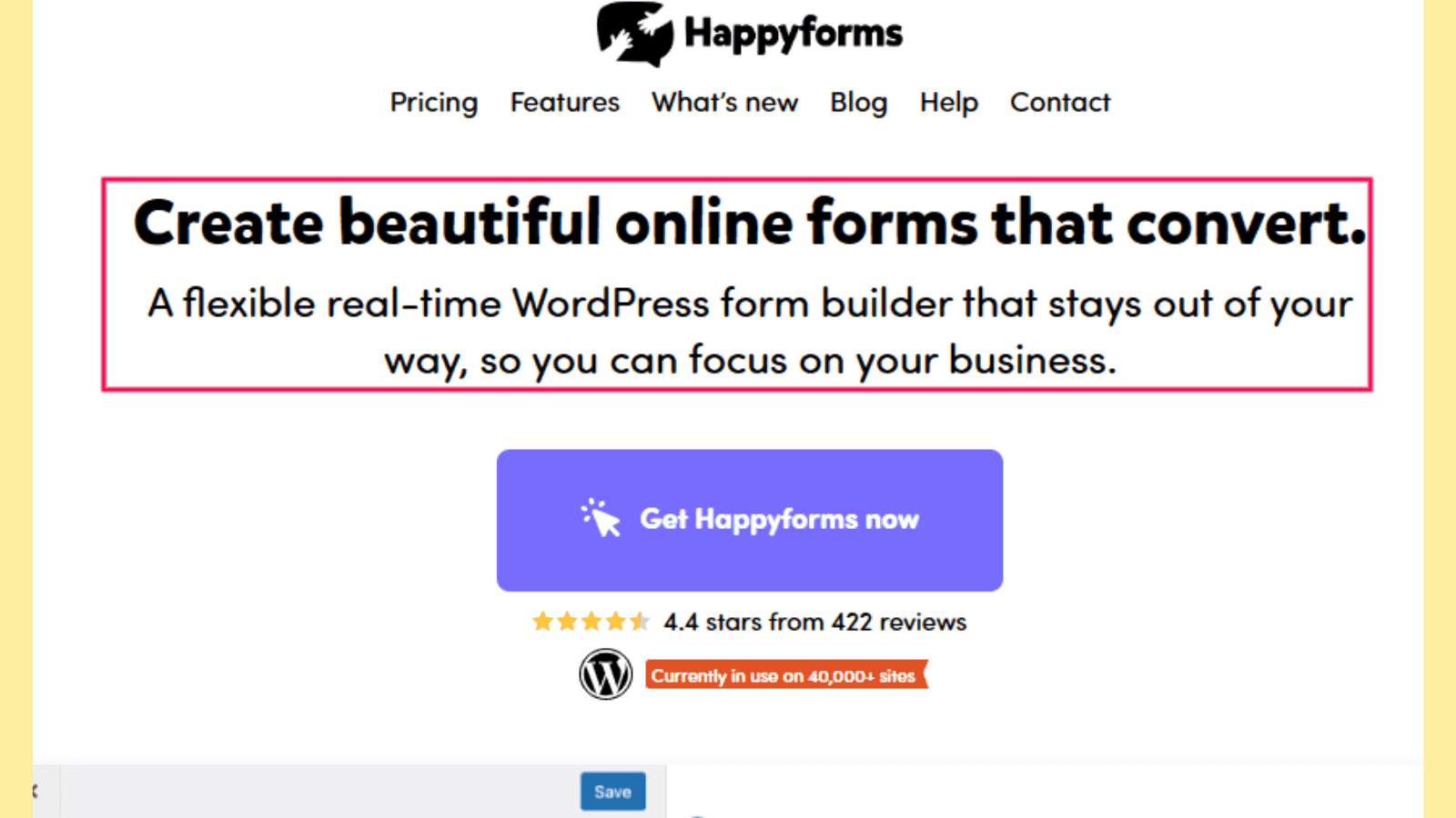
A clear and concise headline ensures visitors immediately understand what your landing page is about.
For instance:
Instead of: “Transform Your Workspace With Our Revolutionary Solutions”
Use: “Upgrade Your Office With Affordable Modern Furniture”
Straightforward headlines build trust and engagement while avoiding confusion.
13. Make It Super Specific
Craft vague landing page headlines and you will leave your visitors guessing and less likely to engage and take the desired action. In fact, this can lead to a higher bounce rate.
When you make the headline specific, you create a sense of value and urgency. Here, you can mention exact numbers, features, or benefits to make your offer tangible.
Here is an example of a super specific landing page headline by Sunbasket that promises 90% off for customers who make their first 4 deliveries.

Also Read: The best 2024 landing page examples for high-conversion rates.
14. Highlight Unique Selling Points (USPs)
Your headline should emphasize what makes your product or service unique. Whether it’s a groundbreaking feature, a special discount, or unparalleled customer service, focus on what sets you apart.
Salesforce does this very well with their landing page headlines:
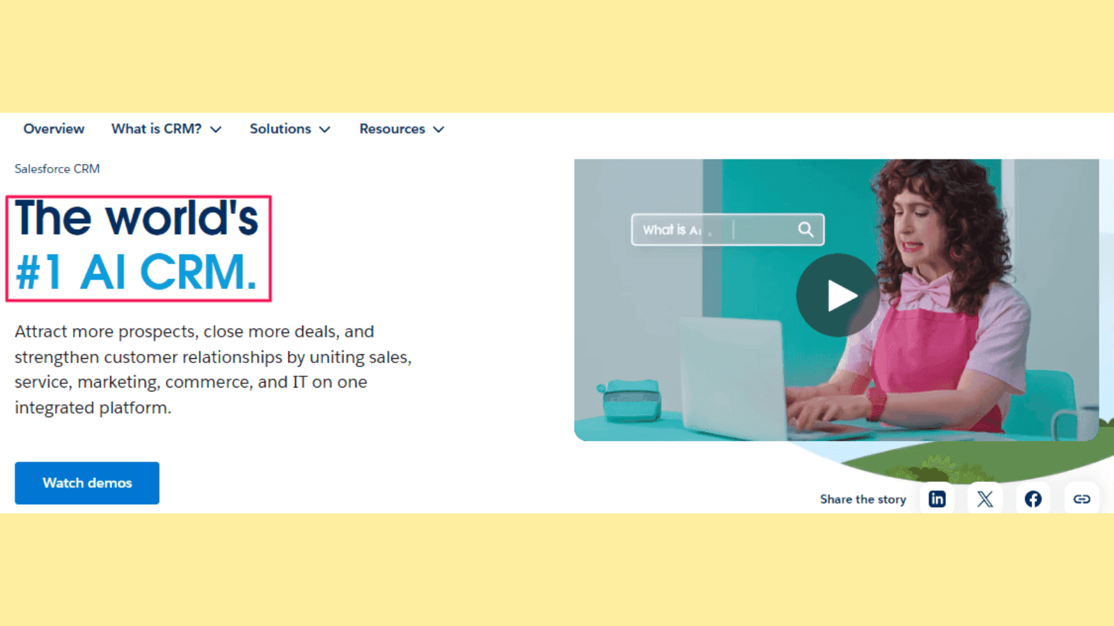
A powerful USP helps position your brand as the best solution to your visitors' needs.
15. Match The Headline With Visitor Expectations
Understanding your target audience is fundamental to crafting a headline that resonates. It ensures the headline speaks directly to the visitor’s intent.
Pro Tip: Use language and terminology they can relate to, addressing their pain points or aspirations.
For instance, if visitors are searching for eco-friendly solutions, a catchy headline that matches their expectations would be:
“Eco-Friendly Cleaning Products That Work Wonders”
Not: “Chemical-Free Solutions for Every Home”
16. Convey Benefits Over Features
A common mistake most people make is focusing solely on features rather than benefits.
While features explain what your product does, benefits highlight how it improves the user’s life. You should craft a headline that answers the visitor’s question: “What’s in it for me?”
For example:
A feature-focused headline would be: “AI-Powered Analytics Software”
A benefit-focused one would be: “Make Smarter Business Decisions With AI Insights”
17. Incorporate Emotional Triggers
Emotionally compelling headlines can significantly enhance engagement. Use words that evoke curiosity, excitement, or urgency.
Here are examples of headlines that spark curiosity and urgency:
Curiosity: “Discover the Secret to Effortless Fitness”
Urgency: “Last Chance to Save 50%. Offer Ends Tonight!”
Nordstrom landing page triggers urgency with its designer clearance:

18. Use Power Words and Keywords
Incorporating power words like “Free,” “Proven,” “Guaranteed,” and “Instant” can make your headline more compelling.
Additionally, include SEO-friendly keywords strategically to make your headline rank well in search engines and make your landing page discoverable.
Pro Tip: When optimizing your headline with power words and keywords, avoid overdoing it so you don’t compromise readability.
Ultimately, crafting compelling landing page headlines requires a blend of clarity, specificity, and audience alignment. Follow these landing page best practices for headlines to create headlines that not only attract but also convert.
Landing Page Best Practices for Crafting Effective CTAs
Are you driving a ton of traffic to your landing pages but conversions aren’t happening? Your CTAs could be the culprits.
Visitors won't take action if your CTA isn't clear or compelling to click on.
Crafting a compelling Call-to-Action (CTA) serves as the gateway between a potential lead and a conversion, making it vital to get it right. Below are practical tips for creating landing page CTAs that drive action and improve overall conversions while following landing page best practices.
19. Keep Your CTA Buttons Straightforward
The CTA serves only one purpose: to get the visitor to take the desired action. Therefore, it should be straightforward in what action the visitor should take after landing on the page.
Home Chef, a meal delivery service use straightforward CTAs with “Pick Your Meals” and “Take Our Quiz.

Clarity is key when designing a CTA. Avoid confusing or vague language and ensure the CTA button clearly states what the user will get.
For example, instead of “Click Here,” use actionable and specific text like “Download Your Free Guide” or “Start Your Free Trial.”
Straightforward CTAs reduce friction and help users take the next step with confidence.
20. Convey Value
Your CTA should answer the question: Why should I click this?
Hence, you should highlight the value or benefit users will receive when they act.
Like Checkbox do it on their landing page CTA:

Using phrases like “Get 20% Off Now” or “Access Exclusive Insights” demonstrates what users gain, which is essential for crafting CTAs that adhere to landing page strategies for success.
Pro Tip: Pair the value proposition with urgency to encourage immediate action, such as “Limited Time Offer: Claim Your Spot!”
21. Make CTAs Visible with Simple and Easy-to-Understand Words
Your landing page CTAs must stand out on the page. No one has the time to dig deep to uncover your CTAs.
Additionally, use concise, easy-to-understand language that aligns with the purpose of your landing page tips.
Pro Tips:
Place the CTA in a prominent location, such as above the fold, and ensure it’s visually distinct from other elements on the page.
Use bold fonts or contrasting colors to highlight the button. According to CXL, when it comes to button color, red CTAs outperform green ones.
Position the CTA strategically near key information, such as product benefits or testimonials, to maximize visibility.
22. Avoid Pulling a Bait and Switch
Trust is vital for conversions, and misleading CTAs can harm your brand.
Ensure the action promised in the CTA matches what users experience after clicking. For instance, if the button says “Download Free E-book,” users should not be redirected to a paid product page. Focus on transparent messaging to maintain credibility and user trust.
23. Make It Visually Appealing and Interactive
Design matters when creating a high-converting CTA.
Buttons with clean designs, rounded edges, or hover effects are interactive and engaging.
Additionally, consider using animations or micro-interactions that draw attention to the button without being overly distracting.
Here are actionable landing page optimization tips to make CTAs visually appealing and interactive:
Choose a button color that stands out from the background to draw attention. Ensure it aligns with your brand.
Add interactive effects, like color changes or animations, when users hover over the CTA to make it engaging.
Surround the CTA with sufficient white space to prevent visual clutter and highlight its importance.
24. Make Your CTA Copy Results-Oriented
Focus your CTA text on the outcome users want to achieve. Use action-oriented words and emphasize the results users can expect. For instance:
Instead of: “Sign Up”
Use: “Join Thousands of Happy Customers”
This approach creates an emotional connection and aligns with landing page strategies that prioritize user benefits.
25. Use Mobile-Friendly Buttons
Statistics are clear: Over 60% of all website traffic comes from mobile device users.
What does this mean?
When designing your landing pages, you must ensure all elements are optimized for mobile users including your CTA buttons.
Use buttons that are large enough to tap easily on small screens, and place them in areas that don’t require excessive scrolling.
Overall, crafting effective CTAs for your landing page requires a balance of clarity, value, and design. By following these best landing page best practices, you can create CTAs that resonate with your audience and drive meaningful results.
Landing Page UX Best Practices for Improved Conversions
Creating a high-performing landing page requires a meticulous focus on user experience (UX).
A well-executed UX design can significantly boost conversions by ensuring that visitors not only find what they need but are encouraged to take action. Below are actionable landing page UX tips to improve engagement, user satisfaction, and overall conversion rates.
26. Use Minimalist Designs
Take a look at this landing page by BRĒZ
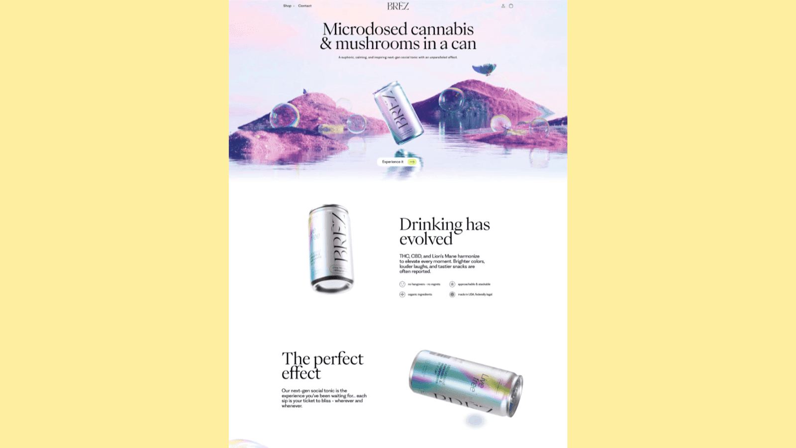
There are not a lot of colors. Just bolded headlines and a clear copy that’s easy on the eyes and some interactive elements. That’s how a minimalist landing page design looks like.
Having a cluttered landing page design can drive visitors away from your landing page. While mixing textual and visual elements can help improve engagement, crowing them on your landing page layout can hurt user experience.
What to do? Simplicity is a cornerstone of effective landing pages.
A clutter-free layout helps users focus on the main message and desired action. Besides, using minimalist designs eliminates distractions, ensuring that every element serves a purpose.
Here are landing page design best practices for a minimalist design:
Limit the use of colors to 2-3 tones.
Maintain whitespace to create breathing room.
Ensure the call-to-action (CTA) button stands out.
Remove anything from your page that isn’t relevant to its goal.
Keep the landing page design straightforward.
27. Remove Distractions to Boost Page Conversions
Did you know that minimizing distractions on your landing page can increase conversions by 10%?
Distractions, such as excessive navigation options, autoplay videos, or pop-ups, can detract from the main objective of the landing page. By removing or minimizing distractions, you can guide users seamlessly toward your CTA.
Here are landing page optimization tips for eliminating distractions on your landing page:
Replace busy navigation menus with a single, prominent CTA button.
Disable autoplay for multimedia and keep design elements clean.
Highlight your value proposition prominently without unnecessary embellishments.
Minimize form fields by asking only important information.
28. Provide a Consistent Visitor Experience
From the moment users interact with your ad or email, through to your landing page, and into your checkout or signup flow—the design, messaging, and tone should all be consistent with the expectations they had when they first clicked.
For example, notice how Monday matches their PPC ad copy with their landing page copy:
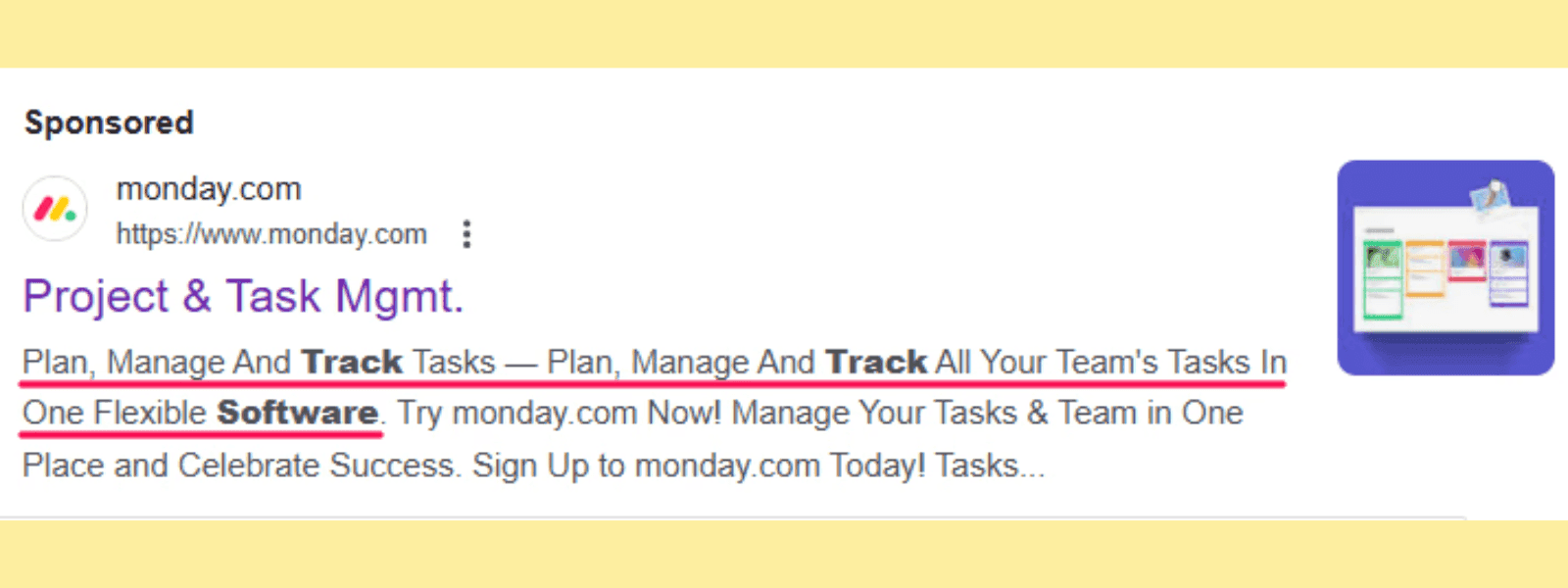
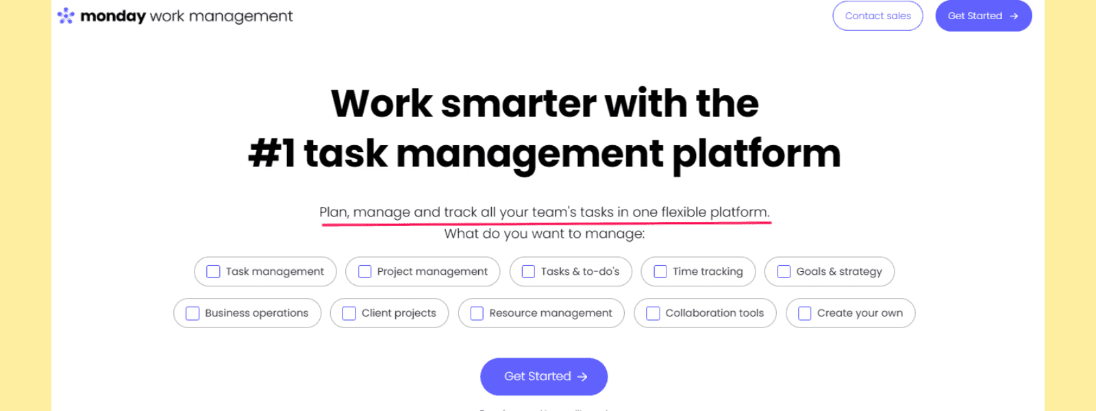
Consistency in branding, design, and messaging across all touchpoints ensures that users trust your page. A mismatch between your ad and the landing page design can confuse visitors, leading to higher bounce rates.
Here are pro tips to provide a consistent visitor experience on your landing pages:
Match the colors, tone, messaging, and visuals of your landing page to the ad or campaign that brought users there.
Use consistent fonts and visual cues to reinforce your brand identity throughout the customer journey.
29. Do Not Bug Your Users to Reveal Too Much Information
Take a look at the form below. How long does it take to fill out the information required? Probably less than 3 seconds.
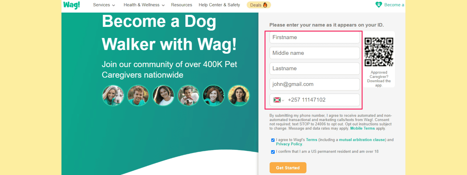
That’s what your landing page forms should be. Short with fewer fields.
Lengthy forms requiring excessive personal details can deter users. You must use a streamlined approach to data collection to improve trust and completion rates.
Pro Tip: Ask only for essential information. Use optional fields sparingly, and explain why certain data is needed (e.g., “We need your email to send you the guide”).
30. Optimize the Landing Page for Mobile Devices
According to statistics, more than half of website traffic comes from mobile platforms.
But you know what? 50% of marketers are yet to optimize their landing pages for mobile users. Are you one of these? If so, you need to make your landing pages mobile-friendly.
Optimizing landing pages for mobile devices is crucial for improving user experience and conversion rates. With mobile traffic surpassing desktop usage, landing page mobile optimization is no longer optional; it's a necessity. A mobile-friendly design ensures fast loading times, intuitive navigation, and responsive layouts.
Here are actionable landing page tips to optimize for mobile devices:
Use responsive designs that adapt to various screen sizes.
Test your landing page on different devices to ensure text, images, and buttons render correctly.
Keep buttons thumb-friendly (large enough to click easily on mobile screens) and avoid overly long scrolling experiences.
Minimize menu items or use a collapsible hamburger menu.
Use a single-column layout for easy scrolling.
Break up text into short paragraphs and bullet points.
Use flexible grids and scalable visuals.
Avoid placing interactive elements too close together.
31. Ensure a Clear Visual Hierarchy and Readability
A well-structured landing page is easy to use and can improve conversions. On the contrary, a disorganized landing page can lead to user confusion and drive away visitors.
Using visual hierarchy ensures that users can quickly scan your page and understand the most important elements.
Start with a bold headline at the top, followed by concise subheadings and body text to guide users through the page.
Emphasize readability with short paragraphs, bullet points, and ample whitespace.
Stick to 2–3 complementary fonts.
Arrange content to match natural reading patterns for optimal scanning.
Use relevant visuals to break up text and provide context. Arrows or lines can subtly guide attention to critical sections.
You can use a landing page template to design outstanding landing pages with a good visual hierarchy.
Effective landing page copywriting can:
✔ Pull in readers
✔ Engage them
✔ Generate conversions, and ultimately produce buckets of cash.
But here is the challenge: Not everyone is a copywriter, plus copywriting is an art that only a few can master.
Well, below are best landing page practices to guide you in crafting compelling and result-driven content for your landing page copy.
32. Communicate Value Propositions Clearly
In six words, the Asana pricing page, which also acts as their landing page makes its value proposition clear:
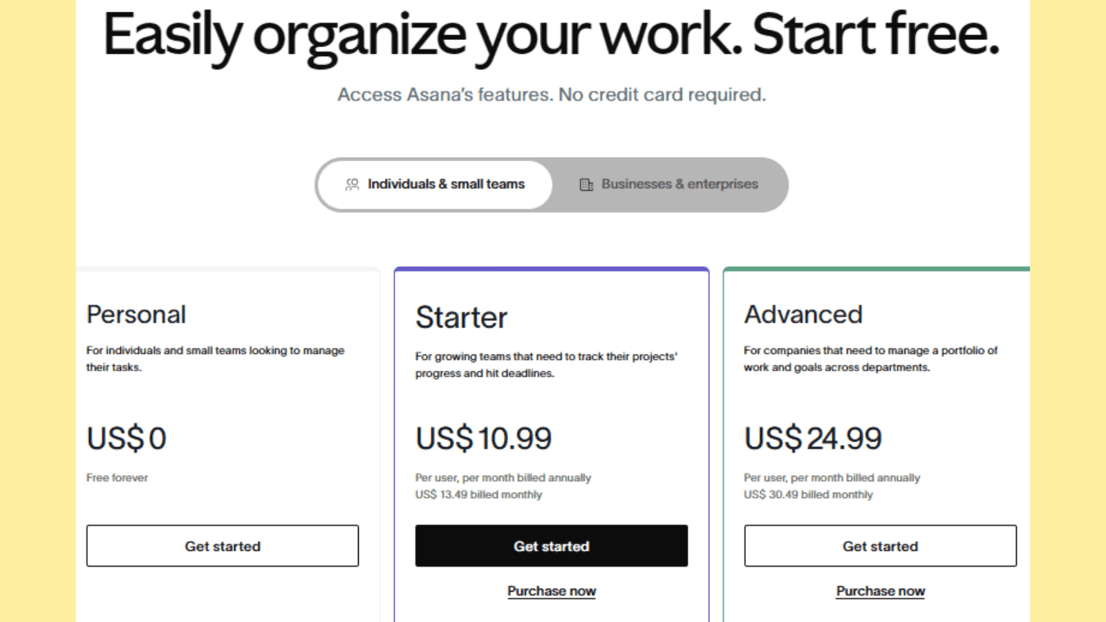
They quickly get to the point, letting users know what they’ll be able to do with the platform.
Your main headline and subheadings are prime real estate for communicating your value proposition. Make it immediately clear what your product or service offers and why it matters.
For instance, instead of saying “Top Software Solutions,” use something specific like “Increase Productivity by 30% with Our Time-Saving Tools.”
Using a clear and engaging headline ensures visitors stay and explore your offer further.
Landing page optimization tip: Use language that resonates with your target audience, addressing their pain points and goals.
33. Focus on Benefits Over Features
Let’s be honest: People are more persuaded by how your product or service will improve their lives than how plenty or fancy the features are.
Of course, features are essential, but if you want to drive sales, highlight the benefits of your product on your landing page copy as well.
Shift the focus from what your product does to how it improves the user’s life or solves their problem. For example, instead of saying “Cloud-based storage,” explain how it ensures “access to your files anytime, anywhere.”
Jarvis knows this magic. Their landing page copy communicates the benefits of the platform instead of mentioning features.
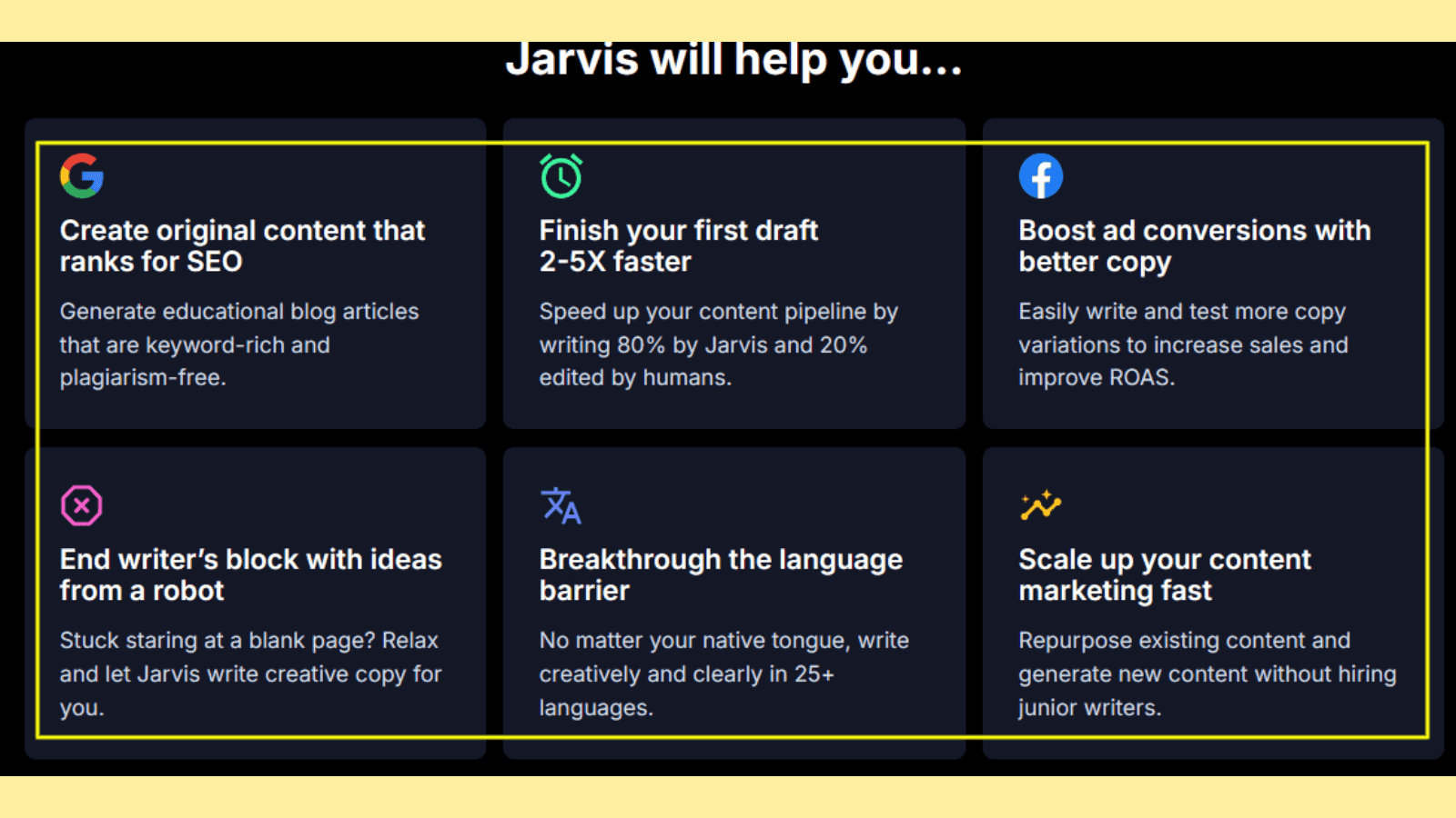
Here are useful tips to help you:
Start with clear, benefit-focused headlines
Turn features into benefits
Use descriptive language to help users envision their improved lives or work with your product.
Appeal to desires like saving time, reducing stress, or feeling accomplished.
Use statistics or measurable outcomes: "Grow Your Revenue by 25% with Our Simple Tool."
Highlight how the product alleviates pain points or delivers joy: "Feel confident knowing your tasks are under control."
34. Keep the Copy Simple and Easy-to-Skim
When crafting your landing page copy, remember this: Digital customers don’t read online content like they do books.
Furthermore, people’s attention spans are short. Therefore, you need to keep your landing page copy short with an easily skimmable layout to make your key points visible.
Some handy landing page tips to help you achieve this include:
Use concise sentences, bullet points, and bolded text to make your message digestible.
Break your content into sections with clear headings so visitors can quickly scan and grasp the key takeaways.
Avoid jargon and long-winded paragraphs.
Lastly, use plain language to connect with a broader audience.
35. Use Visuals to Complement Your Copy
Visual elements like images, infographics, and videos can enhance your message by making complex ideas easier to understand. For example, a short demo video can demonstrate your product in action, while icons can summarize features at a glance.
Ensure your visuals align with your branding and support your copy, rather than distracting from it. Also, implement a cohesive design that improves user experience and helps convey professionalism.
36. Optimize for Organic Search
While landing pages are commonly used with paid advertising campaigns, they can drive organic traffic to your website. Follow landing page SEO copywriting best practices to maximize your traffic potential.
Here are useful tips to help you achieve this:
Use a keyword research platform like Keyword Magic Tool to identify the keywords your ideal customers use in search engines.
Use these keywords on your landing page—in the header and body of the text.
Use them in the page’s meta description and image alt text to enhance image discoverability.
37. Keep Your Writing Simple
Simplicity is key to effective landing page copy. Simple copy ensures your message is easy to understand and appeals to a broad audience. Use clear, concise language that gets straight to the point and avoid jargon or overly complex terms. Break down information into short paragraphs, bullet points, or headings to improve readability.
This practice keeps visitors engaged and guides them smoothly toward your call to action. Implementing a clutter-free, straightforward approach not only reduces cognitive load but also builds trust. This helps potential customers to focus on the value your product or service offers without unnecessary distractions.
Imagine visiting a landing page without any visuals or multimedia. How would it feel? Boring, isn’t it?
Visuals and multimedia elements are critical components of modern landing pages.
As competition for online attention grows, businesses must prioritize user engagement and experience.
The use of high-quality images, videos, infographics, and animations plays an essential role in shaping how visitors interact with a page, ultimately influencing conversion rates and business success. Here’s why visuals and multimedia matter so much on landing pages.
1. Visuals Capture Attention
When visitors land on your page, you have a few seconds to capture their attention. That’s where visuals and other multimedia elements become helpful.
High-quality visuals and videos immediately draw the eye making your landing page more inviting to boost user engagement.
Furthermore, the human brain is wired to process visual information faster and more efficiently than text. Hence, using images or videos on your landing pages can instantly convey the message you're trying to get across without overwhelming users with large blocks of text. This immediate appeal is vital in reducing bounce rates and keeping users engaged.
2. Improve User Experience
User experience (UX) is central to the effectiveness of a landing page, and engaging visuals significantly enhance UX. When designed strategically, multimedia elements make a page more interactive, visually appealing, and easier to navigate.
For example, instead of long paragraphs of text, visitors can interact with dynamic visuals that lead them through the content more intuitively. Using a balanced combination of visuals and concise text can create a user-friendly environment that encourages exploration, which can ultimately lead to conversions.
3. Boost Conversion Rates
One of the most compelling reasons to include multimedia on landing pages is its impact on conversion rates. This is because visuals not only capture attention but also allow businesses to showcase their products or services in action.
For instance, adding videos to landing pages has been proven to increase conversions by 86%.
For example, a product demo video can significantly reduce hesitation, helping visitors make purchasing decisions faster. The emotional appeal of videos also builds a stronger connection with potential customers, leading to an increased likelihood of completing the desired action (like making a purchase or signing up for a service).
4. Help Audiences Absorb Information
Humans are naturally visual learners, which is why multimedia, especially videos, can help audiences absorb complex information quickly and efficiently.
According to a recent Wyzowl video survey, 96% of video marketers say video has increased user understanding of their product or service.
While text-heavy pages can overwhelm visitors, videos break down information into digestible chunks.
For example, explainer videos can outline the benefits of a product, demonstrate its use, or explain complex concepts in just a few minutes, making them more accessible than written content. Videos also increase retention.
5. Convey Ideas More Effectively
Some ideas are simply difficult to communicate through text alone. Visuals, animations, and videos can bring intangible concepts to life, helping visitors understand your message more clearly.
For instance, a landing page for a fitness app could use a short animation to show the app’s features or benefits in action, which would be more effective than a bulleted list of features.
The power of visual storytelling lies in its ability to communicate your message concisely and emotionally; something that plain text cannot always achieve.
6. Showcase Products
When it comes to improving product understanding, especially those that are complex or have unique features, videos are indispensable.
According to Wyzowl, 88% of marketers say video has helped them increase user understanding of their product or service.
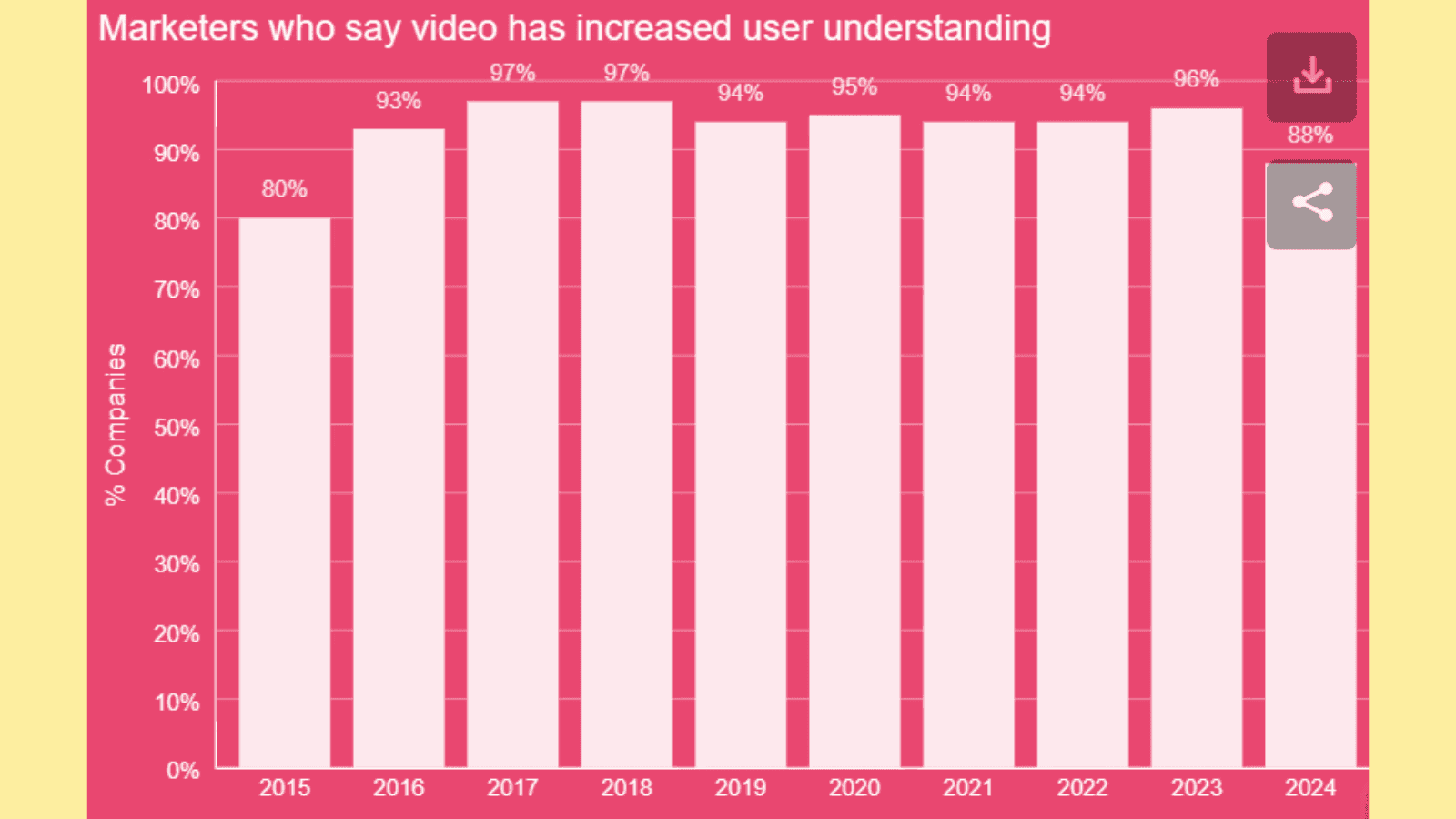
Instead of relying solely on static images, a product demo video can give potential customers a real-time look at the product, demonstrating its functionality and features in action.
This is particularly valuable for products that require explanation, such as software, gadgets, or appliances. Visitors are more likely to trust a product they can see in action, which can significantly boost purchase intent and reduce doubts that might prevent conversions.
7. Increase Engagement
Videos keep visitors on your page for longer than text. According to Wistia, people spend on average 2.6 times longer on a page with video than that without.
This principle applies to landing pages as well. When visitors are presented with compelling visuals or multimedia content, they are more likely to stay on the page longer, interact with the content, and share it with others. Increased engagement leads to better visibility, a stronger relationship with potential customers, and a greater chance of conversion.
Given these benefits, incorporating visuals and multimedia elements on landing pages is no longer optional but a necessity for capturing attention, improving user experience, and driving conversions.
High-quality images, videos, and animations provide an interactive, engaging, and informative experience that enhances the overall effectiveness of a landing page.
Optimizing a landing page is crucial for converting visitors into customers. However, common mistakes can derail efforts, leading to poor performance and lower conversion rates. Let’s explore these landing page optimization mistakes in detail and how to avoid them.
1. Burying the Call to Action (CTA)
Your call to action (CTA) is the centerpiece of your landing page, guiding visitors toward your desired action. When CTAs are hidden below the fold or lost amidst other elements, visitors may miss them entirely.
To fix this, place your primary CTA prominently above the fold, ensuring it's easily accessible. Use contrasting colors and action-oriented text like “Sign Up Now” or “Get Started” to draw attention.
2. Focusing on Too Many Landing Page Goals
A landing page designed with multiple objectives can confuse visitors and reduce its effectiveness. For instance, combining a product demo sign-up with a newsletter subscription may dilute user focus.
Prioritize a single, clear goal per landing page, whether it’s generating leads, capturing emails, or driving purchases. Use supporting content to reinforce this objective and remove unrelated distractions to enhance clarity and intent as well.
3. Crafting Generic Copy
Generic, uninspired copy can’t resonate with your audience. Visitors are more likely to convert when the copy speaks directly to their needs and challenges. Instead of vague phrases like “best product for everyone,” craft specific, benefit-driven messaging that addresses pain points.
Incorporate persuasive language and customer-centric terms that highlight unique selling points, ensuring your copy connects emotionally and logically with readers.
4. Writing Vague Headlines
Your headline is the first impression visitors get and plays a significant role in keeping them engaged. A bland or confusing headline can lead to higher bounce rates.
To create compelling headlines, focus on clarity, relevance, and intrigue. Also, use power words, emphasize benefits, and align the headline with the visitor’s search intent.
5. Overloading the Page with CTAs
While a clear CTA is essential, having too many CTAs can overwhelm users and lead to decision fatigue. Avoid cluttering your landing page with multiple competing CTAs that confuse visitors about what to do next.
Instead, emphasize a single primary CTA and use secondary CTAs sparingly to support, not compete with the main goal. This can simplify the decision-making process to enhance user experience and increase conversions.
6. Cluttered Design
How would you feel if you entered a room where you can’t tell where the exit door or windows are? A room where you can’t even walk freely. Most likely, you will walk out using the door you entered through.
A cluttered landing page layout with excessive text, images, or elements can frustrate visitors and detract from your message. A clean, minimalistic design keeps visitors focused on the content and CTA.
To fix this, use ample white space, intuitive navigation, and a logical flow to guide users. Break up large chunks of text with bullet points or subheadings, and avoid overcrowding the page with unnecessary visuals.
7. Unclear Value Proposition
If your landing page fails to communicate why your product or service is valuable, visitors won’t convert. An unclear value proposition leaves users wondering, “What’s in it for me?”
Clearly articulate what sets you apart from competitors and how your offering solves their problems.
Use concise, impactful statements supported by visuals or testimonials to build trust and demonstrate value.
8. Overlooking Page Load Speed
Page load speed directly impacts user experience and conversion rates. Research shows that a delay of just a few seconds can significantly increase bounce rates. Slow pages frustrate users and hurt SEO rankings as well.
To avoid this, optimize your landing page by compressing images, leveraging browser caching, and minimizing code. Tools like Google PageSpeed Insights can help identify and address performance issues.
9. Using Too Many Colors or Graphics
Excessive use of colors or graphics can overwhelm visitors and make your page appear unprofessional. Consistent visual elements build trust and ensure your message remains the focal point.
Stick to a cohesive color scheme that aligns with your brand identity. Limit the number of colors to two or three primary shades and use graphics strategically to enhance, not distract from, your content.
Creating a landing page is only the first step in boosting your online performance; testing and measuring its effectiveness is essential for optimization. Besides, even with the best landing page practices, continuous improvement is vital. Here are practical landing page strategies to assess and improve your page's performance.
1. Define Your Goals and Metrics
The first step in testing and measuring landing page effectiveness is to establish your key landing page goals and metrics.
Start by clarifying what you want your landing page to achieve. Is your goal to increase newsletter signups, product purchases, or free trial downloads? Setting clear goals allows you to choose relevant metrics like conversion rates, bounce rates, and click-through rates.
These metrics form the foundation of all testing efforts and are crucial for implementing the best landing page practices.
2. Conduct A/B Testing or Multivariate Testing
Testing different elements of your landing page is one of the most effective ways to optimize it. A/B testing involves comparing two variations of a single element, while multivariate testing assesses multiple changes simultaneously.
Focus on testing:
CTAs (Call-to-Actions): Experiment with button text, size, and color to see what drives clicks.
Headlines: Adjust wording and tone to capture user attention.
Form fields: Test the number and type of fields to strike a balance between collecting information and maintaining user convenience.
Images and videos: Experiment with visual elements to determine their impact on engagement and conversions.
Entire design layout: Tweak the placement of elements for better usability and flow.
Testing continuously is a practical landing page optimization tip that ensures you adapt to changing user behavior.
Also Read: 7 best A/B testing tools of 2025
3. Utilize Heatmaps and Eye-Tracking Tools
Heatmaps and eye-tracking tools reveal how visitors interact with your landing page. Heatmaps show where users click, scroll, and linger while eye-tracking focuses on what visually draws their attention.
These tools are essential for identifying underperforming sections and reworking them for better engagement. For instance, if users frequently ignore your CTA, reposition it or adjust its design. These landing page tips can significantly improve conversion rates.
4. Use Surveys and Feedback Tools
Why not ask your target audience what they feel needs to be improved on your landing page?
Understanding the user perspective is vital for creating landing pages that convert. Tools like on-page surveys, pop-up feedback requests, and user interviews can provide direct insights into what visitors like or dislike about your page.
In your surveys, ask questions such as:
What convinced you to stay on this page?
What stopped you from completing the desired action?
How was your experience when interacting with this page?
How would you like us to improve the page?
Gathering all this feedback helps you align your design and content with user expectations.
5. Use Analytics and Reporting Tools
Analytics tools like Google Analytics and specialized platforms like Hotjar offer in-depth data about your landing page's performance.
These tools help you measure visitor behavior, track conversions, and identify potential drop-off points. Set up goals in your analytics software to get detailed reports that inform your landing page strategies for improvement.
6. Track Time on Page
You’re probably driving tons of visitors to your landing page, but what if they aren’t spending even one minute interacting with it? How do you know that?
Time on page is an important metric for understanding user engagement. If visitors leave quickly, it could indicate a mismatch between your content and user expectations.
Use this metric in conjunction with other insights, like bounce rates, to determine whether your page provides value or needs adjustments. Monitoring time on page is one of the best landing page practices to ensure you're keeping visitors engaged.
7. Track Traffic Sources
Landing pages get traffic from email, social media, ads, and more. Do you know the source of your landing page visitors?
Knowing where your visitors are coming from can help you tailor your landing page to specific audiences. For instance, users from social media may prefer a more visually dynamic page, while email traffic might respond better to personalized content.
Tracking traffic sources enables you to refine your landing page optimization tips based on audience behavior.
Building and optimizing an effective landing page can be daunting without the right tools. Here are a few landing page optimization tools to make your job easier.
Fibr AI: Fibr AI is an advanced tool that leverages artificial intelligence to optimize landing pages by analyzing user behavior and suggesting actionable improvements. It provides real-time insights on layout, content, and performance, helping businesses increase conversions and engagement by ensuring landing pages align with user preferences and browsing habits.
Hotjar: Hotjar focuses on user behavior analytics by combining heatmaps, session recordings, and feedback surveys. It reveals how visitors interact with landing pages, pinpointing design flaws or navigation issues. Hotjar enables marketers to understand user intent and friction points to refine page elements for better engagement and conversion rates.
Unbounce: Unbounce is a no-code landing page builder designed to boost conversions through dynamic customization and testing. Its drag-and-drop editor, A/B testing, and AI-powered optimization tools allow marketers to craft high-performing pages without relying on developers, making it ideal for rapid iteration and campaign-specific designs.
Google Analytics: Google Analytics is a comprehensive web analytics platform that tracks and reports landing page performance metrics, such as bounce rates, session durations, and traffic sources. It provides deep insights into user behavior and demographics which helps businesses identify underperforming elements and refine their landing pages for maximum impact.
Ahrefs: Ahrefs excels at landing page search engine optimization, providing keyword research, backlink analysis, and competitor insights. The platform helps in identifying high-converting keywords to support the creation of landing pages that rank well and drive targeted traffic.
For a more in-depth look into these tools, check out our detailed reviews of the top 10 landing page optimization tools to boost your landing page conversions.
Bonus: Key Strategies for Improving Landing Page Performance
Improving landing page performance can significantly help in driving conversions for your online business. Here are practical strategies to optimize landing pages effectively.
1. Leverage Social Proof to Help Convert Undecided Customers
Would you buy a product or service if the product page doesn’t feature reviews or testimonials about it? Of course, you wouldn’t.
Today’s customers depend on social proof; whether case studies, testimonials, or user reviews when making a purchase decision. Here is the proof:
According to a PowerReviews survey, 98% of customers say reviews are an important resource when making purchase decisions.
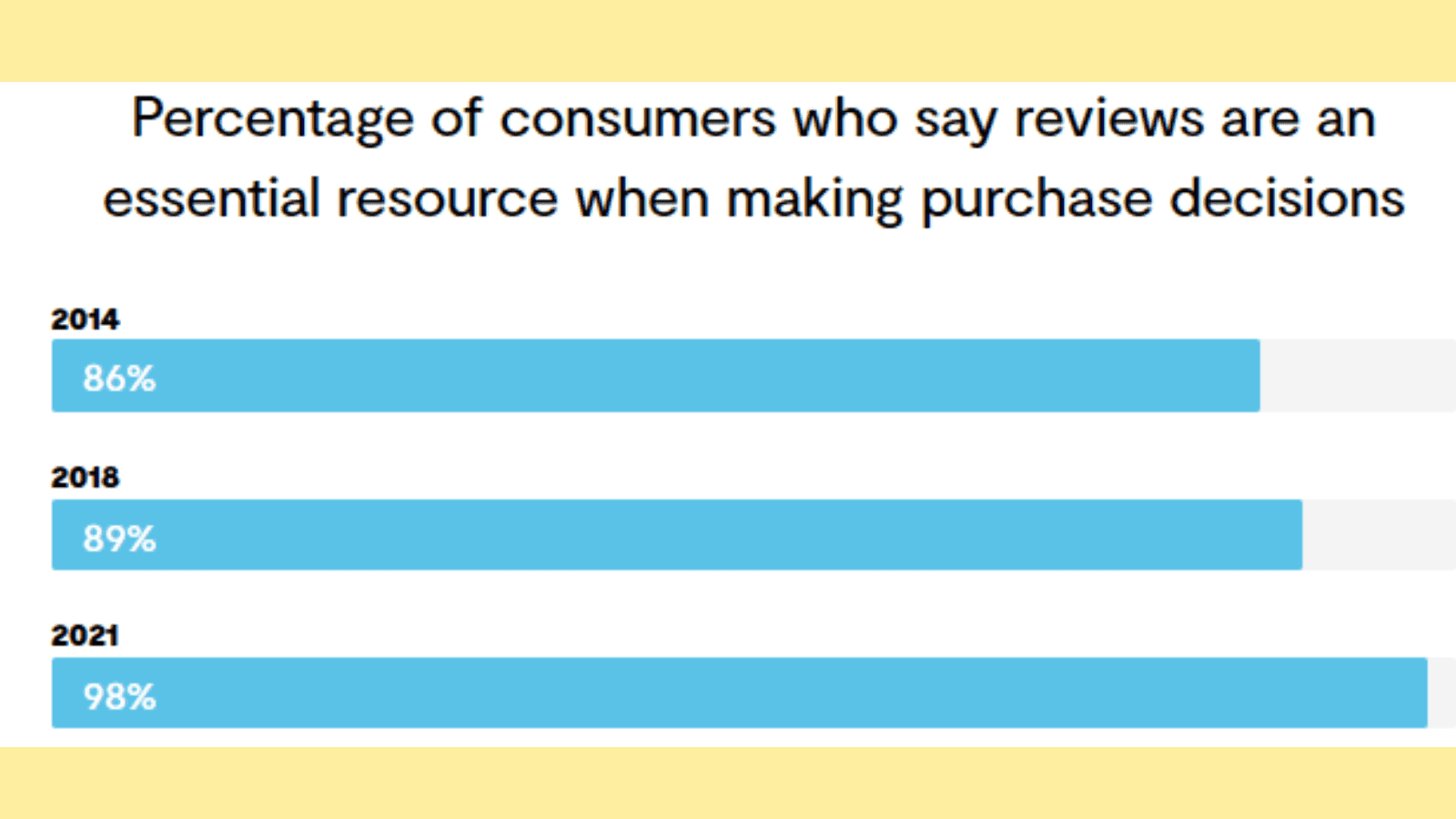
In fact, according to the same survey, many shoppers will abandon a purchase if there are no reviews available.
But why?
Reviews/testimonials are social proof that reassures potential customers by showing them that others trust and benefit from your brand.
Trainual leverages social proof efficiently by featuring testimonials on their landing pages:
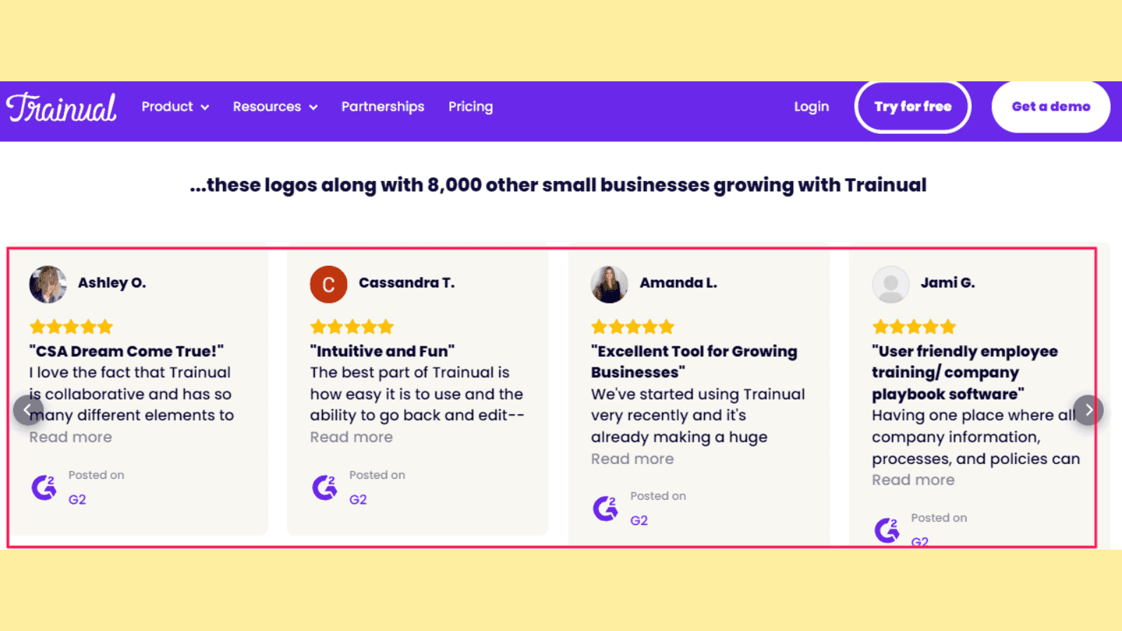
Here are practical tips to utilize social proof on your landing pages:
Feature customer testimonials with photos or names to humanize your brand and enhance authenticity.
Display trust indicators like certifications, awards, or security badges.
Highlight live statistics, such as “1,000+ happy customers served.”
Highlight success stories with measurable outcomes.
Including customer testimonials, case studies, and user reviews on your landing page copy and other strategic locations demonstrates credibility and encourages undecided visitors to take action.
2. Focus on Benefits Instead of Product Features
How does this product benefit my life or business?
That’s the big question customers ask when they come across a product they want to buy.
In the same way, when visitors land on your product landing page, they want to know how your product/service will improve their lives.
Hence, one of the landing page's best practices is to emphasize benefits instead of features. Ensure you clearly communicate value to make users understand why they need your product or service.
Take a look at how Clay formulates their headline and subheads focusing on the benefits the user gets.
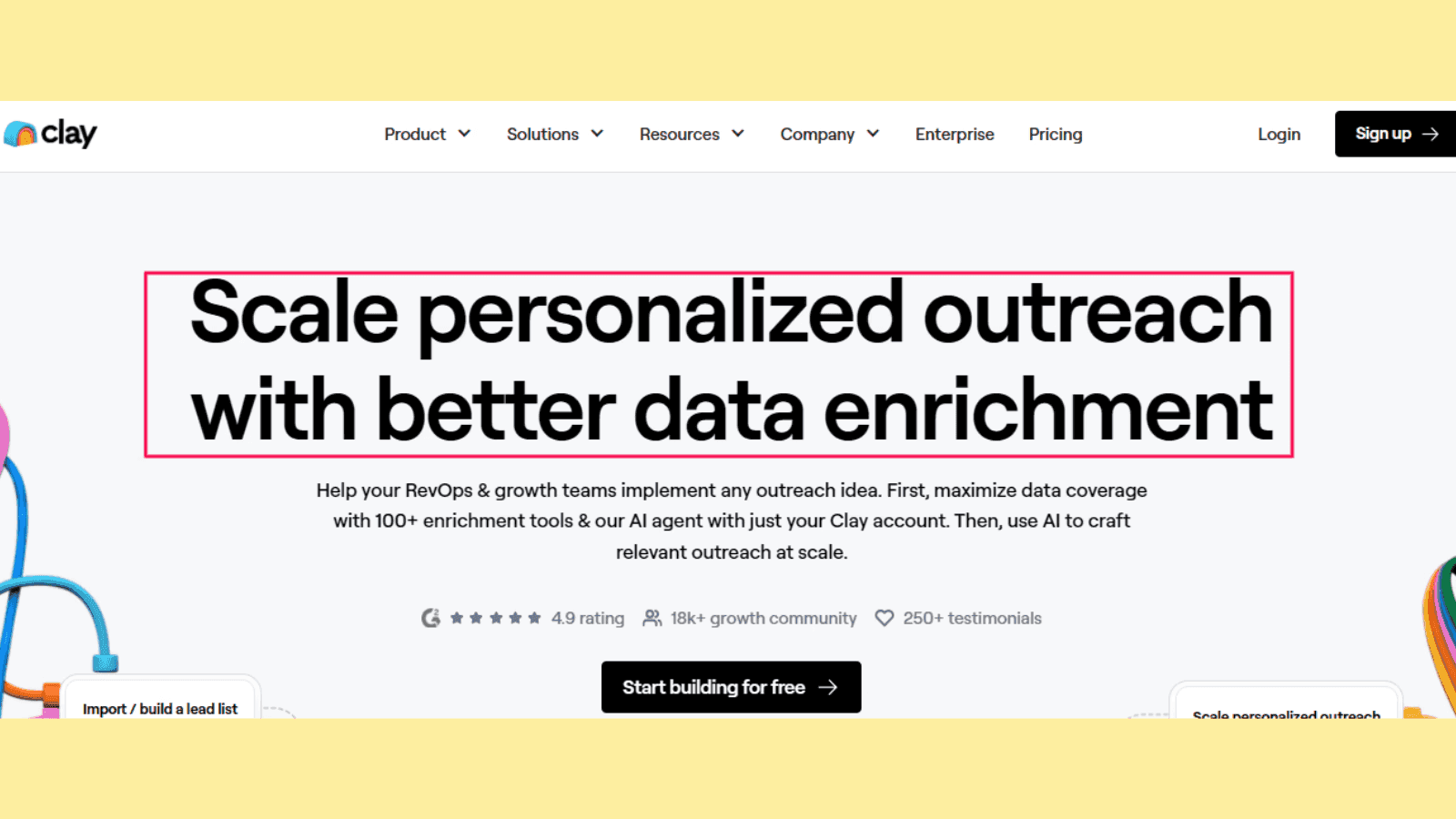
Here are useful tips to help you implement this:
Write benefit-driven headlines that directly address the user's needs.
Use bullet points to list benefits clearly and concisely.
Use visual elements like icons or infographics to reinforce benefits.
Add customer success stories that quantify the benefits (e.g., “Saved 50% in costs”).
3. Optimize Your Landing Page for SEO
You can drive traffic, conversions, and sales without paying ads if your landing page ranks higher in search engines like Google. Applying practical landing page optimization tips can improve your landing page rankings in search engines and increase organic traffic.
When you search for “email marketing platform” on Google, a couple of landing pages show up:
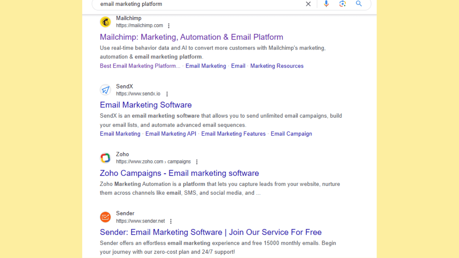
This is a typical example of landing page SEO in action. These platforms have optimized their landing pages to rank higher in search engines and enhance their discoverability by searchers.
Here are landing page optimization tips to improve your landing page discoverability online:
Incorporate your target keywords naturally in headlines, subheadings, and meta descriptions.
Optimize images with descriptive file names, alt tags, and compressed file sizes.
Use a responsive design to ensure mobile-friendliness.
Add internal links to relevant content for better navigation and SEO ranking.
One thing to remember when implementing this landing page best practice is to avoid keyword stuffing.
4. Personalize Your Landing Page
Ever landed on a page that felt like it was designed specifically for you?
Something like this:

Modern consumers want personalized experiences and will reward the brands that provide them. Don’t take our word for it.
Here is the proof:
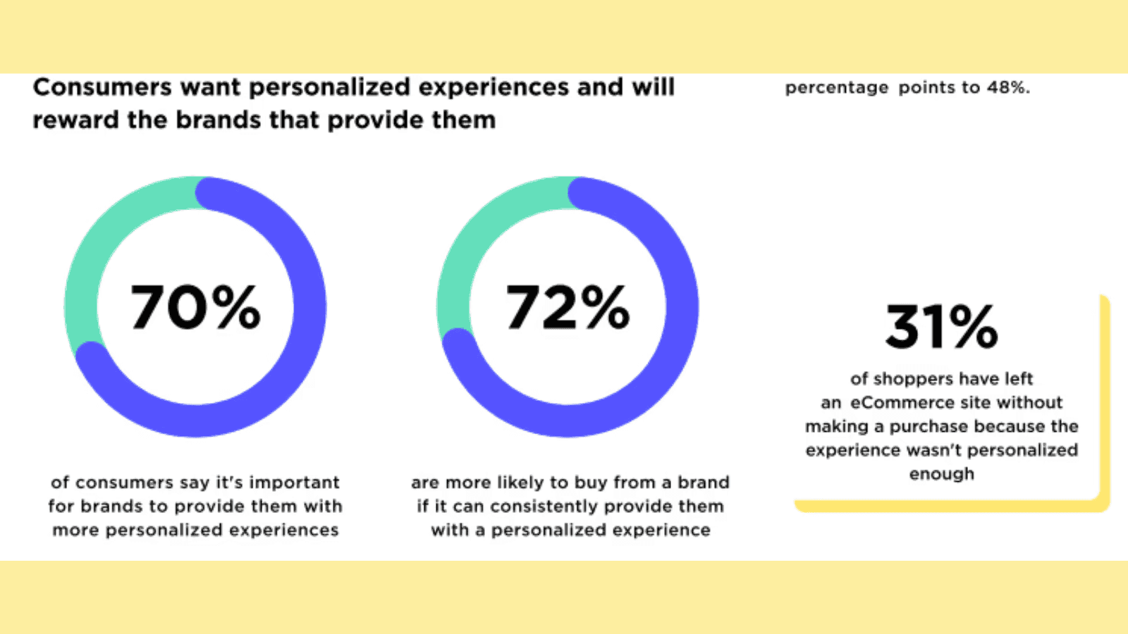
Who doesn’t want customers to keep coming back after purchasing their product?
Personalized landing pages have been proven to increase conversions and enhance the effectiveness of marketing campaigns.
This is because personalization creates a tailored experience, making visitors feel understood and valued. By tailoring your messaging to specific audience segments, you create a more relevant and memorable experience.
Here are landing page strategies to enhance personalization:
Use location-based targeting to show region-specific offers.
Use dynamic text to adapt landing page headlines to a visitor's search query.
Include personalized CTAs, such as “Welcome back, [Name]!”
Leverage user behavior data to suggest relevant products or services.
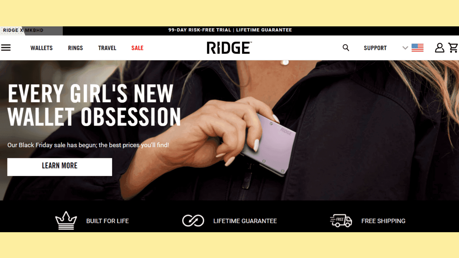
Here is an example of a personalized landing page where Ridge, a brand of slim, minimalist wallets and accessories, is targeting female customers only:
Also Read: Top 7 Website Personalization Tools
5. Address Audience Pain Points
Understanding your audience’s challenges helps position your product or service as a solution to their problems. Your customers' pain points can be your golden nuggets when it comes to boosting your conversion rates.
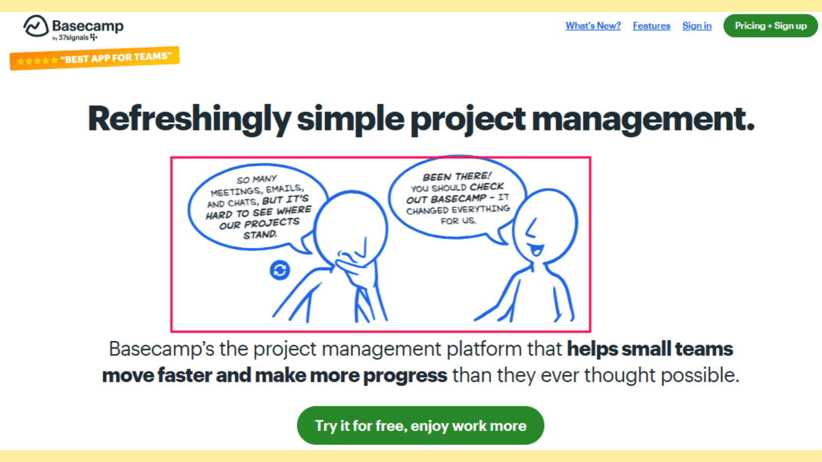
Basecamp use pain points to boost conversions on their landing page:
Here are actionable best practices for landing pages to leverage pain points effectively:
Conduct audience research through surveys or feedback to identify common challenges.
Craft empathetic copy that acknowledges pain points and provides a solution like the Basecamp above.
Use before-and-after visuals to show how your solution helps.
Use testimonials that highlight how your product solved real problems.
Offer free trials, tools, or guides for customers to address immediate concerns.
6. Add Interactive Storytelling to Show Your Product/Service in Action
Adding interactive elements to your landing pages can help to engage users and help them visualize your offering in real-world scenarios. This approach captivates attention, making it easier for visitors to understand your value proposition.
Dropbox understands this magic and uses a short, sweet, and effective GIF to demonstrate how its features work.
Here are interactive landing page design tips to boost engagement:
Embed explainer videos or product demos showcasing product functionality.
Create interactive GIFs, sliders, or timelines to guide users through your process.
Add gamified elements like quizzes that reveal personalized recommendations.
Incorporate customer journey stories through interactive timelines or maps.
If done right, interactive storytelling on landing pages can help improve user experience and conversion rates by creating an engaging experience that guides users toward taking action.
7. Offer Value Immediately on Your Landing Page
Visitors decide within seconds whether to stay or leave a page. Offering immediate value ensures they see the benefits of engaging with your brand right away. This can boost retention and conversions.
This is one of the powerful landing page best practices OptinMonster uses.
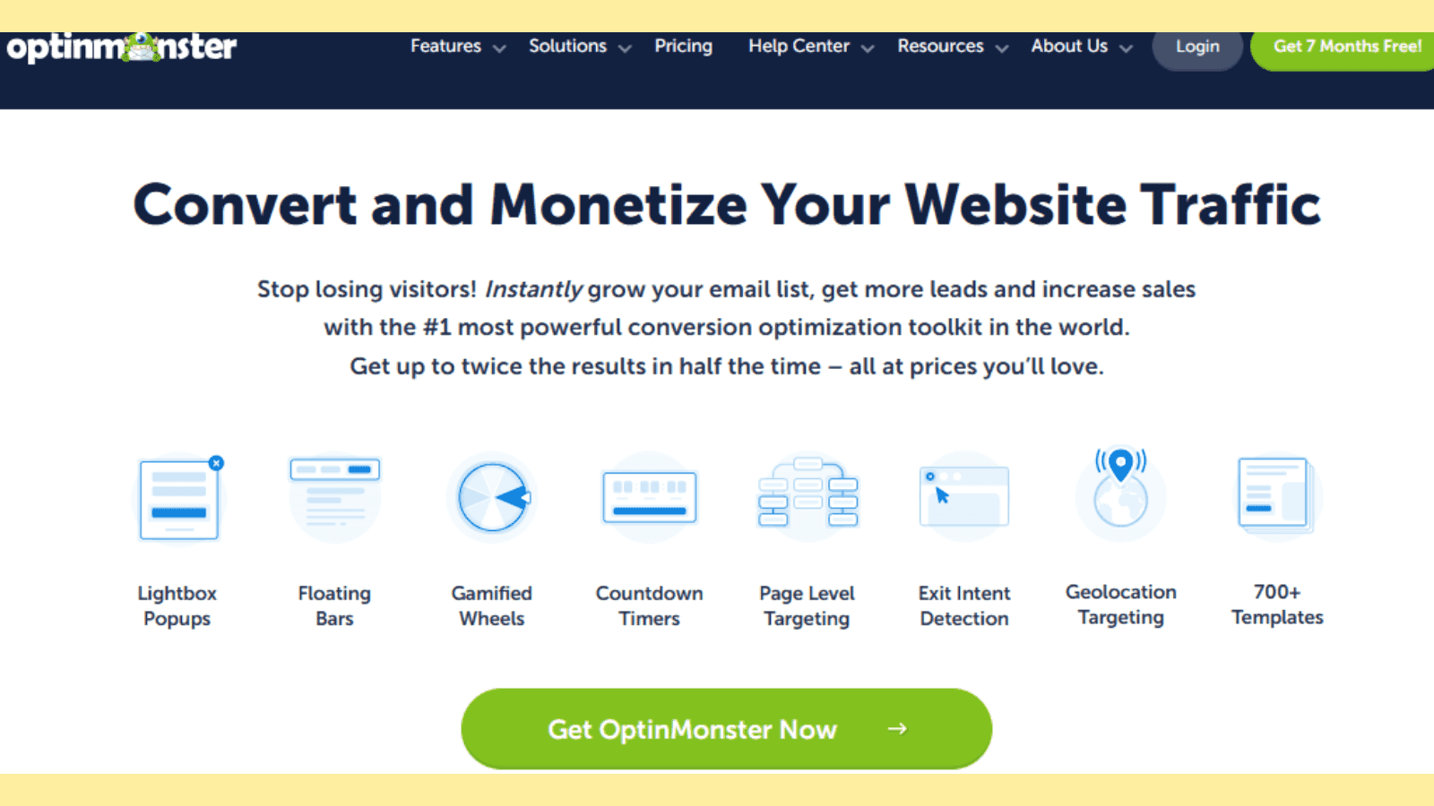
Their landing page shows users what they do and how their software can improve conversions for small businesses without scrolling further.
Here are landing page tips to help you implement this tactic:
Present a compelling benefit-driven headline that highlights your unique selling proposition (USP) within the first few seconds of interaction.
Offer free tools, templates, or exclusive discounts upfront.
Place a clear and actionable CTA above the fold.
8. Improve the Page Loading Time
A slow-loading landing page frustrates users and increases bounce rates, ultimately reducing conversion rates.
A survey by Portent reveals some fascinating statistical correlations between the loading time and its consequent conversion rate.
According to the survey, when a page loads in 1 second, the average conversion rate is almost 40%. The conversion rate drops to 34% when the page loads in 2 seconds.
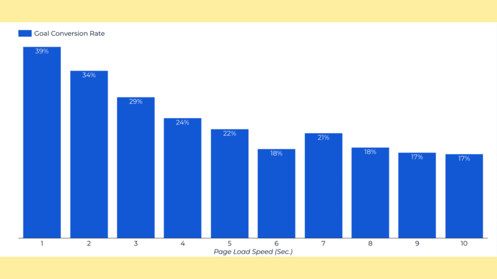
What does this mean?
You need to increase your landing page loading speed to enhance experience, retain users, and boost conversion rates on your landing pages.
Here are actionable landing page optimization best practices to boost your landing page loading speed.
Use Google’s PageSpeed Insights tool to test your landing page load speed. This tool also offers helpful tips and suggestions on how to improve your landing page load time.
Compress images and use next-gen formats like WebP for faster loading.
Minimize HTTP requests by combining CSS and JavaScript files.
Leverage a Content Delivery Network (CDN) to distribute page assets efficiently.
What next? It’s to implement these landing page optimization best practices to improve your landing page performance.
But before that, let’s optimize your landing page design and layout as well following landing page best practices that are proven to work.
Also Read: 8 best landing page tools of 2025
Create High-Converting Landing Pages Today
When it comes to creating landing pages, it’s not about making the page look pretty or attractive. It’s about creating a memorable experience that resonates with your website visitors and encourages them to take the desired action.
This can never be easy without following landing page best practices.
Now go ahead and implement all these landing page strategies with the help of Fibr AI, then constantly test and optimize based on data from the tool.
1. How do you optimize landing pages for conversions?
To optimize landing pages for conversions:
Focus on clear, compelling headlines that highlight your value proposition.
Use a clean design with intuitive navigation, ensuring all elements direct users toward the call-to-action (CTA).
Leverage social proof like testimonials or trust badges to build credibility.
Test different layouts, copy, and visuals through A/B testing.
Optimize for mobile responsiveness and fast loading speeds to reduce bounce rates, and use analytics to track performance.
2. What makes a high-converting landing page?
A high-converting landing page effectively communicates its purpose with a clear headline and concise copy tailored to the target audience.
It uses a strong CTA positioned prominently, alongside engaging visuals that align with the brand.
Also, the page should load quickly, offer a good user experience across devices, and minimize distractions to keep visitors focused on the desired action.
3. What are the most important elements of a landing page?
Key elements of a landing page include a compelling headline, persuasive subheadline, and clear, action-oriented CTA. Supporting content like concise copy and relevant visuals reinforce the message.
Other elements include social proof, such as customer testimonials or statistics that build trust.
Table of Content
You’ve poured all your precious time and money into your campaigns, traffic is flowing into your landing page. But conversions aren’t happening.
Isn’t this frustrating?
Of course, it is.
Unlike other website pages, the landing page is designed to help your business in achieving one key goal:
To drive sales and generate revenue by attracting more prospects and converting them into customers.
A well-optimized landing page can make a great difference.
Wondering how to create a high-converting landing page?
In this detailed guide , we discuss practical landing page best practices to help you design landing pages that attract and turn website visitors into leads and customers.
These landing page optimization tips will help you whether you want to drive leads, signups, or sales.
We’ve taken them from practical landing page optimization case studies, so you know they are effective.Use them to optimize your landing pages and boost conversion rates.
Landing Page Best Practices: A Quick Summary
Effective landing pages ensure better audience engagement, improve brand perception, and maximize conversions by reducing friction and enhancing user experience.
Key Strategies for Performance Optimization include focusing on fast load times, mobile responsiveness, and clear, value-driven messaging to attract and retain visitors.
Effective landing page design and layout best practices encompass maintaining a clean, visually appealing layout with intuitive navigation, a clear hierarchy, and strategically placed white space.
To improve landing page UX use simple forms, limited distractions, and seamless navigation to guide visitors toward conversion goals effortlessly.
To avoid common landing page optimization mistakes, fix issues like cluttered designs, excessive form fields, and slow-loading pages to avoid losing potential leads.
To testing and measure landing page effectiveness, regularly A/B test elements like headlines, CTAs, and layouts while tracking performance metrics (e.g., conversion rates, bounce rates) to refine your strategy.
Why Following Landing Page Best Practices Is Essential
HubSpot says the average conversion rate across all industries is 5.89%. The benchmark for a good conversion rate is 10%. However, you must create high-converting landing pages that benefit you and your target audience to hit this mark.
To achieve this, you must follow landing page design best practices that have consistently increased conversions for other online businesses.
Following these practices will help you:
Improve the landing page experience: A clean design, clear navigation, and fast loading times help visitors find the information they need quickly, reducing bounce rates.
Boost conversions: Landing page best practices like crafting compelling CTAs, strategically placing forms, and focusing on benefits help guide users toward desired actions, which increases lead generation and sales.
Boost credibility: Including trust signals like testimonials, badges, and clear contact information builds confidence in your offering.
Optimize landing pages for mobile users: With mobile traffic dominating, responsive designs make your landing pages accessible and usable across devices.
Make data-driven decisions: These practices emphasize implementing analytics tools and A/B testing which allows you to refine performance and make data-backed decisions to improve ROI.
Overall, if you want high conversion rates in your landing pages, follow these practices when creating or from the moment you create landing pages.
Also Read: Conversion Rate Optimization Tips for Landing Pages
Best Practices for Landing Page Design and Layout
An effective landing page needs to be clear with a focused layout. The page layout should be well-structured, organized, and easy to navigate. Above all, it should focus users’ attention on the most crucial elements such as headline, copy, and call-to-action.
Here are landing page design best practices that can help you design layouts that captivate your audience, convey your message clearly, and encourage action.
1. Get to Know Your Audience
Do you know your target customers enough? You probably don’t and that could make it impossible to create a landing page design and layout that resonates with them.
According to a HubSpot survey, just about 42% of marketers know the basic demographic information of their target audience—their name, gender, and location.
Understanding your audience is the cornerstone of any successful landing page. Knowing their preferences, pain points, and behaviors allows you to tailor content that resonates and drives engagement. When your audience feels understood, they’re more likely to trust your brand and convert.
Here are tips to uncover your target audience:
Conduct surveys or interviews to gather insights.
Use analytics tools to track user behavior.
Create detailed buyer personas.
Test different approaches to see what resonates most.
Also Read: 7 Best User Behavior Tools to Consider in 2025
2. Know Where Your Visitors Are Coming From, Plus Their Main Goal
Visitors arrive at your landing page through various channels—from ads, email, and social media—and each has its intent. Knowing their source helps you align the page's content and design with their expectations and objectives. No one wants to click on an ad on social media, only to land on a page that doesn’t align with the ad copy.
Here are handy tips to help you with this:
Set up UTM parameters to track traffic sources.
Use heatmaps to see how users interact with the page.
Tailor messaging to reflect the channel’s tone and purpose.
Identify user goals through A/B testing.
3. Know the Objectives of Your Landing Page
What goals do you want your landing page to help you achieve?
Defining the objective of your landing page ensures every design element serves a purpose, from the headline to the copy and call-to-action. Whether the goal is collecting leads, driving sales, or encouraging sign-ups, clarity prevents distractions and improves conversions.
Here are tips to help you clearly define the objectives of your landing page:
Understand who you’re trying to reach by analyzing demographics, preferences, and behaviors to tailor your landing page content.
Determine the specific action you want visitors to take, such as signing up, making a purchase, or downloading content.
Ensure the landing page objectives are consistent with your broader marketing or business goals, such as increasing conversions or building brand awareness.
Avoid overwhelming visitors by focusing on one primary objective to drive better results and avoid distractions.
Establish measurable KPIs (e.g., click-through rates, form submissions, etc.) to gauge whether your landing page is meeting its objectives effectively.
Write a single, clear call-to-action (CTA).
Remove unnecessary elements that don’t support the goal.
Use analytics to measure the success of the objective.
4. Keep the Design Simple to Make Conversion Easy
One of the common mistakes people make when designing their landing pages is to use a cluttered design. This makes the landing page complicated and confusing for visitors, hindering conversions.
You need to use a clutter-free design that improves usability and keeps visitors focused on your offer.
Like this one:

Simple designs load faster, reduce cognitive overload, and lead to higher conversion rates.
Here are simple tips to make your landing page design simple
Use minimalistic layouts with plenty of whitespace.
Limit the number of form fields to essentials (if you have them).
Highlight the CTA prominently.
Make the landing page mobile responsive for seamless navigation.
5. Leave the Key Information ‘Above-the-Fold’
Above-the-fold is the part of your landing page that visitors see right away when they land on your website before they scroll.
Here’s Slack’s landing page with above-the-fold content:

It typically includes:
A catchy and compelling headline that speaks to the audience’s pain points or highlights a benefit.
Clear, legible, and concise lead text (a sub-headline or paragraph below the headline with smaller fonts that expands on the headline). This should communicate the main value proposition.
An optimized CTA or form fields urging prospects to take action—depending on the landing page goal.
A high-quality image. No stock photo here.
You must make this part grab their attention right away and include key information. Placing vital content above the fold captures attention quickly and reduces the risk of visitors bouncing.
Here are practical tips to help you with this:
Place your value proposition and CTA at the top.
Include a compelling headline to draw attention.
Use visuals to support key messages.
Test different placements of elements to optimize visibility.
6. Use the Right Mix of Contrasting Colors
For most people, when it comes to using contrasting colors, think about the CTA button alone.
Here is the thing: You can use contrasting colors to highlight other essential landing page elements like headlines, features/benefits, percentage discounts, add-to-cart buttons, etc.
Like this:

Using a mix of contrasting colors makes your landing page visually appealing and guides the visitor’s eye to essential elements like CTAs.
Here are powerful landing page strategies for using contrasting colors:
Use a color wheel to find complementary colors.
Highlight CTAs with bold, contrasting hues.
Stick to a consistent color scheme throughout the page.
Test color combinations to find what converts best.
Note that the colors you use should match your brand colors.
7. Make The Design and Layout Consistent With Traffic Sources
Imagine boarding a plane destined for Ukraine only to land in a place that feels completely different from the promised destination.
When people click on an ad or link in an email, there must be consistency with the landing page they land on. Everything from the language, tone, images, and color scheme should be consistent.
Here is a typical example. When you click on these ads on Google, you will be taken to the respective landing pages of the project management tools with the same consistency as in the ads.

Consistency between traffic sources and your landing page reassures visitors they’re in the right place. It builds trust and avoids confusion which can improve the likelihood of conversions.
Here are practical tips to make your landing page design and layout consistent with traffic sources:
Match the headline and visuals with ad creatives.
Use similar language and tone from the referral source.
Ensure the offer is the same as promised in the ad or link.
Test consistency across multiple traffic sources.
8. Use Ample Whitespace in Your Landing Page Layout
Whitespaces, or negative spaces enhance readability so users can focus on what’s important.
Like in this landing page by AnyRoad:

These white spaces allow key landing page elements to stand out, making the page less overwhelming and more user-friendly.
Here are tips to incorporate whitespace in your landing page layout:
Avoid overcrowding text or images.
Space out sections and elements.
Use margins and padding to create visual balance.
Test layouts to see which whitespace distribution works best.
9. Segment Your Landing Pages Based on Audiences
People landing on your page aren’t the same, plus they have different goals and expectations. That’s why you need to segment your landing page based on audiences.
Tailoring landing pages for specific audiences improves relevance and engagement. Segmentation allows you to address unique needs, behaviors, and expectations.
For instance, Mogul.io segments based on use case—targeting only SaaS founders and CEOs:

Use the following tips to segment your landing page audiences effectively:
Create separate landing pages for different campaigns.
Use dynamic content to personalize pages.
Optimize CTAs and messaging for each audience.
Analyze segmented traffic data to refine strategies.
10. Use Directional Cues to Direct the Eye
Capturing your website visitors’ attention is half the battle. You need to point them at your landing page’s conversion goal. That’s where using directional cues becomes helpful.
Directional cues such as arrows or visual hierarchies guide visitors to the most critical elements of your page. These cues create a smooth user journey and encourage users to take desired actions.
You can use various directional cues including:
Colored call-to-action
White space cues
Arrows/linear cues
Eye-direction cues
Here is an example of arrow cues:

Follow these handy tips to use directional cues on your landing pages:
Use arrows or lines to point toward CTAs or signup forms.
Position images to direct focus naturally.
Apply visual hierarchy with fonts and colors.
A/B test cues to determine effectiveness.
Implementing these landing page optimization best practices will help you design pages that engage visitors and drive conversions. Each strategy serves to optimize the user experience and achieve your goals.
Landing Page Best Practices for Crafting Effective Headlines
Your landing page headlines and CTAs are the first touchpoints for visitors. They are the most important elements for driving engagement and conversions.
A well-crafted headline communicates value and relevance, while a strong CTA encourages users to act decisively.
Let’s explore some practical landing page tips for crafting them.
Great headlines build curiosity and create excitement, and enthusiasm to click or continue reading. Remember that when visitors come to your landing page, you only have one shot to succeed.
Here are useful tips to craft killer landing page headlines that convert prospects:
11. Align Your Headline with the Overall Campaign
Consistency across marketing channels builds trust and credibility. Ensure that your landing page headline aligns with the messaging in your ads, emails, or social media posts.
For example, if your ad promises “50% Off on Premium Subscriptions,” the headline should explicitly reflect this offer. This alignment strengthens your brand message and reduces bounce rates.
Pro Tip: One of the key landing page best practices is to use the same tone and keywords from your campaign to create a seamless experience.
12. Keep the Headline Clear and Straightforward
Avoid overcomplicating your headline with jargon or overly creative language. Instead, focus on clarity. Like Happy forms does with their landing page headline below:

A clear and concise headline ensures visitors immediately understand what your landing page is about.
For instance:
Instead of: “Transform Your Workspace With Our Revolutionary Solutions”
Use: “Upgrade Your Office With Affordable Modern Furniture”
Straightforward headlines build trust and engagement while avoiding confusion.
13. Make It Super Specific
Craft vague landing page headlines and you will leave your visitors guessing and less likely to engage and take the desired action. In fact, this can lead to a higher bounce rate.
When you make the headline specific, you create a sense of value and urgency. Here, you can mention exact numbers, features, or benefits to make your offer tangible.
Here is an example of a super specific landing page headline by Sunbasket that promises 90% off for customers who make their first 4 deliveries.

Also Read: The best 2024 landing page examples for high-conversion rates.
14. Highlight Unique Selling Points (USPs)
Your headline should emphasize what makes your product or service unique. Whether it’s a groundbreaking feature, a special discount, or unparalleled customer service, focus on what sets you apart.
Salesforce does this very well with their landing page headlines:

A powerful USP helps position your brand as the best solution to your visitors' needs.
15. Match The Headline With Visitor Expectations
Understanding your target audience is fundamental to crafting a headline that resonates. It ensures the headline speaks directly to the visitor’s intent.
Pro Tip: Use language and terminology they can relate to, addressing their pain points or aspirations.
For instance, if visitors are searching for eco-friendly solutions, a catchy headline that matches their expectations would be:
“Eco-Friendly Cleaning Products That Work Wonders”
Not: “Chemical-Free Solutions for Every Home”
16. Convey Benefits Over Features
A common mistake most people make is focusing solely on features rather than benefits.
While features explain what your product does, benefits highlight how it improves the user’s life. You should craft a headline that answers the visitor’s question: “What’s in it for me?”
For example:
A feature-focused headline would be: “AI-Powered Analytics Software”
A benefit-focused one would be: “Make Smarter Business Decisions With AI Insights”
17. Incorporate Emotional Triggers
Emotionally compelling headlines can significantly enhance engagement. Use words that evoke curiosity, excitement, or urgency.
Here are examples of headlines that spark curiosity and urgency:
Curiosity: “Discover the Secret to Effortless Fitness”
Urgency: “Last Chance to Save 50%. Offer Ends Tonight!”
Nordstrom landing page triggers urgency with its designer clearance:

18. Use Power Words and Keywords
Incorporating power words like “Free,” “Proven,” “Guaranteed,” and “Instant” can make your headline more compelling.
Additionally, include SEO-friendly keywords strategically to make your headline rank well in search engines and make your landing page discoverable.
Pro Tip: When optimizing your headline with power words and keywords, avoid overdoing it so you don’t compromise readability.
Ultimately, crafting compelling landing page headlines requires a blend of clarity, specificity, and audience alignment. Follow these landing page best practices for headlines to create headlines that not only attract but also convert.
Landing Page Best Practices for Crafting Effective CTAs
Are you driving a ton of traffic to your landing pages but conversions aren’t happening? Your CTAs could be the culprits.
Visitors won't take action if your CTA isn't clear or compelling to click on.
Crafting a compelling Call-to-Action (CTA) serves as the gateway between a potential lead and a conversion, making it vital to get it right. Below are practical tips for creating landing page CTAs that drive action and improve overall conversions while following landing page best practices.
19. Keep Your CTA Buttons Straightforward
The CTA serves only one purpose: to get the visitor to take the desired action. Therefore, it should be straightforward in what action the visitor should take after landing on the page.
Home Chef, a meal delivery service use straightforward CTAs with “Pick Your Meals” and “Take Our Quiz.

Clarity is key when designing a CTA. Avoid confusing or vague language and ensure the CTA button clearly states what the user will get.
For example, instead of “Click Here,” use actionable and specific text like “Download Your Free Guide” or “Start Your Free Trial.”
Straightforward CTAs reduce friction and help users take the next step with confidence.
20. Convey Value
Your CTA should answer the question: Why should I click this?
Hence, you should highlight the value or benefit users will receive when they act.
Like Checkbox do it on their landing page CTA:

Using phrases like “Get 20% Off Now” or “Access Exclusive Insights” demonstrates what users gain, which is essential for crafting CTAs that adhere to landing page strategies for success.
Pro Tip: Pair the value proposition with urgency to encourage immediate action, such as “Limited Time Offer: Claim Your Spot!”
21. Make CTAs Visible with Simple and Easy-to-Understand Words
Your landing page CTAs must stand out on the page. No one has the time to dig deep to uncover your CTAs.
Additionally, use concise, easy-to-understand language that aligns with the purpose of your landing page tips.
Pro Tips:
Place the CTA in a prominent location, such as above the fold, and ensure it’s visually distinct from other elements on the page.
Use bold fonts or contrasting colors to highlight the button. According to CXL, when it comes to button color, red CTAs outperform green ones.
Position the CTA strategically near key information, such as product benefits or testimonials, to maximize visibility.
22. Avoid Pulling a Bait and Switch
Trust is vital for conversions, and misleading CTAs can harm your brand.
Ensure the action promised in the CTA matches what users experience after clicking. For instance, if the button says “Download Free E-book,” users should not be redirected to a paid product page. Focus on transparent messaging to maintain credibility and user trust.
23. Make It Visually Appealing and Interactive
Design matters when creating a high-converting CTA.
Buttons with clean designs, rounded edges, or hover effects are interactive and engaging.
Additionally, consider using animations or micro-interactions that draw attention to the button without being overly distracting.
Here are actionable landing page optimization tips to make CTAs visually appealing and interactive:
Choose a button color that stands out from the background to draw attention. Ensure it aligns with your brand.
Add interactive effects, like color changes or animations, when users hover over the CTA to make it engaging.
Surround the CTA with sufficient white space to prevent visual clutter and highlight its importance.
24. Make Your CTA Copy Results-Oriented
Focus your CTA text on the outcome users want to achieve. Use action-oriented words and emphasize the results users can expect. For instance:
Instead of: “Sign Up”
Use: “Join Thousands of Happy Customers”
This approach creates an emotional connection and aligns with landing page strategies that prioritize user benefits.
25. Use Mobile-Friendly Buttons
Statistics are clear: Over 60% of all website traffic comes from mobile device users.
What does this mean?
When designing your landing pages, you must ensure all elements are optimized for mobile users including your CTA buttons.
Use buttons that are large enough to tap easily on small screens, and place them in areas that don’t require excessive scrolling.
Overall, crafting effective CTAs for your landing page requires a balance of clarity, value, and design. By following these best landing page best practices, you can create CTAs that resonate with your audience and drive meaningful results.
Landing Page UX Best Practices for Improved Conversions
Creating a high-performing landing page requires a meticulous focus on user experience (UX).
A well-executed UX design can significantly boost conversions by ensuring that visitors not only find what they need but are encouraged to take action. Below are actionable landing page UX tips to improve engagement, user satisfaction, and overall conversion rates.
26. Use Minimalist Designs
Take a look at this landing page by BRĒZ

There are not a lot of colors. Just bolded headlines and a clear copy that’s easy on the eyes and some interactive elements. That’s how a minimalist landing page design looks like.
Having a cluttered landing page design can drive visitors away from your landing page. While mixing textual and visual elements can help improve engagement, crowing them on your landing page layout can hurt user experience.
What to do? Simplicity is a cornerstone of effective landing pages.
A clutter-free layout helps users focus on the main message and desired action. Besides, using minimalist designs eliminates distractions, ensuring that every element serves a purpose.
Here are landing page design best practices for a minimalist design:
Limit the use of colors to 2-3 tones.
Maintain whitespace to create breathing room.
Ensure the call-to-action (CTA) button stands out.
Remove anything from your page that isn’t relevant to its goal.
Keep the landing page design straightforward.
27. Remove Distractions to Boost Page Conversions
Did you know that minimizing distractions on your landing page can increase conversions by 10%?
Distractions, such as excessive navigation options, autoplay videos, or pop-ups, can detract from the main objective of the landing page. By removing or minimizing distractions, you can guide users seamlessly toward your CTA.
Here are landing page optimization tips for eliminating distractions on your landing page:
Replace busy navigation menus with a single, prominent CTA button.
Disable autoplay for multimedia and keep design elements clean.
Highlight your value proposition prominently without unnecessary embellishments.
Minimize form fields by asking only important information.
28. Provide a Consistent Visitor Experience
From the moment users interact with your ad or email, through to your landing page, and into your checkout or signup flow—the design, messaging, and tone should all be consistent with the expectations they had when they first clicked.
For example, notice how Monday matches their PPC ad copy with their landing page copy:


Consistency in branding, design, and messaging across all touchpoints ensures that users trust your page. A mismatch between your ad and the landing page design can confuse visitors, leading to higher bounce rates.
Here are pro tips to provide a consistent visitor experience on your landing pages:
Match the colors, tone, messaging, and visuals of your landing page to the ad or campaign that brought users there.
Use consistent fonts and visual cues to reinforce your brand identity throughout the customer journey.
29. Do Not Bug Your Users to Reveal Too Much Information
Take a look at the form below. How long does it take to fill out the information required? Probably less than 3 seconds.

That’s what your landing page forms should be. Short with fewer fields.
Lengthy forms requiring excessive personal details can deter users. You must use a streamlined approach to data collection to improve trust and completion rates.
Pro Tip: Ask only for essential information. Use optional fields sparingly, and explain why certain data is needed (e.g., “We need your email to send you the guide”).
30. Optimize the Landing Page for Mobile Devices
According to statistics, more than half of website traffic comes from mobile platforms.
But you know what? 50% of marketers are yet to optimize their landing pages for mobile users. Are you one of these? If so, you need to make your landing pages mobile-friendly.
Optimizing landing pages for mobile devices is crucial for improving user experience and conversion rates. With mobile traffic surpassing desktop usage, landing page mobile optimization is no longer optional; it's a necessity. A mobile-friendly design ensures fast loading times, intuitive navigation, and responsive layouts.
Here are actionable landing page tips to optimize for mobile devices:
Use responsive designs that adapt to various screen sizes.
Test your landing page on different devices to ensure text, images, and buttons render correctly.
Keep buttons thumb-friendly (large enough to click easily on mobile screens) and avoid overly long scrolling experiences.
Minimize menu items or use a collapsible hamburger menu.
Use a single-column layout for easy scrolling.
Break up text into short paragraphs and bullet points.
Use flexible grids and scalable visuals.
Avoid placing interactive elements too close together.
31. Ensure a Clear Visual Hierarchy and Readability
A well-structured landing page is easy to use and can improve conversions. On the contrary, a disorganized landing page can lead to user confusion and drive away visitors.
Using visual hierarchy ensures that users can quickly scan your page and understand the most important elements.
Start with a bold headline at the top, followed by concise subheadings and body text to guide users through the page.
Emphasize readability with short paragraphs, bullet points, and ample whitespace.
Stick to 2–3 complementary fonts.
Arrange content to match natural reading patterns for optimal scanning.
Use relevant visuals to break up text and provide context. Arrows or lines can subtly guide attention to critical sections.
You can use a landing page template to design outstanding landing pages with a good visual hierarchy.
Landing Page Copywriting Best Practices
Effective landing page copywriting can:
✔ Pull in readers
✔ Engage them
✔ Generate conversions, and ultimately produce buckets of cash.
But here is the challenge: Not everyone is a copywriter, plus copywriting is an art that only a few can master.
Well, below are best landing page practices to guide you in crafting compelling and result-driven content for your landing page copy.
32. Communicate Value Propositions Clearly
In six words, the Asana pricing page, which also acts as their landing page makes its value proposition clear:

They quickly get to the point, letting users know what they’ll be able to do with the platform.
Your main headline and subheadings are prime real estate for communicating your value proposition. Make it immediately clear what your product or service offers and why it matters.
For instance, instead of saying “Top Software Solutions,” use something specific like “Increase Productivity by 30% with Our Time-Saving Tools.”
Using a clear and engaging headline ensures visitors stay and explore your offer further.
Landing page optimization tip: Use language that resonates with your target audience, addressing their pain points and goals.
33. Focus on Benefits Over Features
Let’s be honest: People are more persuaded by how your product or service will improve their lives than how plenty or fancy the features are.
Of course, features are essential, but if you want to drive sales, highlight the benefits of your product on your landing page copy as well.
Shift the focus from what your product does to how it improves the user’s life or solves their problem. For example, instead of saying “Cloud-based storage,” explain how it ensures “access to your files anytime, anywhere.”
Jarvis knows this magic. Their landing page copy communicates the benefits of the platform instead of mentioning features.

Here are useful tips to help you:
Start with clear, benefit-focused headlines
Turn features into benefits
Use descriptive language to help users envision their improved lives or work with your product.
Appeal to desires like saving time, reducing stress, or feeling accomplished.
Use statistics or measurable outcomes: "Grow Your Revenue by 25% with Our Simple Tool."
Highlight how the product alleviates pain points or delivers joy: "Feel confident knowing your tasks are under control."
34. Keep the Copy Simple and Easy-to-Skim
When crafting your landing page copy, remember this: Digital customers don’t read online content like they do books.
Furthermore, people’s attention spans are short. Therefore, you need to keep your landing page copy short with an easily skimmable layout to make your key points visible.
Some handy landing page tips to help you achieve this include:
Use concise sentences, bullet points, and bolded text to make your message digestible.
Break your content into sections with clear headings so visitors can quickly scan and grasp the key takeaways.
Avoid jargon and long-winded paragraphs.
Lastly, use plain language to connect with a broader audience.
35. Use Visuals to Complement Your Copy
Visual elements like images, infographics, and videos can enhance your message by making complex ideas easier to understand. For example, a short demo video can demonstrate your product in action, while icons can summarize features at a glance.
Ensure your visuals align with your branding and support your copy, rather than distracting from it. Also, implement a cohesive design that improves user experience and helps convey professionalism.
36. Optimize for Organic Search
While landing pages are commonly used with paid advertising campaigns, they can drive organic traffic to your website. Follow landing page SEO copywriting best practices to maximize your traffic potential.
Here are useful tips to help you achieve this:
Use a keyword research platform like Keyword Magic Tool to identify the keywords your ideal customers use in search engines.
Use these keywords on your landing page—in the header and body of the text.
Use them in the page’s meta description and image alt text to enhance image discoverability.
37. Keep Your Writing Simple
Simplicity is key to effective landing page copy. Simple copy ensures your message is easy to understand and appeals to a broad audience. Use clear, concise language that gets straight to the point and avoid jargon or overly complex terms. Break down information into short paragraphs, bullet points, or headings to improve readability.
This practice keeps visitors engaged and guides them smoothly toward your call to action. Implementing a clutter-free, straightforward approach not only reduces cognitive load but also builds trust. This helps potential customers to focus on the value your product or service offers without unnecessary distractions.
Importance of Visuals and Multimedia on Landing Pages
Imagine visiting a landing page without any visuals or multimedia. How would it feel? Boring, isn’t it?
Visuals and multimedia elements are critical components of modern landing pages.
As competition for online attention grows, businesses must prioritize user engagement and experience.
The use of high-quality images, videos, infographics, and animations plays an essential role in shaping how visitors interact with a page, ultimately influencing conversion rates and business success. Here’s why visuals and multimedia matter so much on landing pages.
1. Visuals Capture Attention
When visitors land on your page, you have a few seconds to capture their attention. That’s where visuals and other multimedia elements become helpful.
High-quality visuals and videos immediately draw the eye making your landing page more inviting to boost user engagement.
Furthermore, the human brain is wired to process visual information faster and more efficiently than text. Hence, using images or videos on your landing pages can instantly convey the message you're trying to get across without overwhelming users with large blocks of text. This immediate appeal is vital in reducing bounce rates and keeping users engaged.
2. Improve User Experience
User experience (UX) is central to the effectiveness of a landing page, and engaging visuals significantly enhance UX. When designed strategically, multimedia elements make a page more interactive, visually appealing, and easier to navigate.
For example, instead of long paragraphs of text, visitors can interact with dynamic visuals that lead them through the content more intuitively. Using a balanced combination of visuals and concise text can create a user-friendly environment that encourages exploration, which can ultimately lead to conversions.
3. Boost Conversion Rates
One of the most compelling reasons to include multimedia on landing pages is its impact on conversion rates. This is because visuals not only capture attention but also allow businesses to showcase their products or services in action.
For instance, adding videos to landing pages has been proven to increase conversions by 86%.
For example, a product demo video can significantly reduce hesitation, helping visitors make purchasing decisions faster. The emotional appeal of videos also builds a stronger connection with potential customers, leading to an increased likelihood of completing the desired action (like making a purchase or signing up for a service).
4. Help Audiences Absorb Information
Humans are naturally visual learners, which is why multimedia, especially videos, can help audiences absorb complex information quickly and efficiently.
According to a recent Wyzowl video survey, 96% of video marketers say video has increased user understanding of their product or service.
While text-heavy pages can overwhelm visitors, videos break down information into digestible chunks.
For example, explainer videos can outline the benefits of a product, demonstrate its use, or explain complex concepts in just a few minutes, making them more accessible than written content. Videos also increase retention.
5. Convey Ideas More Effectively
Some ideas are simply difficult to communicate through text alone. Visuals, animations, and videos can bring intangible concepts to life, helping visitors understand your message more clearly.
For instance, a landing page for a fitness app could use a short animation to show the app’s features or benefits in action, which would be more effective than a bulleted list of features.
The power of visual storytelling lies in its ability to communicate your message concisely and emotionally; something that plain text cannot always achieve.
6. Showcase Products
When it comes to improving product understanding, especially those that are complex or have unique features, videos are indispensable.
According to Wyzowl, 88% of marketers say video has helped them increase user understanding of their product or service.

Instead of relying solely on static images, a product demo video can give potential customers a real-time look at the product, demonstrating its functionality and features in action.
This is particularly valuable for products that require explanation, such as software, gadgets, or appliances. Visitors are more likely to trust a product they can see in action, which can significantly boost purchase intent and reduce doubts that might prevent conversions.
7. Increase Engagement
Videos keep visitors on your page for longer than text. According to Wistia, people spend on average 2.6 times longer on a page with video than that without.
This principle applies to landing pages as well. When visitors are presented with compelling visuals or multimedia content, they are more likely to stay on the page longer, interact with the content, and share it with others. Increased engagement leads to better visibility, a stronger relationship with potential customers, and a greater chance of conversion.
Given these benefits, incorporating visuals and multimedia elements on landing pages is no longer optional but a necessity for capturing attention, improving user experience, and driving conversions.
High-quality images, videos, and animations provide an interactive, engaging, and informative experience that enhances the overall effectiveness of a landing page.
Landing Page Optimization Mistakes and How to Fix Them
Optimizing a landing page is crucial for converting visitors into customers. However, common mistakes can derail efforts, leading to poor performance and lower conversion rates. Let’s explore these landing page optimization mistakes in detail and how to avoid them.
1. Burying the Call to Action (CTA)
Your call to action (CTA) is the centerpiece of your landing page, guiding visitors toward your desired action. When CTAs are hidden below the fold or lost amidst other elements, visitors may miss them entirely.
To fix this, place your primary CTA prominently above the fold, ensuring it's easily accessible. Use contrasting colors and action-oriented text like “Sign Up Now” or “Get Started” to draw attention.
2. Focusing on Too Many Landing Page Goals
A landing page designed with multiple objectives can confuse visitors and reduce its effectiveness. For instance, combining a product demo sign-up with a newsletter subscription may dilute user focus.
Prioritize a single, clear goal per landing page, whether it’s generating leads, capturing emails, or driving purchases. Use supporting content to reinforce this objective and remove unrelated distractions to enhance clarity and intent as well.
3. Crafting Generic Copy
Generic, uninspired copy can’t resonate with your audience. Visitors are more likely to convert when the copy speaks directly to their needs and challenges. Instead of vague phrases like “best product for everyone,” craft specific, benefit-driven messaging that addresses pain points.
Incorporate persuasive language and customer-centric terms that highlight unique selling points, ensuring your copy connects emotionally and logically with readers.
4. Writing Vague Headlines
Your headline is the first impression visitors get and plays a significant role in keeping them engaged. A bland or confusing headline can lead to higher bounce rates.
To create compelling headlines, focus on clarity, relevance, and intrigue. Also, use power words, emphasize benefits, and align the headline with the visitor’s search intent.
5. Overloading the Page with CTAs
While a clear CTA is essential, having too many CTAs can overwhelm users and lead to decision fatigue. Avoid cluttering your landing page with multiple competing CTAs that confuse visitors about what to do next.
Instead, emphasize a single primary CTA and use secondary CTAs sparingly to support, not compete with the main goal. This can simplify the decision-making process to enhance user experience and increase conversions.
6. Cluttered Design
How would you feel if you entered a room where you can’t tell where the exit door or windows are? A room where you can’t even walk freely. Most likely, you will walk out using the door you entered through.
A cluttered landing page layout with excessive text, images, or elements can frustrate visitors and detract from your message. A clean, minimalistic design keeps visitors focused on the content and CTA.
To fix this, use ample white space, intuitive navigation, and a logical flow to guide users. Break up large chunks of text with bullet points or subheadings, and avoid overcrowding the page with unnecessary visuals.
7. Unclear Value Proposition
If your landing page fails to communicate why your product or service is valuable, visitors won’t convert. An unclear value proposition leaves users wondering, “What’s in it for me?”
Clearly articulate what sets you apart from competitors and how your offering solves their problems.
Use concise, impactful statements supported by visuals or testimonials to build trust and demonstrate value.
8. Overlooking Page Load Speed
Page load speed directly impacts user experience and conversion rates. Research shows that a delay of just a few seconds can significantly increase bounce rates. Slow pages frustrate users and hurt SEO rankings as well.
To avoid this, optimize your landing page by compressing images, leveraging browser caching, and minimizing code. Tools like Google PageSpeed Insights can help identify and address performance issues.
9. Using Too Many Colors or Graphics
Excessive use of colors or graphics can overwhelm visitors and make your page appear unprofessional. Consistent visual elements build trust and ensure your message remains the focal point.
Stick to a cohesive color scheme that aligns with your brand identity. Limit the number of colors to two or three primary shades and use graphics strategically to enhance, not distract from, your content.
How to Test and Measure Landing Page Effectiveness
Creating a landing page is only the first step in boosting your online performance; testing and measuring its effectiveness is essential for optimization. Besides, even with the best landing page practices, continuous improvement is vital. Here are practical landing page strategies to assess and improve your page's performance.
1. Define Your Goals and Metrics
The first step in testing and measuring landing page effectiveness is to establish your key landing page goals and metrics.
Start by clarifying what you want your landing page to achieve. Is your goal to increase newsletter signups, product purchases, or free trial downloads? Setting clear goals allows you to choose relevant metrics like conversion rates, bounce rates, and click-through rates.
These metrics form the foundation of all testing efforts and are crucial for implementing the best landing page practices.
2. Conduct A/B Testing or Multivariate Testing
Testing different elements of your landing page is one of the most effective ways to optimize it. A/B testing involves comparing two variations of a single element, while multivariate testing assesses multiple changes simultaneously.
Focus on testing:
CTAs (Call-to-Actions): Experiment with button text, size, and color to see what drives clicks.
Headlines: Adjust wording and tone to capture user attention.
Form fields: Test the number and type of fields to strike a balance between collecting information and maintaining user convenience.
Images and videos: Experiment with visual elements to determine their impact on engagement and conversions.
Entire design layout: Tweak the placement of elements for better usability and flow.
Testing continuously is a practical landing page optimization tip that ensures you adapt to changing user behavior.
Also Read: 7 best A/B testing tools of 2025
3. Utilize Heatmaps and Eye-Tracking Tools
Heatmaps and eye-tracking tools reveal how visitors interact with your landing page. Heatmaps show where users click, scroll, and linger while eye-tracking focuses on what visually draws their attention.
These tools are essential for identifying underperforming sections and reworking them for better engagement. For instance, if users frequently ignore your CTA, reposition it or adjust its design. These landing page tips can significantly improve conversion rates.
4. Use Surveys and Feedback Tools
Why not ask your target audience what they feel needs to be improved on your landing page?
Understanding the user perspective is vital for creating landing pages that convert. Tools like on-page surveys, pop-up feedback requests, and user interviews can provide direct insights into what visitors like or dislike about your page.
In your surveys, ask questions such as:
What convinced you to stay on this page?
What stopped you from completing the desired action?
How was your experience when interacting with this page?
How would you like us to improve the page?
Gathering all this feedback helps you align your design and content with user expectations.
5. Use Analytics and Reporting Tools
Analytics tools like Google Analytics and specialized platforms like Hotjar offer in-depth data about your landing page's performance.
These tools help you measure visitor behavior, track conversions, and identify potential drop-off points. Set up goals in your analytics software to get detailed reports that inform your landing page strategies for improvement.
6. Track Time on Page
You’re probably driving tons of visitors to your landing page, but what if they aren’t spending even one minute interacting with it? How do you know that?
Time on page is an important metric for understanding user engagement. If visitors leave quickly, it could indicate a mismatch between your content and user expectations.
Use this metric in conjunction with other insights, like bounce rates, to determine whether your page provides value or needs adjustments. Monitoring time on page is one of the best landing page practices to ensure you're keeping visitors engaged.
7. Track Traffic Sources
Landing pages get traffic from email, social media, ads, and more. Do you know the source of your landing page visitors?
Knowing where your visitors are coming from can help you tailor your landing page to specific audiences. For instance, users from social media may prefer a more visually dynamic page, while email traffic might respond better to personalized content.
Tracking traffic sources enables you to refine your landing page optimization tips based on audience behavior.
Landing Page Optimization Tools
Building and optimizing an effective landing page can be daunting without the right tools. Here are a few landing page optimization tools to make your job easier.
Fibr AI: Fibr AI is an advanced tool that leverages artificial intelligence to optimize landing pages by analyzing user behavior and suggesting actionable improvements. It provides real-time insights on layout, content, and performance, helping businesses increase conversions and engagement by ensuring landing pages align with user preferences and browsing habits.
Hotjar: Hotjar focuses on user behavior analytics by combining heatmaps, session recordings, and feedback surveys. It reveals how visitors interact with landing pages, pinpointing design flaws or navigation issues. Hotjar enables marketers to understand user intent and friction points to refine page elements for better engagement and conversion rates.
Unbounce: Unbounce is a no-code landing page builder designed to boost conversions through dynamic customization and testing. Its drag-and-drop editor, A/B testing, and AI-powered optimization tools allow marketers to craft high-performing pages without relying on developers, making it ideal for rapid iteration and campaign-specific designs.
Google Analytics: Google Analytics is a comprehensive web analytics platform that tracks and reports landing page performance metrics, such as bounce rates, session durations, and traffic sources. It provides deep insights into user behavior and demographics which helps businesses identify underperforming elements and refine their landing pages for maximum impact.
Ahrefs: Ahrefs excels at landing page search engine optimization, providing keyword research, backlink analysis, and competitor insights. The platform helps in identifying high-converting keywords to support the creation of landing pages that rank well and drive targeted traffic.
For a more in-depth look into these tools, check out our detailed reviews of the top 10 landing page optimization tools to boost your landing page conversions.
Bonus: Key Strategies for Improving Landing Page Performance
Improving landing page performance can significantly help in driving conversions for your online business. Here are practical strategies to optimize landing pages effectively.
1. Leverage Social Proof to Help Convert Undecided Customers
Would you buy a product or service if the product page doesn’t feature reviews or testimonials about it? Of course, you wouldn’t.
Today’s customers depend on social proof; whether case studies, testimonials, or user reviews when making a purchase decision. Here is the proof:
According to a PowerReviews survey, 98% of customers say reviews are an important resource when making purchase decisions.

In fact, according to the same survey, many shoppers will abandon a purchase if there are no reviews available.
But why?
Reviews/testimonials are social proof that reassures potential customers by showing them that others trust and benefit from your brand.
Trainual leverages social proof efficiently by featuring testimonials on their landing pages:

Here are practical tips to utilize social proof on your landing pages:
Feature customer testimonials with photos or names to humanize your brand and enhance authenticity.
Display trust indicators like certifications, awards, or security badges.
Highlight live statistics, such as “1,000+ happy customers served.”
Highlight success stories with measurable outcomes.
Including customer testimonials, case studies, and user reviews on your landing page copy and other strategic locations demonstrates credibility and encourages undecided visitors to take action.
2. Focus on Benefits Instead of Product Features
How does this product benefit my life or business?
That’s the big question customers ask when they come across a product they want to buy.
In the same way, when visitors land on your product landing page, they want to know how your product/service will improve their lives.
Hence, one of the landing page's best practices is to emphasize benefits instead of features. Ensure you clearly communicate value to make users understand why they need your product or service.
Take a look at how Clay formulates their headline and subheads focusing on the benefits the user gets.

Here are useful tips to help you implement this:
Write benefit-driven headlines that directly address the user's needs.
Use bullet points to list benefits clearly and concisely.
Use visual elements like icons or infographics to reinforce benefits.
Add customer success stories that quantify the benefits (e.g., “Saved 50% in costs”).
3. Optimize Your Landing Page for SEO
You can drive traffic, conversions, and sales without paying ads if your landing page ranks higher in search engines like Google. Applying practical landing page optimization tips can improve your landing page rankings in search engines and increase organic traffic.
When you search for “email marketing platform” on Google, a couple of landing pages show up:

This is a typical example of landing page SEO in action. These platforms have optimized their landing pages to rank higher in search engines and enhance their discoverability by searchers.
Here are landing page optimization tips to improve your landing page discoverability online:
Incorporate your target keywords naturally in headlines, subheadings, and meta descriptions.
Optimize images with descriptive file names, alt tags, and compressed file sizes.
Use a responsive design to ensure mobile-friendliness.
Add internal links to relevant content for better navigation and SEO ranking.
One thing to remember when implementing this landing page best practice is to avoid keyword stuffing.
4. Personalize Your Landing Page
Ever landed on a page that felt like it was designed specifically for you?
Something like this:

Modern consumers want personalized experiences and will reward the brands that provide them. Don’t take our word for it.
Here is the proof:

Who doesn’t want customers to keep coming back after purchasing their product?
Personalized landing pages have been proven to increase conversions and enhance the effectiveness of marketing campaigns.
This is because personalization creates a tailored experience, making visitors feel understood and valued. By tailoring your messaging to specific audience segments, you create a more relevant and memorable experience.
Here are landing page strategies to enhance personalization:
Use location-based targeting to show region-specific offers.
Use dynamic text to adapt landing page headlines to a visitor's search query.
Include personalized CTAs, such as “Welcome back, [Name]!”
Leverage user behavior data to suggest relevant products or services.
Here is an example of a personalized landing page where Ridge, a brand of slim, minimalist wallets and accessories, is targeting female customers only:

Also Read: Top 7 Website Personalization Tools
5. Address Audience Pain Points
Understanding your audience’s challenges helps position your product or service as a solution to their problems. Your customers' pain points can be your golden nuggets when it comes to boosting your conversion rates.
Basecamp use pain points to boost conversions on their landing page:

Here are actionable best practices for landing pages to leverage pain points effectively:
Conduct audience research through surveys or feedback to identify common challenges.
Craft empathetic copy that acknowledges pain points and provides a solution like the Basecamp above.
Use before-and-after visuals to show how your solution helps.
Use testimonials that highlight how your product solved real problems.
Offer free trials, tools, or guides for customers to address immediate concerns.
6. Add Interactive Storytelling to Show Your Product/Service in Action
Adding interactive elements to your landing pages can help to engage users and help them visualize your offering in real-world scenarios. This approach captivates attention, making it easier for visitors to understand your value proposition.
Dropbox understands this magic and uses a short, sweet, and effective GIF to demonstrate how its features work.
Here are interactive landing page design tips to boost engagement:
Embed explainer videos or product demos showcasing product functionality.
Create interactive GIFs, sliders, or timelines to guide users through your process.
Add gamified elements like quizzes that reveal personalized recommendations.
Incorporate customer journey stories through interactive timelines or maps.
If done right, interactive storytelling on landing pages can help improve user experience and conversion rates by creating an engaging experience that guides users toward taking action.
7. Offer Value Immediately on Your Landing Page
Visitors decide within seconds whether to stay or leave a page. Offering immediate value ensures they see the benefits of engaging with your brand right away. This can boost retention and conversions.
This is one of the powerful landing page best practices OptinMonster uses.

Their landing page shows users what they do and how their software can improve conversions for small businesses without scrolling further.
Here are landing page tips to help you implement this tactic:
Present a compelling benefit-driven headline that highlights your unique selling proposition (USP) within the first few seconds of interaction.
Offer free tools, templates, or exclusive discounts upfront.
Place a clear and actionable CTA above the fold.
8. Improve the Page Loading Time
A slow-loading landing page frustrates users and increases bounce rates, ultimately reducing conversion rates.
A survey by Portent reveals some fascinating statistical correlations between the loading time and its consequent conversion rate.
According to the survey, when a page loads in 1 second, the average conversion rate is almost 40%. The conversion rate drops to 34% when the page loads in 2 seconds.

What does this mean?
You need to increase your landing page loading speed to enhance experience, retain users, and boost conversion rates on your landing pages.
Here are actionable landing page optimization best practices to boost your landing page loading speed.
Use Google’s PageSpeed Insights tool to test your landing page load speed. This tool also offers helpful tips and suggestions on how to improve your landing page load time.
Compress images and use next-gen formats like WebP for faster loading.
Minimize HTTP requests by combining CSS and JavaScript files.
Leverage a Content Delivery Network (CDN) to distribute page assets efficiently.
What next? It’s to implement these landing page optimization best practices to improve your landing page performance.
But before that, let’s optimize your landing page design and layout as well following landing page best practices that are proven to work.
Also Read: 8 best landing page tools of 2025
Create High-Converting Landing Pages Today
When it comes to creating landing pages, it’s not about making the page look pretty or attractive. It’s about creating a memorable experience that resonates with your website visitors and encourages them to take the desired action.
This can never be easy without following landing page best practices.
Now go ahead and implement all these landing page strategies with the help of Fibr AI, then constantly test and optimize based on data from the tool.
FAQs
1. How do you optimize landing pages for conversions?
To optimize landing pages for conversions:
Focus on clear, compelling headlines that highlight your value proposition.
Use a clean design with intuitive navigation, ensuring all elements direct users toward the call-to-action (CTA).
Leverage social proof like testimonials or trust badges to build credibility.
Test different layouts, copy, and visuals through A/B testing.
Optimize for mobile responsiveness and fast loading speeds to reduce bounce rates, and use analytics to track performance.
2. What makes a high-converting landing page?
A high-converting landing page effectively communicates its purpose with a clear headline and concise copy tailored to the target audience.
It uses a strong CTA positioned prominently, alongside engaging visuals that align with the brand.
Also, the page should load quickly, offer a good user experience across devices, and minimize distractions to keep visitors focused on the desired action.
3. What are the most important elements of a landing page?
Key elements of a landing page include a compelling headline, persuasive subheadline, and clear, action-oriented CTA. Supporting content like concise copy and relevant visuals reinforce the message.
Other elements include social proof, such as customer testimonials or statistics that build trust.
Featured Blogs
Featured Blogs
Delaware, USA
Subscribe to our newsletter for exclusive updates and insights.
By clicking submit, you agree to the terms and conditions and acknowledge the privacy policy.


Delaware, USA
Subscribe to our newsletter for exclusive updates and insights.
By clicking submit, you agree to the terms and conditions and acknowledge the privacy policy.


Delaware, USA
Subscribe to our newsletter for exclusive updates and insights.
By clicking submit, you agree to the terms and conditions and acknowledge the privacy policy.


